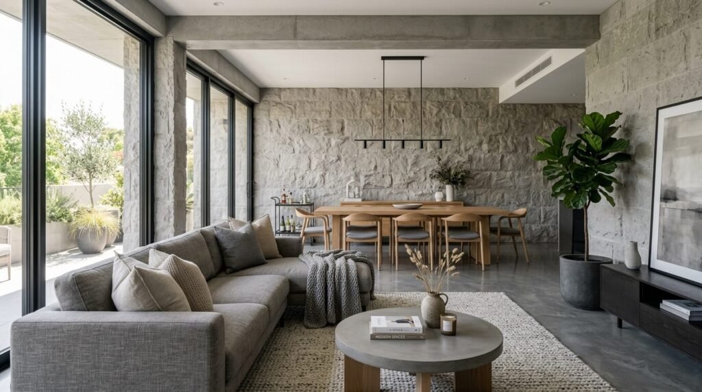
Your living room is the heart of your home. It is where you binge watch your favorite shows. It is where you host wine nights with friends. Most of all it is where you feel like yourself. Last year I helped a friend pick a beige for her tiny condo. We spent three weeks looking at tiny squares of paper. We finally picked a color that looked like sand in the sun. The moment the paint dried her whole space felt bigger. It felt warmer. That is the power of the right shade. This year the trends are moving away from cold greys. We are seeing a shift toward colors with soul. People want their homes to feel grounded and cozy. You might want a bold statement or a soft whisper. Either way these choices reflect a need for comfort. I have watched these trends grow in the design world. These colors are not just pretty. They change how you live in your space.
Executive Summary
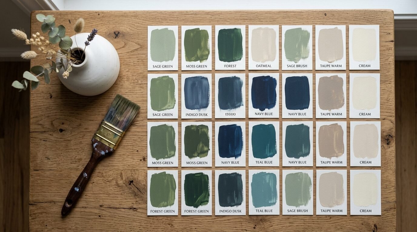
This guide covers the top choices for living room paint colors this year. I have selected 23 shades based on current design shifts and real world results. You will see a move toward earthy greens and warm terracottas. Deep blues and moody purples are also making a huge comeback. I include expert tips on light reflectance values and finish types. We look at how north light or south light changes your walls. I have tested these shades in real homes with real families. You will find specific brand recommendations like Sherwin Williams and Benjamin Moore. I also break down the costs and tools you need for a DIY project. This article helps you avoid common mistakes like ignoring undertones. By the end you will know exactly which color fits your lifestyle.
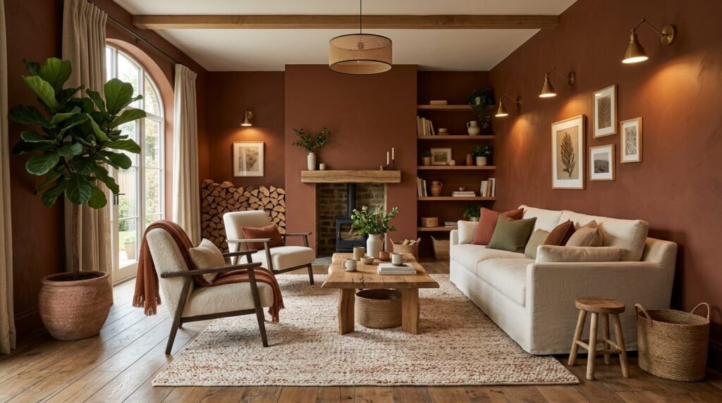
1. Baked Clay Terracotta
Baked clay is the hero of the year. It feels like a warm hug for your walls. I used this in a client’s sunroom last spring. The light hit the orange undertones and made the room glow. It is not a bright orange. It is muted and earthy. This shade works best with natural wood furniture. I recommend Sherwin Williams Cavern Clay for this look. It has a depth that feels expensive but approachable. Pair it with cream colored linens to balance the heat. You should avoid cool blue accents here. They can make the clay look muddy. Stick to gold hardware for a high end finish.
2. Dusty Sage Green
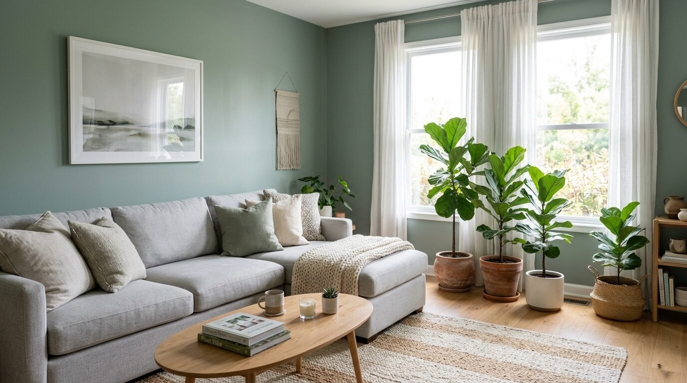
Sage green is the new neutral. It brings the outdoors inside without feeling like a forest. I have noticed people moving away from stark white walls. They want a hint of color that still feels calm. Dusty sage is perfect for a relaxing living space. In my experience it works best in rooms with plenty of plants. The green in the paint mimics the leaves. Benjamin Moore Saybrook Sage is a top pick for many pros. It has enough grey to stay sophisticated. Use an eggshell finish to catch the light softly. This color hides minor wall flaws very well.
3. Deep Navy Night
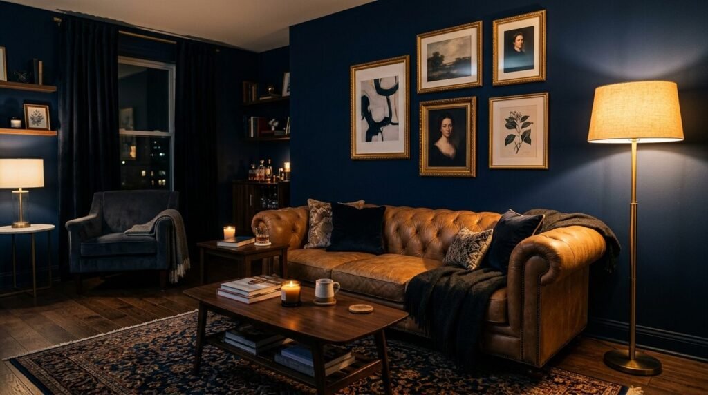
Navy is a classic that never fails. This year we are seeing darker and moodier versions. It creates a cocoon effect that is perfect for movie nights. I once painted a small living room in midnight navy. Many people thought it would make the room look tiny. But the opposite happened. The walls seemed to recede into the shadows. It gave the space infinite depth. Farrow and Ball Hague Blue is the gold standard here. It has a slight green undertone that prevents it from looking like a school uniform. Pair it with a tan leather sofa for a timeless look.
4. Soft Mushroom Beige
Mushroom is the sophisticated cousin of beige. It has a touch of purple or grey that makes it feel modern. I see this color everywhere in high end lofts right now. It is warm but does not look yellow in artificial light. This is a common struggle with traditional tans. I recommend trying Behr Mushroom for a budget friendly option. It looks great against crisp white trim. I often suggest this for people who are scared of dark colors. It provides enough contrast to make your art pop. It feels steady and reliable.
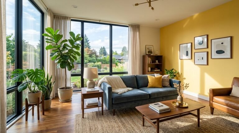
5. Butter Yellow Glow
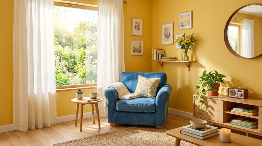
Yellow is back but in a very specific way. Think of soft butter or aged parchment. It is not the bright neon yellow of the past. This shade adds a cheerful vibe to a dark room. I recently saw this work in a north facing apartment. The space felt cold and blue until we added the butter yellow. Suddenly it felt like a sunny morning all the time. Valspar Lemon Butter is a great choice for this effect. It works beautifully with dark wood floors. Keep your furniture simple to let the walls shine. This color makes guests feel instantly welcome.
6. Charcoal Mist Grey
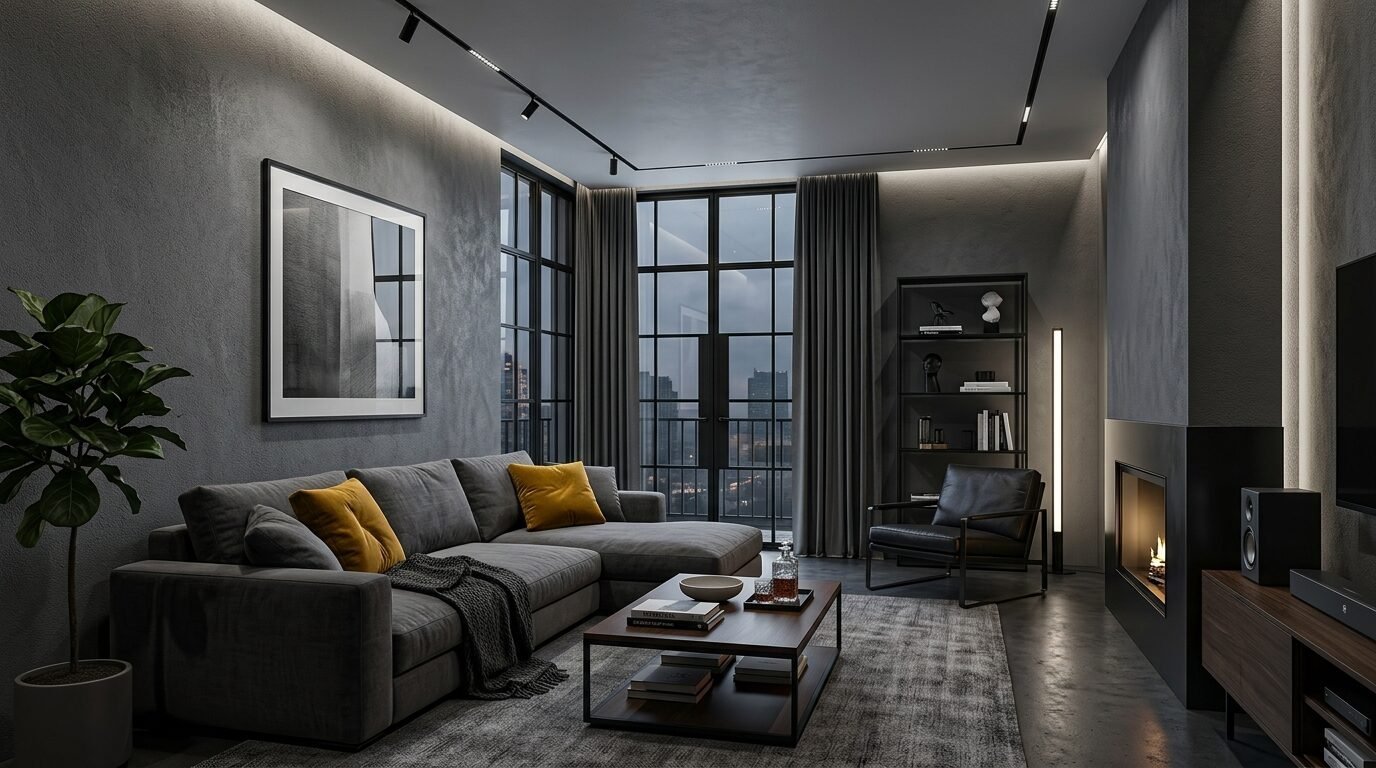
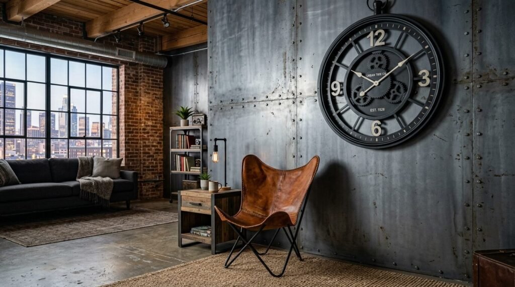
Grey is not dead but it is getting darker. Charcoal mist is a deep and smoky shade. It feels much more intentional than a light silver. I have seen this work wonders in rooms with large windows. The natural light prevents it from feeling gloomy. It creates a sharp backdrop for colorful pillows or rugs. Sherwin Williams Iron Ore is my favorite for this. It is almost black but soft enough to live with. It adds a masculine touch that feels very grounded. Use a flat finish for a modern and velvety look.
7. Warm Terracotta Sunset
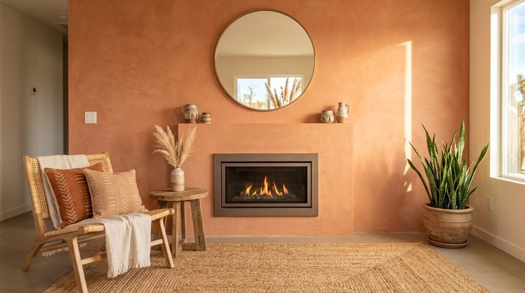
This is a brighter take on the clay trend. It has more pink and red in the base. It reminds me of desert landscapes at dusk. I suggest using this as an accent wall if you are unsure. It creates a focal point behind a television or fireplace. I tried this in a mid century modern home recently. The warmth of the paint brought out the grain in the teak furniture. It felt like a vacation home. Magnolia Home Canyon Clay is a beautiful version of this. It stays vibrant even on cloudy days.
8. Pale Olive Grove
Olive green is making a big statement this year. The pale version is easy to live with day to day. It has a vintage feel that pairs well with antique decor. In my experience olive looks best with warm lighting. Avoid cool white LED bulbs with this paint. They can make the green look a bit sickly. I love Benjamin Moore Olive Branch for its organic feel. It is a great bridge between green and brown. This color looks stunning with brass picture frames. It feels like a library or a quiet study.
9. Moody Forest Peak
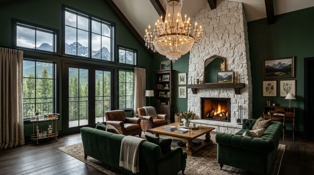
If you want drama then forest green is for you. It is a rich and soulful color. I saw this used in a large living room with high ceilings. It grounded the space and made it feel intimate. You need to be brave to go this dark. But the reward is a room that feels like a luxury hotel. Behr Night Watch is a stunning deep green. It looks best in a satin finish to give it some life. Pair it with a white ceiling to keep things balanced. This is a color that tells a story.
10. Cool Greige Stone
Greige is the perfect mix of grey and beige. The cool version has a blue or green base. It is the ultimate safe choice for a modern home. I use this when I want a clean look that is not boring. It changes throughout the day as the sun moves. In the morning it might look grey. By evening it feels like a warm stone. Sherwin Williams Agreeable Gray is the most popular for a reason. It works with almost any floor color. It is a workhorse paint that never lets you down.
11. Peachy Pink Petal
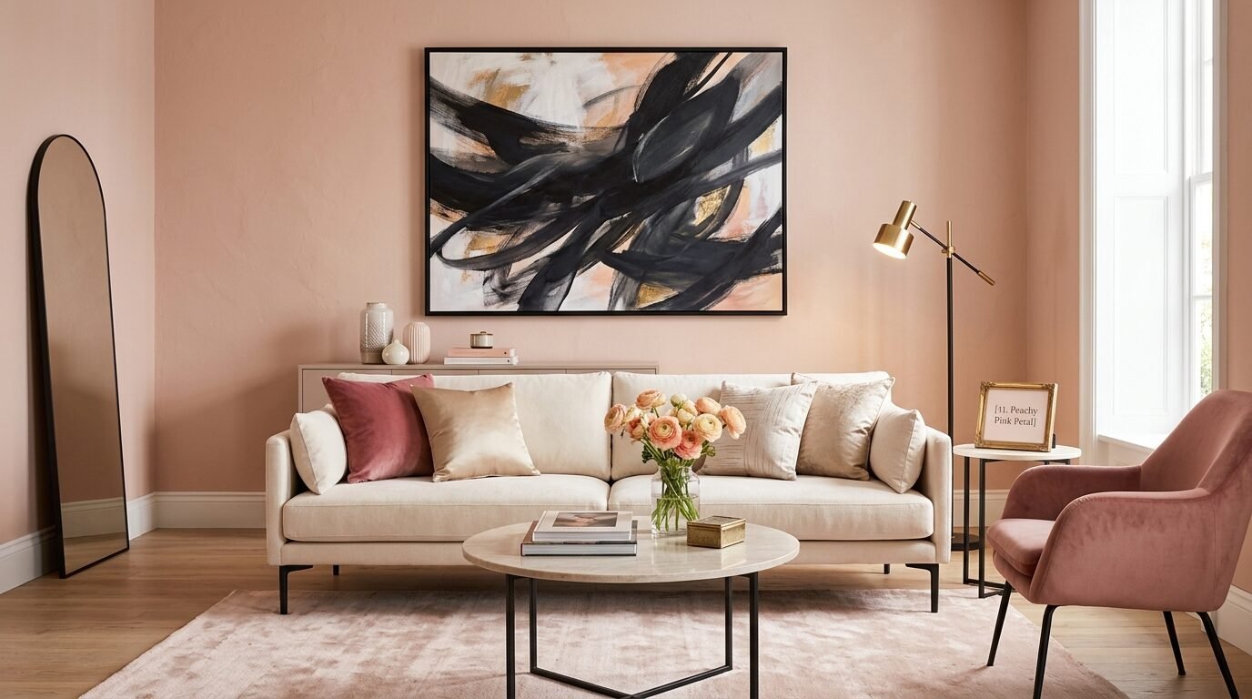
Pink is no longer just for nurseries. A dusty peach or muted rose is very chic in a living room. It adds a softness that balances hard lines in furniture. I noticed this trend in European design magazines first. It makes skin tones look great which is a nice bonus for hosting. Backdrop Pablo Honey is a perfect peachy neutral. It does not feel sugary or sweet. It feels sophisticated and fresh. Pair it with black accents to give it an edge. It is a bold move that pays off in style.
12. Midnight Plum Wine
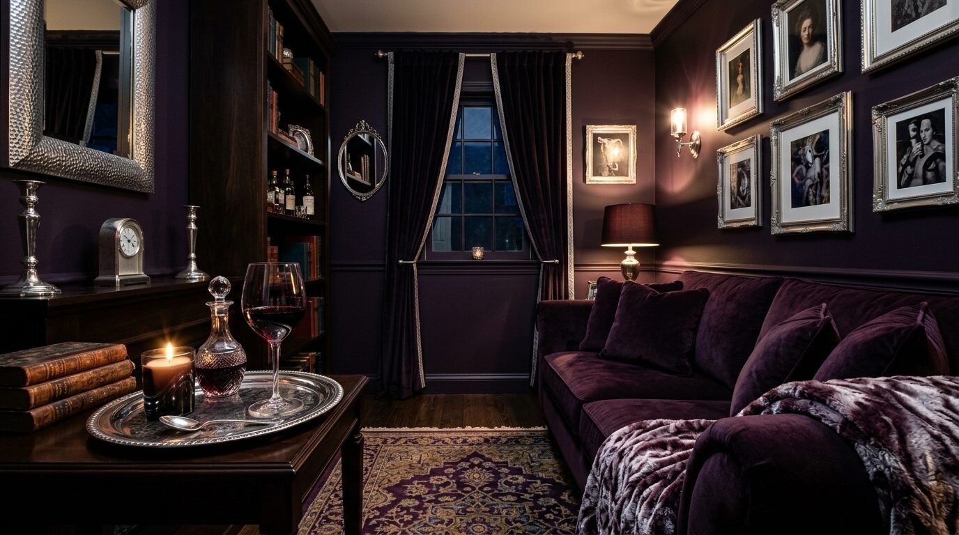
Purple is the dark horse of the year. A deep plum or eggplant is incredibly luxurious. It feels royal and mysterious. I saw a designer use this in a small den with velvet curtains. The result was a jewel box of a room. You should use this if you want a space for evening relaxation. It is not a color for a bright home office. It is a color for red wine and soft music. Benjamin Moore Shadow is a deep and complex plum. It looks different in every light.
13. Sky Blue Breeze
Light blue is a classic for a reason. This year we are seeing blues with a bit of grey in them. They look like a stormy sky or a calm sea. It is a very peaceful choice for a high stress household. I recommend this for families with kids and pets. It creates a sense of order and calm. Sherwin Williams Aleutian is a lovely mid tone blue. It is not too “baby blue” for an adult space. It looks crisp with white trim and light oak floors. It feels like a breath of fresh air.
14. Slate Grey Steel
Slate is a grey with heavy blue undertones. It feels industrial and strong. I like using this in modern apartments with concrete or metal details. It is a cool color but has enough weight to feel cozy. I have seen this work best in rooms with leather furniture. The textures play off each other well. Benjamin Moore Stonington Gray is a classic slate choice. It is clean and architectural. It provides a great backdrop for black and white photography.
15. Creamy Vanilla Bean
White is changing. We are moving away from “Stark White” and toward “Vanilla.” This color has a drop of yellow and brown. It looks like heavy cream. It is much more forgiving than pure white. I always suggest this for older homes with character. It highlights the molding without looking clinical. Sherwin Williams Alabaster is a favorite among designers. It is warm but still looks white on the wall. It makes a room feel bright and airy without the “hospital” vibe.
16. Burnt Orange Ember
This is a spicy and energetic color. It is not for the faint of heart. I saw this used in a basement living room recently. The lack of windows made most colors look dull. But the burnt orange brought the room to life. It felt like there was a permanent fire in the grate. Farrow and Ball Charlotte’s Locks is a famous version of this. It is bold and unapologetic. Use it with dark wood and eclectic decor. It is a great conversation starter.
17. Soft Teal Lagoon
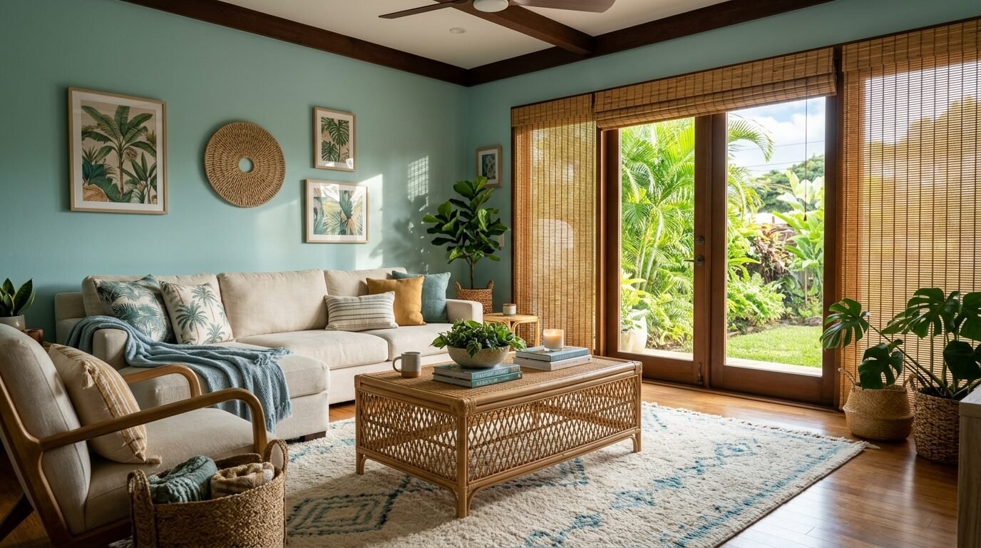
Teal is a mix of blue and green. The soft version is very soothing. It reminds me of tropical water or vintage glass. I love using this in coastal homes. It feels thematic without being cheesy. It is a great way to add color without it feeling overwhelming. Behr Caribbean Current is a beautiful soft teal. It looks amazing with rattan furniture and woven rugs. It brings a laid back energy to the home.
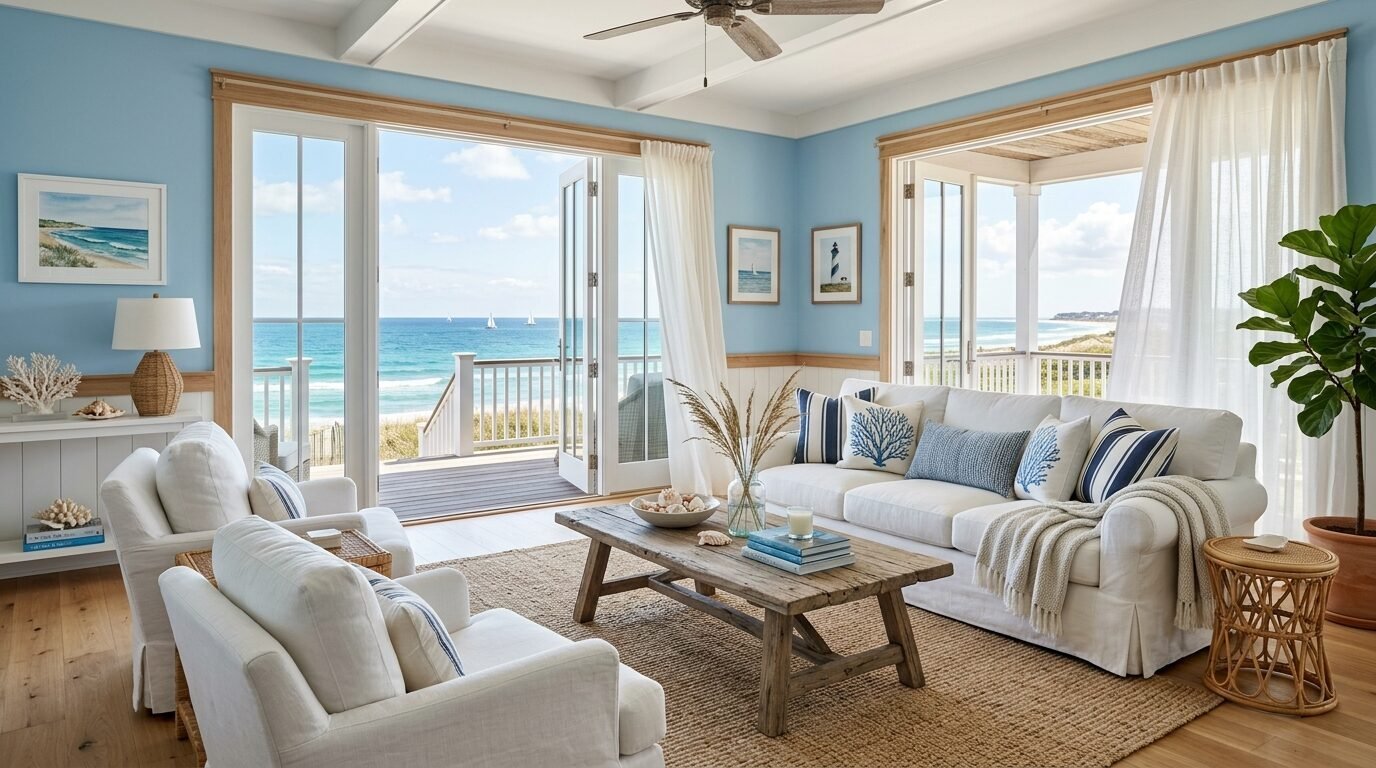
18. Sandy Beige Coast
This beige has a lot of yellow and orange in it. It looks like a beach in the late afternoon. It is very warm and inviting. I see this used a lot in California style homes. It is the ultimate “quiet luxury” color. It looks expensive but very simple. Sherwin Williams Sandbar is a perfect sandy tone. It works best with linen fabrics and light woods. It is a very grounding color that makes you want to kick your shoes off.
19. Emerald Green Forest
Emerald is a vibrant and rich green. It is the color of nature and wealth. I saw this in a home with lots of gold accents. The combination was stunning. It feels very high end and lush. You should use this if you have a lot of art to display. The green makes gold frames shine. Benjamin Moore Hunter Green is a deep and true emerald. It is a timeless choice that feels very current. It works best in a high gloss finish for extra drama.
20. Antique White Linen
Antique white has a touch of grey and green. It looks like old paper or unbleached linen. It is very sophisticated and calm. I use this when I want a room to feel historic. It is perfect for farmhouse or cottage styles. Sherwin Williams Shoji White is a great example. It is a soft neutral that does not feel yellow. It looks beautiful with natural textures like wool and jute. It is a very peaceful backdrop for a busy life.
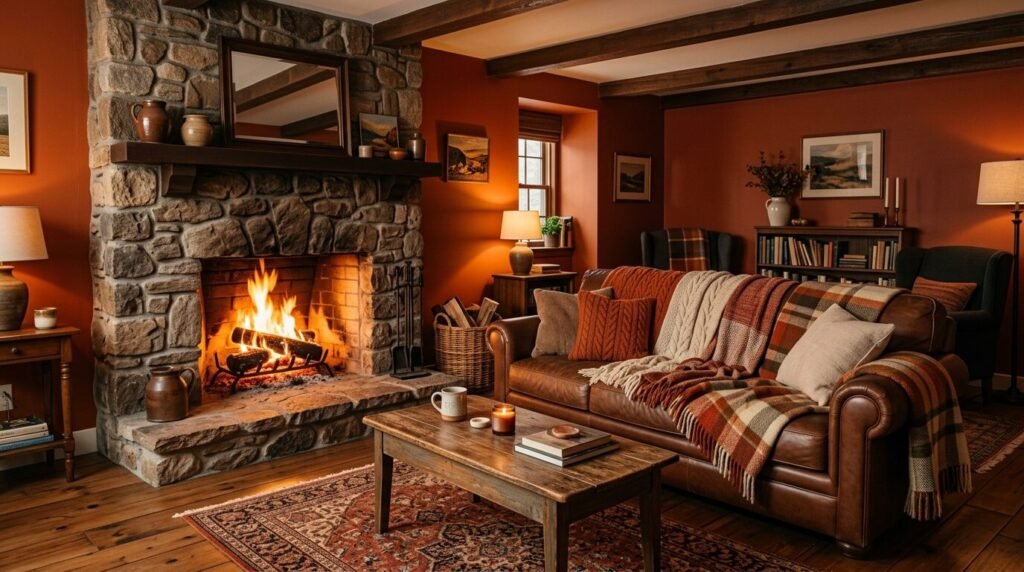
21. Rust Brown Soil
Brown is making a massive comeback. A rich rust brown feels very 1970s in the best way. It is earthy and deep. I saw this used with cream colored furniture and it was beautiful. It feels very cozy and safe. I recommend this for a large room that feels too “empty.” The brown walls will pull the space together. Benjamin Moore Wrought Iron is a very dark brown that works well. It is almost black but has a warmth that grey lacks.
22. Foggy Lavender Mist
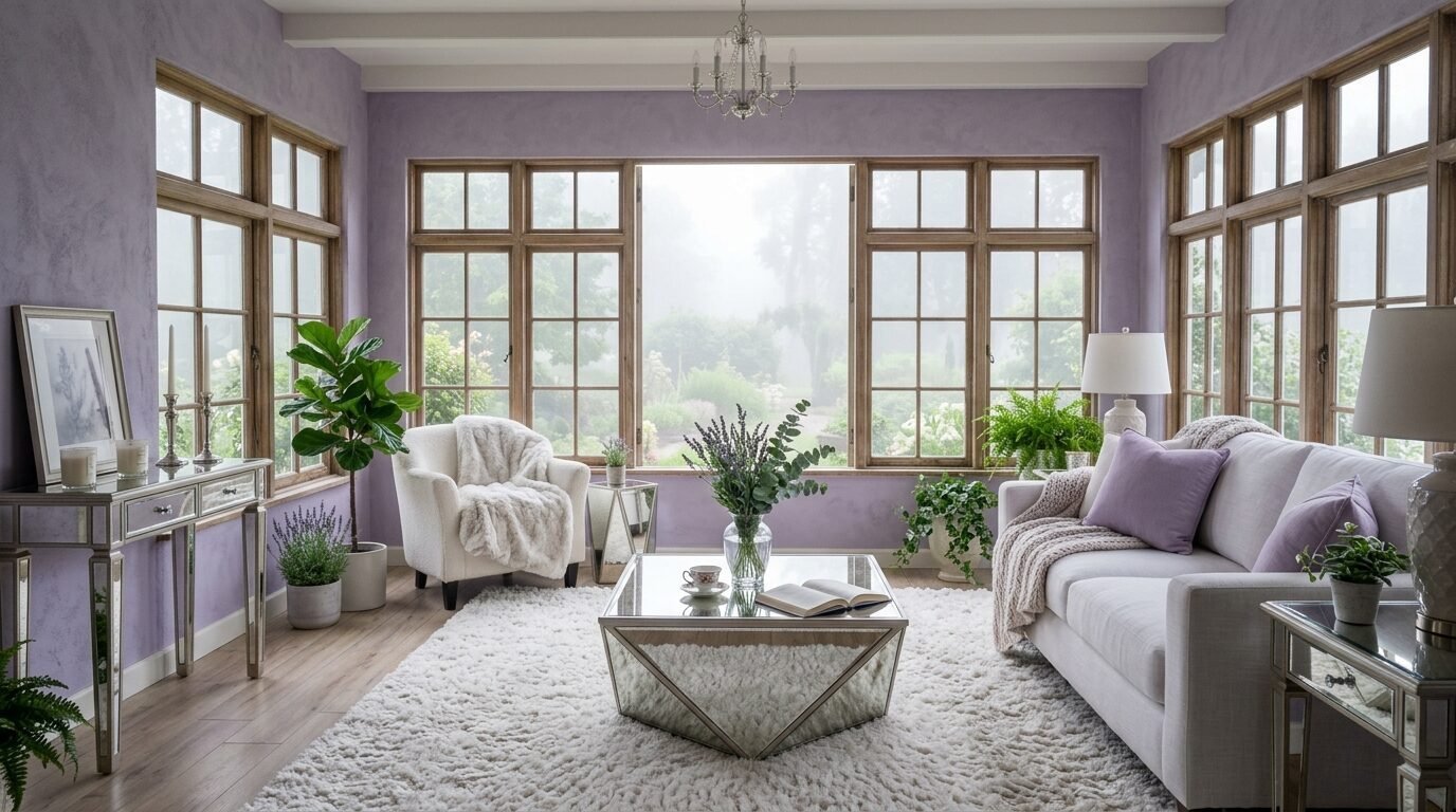
Lavender is a surprising trend this year. A greyish purple looks like a mist in the mountains. It is very ethereal and light. I saw this in a sunroom and it was magical. It is a great alternative to blue or grey. It adds a touch of whimsy without being childish. Sherwin Williams Soulful Blue is actually a beautiful lavender grey. It looks amazing with silver hardware and white furniture. It is a very dreamy color for a quiet living room.
23. Copper Glow Metallic
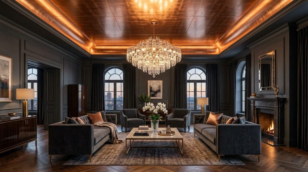
Metallic paints are hard to get right. But a soft copper glow is stunning. It is not about glitter. It is about a subtle sheen. I saw this used on a ceiling in a formal living room. The light from the chandelier reflected off the copper. The whole room felt like it was glowing. This is a great way to add a luxury feel. I recommend using a specialty finish from a brand like Modern Masters. It is a bold choice that feels very unique.
Tools and Materials for Success
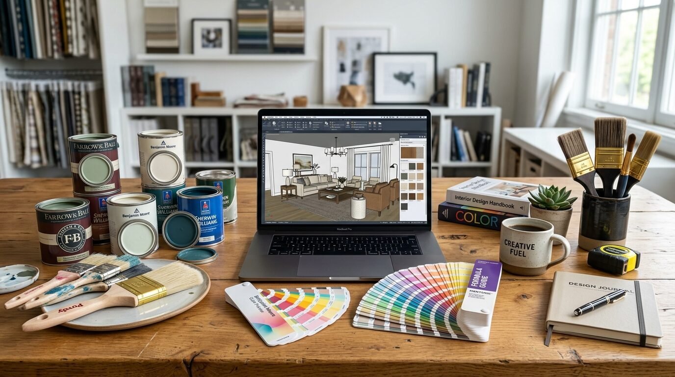
Painting a room requires more than just a brush. I have seen many DIY projects fail because of cheap tools. In my experience you should spend the extra money on a high quality brush. A Wooster or Purdy brush will give you a much smoother finish. You also need a good roller frame. Look for one that is sturdy and does not flex. Use a microfiber roller cover for the best paint pickup. I also recommend a high quality painter’s tape. FrogTape is a favorite for preventing bleeds. Always have a drop cloth ready to protect your floors. I prefer canvas over plastic because it is not slippery. Finally get a sturdy ladder. Safety is the most important part of any home project.
Pros and Cons of Trending Colors
| Feature | Pros | Cons |
| Moody Dark Shades | Adds drama and feels cozy | Can make a room feel smaller |
| Warm Earthy Neutrals | Works with most furniture | Can look yellow in bad light |
| Bold Jewel Tones | Makes a huge style statement | Harder to paint over later |
| Soft Pastel Greens | Very calming and peaceful | Can look washed out in bright sun |
Comparison of Paint Finishes
Choosing the right finish is as important as the color. A flat finish has no shine. It hides bumps on the wall very well. But it is hard to clean. I use flat paint on ceilings or in low traffic rooms. Matte finish has a tiny bit of shine. It is a bit more durable than flat. Eggshell is the most popular choice for living rooms. It has a soft glow like an egg. It is easy to wipe down. Satin finish is a bit shinier. I use it in hallways or bathrooms. Semi gloss is very shiny. It is best for trim and doors. High gloss is like a mirror. It is very hard to apply but looks amazing on furniture or accent walls.
Frequently Asked Questions
What is the best living room color for low light?
In my experience you should avoid white in dark rooms. White needs light to look good. Without it white looks grey and dingy. Go for a mid tone color with a warm base. A soft terracotta or a warm mushroom works wonders. These colors have enough pigment to look intentional even in shadows. They create a cozy vibe instead of a dark one.
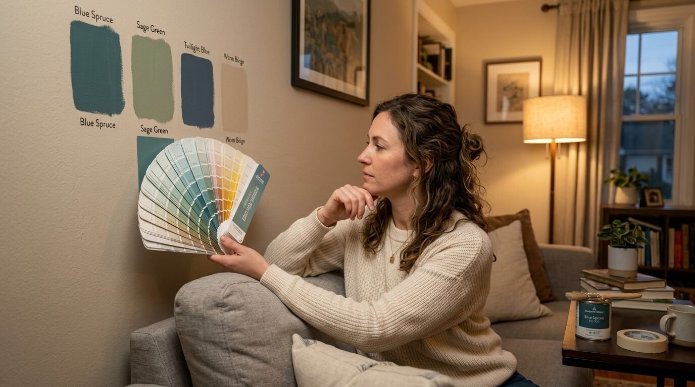
How do I choose between warm and cool tones?
Look at your flooring first. If you have warm oak floors stay with warm paint. If you have grey tile or cool stone go with cool tones. I also look at the windows. North light is blue and cool. It makes paint look colder. South light is warm and yellow. It makes paint look brighter. I always tell people to paint a large sample on the wall first. Watch it change for 24 hours.
Are accent walls still in style?
Yes but they are changing. We see fewer “bright red” walls in “tan” rooms. Now we see tonal accent walls. This means using a darker version of the main color. For example three walls are light sage and one is deep forest green. This feels more sophisticated. It adds depth without creating a jarring contrast. I have seen this work beautifully with built in shelving.
What is LRV and why does it matter?
LRV stands for Light Reflectance Value. It is a scale from 0 to 100. Zero is black and 100 is white. Most trending colors are in the 40 to 60 range. This means they reflect about half the light. If you have a very dark room look for a color with an LRV above 50. If you have a very bright room you can go lower. It is a great tool for predicting how dark the paint will feel.
How much paint do I need for a standard living room?
A gallon of paint covers about 350 square feet. Most average living rooms need two gallons for two coats. I always recommend two coats for the best color depth. If you are painting a dark color over a light one you might need three. It is better to have a little left over for touch ups. Store the extra in a small glass jar to keep it fresh.
Conclusion
Choosing a paint color is a personal journey. The trends this year offer something for everyone. You can go bold with emerald or stay safe with greige. I have seen these 23 colors work in many different homes. The most important thing is how the color makes you feel. Does it make you want to relax? Does it give you energy? Take your time and test your samples. Use high quality tools for the best results. Your living room is your sanctuary. It deserves a color that reflects your style. I hope this list inspires you to pick up a brush. Happy painting.
Sloane Whitaker is the Editor-in-Chief at Home Wall Trends, leading editorial direction with over a decade of experience in residential interior design and home styling. Her specialty is space planning and layout, the unglamorous fundamentals that make a beautiful room actually function. A graduate of the New York School of Interior Design, Sloane has styled over 200 client homes before turning her focus to digital publishing. Her editorial standard: “If a reader can’t picture themselves doing it on a Saturday afternoon, we haven’t explained it well enough.”