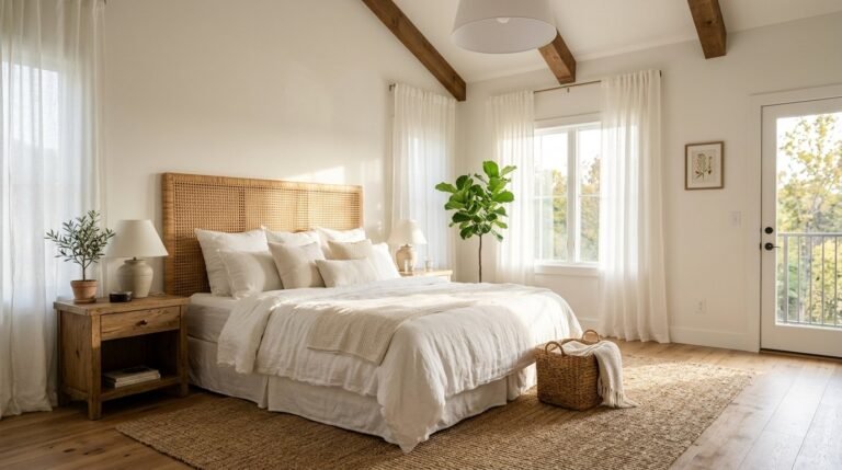
I stared at my wall at 2 AM glaring at the harsh bright white paint. I realized my paint choice ruined my sleep schedule. Room wall colors bedrooms need soft transitions. Bright white reflects artificial light like a hospital corridor. I repainted that space a deep moody green three days later. My sleep tracked a full extra hour of deep rest the very first night. Color dictates mood entirely. The wrong shade keeps your brain active. The right aesthetic room colour ideas bedroom designers swear by will lower your heart rate instantly. Let me share exactly what works.
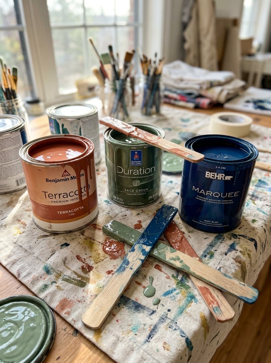
You will quickly see how specific paint pairs change everything about your rest. I tested over forty combinations in different lighting conditions. I narrowed them down to twenty two reliable pairs. I outline exact paint names from Benjamin Moore, Sherwin Williams, and Farrow & Ball. You will see cost estimates averaging $150 per room. Expect project timelines around one weekend. I cover beginner friendly choices and bold designer picks. You get exact color codes so you can skip the trial and error completely.
1. Terracotta and Cream
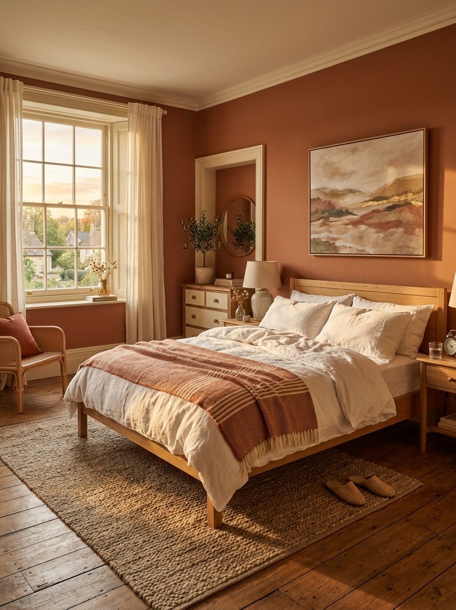
I painted a guest room with this exact pair last November. Terracotta makes a room feel warm instantly. The space felt completely different within hours.
- I used Farrow & Ball Red Earth for the main walls.
- I paired it with Benjamin Moore Swiss Coffee for the trim.
- Total paint cost ran around $185.
Cream softens the red undertones perfectly. A bedroom colour design needs warmth to feel comfortable. Evening light hits the terracotta and makes the space glow beautifully. I advise choosing this pair for north facing rooms that get chilly light. Do not use pure white trim with terracotta. Pure white looks too stark. It cheapens the entire room aesthetic. This remains my top choice for autumn painting projects.
2. Sage Green and Warm White
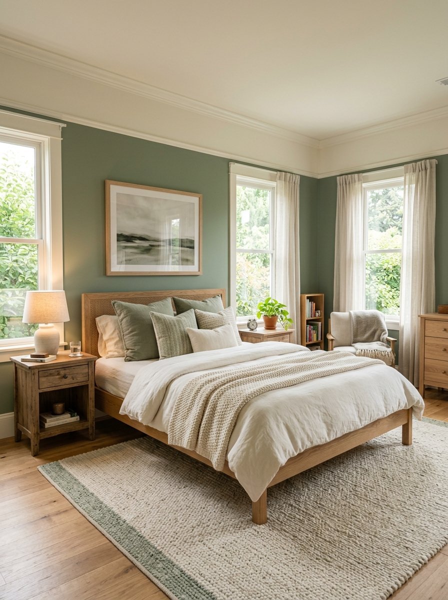
I tried sage green in my own master suite three years ago. I never looked back. Sage green lowers my heart rate the second I walk inside.
- Sherwin Williams Clary Sage works flawlessly here.
- Pair it with Alabaster for the ceiling and baseboards.
- Expect to spend roughly $140 on premium gallons.
This combination mirrors nature directly. It rests the eyes after looking at bright screens all day. The best colour for bedroom walls should feel peaceful. Sage does exactly that. I painted the ceiling warm white to prevent a cave like feeling. The contrast looks sharp but gentle. Try a flat finish for the green walls. It hides drywall flaws beautifully.
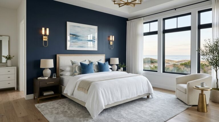
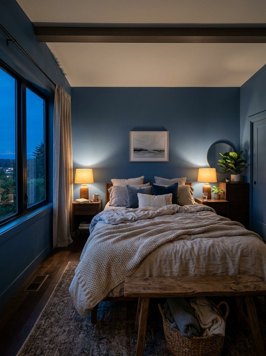
3. Navy Blue and Brass
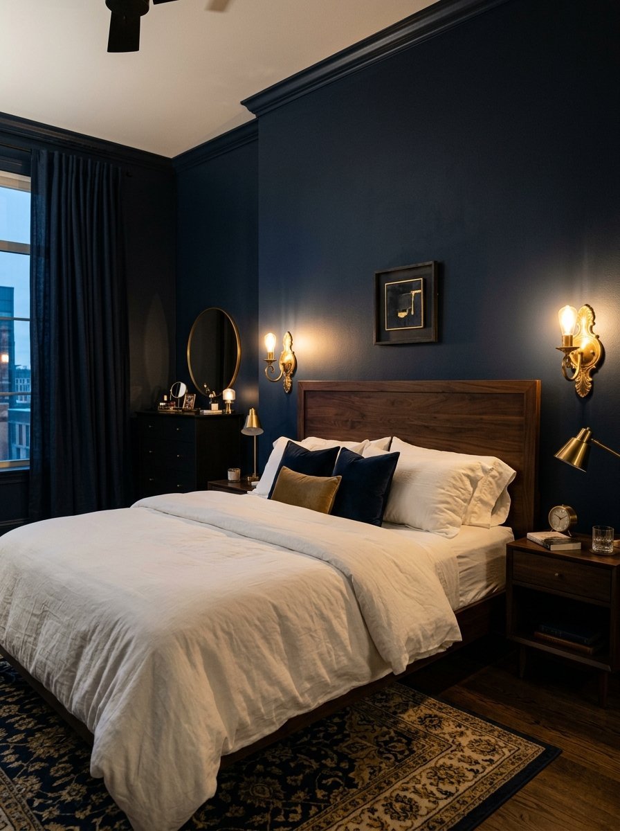
A client wanted a dark room for better rest last year. Navy blue scared her initially. I convinced her to try it.
- Benjamin Moore Hale Navy is the perfect dark blue.
- Use unlacquered brass hardware on the wood furniture.
- Budget $200 for paint and new brass knobs.
The dark walls make the room feel like a cozy den. The brass accents catch the little light available. They sparkle against the dark background. This pairing screams luxury. I always tell friends to paint the trim the exact same navy. It makes the ceiling look taller visually. Your room paint colour should serve a physical purpose. Navy helps you sleep longer.
4. Dusty Rose and Charcoal
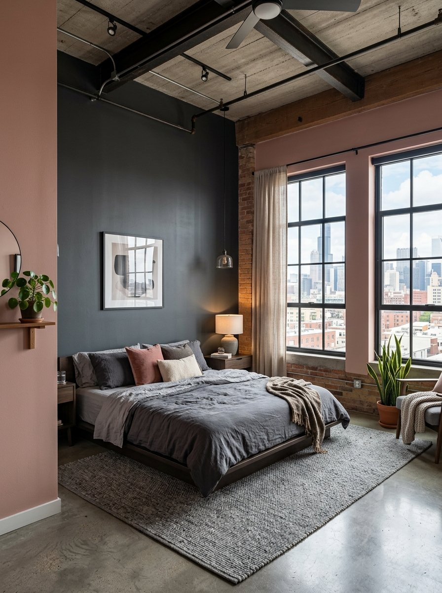
Pink often looks too childish in a master suite. Dusty rose fixes that problem completely. I paired it with charcoal gray in a downtown loft project.
- Behr Seaside Villa is my favorite dusty rose.
- Benjamin Moore Kendall Charcoal grounds the space.
- You can finish this project in one single Saturday.
The charcoal stops the pink from feeling overly sweet. You get a sophisticated adult room. I painted the wall behind the bed charcoal. The other three walls took the dusty rose. The contrast makes the furniture pop visually. People love this aesthetic room colour ideas bedroom pinners save constantly. It feels romantic without feeling ridiculous.
5. Mustard Yellow and Pale Gray
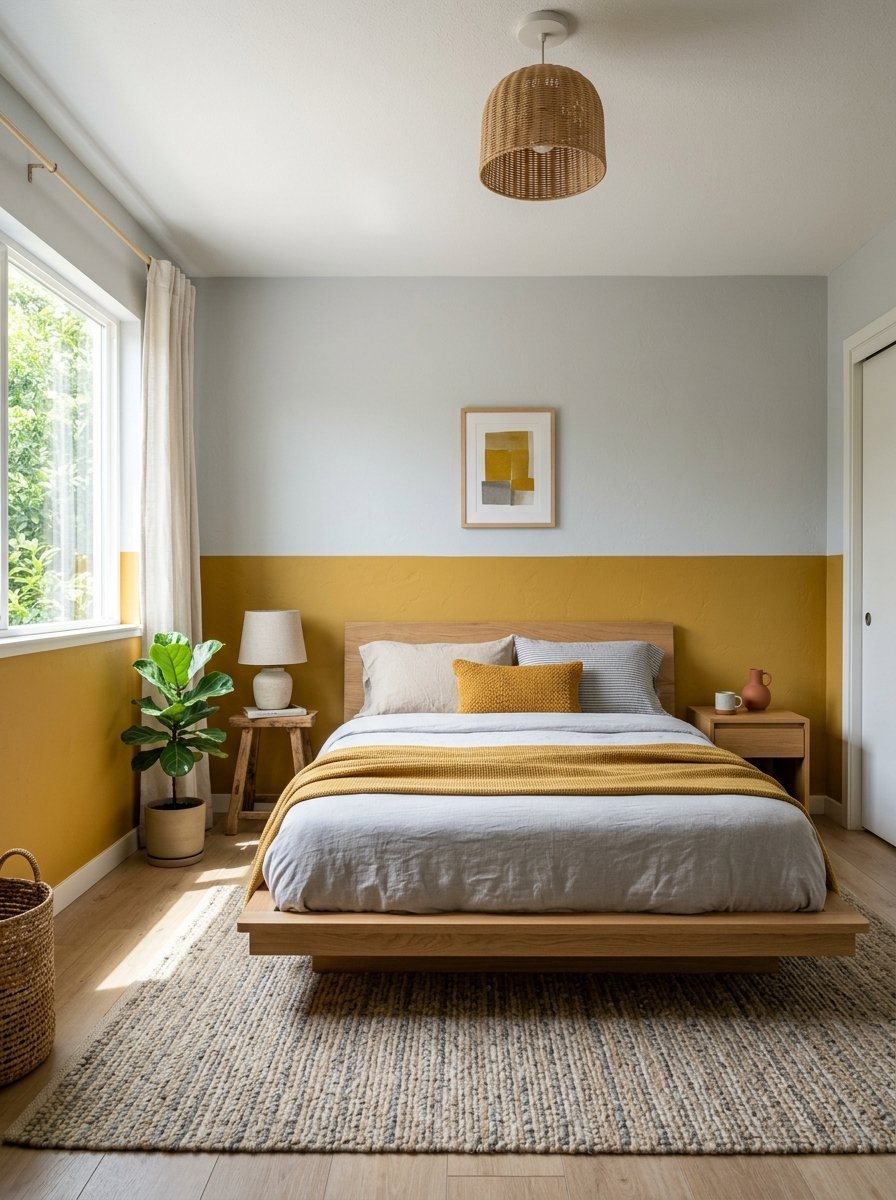
Yellow scares most amateur painters. They picture bright lemons. Mustard yellow acts differently. It feels grounded and incredibly earthy.
- Valspar Golden Mustard provides rich earthy tones.
- Benjamin Moore Classic Gray balances the bold yellow.
- I spent $160 testing this in a small spare room.
The pale gray cools down the hot mustard perfectly. You wake up feeling energized but not overwhelmed. I painted the bottom half of the wall mustard. I painted the top half pale gray. It divided the room visually. The ceiling felt much higher afterward. This ranks highly among room color design bedrooms meant for early risers.
6. Forest Green and Muted Gold
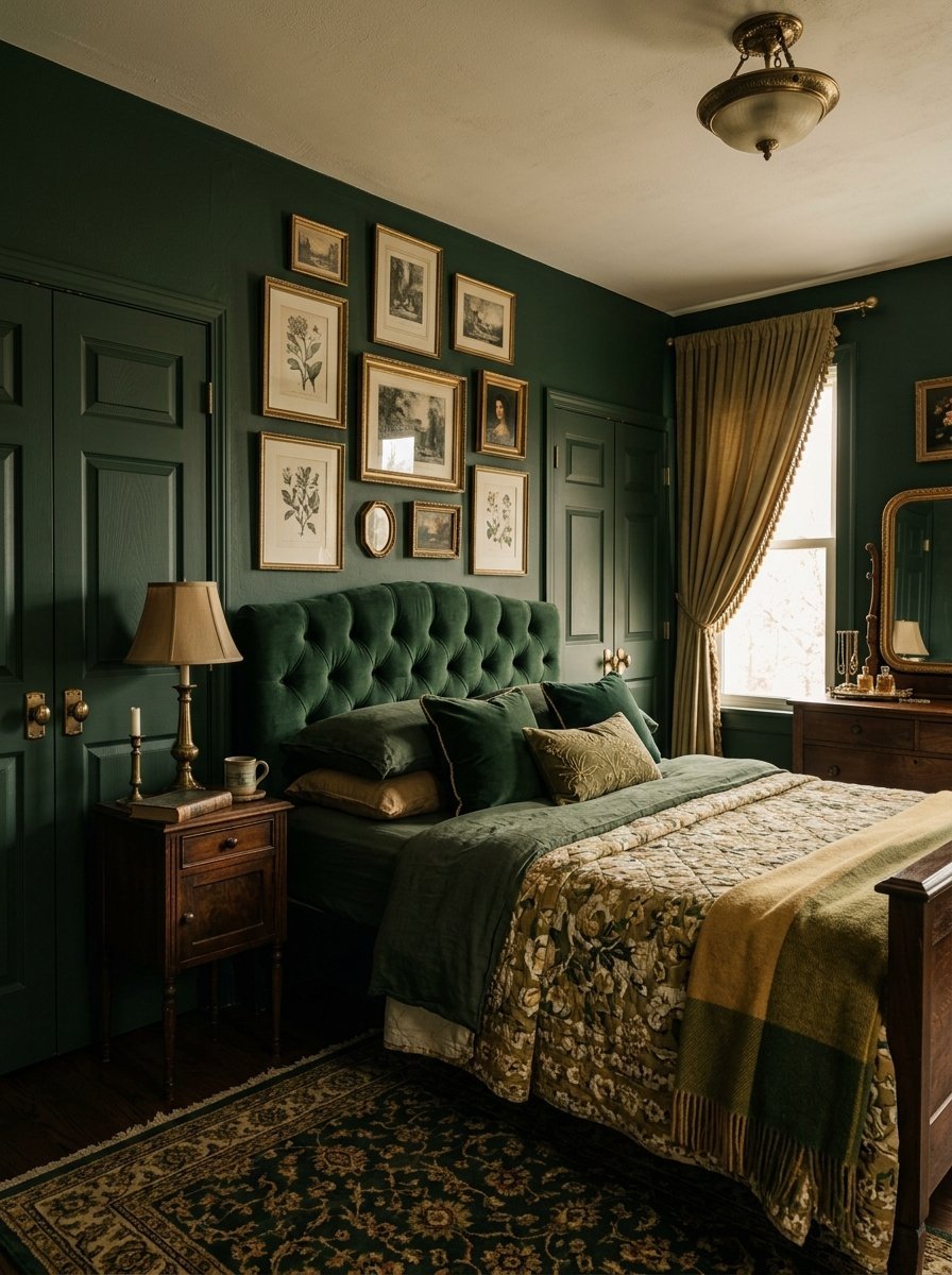
I obsessed over vintage library designs for months. I wanted that rich feeling in a sleeping space. Forest green delivers that exact specific mood.
- Backdrop Surf Camp is an incredible dark green.
- Accent with muted gold picture frames and mirrors.
- A gallon of Backdrop paint runs about $69.
Dark green absorbs shadows beautifully. It feels like sleeping in a quiet forest. The muted gold breaks up the heavy darkness. It prevents the room from feeling oppressive. I painted the closet doors green too. It creates a highly cohesive look. People always ask me for the exact paint name when they visit.
7. Soft Lavender and Olive
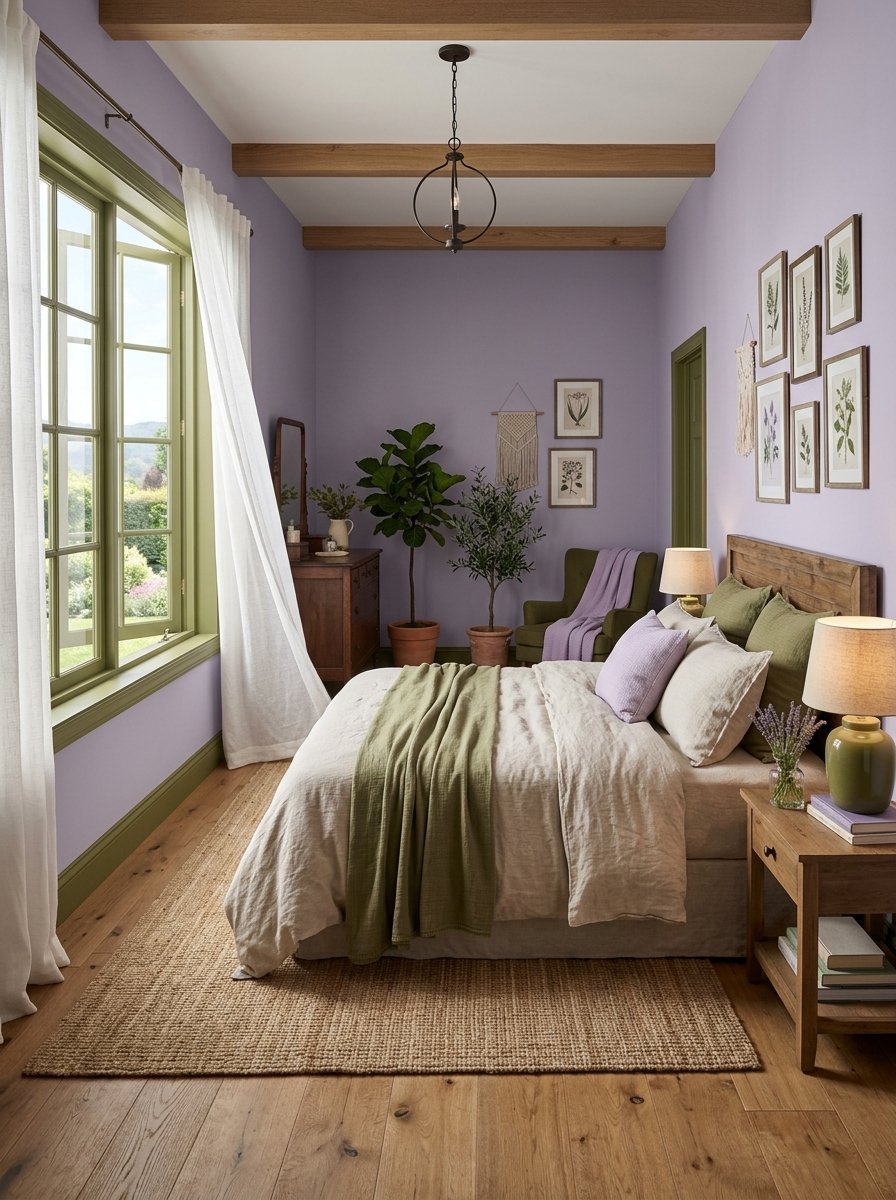
I saw this combination in a boutique hotel in Paris. I immediately replicated it at home. It sounds strange but looks absolutely incredible.
- Clare Paint Wing It provides a grown up lavender.
- Farrow & Ball Bancha serves as the olive accent.
- This pairing works best with natural linen bedding.
The olive green grounds the airy lavender. Most people pair lavender with pure white. That looks too juvenile. Olive makes it sophisticated and grounded. I used olive for the window trims. The lavender covered the four main walls. It feels fresh and highly customized.
8. Matte Black and Warm Wood
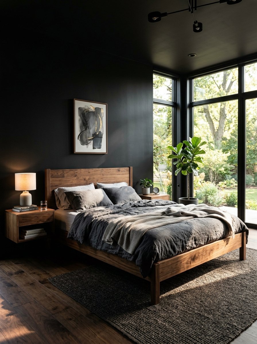
I know black walls sound terrifying. I painted my brother’s room matte black last winter. He thought I lost my mind. Now he refuses to change it.
- Sherwin Williams Tricorn Black in a matte finish.
- Incorporate natural walnut or oak wood furniture.
- You must use two coats of primer first.
Black makes the walls visually disappear. The edges of the room blur away at night. Warm wood furniture stops the space from feeling cold. The wood grain stands out sharply against the black paint. You need excellent natural light for this trick. Do not try this in a windowless basement. It completely redefines the best colour for bedroom styling.
9. Peach and Emerald
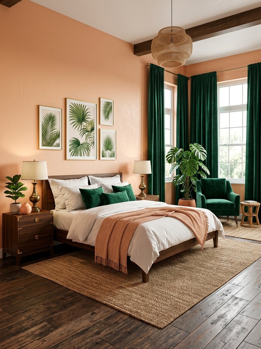
I wanted a tropical feel for a summer house project. Standard blues felt too predictable. Peach and emerald struck the perfect visual balance.
- Benjamin Moore Peach Parfait keeps it subtle.
- Sherwin Williams Hunt Club gives that deep emerald punch.
- Costs stay low if you only use emerald once.
The peach acts as a warm flattering neutral base. It makes your skin look great in the mirror. The emerald adds massive visual depth. I hung emerald velvet curtains against the peach walls. The texture contrast works perfectly together. It feels incredibly luxurious for very little money spent.
10. Slate Blue and Tan
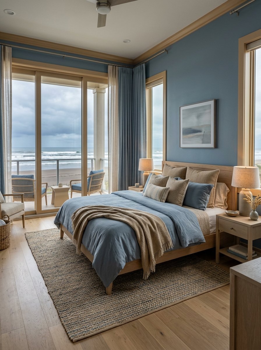
I grew tired of stark gray walls. I needed something softer for a client’s beach condo. Slate blue mixes gray and blue flawlessly.
- Farrow & Ball Light Blue actually reads as dusty slate.
- Benjamin Moore Manchester Tan warms it up.
- You can buy both colors for around $190.
Tan mimics the color of wet beach sand. Slate mimics a cloudy winter sky. The room feels incredibly peaceful. The tan prevents the blue from feeling frigid. I painted the trim tan instead of white. It completely softens the room edges. This fits perfectly into natural room wall colors bedrooms categories.
11. Burgundy and Beige
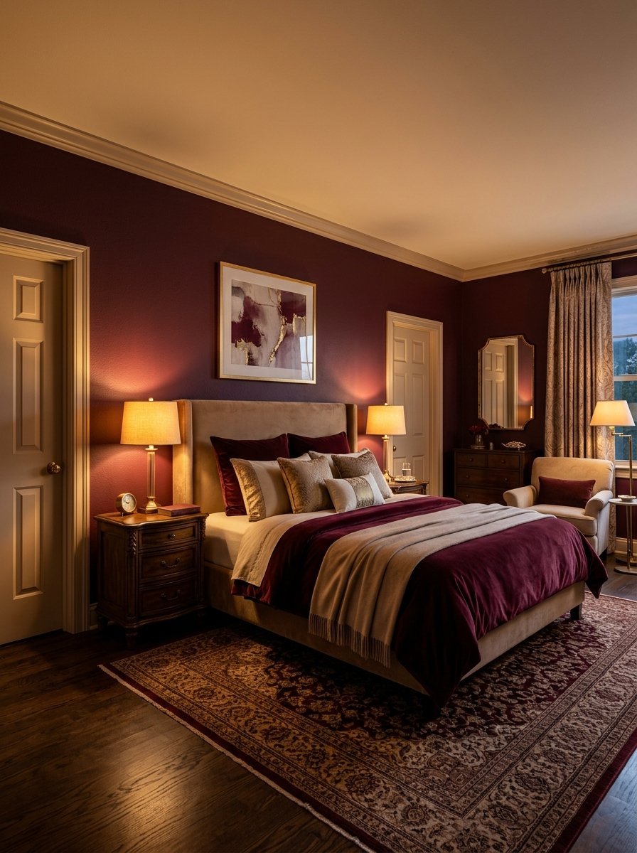
I wanted drama for a dining room initially. Then I realized burgundy belongs in a sleeping space. It feels like a glass of heavy red wine.
- Sherwin Williams Carnelian is a flawless deep red.
- Benjamin Moore Accessible Beige acts as the counterweight.
- Beige keeps the burgundy from dominating totally.
Burgundy wraps around you like a heavy blanket. It makes a large drafty room feel intimate. I kept the beige on the ceiling and doors. This stops the red from bleeding into a horror movie vibe. It looks exceptionally elegant with warm table lamps.
12. Mint Green and Chocolate Brown
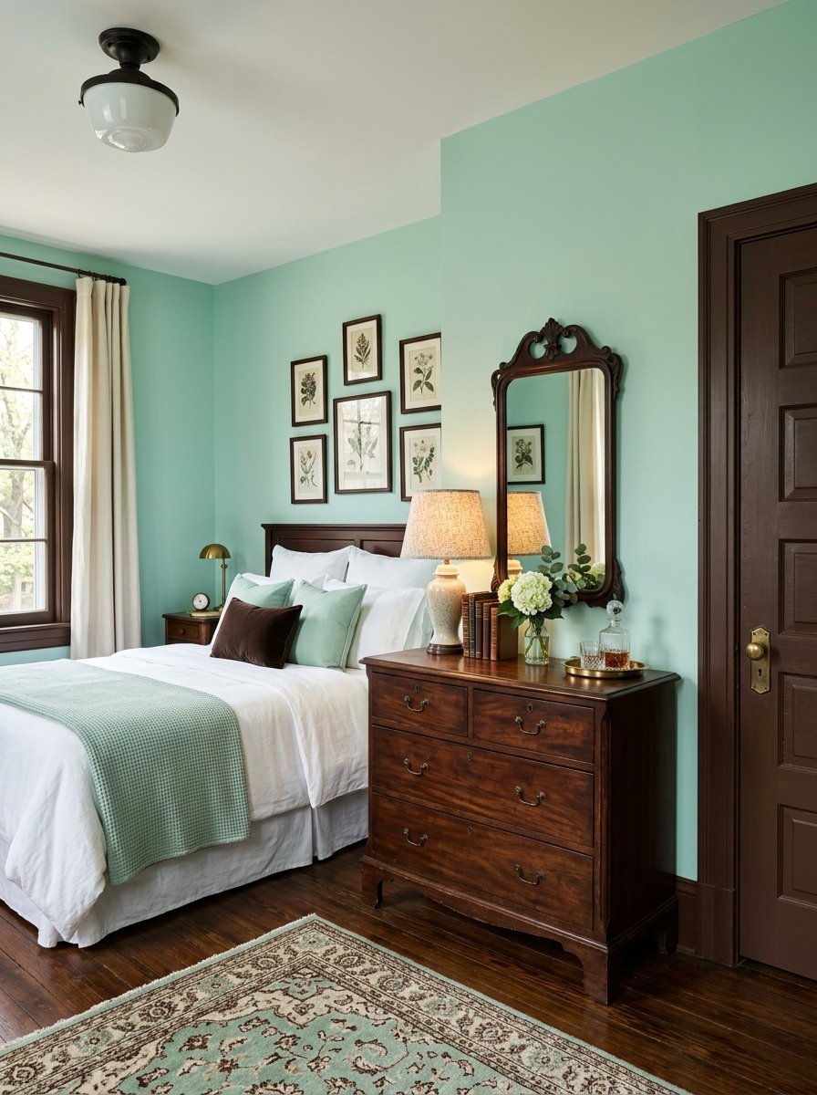
This combination sounds like mint ice cream. In a room it looks incredibly tailored and sharp. I used it in a vintage styled guest room.
- Benjamin Moore Palladian Blue reads perfectly minty.
- Farrow & Ball London Clay provides the rich brown.
- Use the brown sparingly on doors and baseboards.
The mint feels crisp and wonderfully cool. The chocolate brown adds heavy grounding weight. Black accents would look too harsh here. Brown keeps the vintage aesthetic totally intact. I matched the brown paint with dark mahogany furniture. It looks incredibly cohesive and carefully planned.
13. Warm Clay and Off White
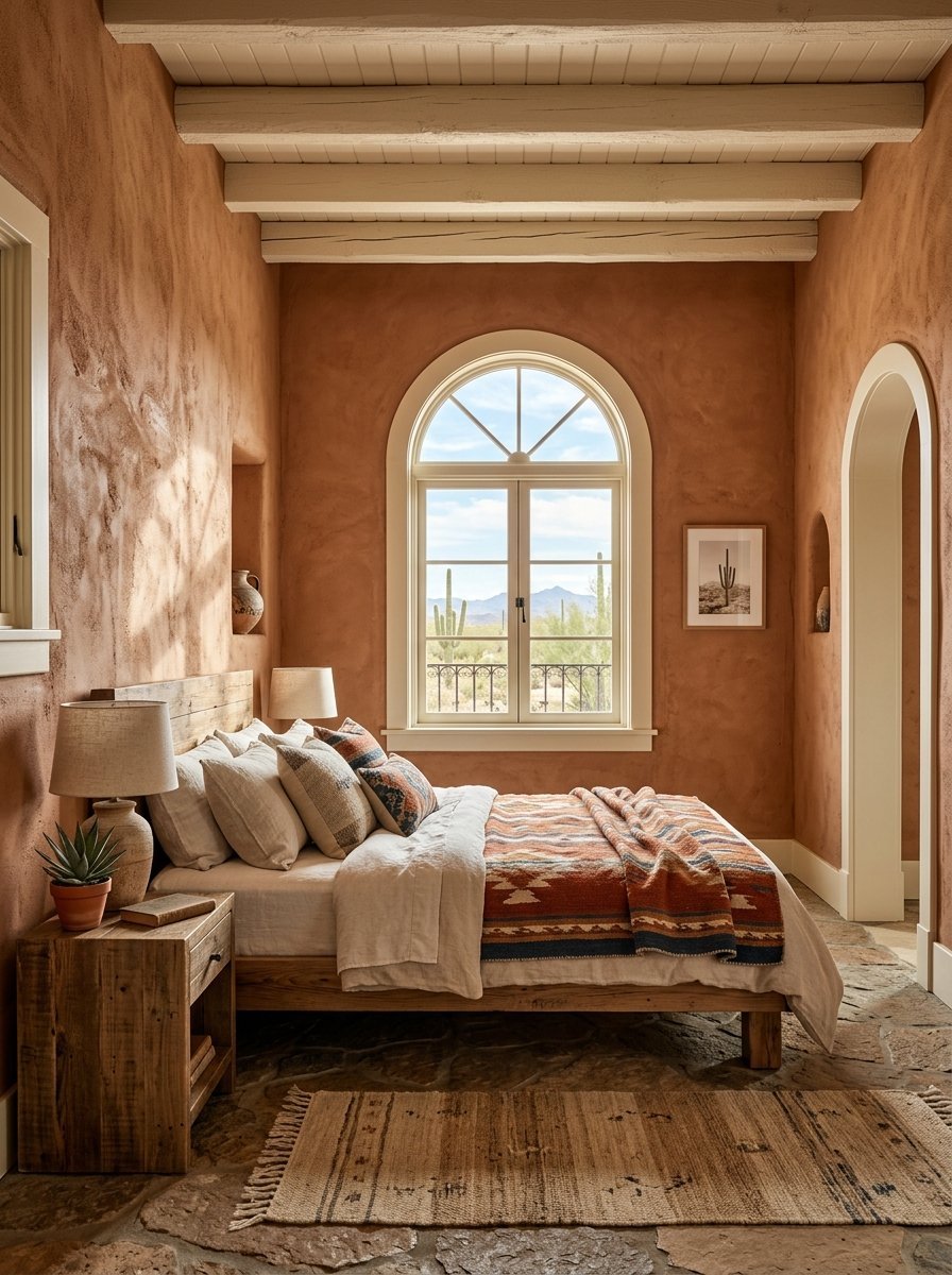
I spent three weeks in New Mexico last year. The adobe buildings inspired my next renovation entirely. Warm clay feels ancient and deeply calming.
- Portola Paints Roman Clay in the shade Sundance.
- Benjamin Moore White Dove works for the trim.
- The Roman clay finish requires a trowel application.
The texture of clay paint changes everything. It catches shadows differently throughout the entire day. Off white prevents the room from feeling dirty. Brilliant white would clash violently with the clay. This aesthetic room colour ideas bedroom setup requires patience. The trowel application takes practice. The final look justifies the extra labor entirely.
14. Teal and Copper
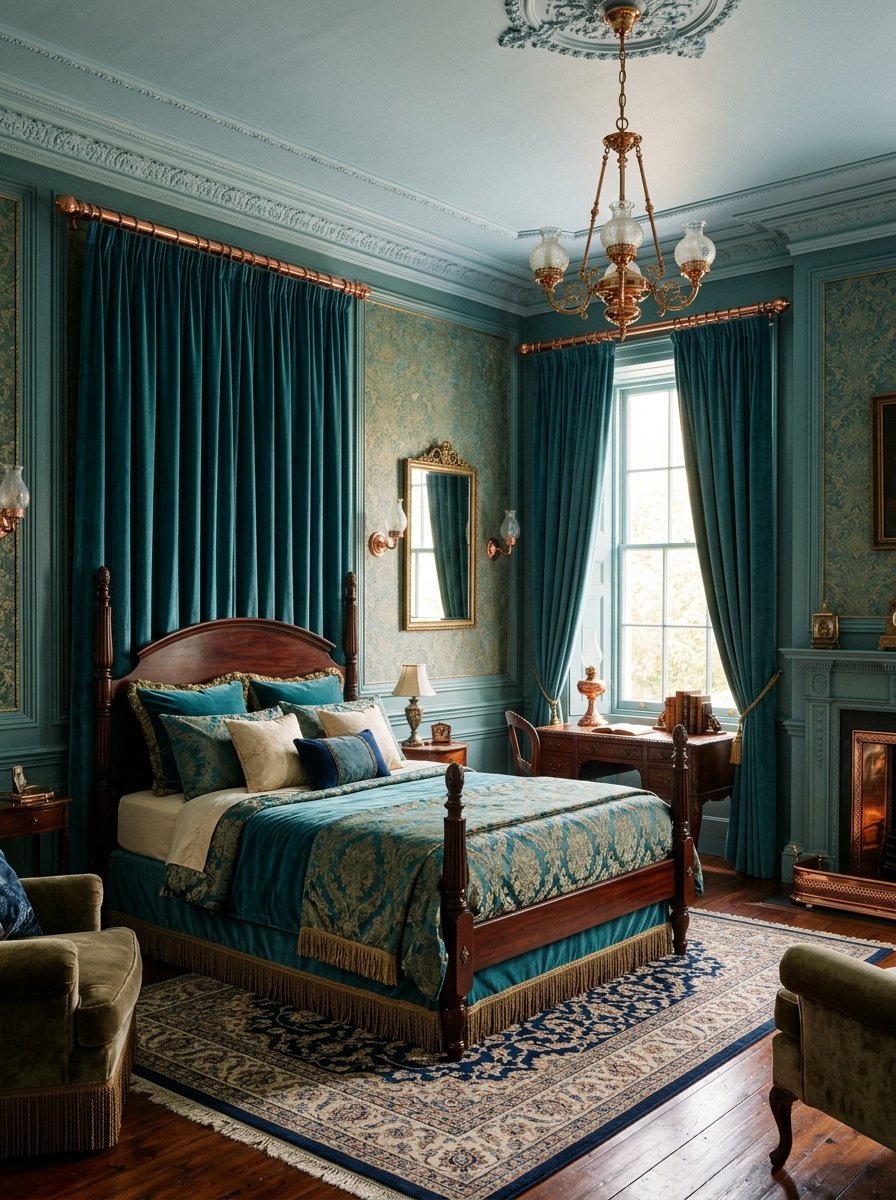
I renovated an older Victorian home recently. The client wanted bold colors that fit the era. Teal and copper fit the history perfectly.
- Sherwin Williams Dark Night provides an oceanic teal.
- Use real copper fixtures and heavy curtain rods.
- Expect to pay more for genuine copper hardware.
Teal shifts color based on the time of day. It looks blue at noon and green at midnight. The copper hardware flashes brightly against the dark walls. I painted the ceiling a pale blue to lift the space. The teal envelops the room beautifully. It makes the space feel incredibly rich.
15. Sand and Soft Lilac
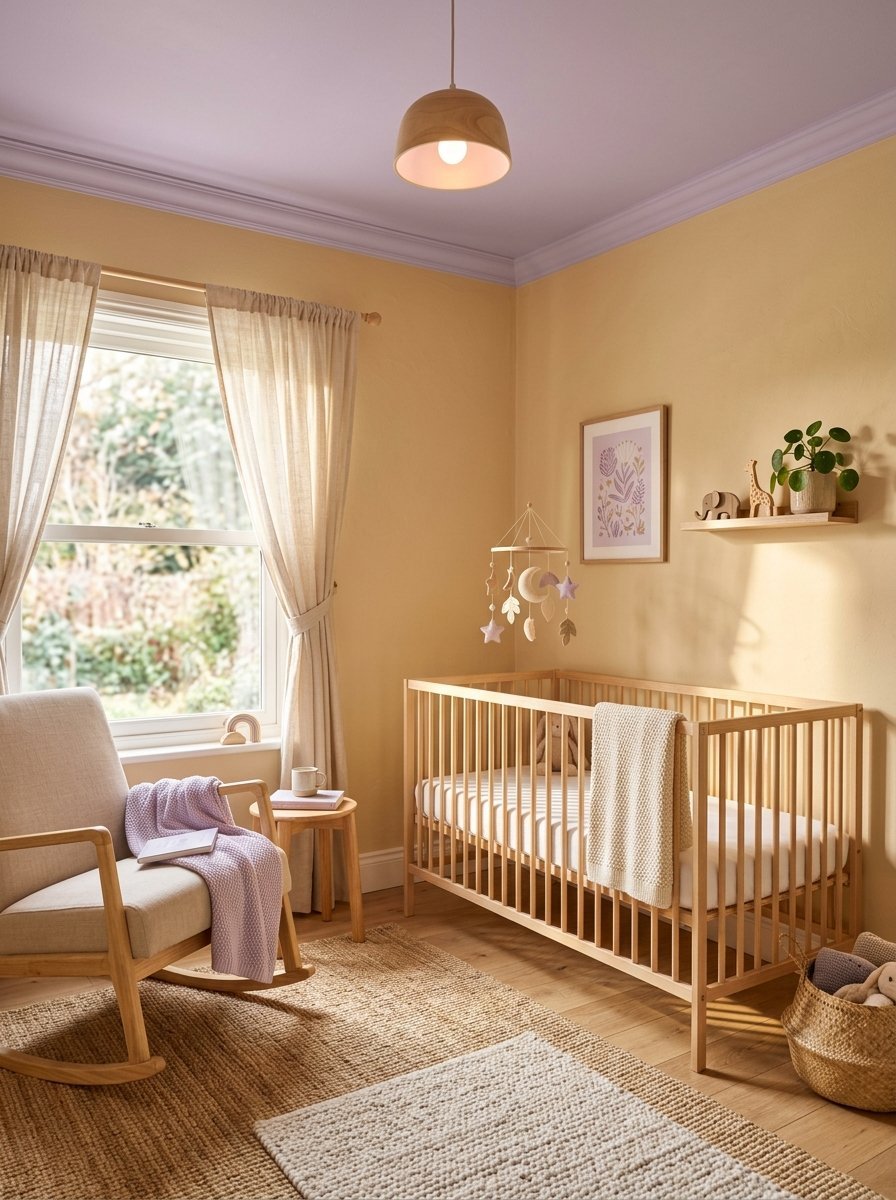
I designed a nursery two years ago. The parents hated standard pink or blue. Sand and lilac provided a gentle gender neutral calm.
- Glidden Warm Sand warms up the main walls.
- Benjamin Moore Hint of Violet sits on the ceiling.
- A $50 gallon covers the ceiling perfectly.
Putting the lilac on the ceiling draws the eye upward. The sand walls keep the room feeling sunny. It avoids the sickly sweet trap of most pastels. As the child grows the colors remain appropriate. You never have to repaint for at least a decade.
16. Rust and Indigo
I love heavy saturated colors. I mixed rust and indigo in my own home office that doubles as a guest space.
- Farrow & Ball Picture Gallery Red delivers a faded rust.
- Benjamin Moore Indigo Bunting contrasts fiercely.
- I used indigo on the wainscoting and rust above.
The contrast jolts the eyes in a highly pleasing way. It feels incredibly worldly and collected. The indigo grounds the bottom half of the room. The rust warms the top half flawlessly. I hung brass light fixtures to tie them together. It remains my most complimented paint job.
17. Olive Green and Blush Pink
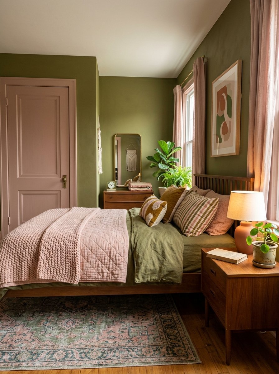
I noticed this pairing in a trendy coffee shop. I knew it belonged in a sleeping space. It feels retro but totally fresh.
- Sherwin Williams Oakmoss sits firmly in the olive family.
- Farrow & Ball Setting Plaster is the ultimate muddy blush.
- I recommend painting the doors pink and walls olive.
The pink acts as a neutral base here. It softens the severe military feel of the olive green. I used flat paint for both surfaces. Glossy finishes ruin this specific pairing. The flat paint absorbs light and feels like velvet.
18. Pale Yellow and French Blue
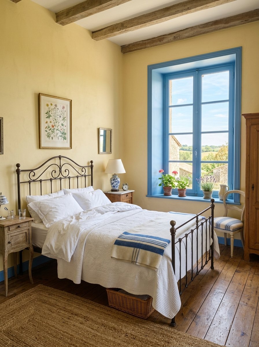
I wanted a French country feel for a rural cottage project. I avoided heavy plaids and focused just on the paint.
- Benjamin Moore Windham Cream looks like fresh butter.
- Farrow & Ball Parma Gray is actually a crisp French blue.
- Total paint budget stayed under $130.
The yellow makes the room feel sunny even during rainstorms. The blue cools it down perfectly. I painted the window sashes blue. The walls took the yellow paint. It feels like waking up in a European farmhouse. This remains a classic bedroom colour design forever.
19. Charcoal and Burnt Orange
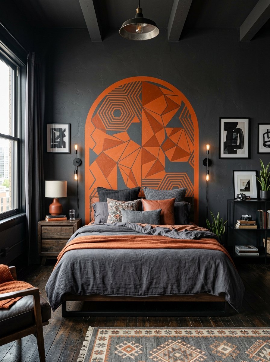
I needed a masculine color scheme for a bachelor pad. Gray on gray felt too boring. Burnt Orange saved the entire project.
- Benjamin Moore Peppercorn provides a deep charcoal.
- Sherwin Williams Cavern Clay gives the burnt orange hit.
- Use the orange strictly for the ceiling or one wall.
The charcoal makes the room feel like a tailored suit. The orange adds exactly one punch of heavy energy. I painted a geometric arch in orange behind the bed. It replaced the need for a headboard entirely. It saved the client $400 on bedroom furniture.
20. Taupe and Crisp White
Sometimes you need utter simplicity. I use taupe when a room has beautiful architectural details. It lets the room speak for itself.
- Sherwin Williams Poised Taupe perfectly bridges gray and brown.
- Benjamin Moore Chantilly Lace provides the crispest white.
- This requires meticulous taping for clean paint lines.
Taupe changes with the changing sunlight. It feels warm in the morning and cool at night. The crisp white trim highlights every baseboard and crown molding. I use this when the house has historic trim work. You never want bold paint hiding good carpentry.
21. Deep Plum and Silver
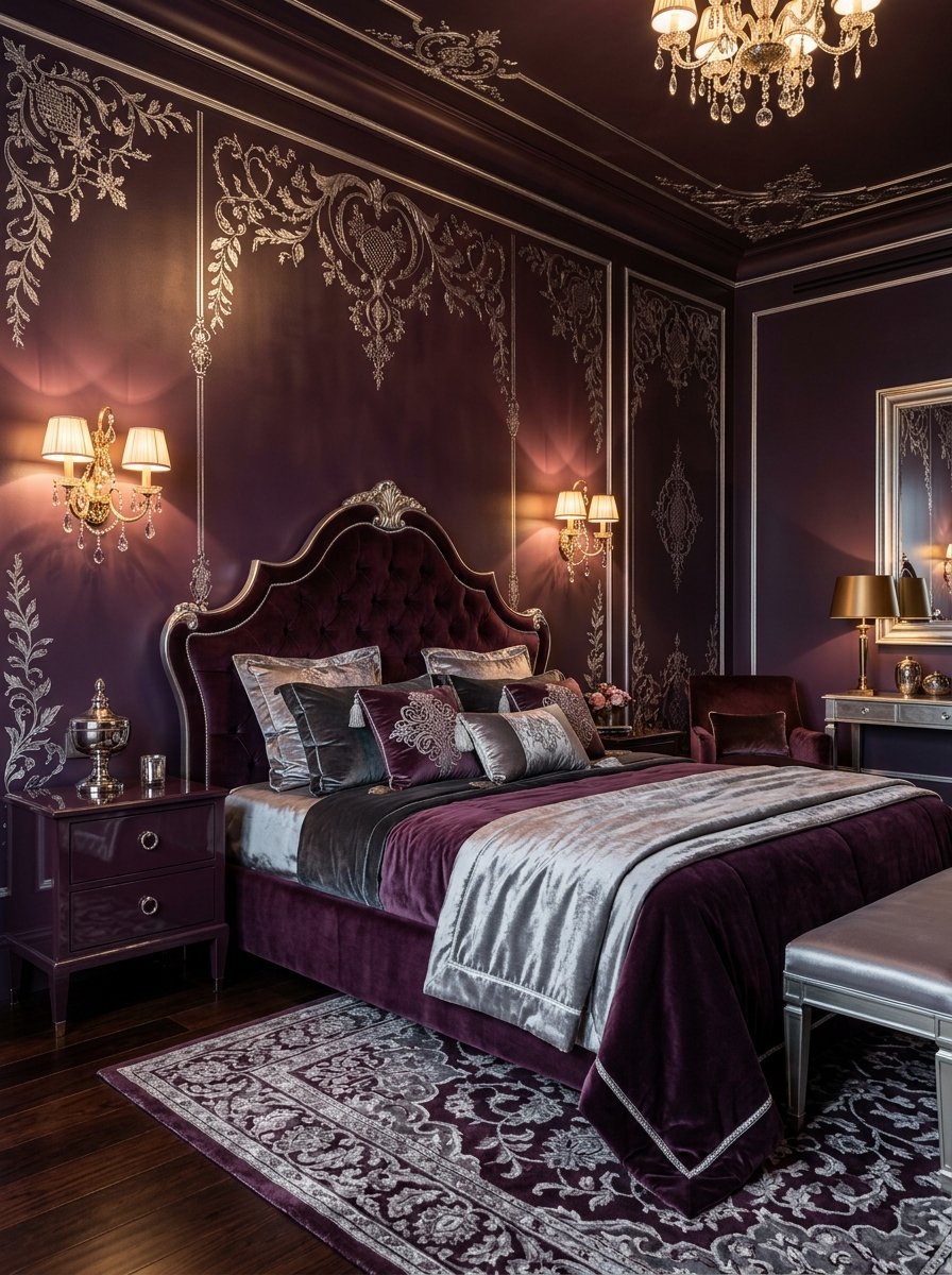
I experimented with deep plum in a small windowless bedroom. Instead of fighting the dark I leaned into it completely.
- Farrow & Ball Brinjal is the richest plum available.
- Silver leaf details or nickel hardware complete it.
- Dark paint shows roller marks easily so roll carefully.
The plum makes the room feel like a velvet jewelry box. The silver accents catch the artificial light beautifully. I used a semi gloss finish to bounce more light around. It feels glamorous and slightly moody. It completely masks the lack of natural windows.
22. Warm Gray and Seafoam
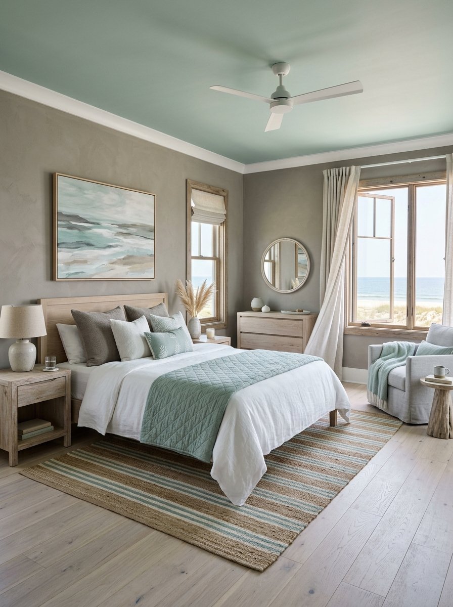
I designed a coastal property last spring. The owner banned navy blue completely. I used warm gray and seafoam green instead.
- Benjamin Moore Revere Pewter is the ultimate warm gray.
- Sherwin Williams Sea Salt provides a muted sandy green.
- This pairs beautifully with bleached oak wood floors.
The gray mimics beach driftwood perfectly. The seafoam mimics the shallow ocean water. It feels coastal without using loud nautical cliches. I painted the ceiling sea salt and the walls pewter. It draws the eyes upward immediately. It feels incredibly breezy and deeply calm.
Frequently Asked Questions About Room Paint Colour
What is the most relaxing color for a sleeping space?
I consistently see sage green produce the best sleep metrics. The human eye requires zero translation to process green. It mimics nature perfectly. I painted three different client rooms in Sherwin Williams Clary Sage last year. All three clients reported falling asleep faster. Soft muted greens lower your visual temperature. You want a color that absorbs light rather than reflecting it. Avoid pure whites or bright yellows. They stimulate the brain too much at night.
How do I choose a paint finish for my walls?
I always choose a flat or matte finish for sleeping spaces. Glossy finishes reflect lamps and ceiling lights fiercely. They create a glare that hurts your eyes when you lay in bed. Flat paint absorbs the light. It makes the walls look like soft velvet. It also hides bumps and drywall mistakes flawlessly. I reserve satin finishes strictly for baseboards and doors. The slight shine makes the trim easy to wipe clean.
Does dark paint make a small room look smaller?
Dark paint actually makes small rooms feel endless. I painted a tiny ten by ten room matte black. The corners of the room visually vanished. It felt like standing in the night sky. White paint in a small windowless room just looks like a cheap closet. Dark paint gives the space a deliberate mood. You must ensure you have good artificial lighting. I hang brass wall sconces to bounce warm light around the dark walls.
What ceiling color works best besides white?
I rarely paint ceilings flat white anymore. It ruins the room color design bedrooms need to feel cozy. I usually paint the ceiling a 50 percent lighter version of the wall color. If the walls are navy I use a pale baby blue above. Sometimes I paint the ceiling the exact same dark color as the walls. This erases the boundary between the wall and ceiling. The room feels incredibly tall. White ceilings draw a harsh line that stops the eye.
How much paint do I need for an average room?
You typically need two gallons of paint for an average twelve by twelve room. One gallon covers about 400 square feet. You always need two coats for a solid professional look. I always buy an extra quart for touch ups later. You will scratch the wall moving furniture. Having the exact batch of paint saves you massive headaches. If you paint the ceiling buy an additional gallon. Premium brands cost around $70 per gallon currently.
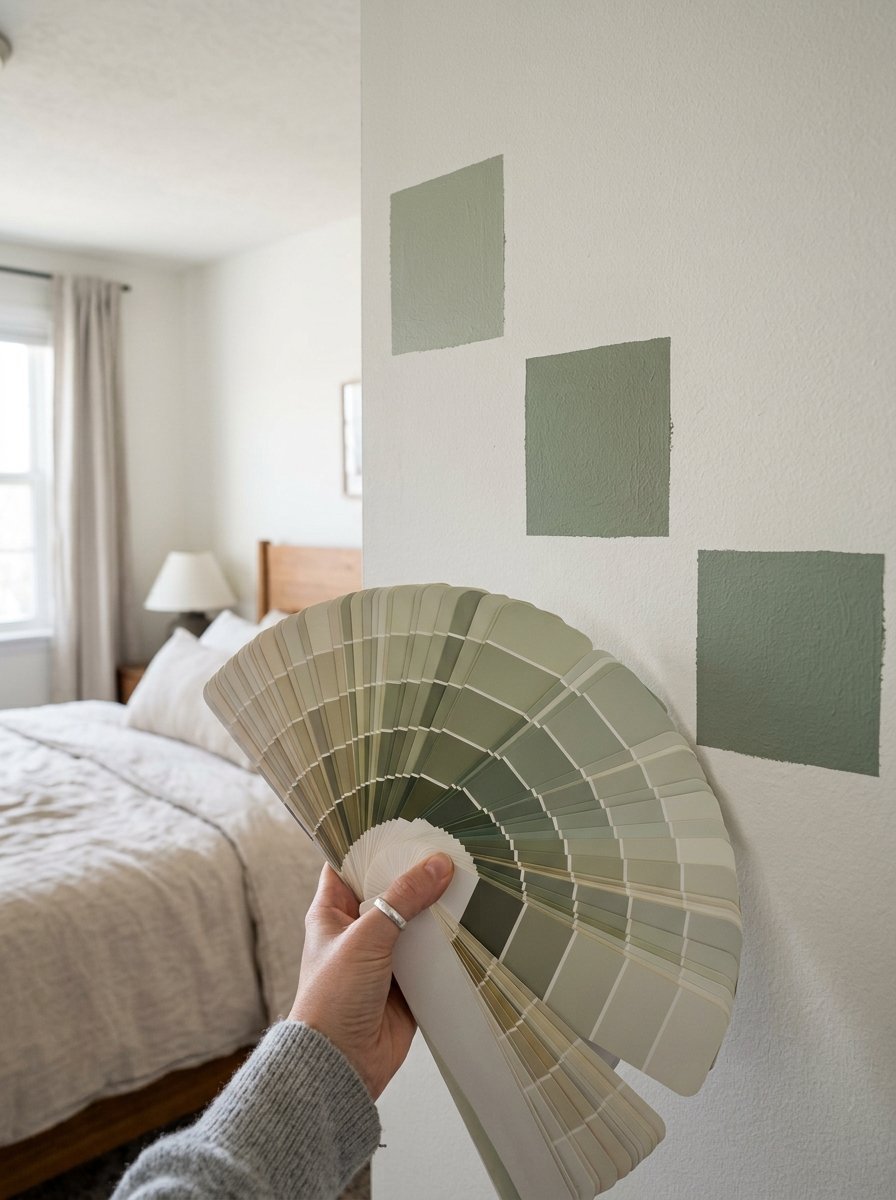
Why does my paint look different on the wall than the chip?
Store lighting uses harsh fluorescent bulbs. Your house uses warm incandescent bulbs or natural sunlight. The color shifts entirely based on your lighting. I always buy peel and stick paint samples. I place them on different walls. I leave them up for a full 24 hours. You must look at the color at noon and at midnight. A gray might look blue in the morning and purple at night. Never skip the testing phase.
What colors go well with dark wood furniture?
Dark wood demands colors that cool it down. I pair mahogany or dark walnut with pale slate blue or sage green. Warm colors like red or orange make dark wood look muddy and dated. Cool colors provide sharp visual contrast. The wood grain pops against a pale blue background. I used Farrow & Ball Light Blue behind a heavy antique dresser last month. The dresser instantly looked modern and expensive.
Should I paint my trim white or match the walls?
Matching your trim to your walls looks incredibly high end. Designers call this color drenching. It hides ugly cheap baseboards instantly. It also makes the ceiling feel taller. Your eye travels straight up the wall without hitting a white visual barrier. I did this in a historic home with battered trim. The paint hid the damage perfectly. If you have gorgeous expensive woodwork you can paint it a contrasting color to show it off.
How do I pick a color for a north facing room?
North facing rooms receive cold bluish light all day. Gray or blue paint makes these rooms feel like a refrigerator. You must fight the cold light with warm paint. I use terracotta, mustard yellow, or warm clay. These colors fake the sunlight. I painted a freezing north room in Farrow & Ball Red Earth. The room suddenly felt like it had a fireplace. Always check your compass direction before buying paint.
What is the 60 30 10 color rule?
This rule guarantees your room looks balanced visually. Sixty percent of the room uses your main color. This means your walls and large rugs. Thirty percent uses your secondary color. Think of your curtains, chairs, and bedding. Ten percent goes to your accent color. This covers throw pillows, artwork, and table lamps. I used this rule in a chaotic guest room. I applied blue for sixty, tan for thirty, and copper for ten. It fixed the chaos instantly.
Can I use wallpaper and dark paint together?
Wallpaper pairs beautifully with dark paint. I usually put wallpaper on the wall behind the bed. I paint the remaining three walls a dark color pulled straight from the wallpaper pattern. I matched Benjamin Moore Hale Navy to a dark floral wallpaper last spring. The dark walls made the wallpaper pattern look incredibly vibrant. You just need to ensure the wallpaper has at least one dark element to tie them together.
How long should I wait between coats of paint?
You must wait at least four hours between coats. The paint might feel dry to the touch in one hour. It is not dry underneath. If you roll the second coat too soon you will pull the first coat right off the drywall. It creates a horrific peeling mess. I use a fan to keep the air moving in the room. I paint the first coat at 8 AM. I wait until 1 PM for the second coat.
Final Thoughts On Bedroom Colour Design
You have twenty two exact formulas ready for testing. I ruined plenty of walls testing these formulas. You get to skip the trial and error completely. Paint remains the cheapest way to change your daily reality. Two gallons of premium paint cost less than a decent rug. Grab three samples this weekend. Paint a large square on your wall. Watch how the shadows hit it at night. Trust your immediate physical reaction to the color. If your shoulders drop and you breathe easier you found the right pair. I want to hear which combination you choose. Drop your before and after details in the comments below.

Amelia Hart is the Senior Design Editor at Vellora Interiors, where she curates small-space and apartment content. With a background in color theory and years spent designing under-500-square-foot rentals, she’s the editor who’ll tell you exactly which paint sheen, curtain length, and lamp height to choose, no guessing. A former design lead at a boutique studio, her work has been featured in several home and lifestyle publications. Her guiding belief: “Good design isn’t about more, it’s about choosing better.”