Last Tuesday I stood in a client bathroom measuring exactly forty square feet. White walls made it look like a sterile hospital box. We changed everything over three days. We painted the ceiling gloss black. We installed a vintage brass mirror. The space completely shifted. Most people play it safe with tiny rooms. White paint does not magically make space. Bold choices actually blur room boundaries. You need specific textures. You need contrasting colors. You need hardware with character. In my experience playing safe guarantees a boring room.
You will read exactly how to style tight spaces. I will share cost breakdowns from real projects. I will explain why standard vanity units fail in tiny rooms. We will look at dark color palettes. We will cover hardware selection. I spent three years testing these specific combinations. I documented every failure. You get the exact combinations that work right now. Here is what you will see:
- Exact cost breakdowns from recent plumbing projects
- Specific paint finishes that bounce light perfectly
- Hardware choices that age beautifully over time
- Visual tricks that make ceilings feel taller
- Storage ideas that hide ugly daily items
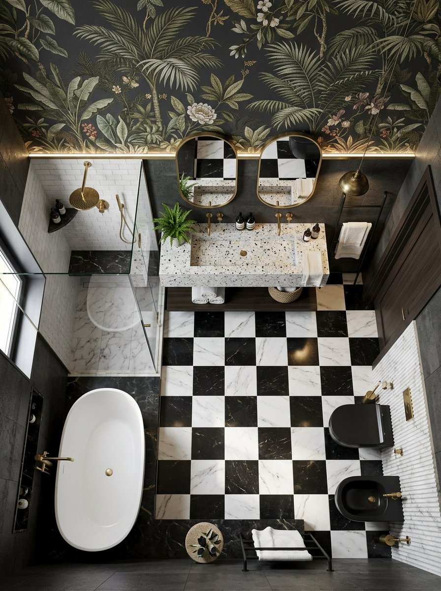
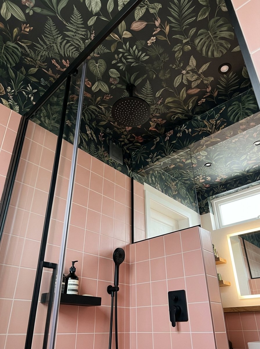
1. Ceiling Wallpaper Installation

Most standard bathroom design styles ignore the ceiling completely. I painted fifty ceilings white before catching my mistake. White ceilings in tight spaces lower the visual height. Paste a dark botanical wallpaper on the fifth wall instead. The pattern forces eyes upward immediately. You trick the brain into ignoring the tight floor plan. I sourced a specific House of Hackney floral print last month. We pasted it directly above a pink tiled shower. The room felt twice as tall instantly. Expect to pay around 150 dollars for two high quality rolls. Hire a professional paper hanger. Steam destroys cheap adhesive within six months. I source pure vinyl paper now. The thick material withstands hot steam perfectly.
2. Unlacquered Brass Hardware
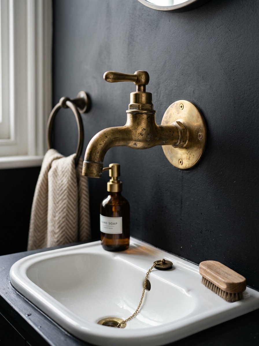
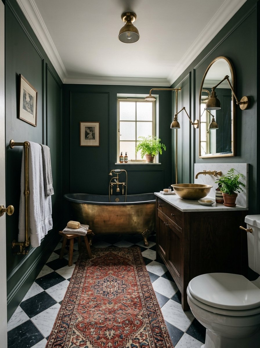
Chrome fixtures look cold in modern small bathrooms. I swapped standard silver taps for raw unlacquered brass. The metal ages every single day. Water spots actually make the finish look better over time. You stop wiping down fixtures obsessively. The patina creates a lived in warmth. Look for solid cast brass pieces. Hollow metal feels cheap and breaks fast. I installed a raw brass faucet from Kingston Brass in a tiny half bath. The entire sink area felt instantly expensive. Mixing this raw metal with matte black walls works perfectly. Keep the standard shiny finishes out of your playful space. I tell every client to let the metal age naturally. The dark spots prove the metal is real.
3. Floor to Ceiling Emerald Tile
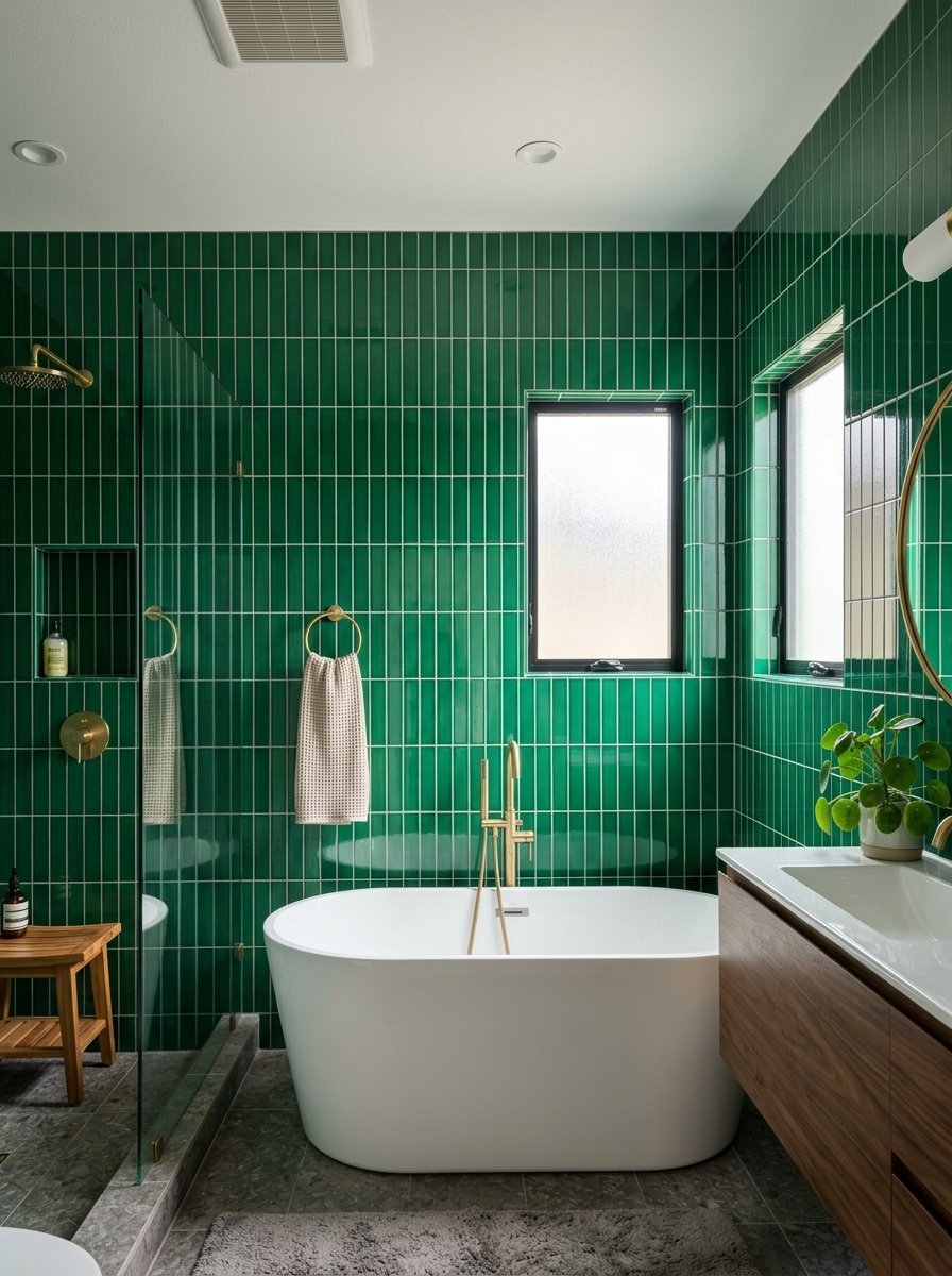
Stop stopping your tile halfway up the wall. I tile straight to the ceiling line now. Emerald green ceramic squares completely change the room depth. Dark green absorbs light differently than flat paint. The glaze reflects the vanity light across the room. We wrapped a tiny five by five room in vertical green Cle Tile rectangles. The seams matched perfectly in the corners. It cost 800 dollars in materials. The finished space rivaled any modern luxury bathroom I have seen. The continuous lines pull your vision upward. Grout color matters strictly here. Match the grout exactly to the tile glaze. White grout lines look messy and busy. I strictly use dark epoxy grout for green tile jobs.
4. Vintage Rugs Over Bath Mats
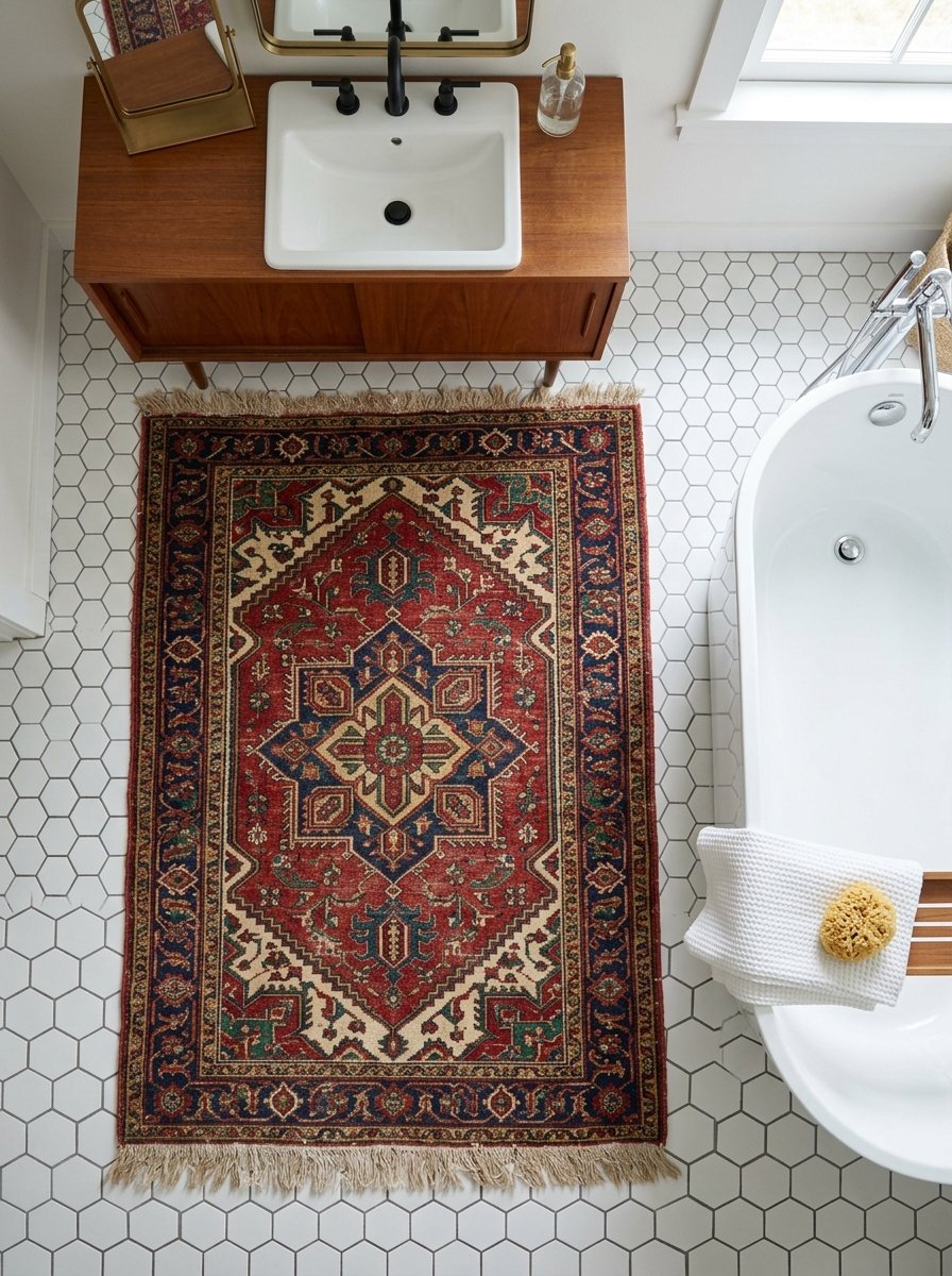
Cotton bath mats ruin the vibe immediately. I buy worn Persian rugs for every plumbing project. The thick wool naturally repels water drops. The tight weave handles heavy foot traffic effortlessly. You find exact two by three foot sizes on online auction sites. Look for deep reds and navy blues. These colors hide dirt completely. I placed an eighty year old Turkish rug over a modern hex tile floor. The friction between old fabric and new stone works beautifully. You shake it out outside once a week. Wool dries surprisingly fast. You get incredible texture for less than 100 dollars. I never buy terry cloth mats anymore. The vintage wool lasts for decades.
5. Wall Mounted Terrazzo Sinks
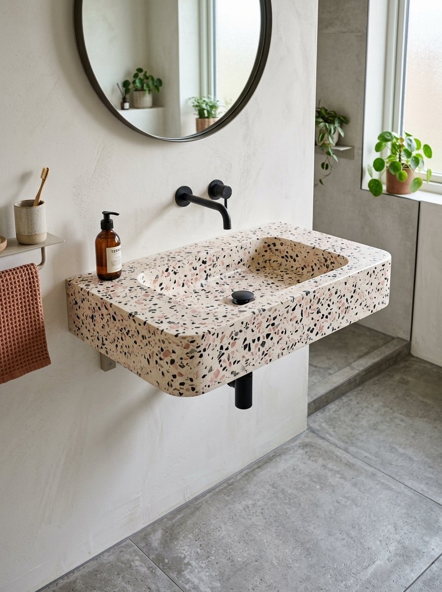
Floor vanities consume too much visual space. I remove them entirely in tight quarters. A floating terrazzo sink exposes the floor tile underneath. You see the room boundaries clearly. The eye registers more floor space. Terrazzo provides built in pattern without overwhelming the walls. I sourced a pink and black stone basin for a tiny ensuite. We mounted it directly to the studs. The floating sink easily holds soap and two hand towels. You lose the under sink cabinet. You get a room that actually feels breathable. Store your extra rolls in a basket outside the door. I prefer the open floor plan over tiny hidden drawers.
6. Neon Sign Ambient Lighting
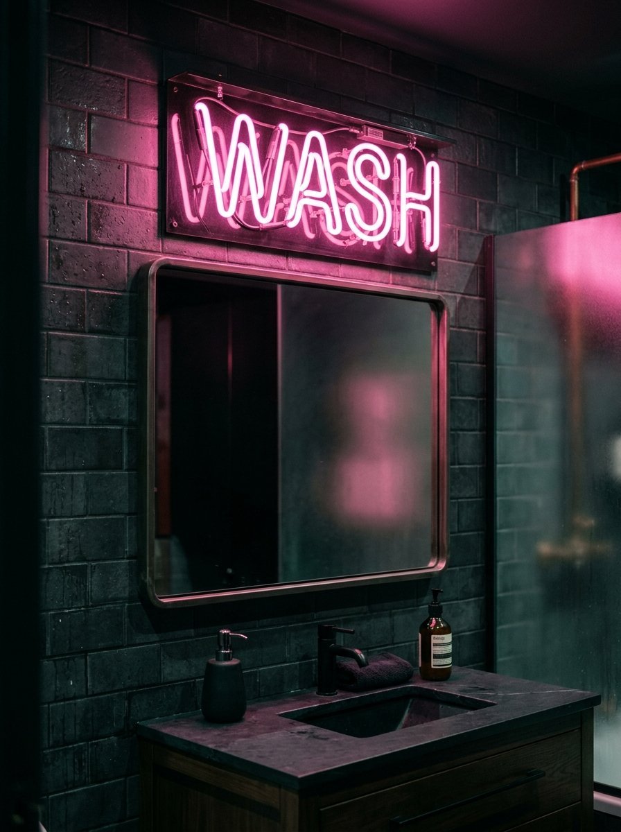
Overhead lights create harsh shadows. I mount small neon text signs above mirrors. A warm pink or amber glow flatters every face. You skip the clinical hospital lighting completely. We wired a custom Wash sign directly into the wall switch. It turns on instead of the main ceiling fixture. The room glows softly at night. The neon tube reflects against glazed wall tiles. This specific bathroom idea works perfectly for evening guests. Buy glass neon over cheap LED strips. Glass tubes look authentic when turned off. LED strips look like plastic string during the day. I hang these high above the wet zones strictly for safety. The ambient glow sets an incredible mood.
7. Contrast Color Grout Lines
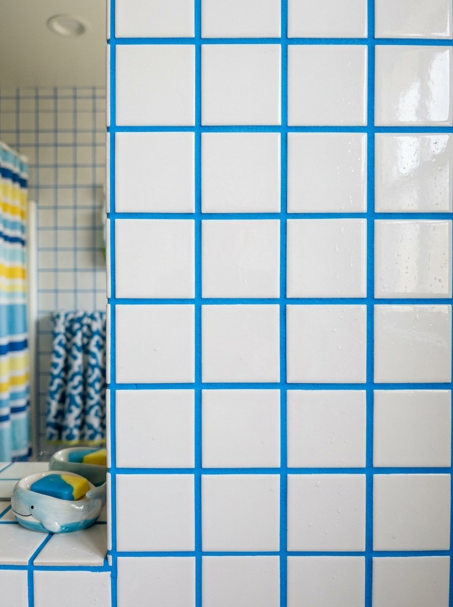
White subway tile gets boring fast. I use electric blue or mustard yellow grout instead. You completely alter cheap white tiles for 30 dollars. The grid pattern becomes the actual focal point. We used bright orange grout between basic square white tiles. The space instantly felt playful and energetic. You must seal the colored grout twice. Dark soap scum ruins the bright pigment quickly. Apply a heavy liquid sealer with a foam brush. The colored grid draws the eye across the entire wall. You trick the viewer into tracking the lines rather than noticing the tight dimensions. I love watching guests react to bright pink grout lines.
8. Frameless Glass Shower Enclosures

Shower curtains cut small rooms exactly in half. I tear down rods and install clear glass panes. The sightline extends all the way to the back wall. Walk in shower ideas fail when you block the view. We secured a single sheet of half inch tempered glass last week. We skipped the door entirely. The open entry makes the space feel like a wet room. You must pitch the floor correctly toward the drain. Water escapes if the slope is wrong. The clear glass reflects natural light from the window. The room feels double its actual size. I wipe the glass down daily with a simple squeegee.
9. Monochromatic Pink Palettes
Painting a room one single color deletes visual boundaries. I match the ceiling paint exactly to the wall tile. We executed a full blush pink room last month using Farrow & Ball paint. The baseboards, walls, ceiling, and door matched perfectly. The corners of the room visually disappear. You cannot tell where the wall ends and the ceiling begins. This works incredibly well in windowless spaces. The monochromatic look feels intentionally designed. Standard white ceilings chop the room visually. The solid pink wrap feels like a warm hug. Keep the plumbing fixtures matte black for sharp contrast. I specify flat paint for the ceiling and eggshell for the walls.
10. Abstract Shaped Mirrors
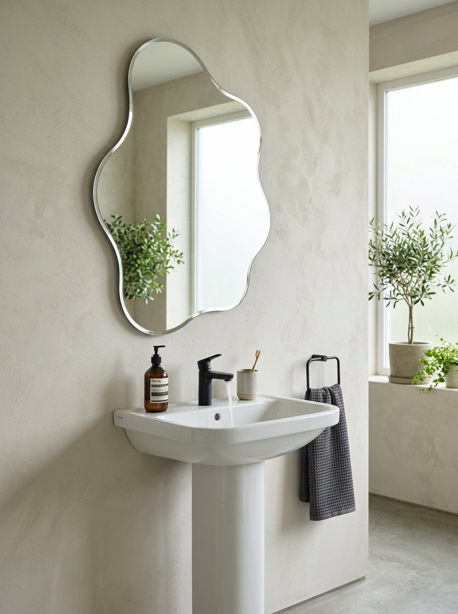
Square mirrors look predictable and rigid. I source asymmetrical blob shaped glass instead. Organic shapes break up the hard lines of tile and cabinetry. We hung a wavy frameless mirror above a square pedestal sink. The contrast felt immediate and fresh. Custom glass shops cut these shapes for around 150 dollars. You provide a cardboard template. They cut the exact squiggles. The weird shape becomes functional art. Standard rectangles belong in builder grade homes. The wavy edges reflect light in unexpected directions. This small swap completely rewrites the vanity space personality. I mount them slightly off center on purpose.
11. High Gloss Paint Finishes
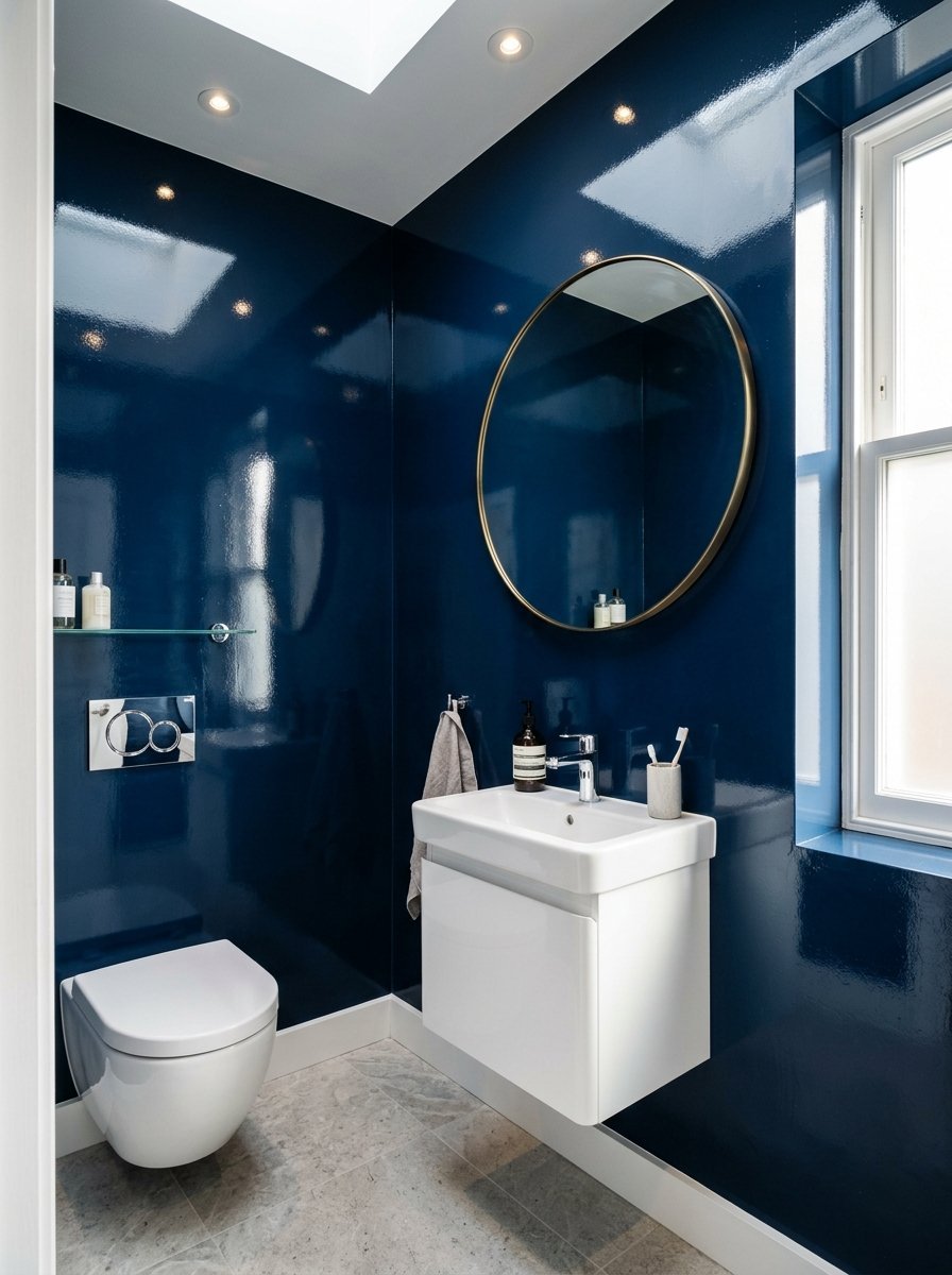
Matte paint belongs in bedrooms. I cover tight washroom walls in high gloss lacquer. The shiny surface acts like a subtle mirror. Light bounces off the walls constantly. Dark colors work best with high gloss. We painted a tiny room high gloss navy blue using Benjamin Moore enamel. The reflections made the dark paint feel alive. You must skim coat the walls perfectly first. Gloss paint highlights every single wall dent. We spent two days sanding drywall before painting. The mirror like finish creates incredible depth. Standard eggshell paint feels dead in comparison. I roll it on slowly to avoid air bubbles.
12. Checkerboard Floor Patterns
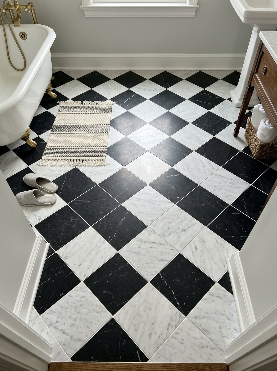
I love placing large black and white marble squares diagonally. A diagonal grid stretches the floor plan visually. Standard parallel grids look boxy. We cut twelve inch marble tiles last spring. We laid them at a 45 degree angle. The longest line of the pattern now runs corner to corner. Your eyes follow the longest path. You perceive the room as longer. This classic pattern feels incredibly fresh right now. Use honed marble instead of polished stone. Polished marble becomes an ice rink when wet. The matte finish provides grip and hides dust better.
13. Sconce Placement on Mirrors
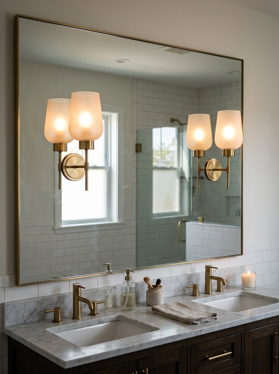
Do not place vanity lights above the mirror. Overhead lighting casts dark shadows under your eyes. I mount brass sconces directly onto the mirror face. The light hits your face straight on. We drilled through a custom glass sheet last week. We mounted two Rohl globes at eye level. The mirror doubles the light output instantly. The floating globes look incredibly high end. You need a professional glazier to drill the holes. Glass cracks instantly if you use the wrong bit. The final layout mimics luxury hotel suites perfectly. I strictly use warm 2700K LED bulbs in these fixtures.
14. Quirky Cabinet Hardware

Standard bar pulls lack personality. I buy vintage animal shapes or colorful glass knobs. You change the entire vanity mood for 40 dollars. We installed heavy brass tiger heads from Rejuvenation on a green cabinet. The heavy metal feels great in your hand. The unexpected shape makes guests smile. You can easily switch these out in ten minutes. Look for hardware with standard hole spacing. We source heavy glass spheres from old mansions. The chunky glass catches morning light beautifully. Treat hardware like jewelry for your cabinets. Avoid cheap hollow plastic pulls completely.
15. Ceiling Track Shower Curtains
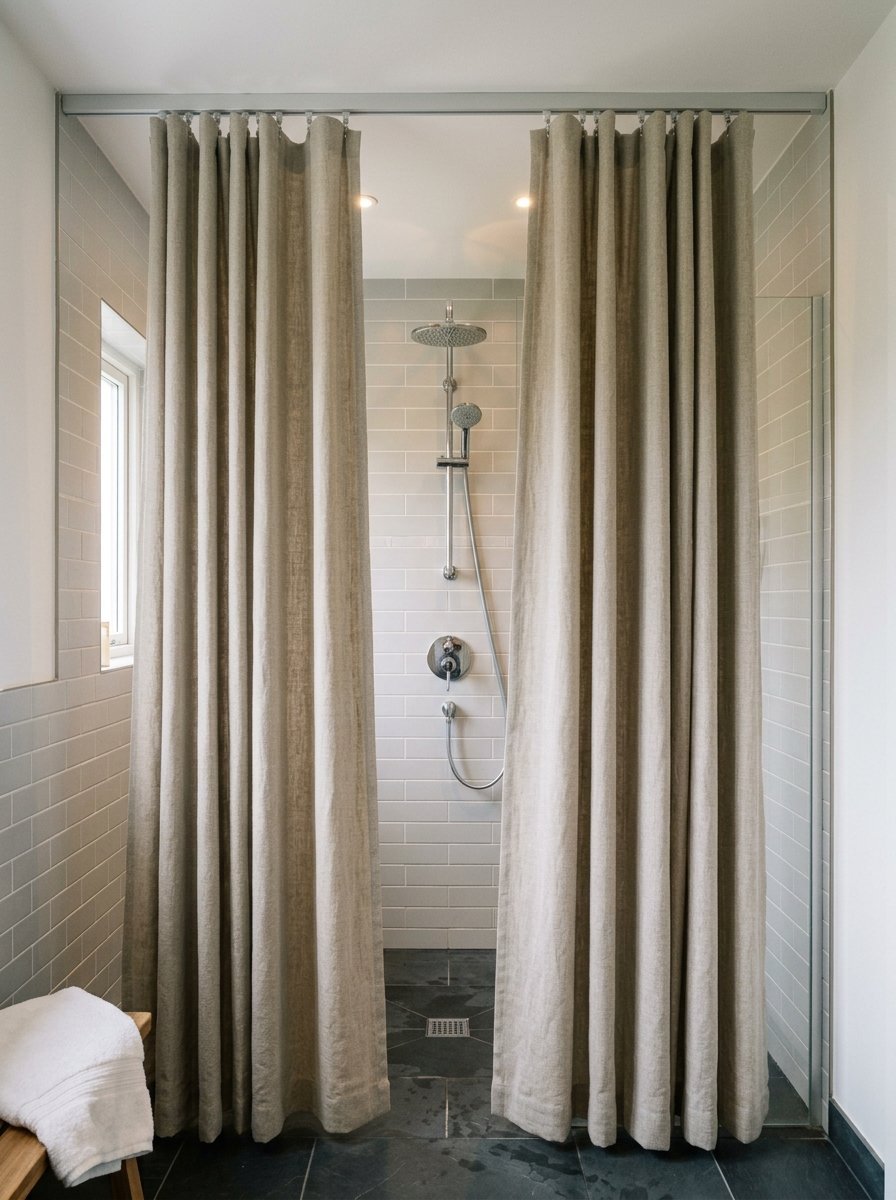
When I must use a curtain, I hang it perfectly. Standard rods sit too low. I mount hospital track rails directly to the ceiling. We hang custom 96 inch linen panels. The fabric drops perfectly from the ceiling to the floor. The vertical fabric lines draw your eyes up. Standard curtains cut the room horizontally. I use heavy canvas with a waterproof liner behind it. The thick fabric looks like custom drapery. You instantly elevate standard washroom design with this simple trick. The ceiling track glides smoothly without catching. It costs less than 50 dollars to install.
16. Dark Wood Wall Paneling
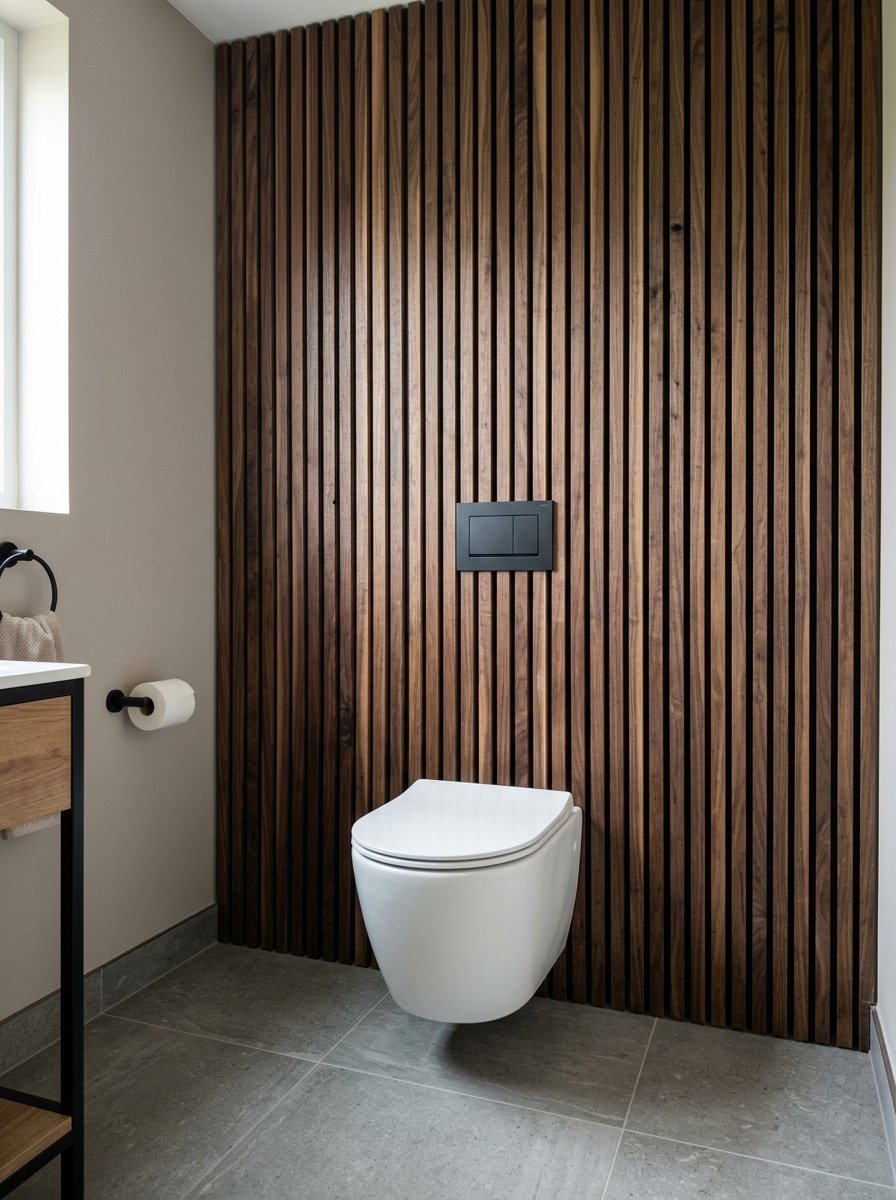
Shiplap looks dated quickly. I install thin vertical walnut slats instead. The dark wood injects incredible warmth against cold porcelain. We clad a single wall behind a white toilet in raw walnut. The vertical lines stretch the wall height. Wood naturally softens the echo in tight tiled rooms. You must seal the wood with marine varnish. Humidity destroys raw wood within weeks. The rich brown tones pair perfectly with matte brass fixtures. The texture mimics expensive saunas. You get an organic feel impossible to get with tile. I wipe the wood down with mineral oil twice a year.
17. Statement Ceiling Medallions

Plaster ceiling details belong in tiny spaces. I glue large ornate medallions around basic light fixtures. The complex plaster texture contrasts with smooth modern tile. We placed a 24 inch Victorian medallion in a tiny half bath. We painted it the exact same color as the ceiling. The monochromatic texture looks incredibly expensive. You draw the eye up immediately. Polyurethane medallions cost 30 dollars and weigh nothing. You install them with basic construction adhesive. It takes ten minutes. The historical detail makes modern spaces feel grounded. Do not leave them white against a dark ceiling.
18. Micro Mosaic Floor Graphics
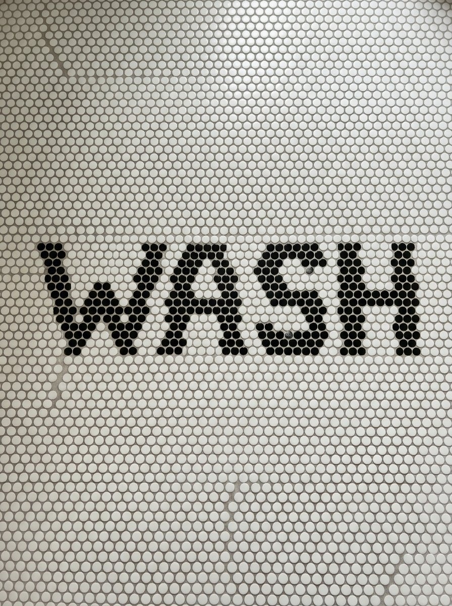
Sheet vinyl looks cheap. I prefer laying custom words in penny tile. You can spell out greetings or funny phrases. We laid the word WASH in black pennies across a white floor. The custom text surprises every guest. You buy standard tile sheets and pluck out specific circles. You drop in the contrasting color. This mirrors high end public toilet design found in boutique restaurants. The tiny grout lines provide incredible slip resistance. Your wet feet grip the floor safely. Custom typography makes the space entirely yours. I map the letters on graph paper first.
19. Bold Pedestal Sink Colors
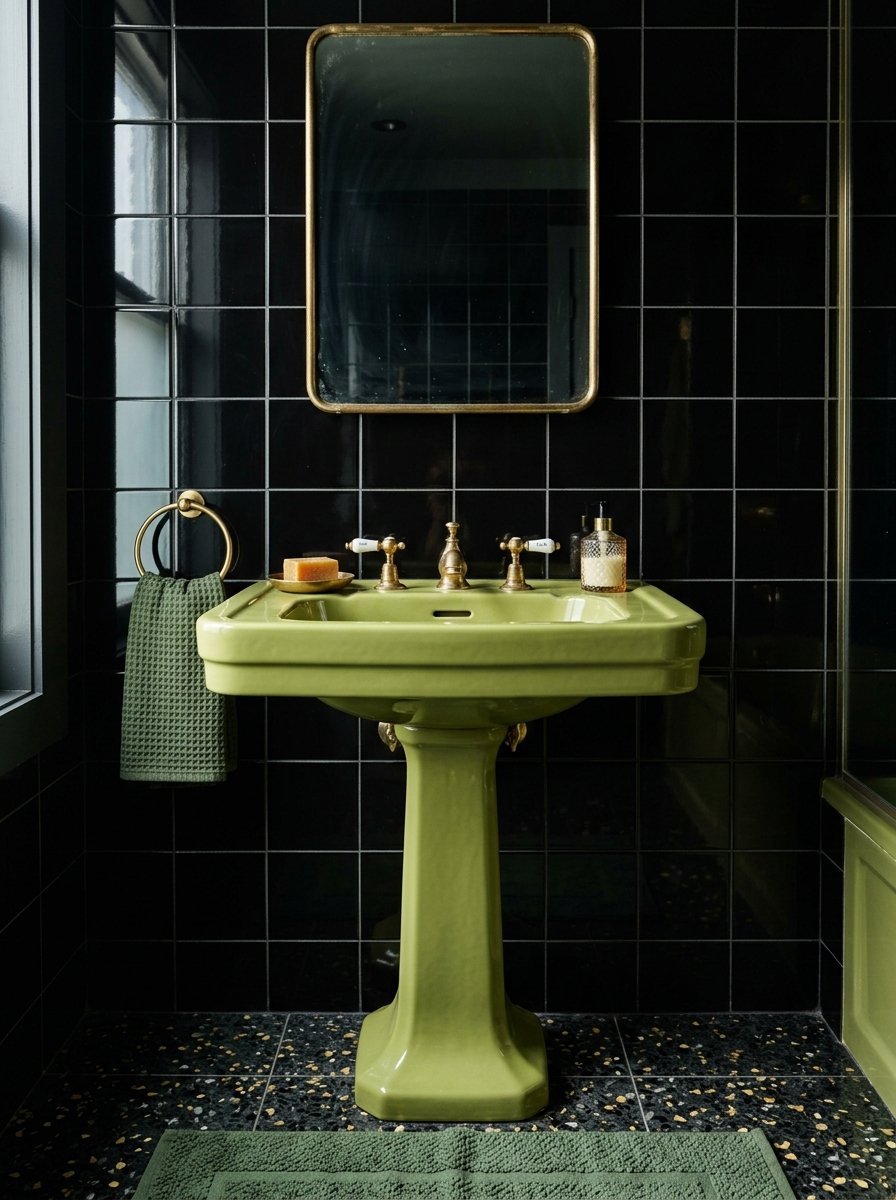
White porcelain sinks lack imagination. I install vintage pink or mint green pedestal sinks. A colorful fixture becomes the anchor piece. We found an avocado green Kohler sink from 1974. We installed it against a stark black wall. The green pops aggressively. You build the entire room around the colored basin. Look at salvage yards for pristine colored porcelain. Modern reproduction sinks cost over 1,000 dollars. Vintage models sit in warehouses for 100 dollars. Check the trap connections carefully before buying. Old plumbing sizes sometimes require modern adapters. The massive visual return easily justifies the hunting effort.
20. Skirted Vanity Sinks
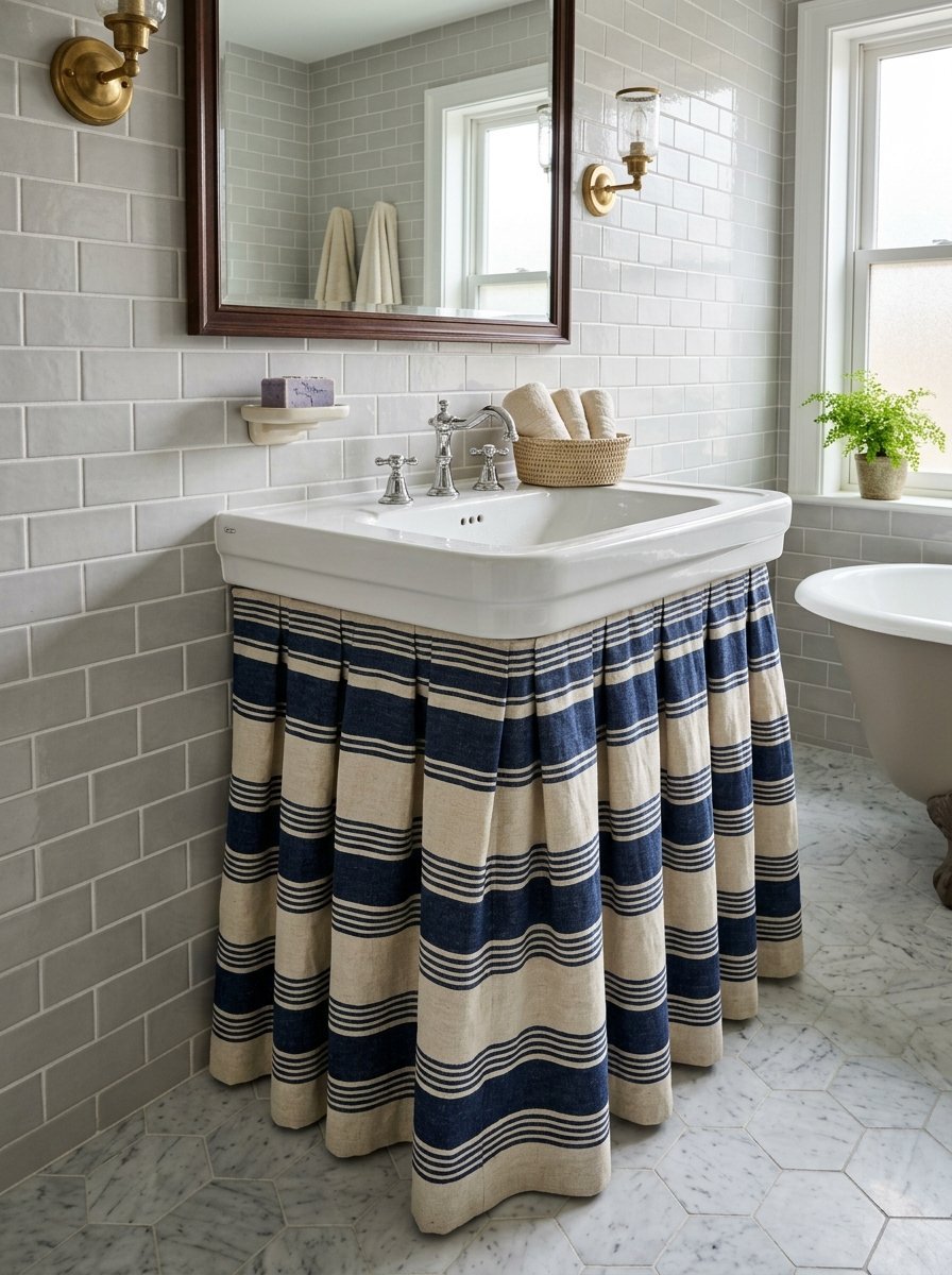
Cabinet doors feel bulky. I staple custom fabric skirts under wall mounted sinks. The pleated fabric hides plumbing completely. You easily access hidden storage by pulling the fabric aside. We used heavy striped Schumacher linen for a small cottage bath. The fabric introduces softness into a room full of hard surfaces. You simply attach a velcro strip directly to the sink edge. You can throw the skirt in the washing machine monthly. This hides ugly pipes perfectly. You spend 50 dollars on fabric instead of 500 dollars on a cabinet. I love the casual relaxed feel it gives.
21. Oversized Wall Art
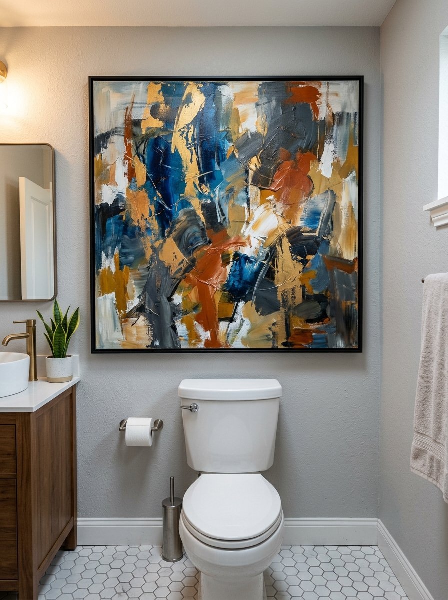
Tiny art looks cluttered in small rooms. I hang one massive painting instead. A large canvas filling an entire wall feels deliberate. We framed a 40 inch abstract canvas above a toilet. The sheer scale tricks you into thinking the wall is larger. You avoid a busy gallery wall entirely. Keep the frame thin and simple. Make sure the room has good ventilation. Moisture ruins unsealed canvas quickly. I prefer framing large waterproof botanical prints under glass. The massive focal point defines the space perfectly. I buy downloadable art and print it massively at local print shops.
22. Wall Mounted Toilet Units
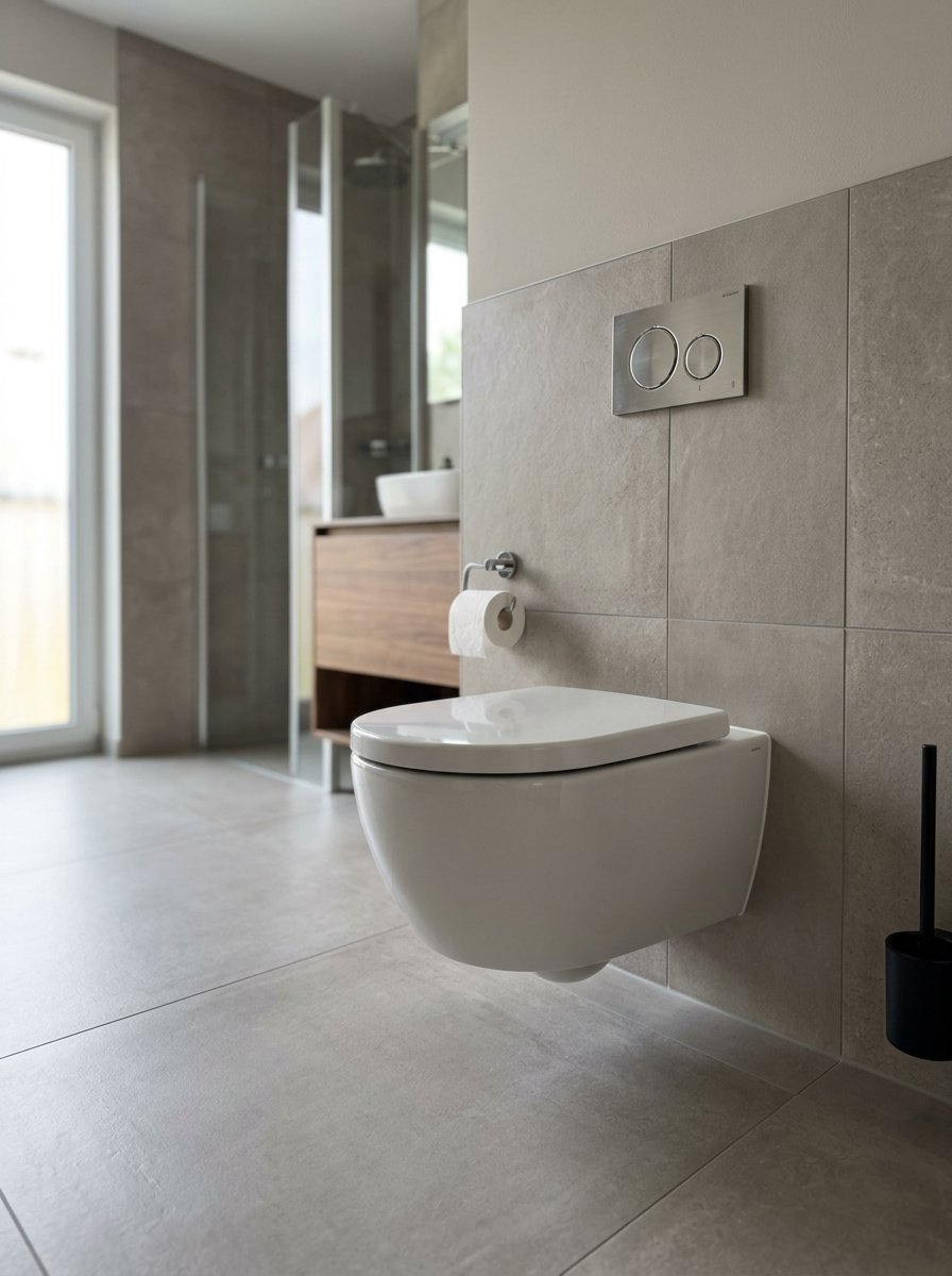
Floor toilets consume floor space physically and visually. I install Toto toilets that bolt directly to the wall. The water tank hides inside the drywall completely. You see unbroken floor tile underneath the bowl. We saved six inches of floor space in a narrow layout recently. Cleaning the floor takes ten seconds with a mop. You push right underneath the fixture. The flush buttons sit flush against the wall. The mechanics require a professional plumber. The visual return makes the plumbing cost entirely worth it. I install these in every single small bathroom project now.
23. Intense Botanical Prints
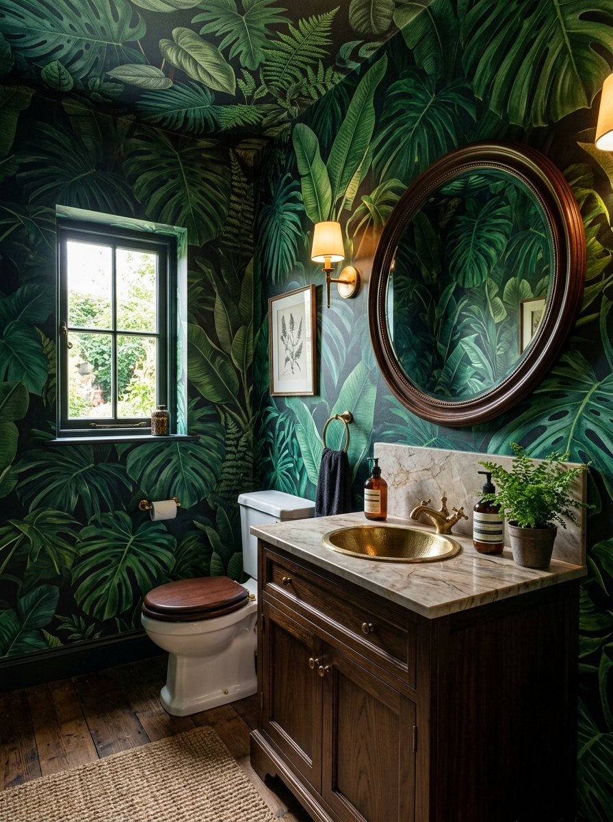
Small spaces handle chaotic patterns perfectly. I wrap entire rooms in oversized jungle print wallpaper. Giant leaves and monkeys hide the room corners completely. We covered a powder room in dark green palm leaf paper. You feel inside a jewelry box. The large scale pattern confuses the eye. You cannot judge the actual distance to the wall. Tiny floral prints look busy and cheap. Massive prints look confident and expensive. Buy vinyl wallpaper for water resistance. Paper backed products peel near sinks. I wipe the walls down with a damp cloth every month.
24. Hidden Medicine Cabinets
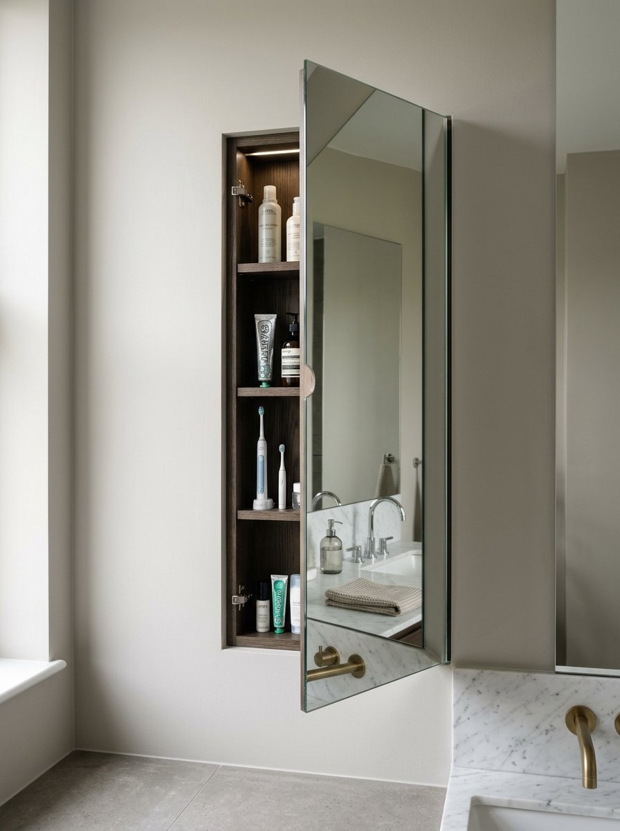
Bulky boxes on the wall scream clutter. I cut into the drywall between the wall studs. I recess the entire medicine cabinet into the wall. The mirror sits totally flush with the drywall. We recessed a tall rectangular mirror last month. You simply pull the glass edge to open it. The room keeps a perfectly flat profile. You get four shelves of storage without sacrificing an inch of air space. Check for electrical wires before cutting your drywall. A flush mirror looks sleek and incredibly custom. I line the inside shelves with dark velvet contact paper.
Frequently Asked Questions

How do you paint a small room dark without making it feel smaller?
You paint everything the exact same dark color. Paint the walls, the baseboards, the doors, and the ceiling black or navy. You erase the visual corners. The room feels endless instead of boxed in. Glossy finishes bounce light around the dark surfaces. I have seen this work perfectly in windowless spaces.
What lighting works best in tight spaces?
Mount sconces exactly at eye level. Use frosted glass shades. The soft light wraps around your face evenly. Avoid harsh overhead ceiling lights directly above the mirror. Always put your fixtures on dimmer switches. You control the mood instantly. Warm bulbs look much better than daylight bulbs.
Can you put wallpaper next to a shower?
Yes you can. You must use pure vinyl wallpaper. You must run an exhaust fan during every shower. You must seal the wallpaper seams with clear seam adhesive. Paper products peel. Vinyl holds up perfectly against humidity. I install heavy vinyl near water all the time.
Should floor tiles be large or small in tiny rooms?
Go massive or go microscopic. Large twenty four inch tiles mean fewer grout lines. Fewer lines mean less visual clutter. Penny tiles create a dense texture that works perfectly too. Avoid standard twelve inch squares. They look cheap and basic. I always choose the extremes for floor tile.
Final Thoughts
Stop playing it safe in small spaces. White paint and standard chrome fixtures never make a tiny room feel grand. You must commit to bold choices. Pick a dark color and paint the ceiling. Install raw brass hardware that actually ages. Hang a custom neon sign. Throw out the bulky floor vanity for a floating sink. These exact choices turn tight spaces into incredible experiences. Start with one bold change this weekend. Buy the vintage rug. Paint the high gloss ceiling. Your guests will notice immediately. I promise you will never want a boring white box again.

Amelia Hart is the Senior Design Editor at Vellora Interiors, where she curates small-space and apartment content. With a background in color theory and years spent designing under-500-square-foot rentals, she’s the editor who’ll tell you exactly which paint sheen, curtain length, and lamp height to choose, no guessing. A former design lead at a boutique studio, her work has been featured in several home and lifestyle publications. Her guiding belief: “Good design isn’t about more, it’s about choosing better.”