Your alarm rings. You open your eyes. The walls around you dictate your mood for the entire day. Bright red walls scream at you. Soft green walls whisper a gentle good morning. I have painted my own rooms dozens of times. I have painted client spaces hundreds of times. A bad paint job creates daily stress. The right paint creates an instant sanctuary. You want a space to rest. You want a room that feels like a long exhale. Let me show you exactly which paints create that feeling.
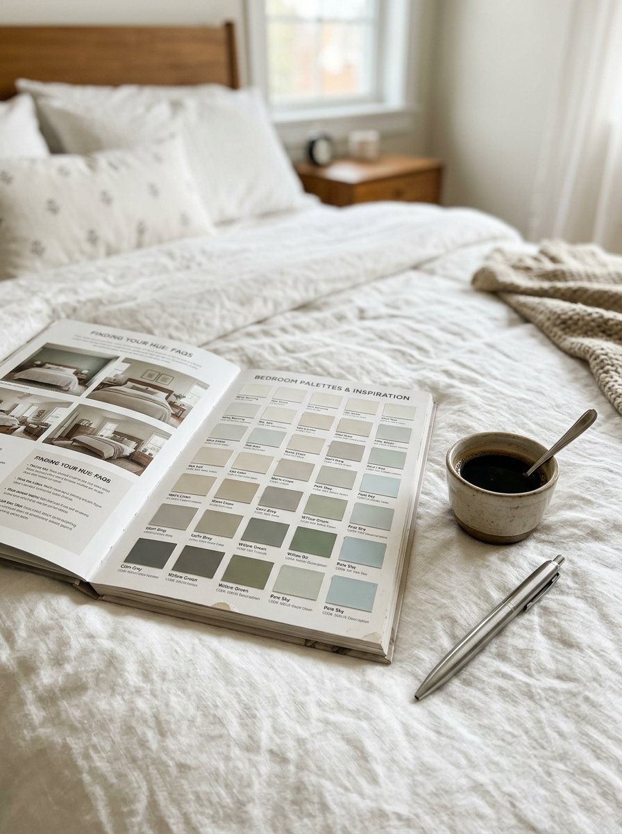
You will see twenty five specific paint choices below. These are not guesses. I have tested these exact paints in real homes. You can buy these at any local hardware store. A gallon costs about fifty dollars. You can paint a standard room in one weekend. We will look at soft greens, warm whites, and deep blues. We cover combinations for large master suites and tiny guest spaces. I will share my exact formulas for picking a room colour ideas bedroom palette. You will see what works for dark rooms. You will see what works for bright rooms. Pick one color from this list. Go buy a sample. Paint a small square on your wall today.
1. Soft Warm Gray
Warm gray wraps the room in a gentle blanket. Cold grays feel like a hospital. Warm grays feel like a rainy Sunday morning. I have noticed this shade works perfectly in rooms with large windows. The natural light warms the gray even more. I bought a gallon of Sherwin Williams for my guest room last October. Visitors always sleep late in that room. You need a room color combination that flows seamlessly.
- Pair this with pure white trim
- Use matte finish on the walls
- Keep the ceiling flat white
This acts as a perfect base for any furniture style. You can change your bedding anytime. The walls will always match.
2. Pale Sage Green
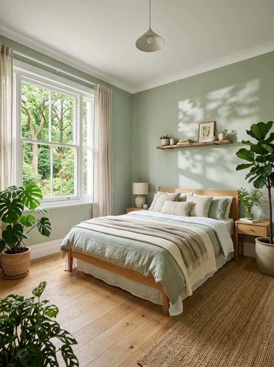
A sage green bedroom pulls nature indoors. I have seen this work wonders for anxious clients. Green lowers your heart rate naturally. It mimics the feeling of sitting in a quiet forest. I tried Benjamin Moore paint in my guest space three months ago. The feedback from visitors remains overwhelmingly positive.
- Use this for rooms with lots of plants
- Match it with light oak wood floors
- Paint the window trim a crisp white
This color changes beautifully throughout the day. It looks fresh in the morning light. It turns moody and quiet by nightfall. You get two completely different moods from one paint can.
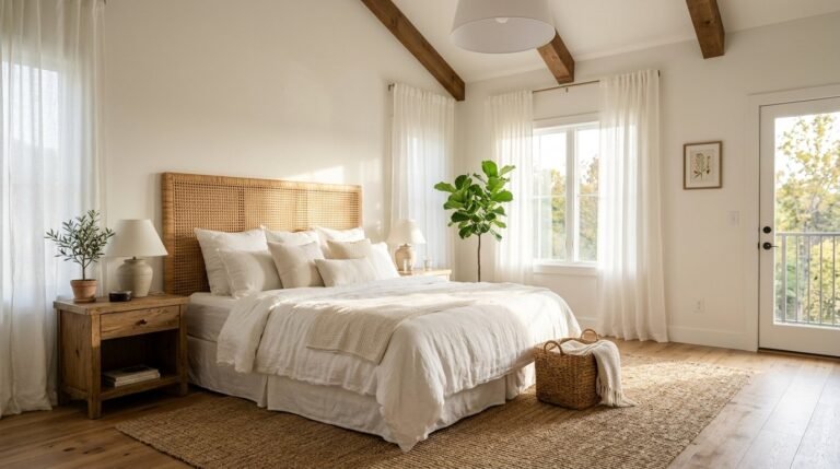
3. Creamy Off White
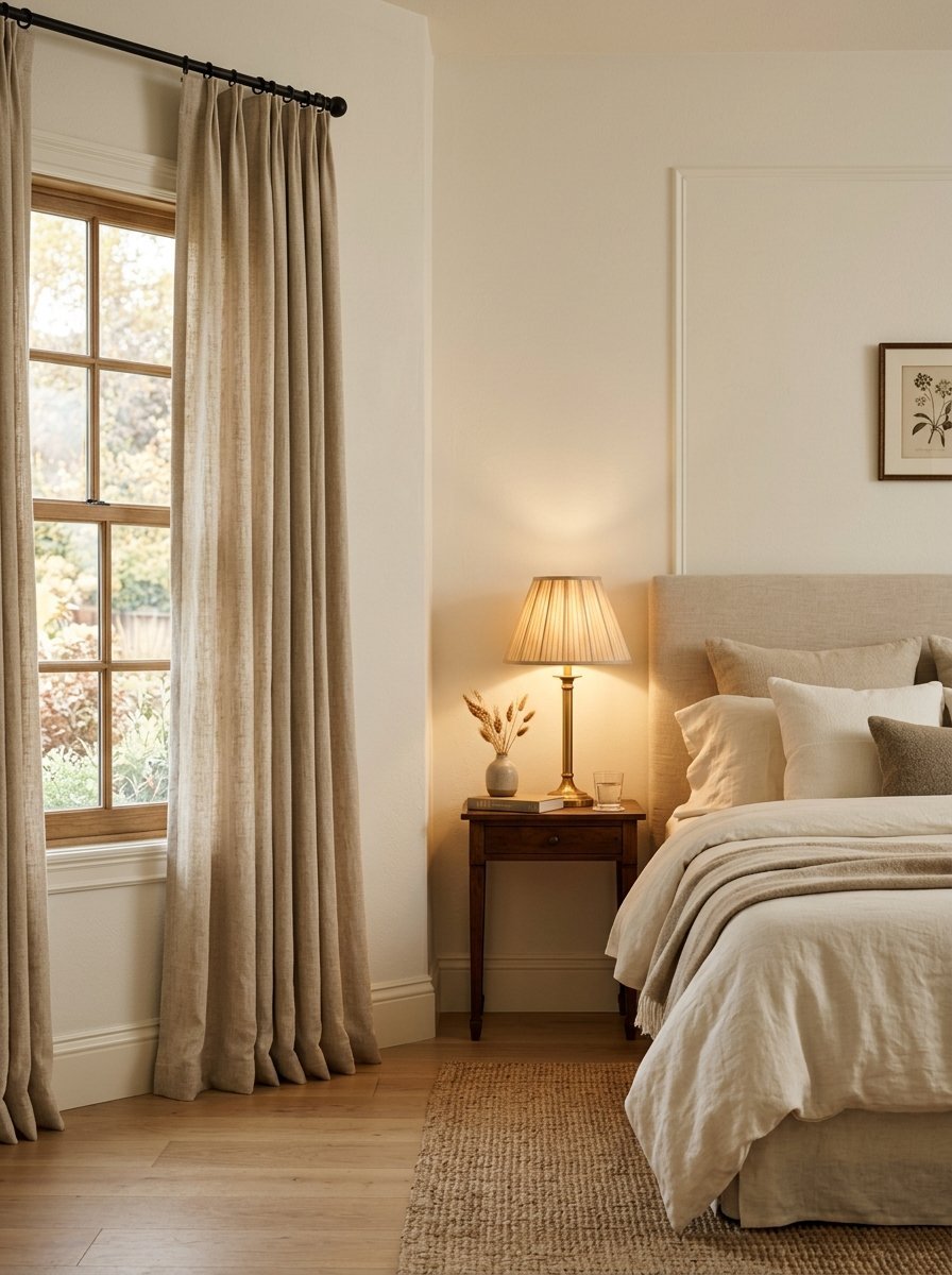
An off white room color never goes out of style. Pure bright white feels too aggressive for sleeping. Creamy off white softens the edges of your room. I have noticed this shade hides wall imperfections perfectly. I used Behr paint for a hundred-year-old home. The cracked plaster vanished instantly.
- Mix this with natural linen curtains
- Choose a satin finish for the baseboards
- Use warm light bulbs in your lamps
This shade gives you complete freedom with your furniture. You can buy bright pillows or dark rugs. The walls step back quietly. It reflects light without blinding you in the early morning.
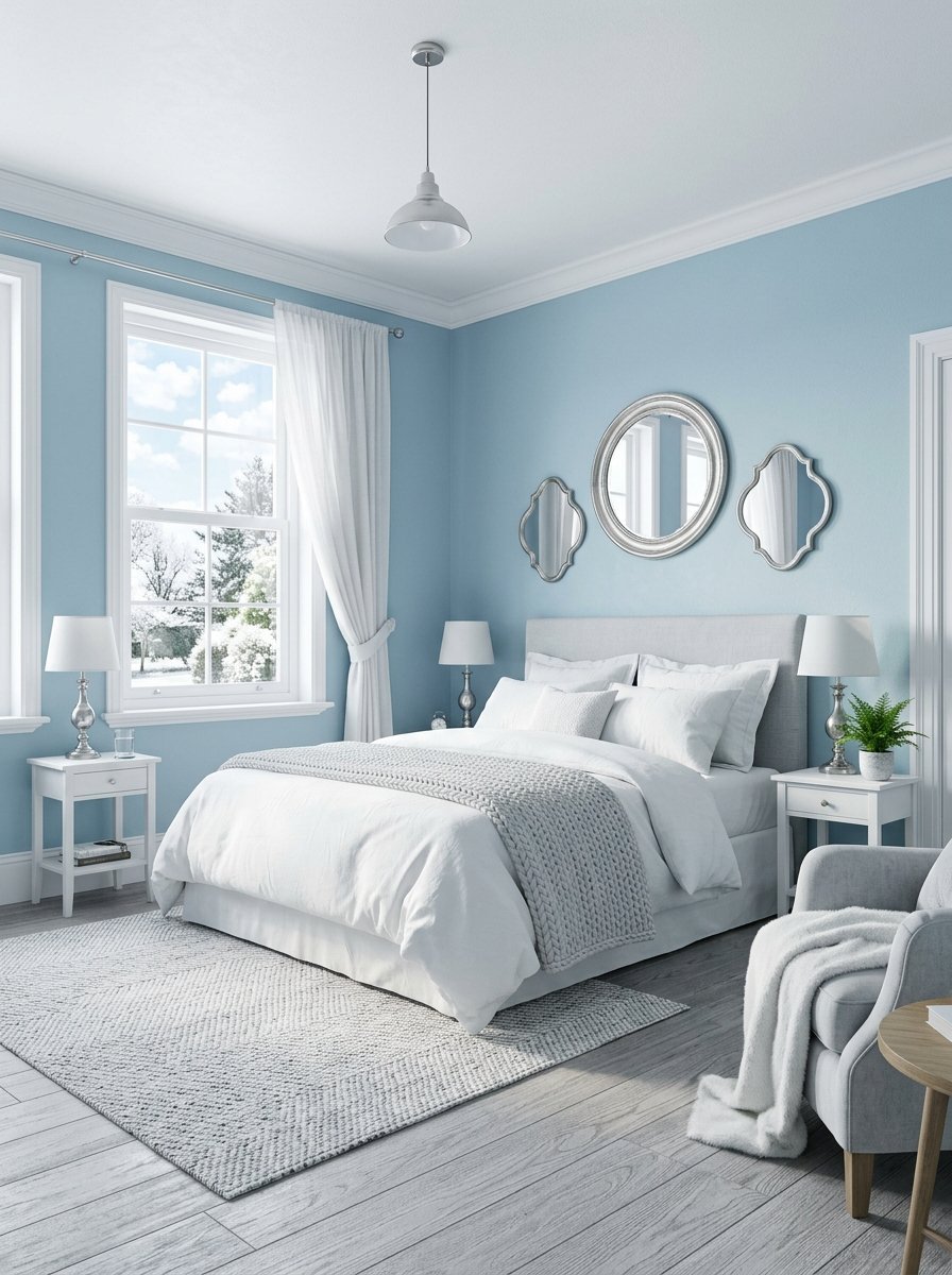
4. Dusty Blue
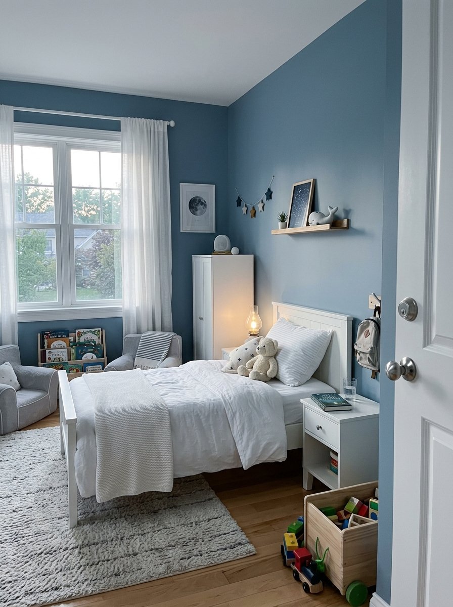
Blue instantly calms the human brain. Dusty blue specifically mimics the sky right after sunset. I always pick this for children who struggle to fall asleep. I painted my nephew’s room with Farrow and Ball paint last summer. He stopped fighting bedtime entirely. It ranks among the best colors for bedroom spaces.
- Keep all your bedding crisp and white
- Use silver or chrome hardware on doors
- Paint the ceiling one shade lighter
This color cools down rooms facing west. The hot afternoon sun neutralizes against the blue walls. It creates a physical cooling sensation. You will literally feel your shoulders drop when you walk inside.
5. Muted Terracotta
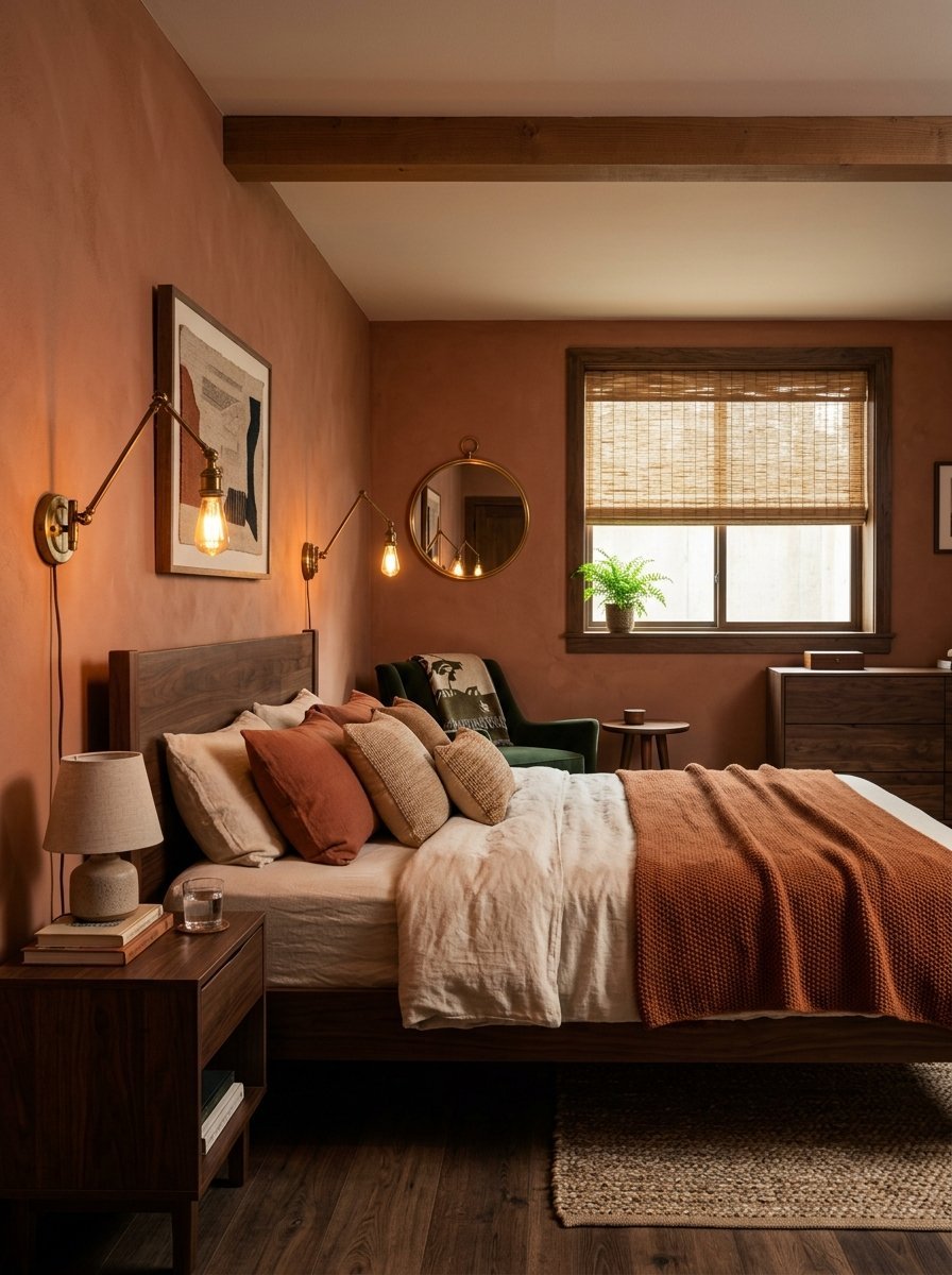
Terracotta warms up any cold space instantly. You want a muted version for a sleeping area. Bright orange keeps you awake. Muted clay puts you to sleep. I have seen this work perfectly in basement bedrooms. It fakes the feeling of natural sunlight. I applied a coat of Glidden paint in a tiny windowless room.
- Match this with dark walnut wood tones
- Hang woven bamboo shades on the windows
- Use soft brass light fixtures
This color wraps around you like a hug. It creates a cozy cave atmosphere. It turned the worst room into the favorite spot in the house. You will love waking up here.
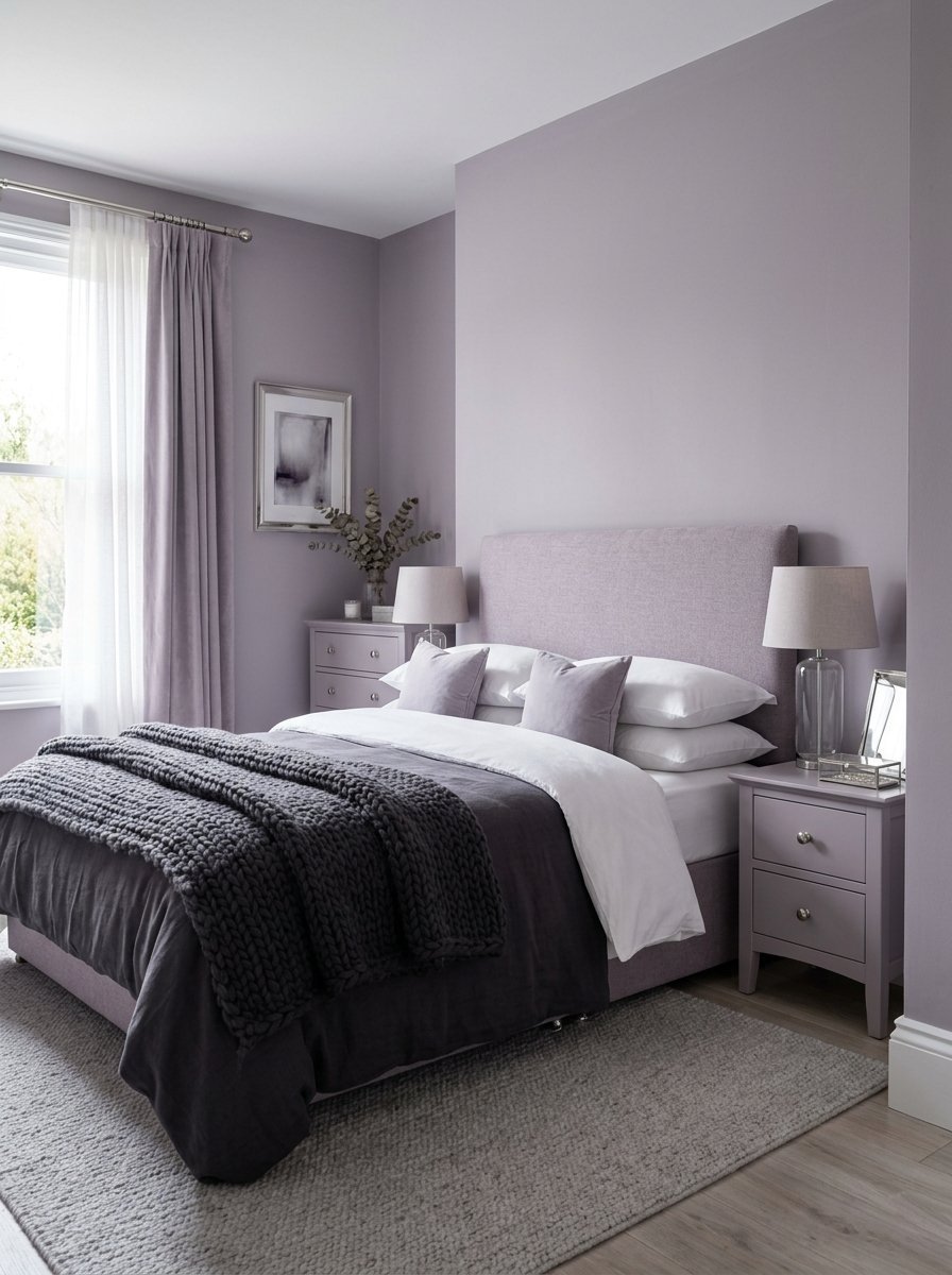
6. Pale Lavender
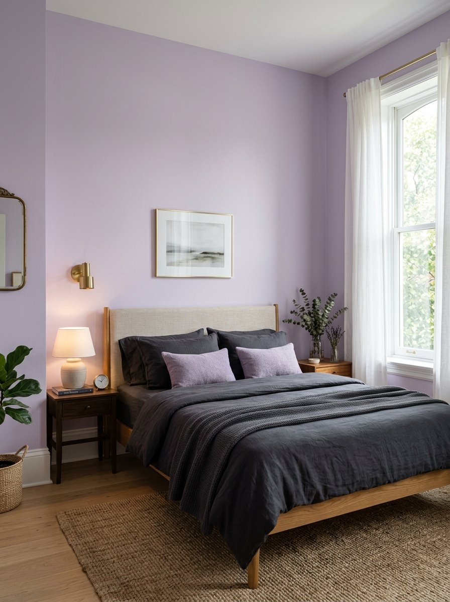
Lavender holds secret calming powers. Many people avoid purple because they fear it looks childish. Pale lavender acts exactly like a neutral gray. It just has a quiet heartbeat of color. I used Valspar paint in my own office space first. I loved it so much I moved it to the bedroom.
- Mix this with dark charcoal bed sheets
- Use a flat finish to avoid shiny spots
- Paint the doors the exact same color
This shade makes small room paint ideas feel fresh. The color tricks the eye. The walls visually push outward. The room breathes better. It feels like a boutique hotel.
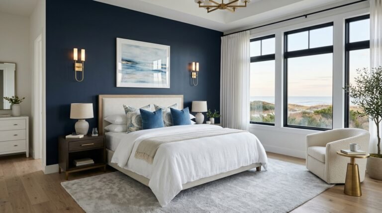
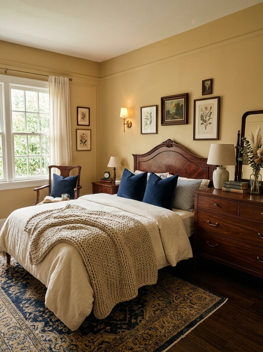
7. Deep Navy
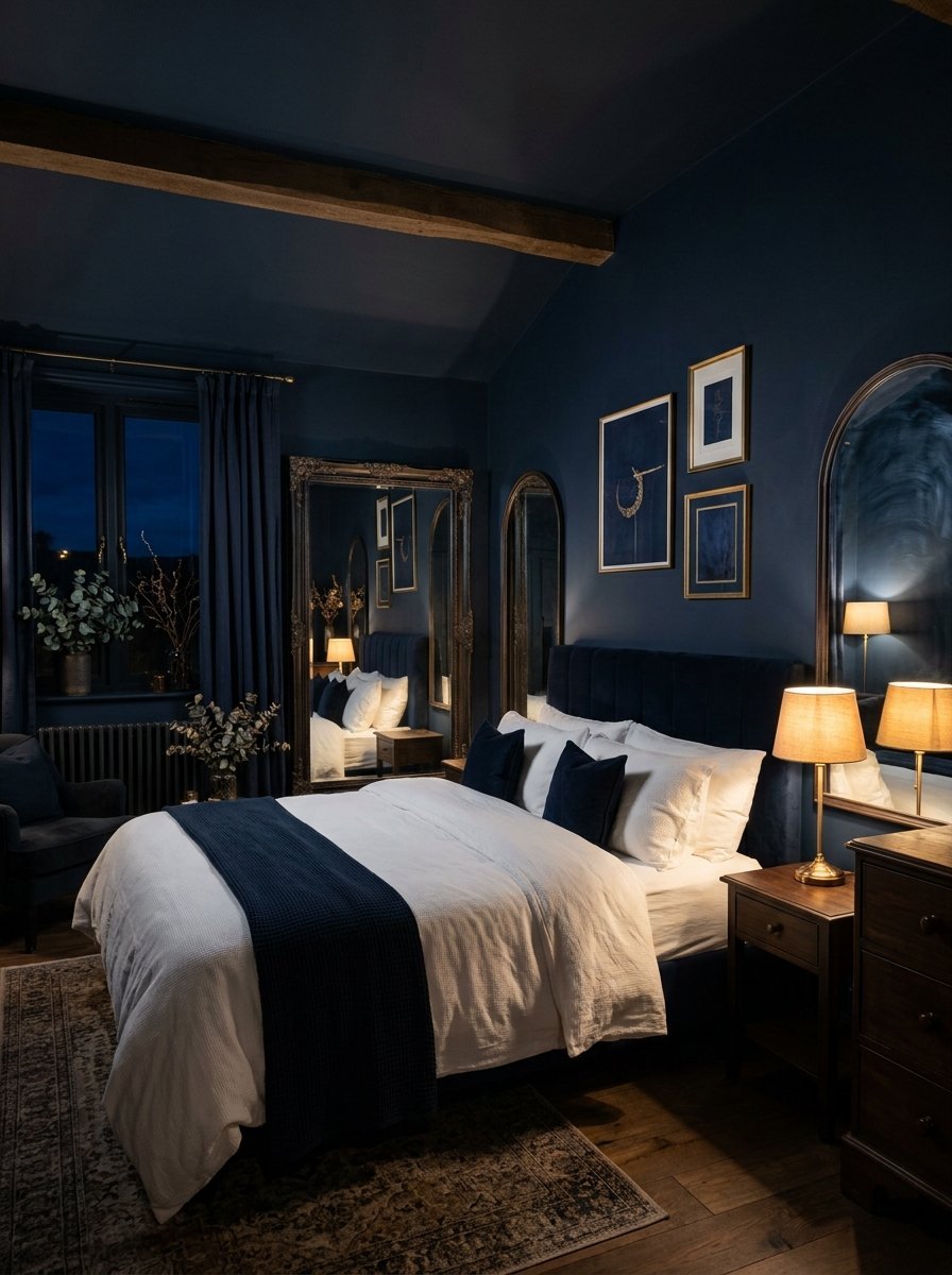
Dark colors scare many homeowners. Deep navy actually makes walls disappear entirely. The edges of the room blur into shadows. I have painted dozens of small rooms completely navy. The owners always gasp at the cozy finish. It feels like sleeping inside a midnight sky. I bought Clare paint for a client ceiling recently.
- Paint the baseboards the same navy color
- Hang large mirrors to bounce the light
- Use crisp white sheets for contrast
This color demands good artificial lighting. You must place lamps in three different corners. The dark walls absorb the light beautifully. You will sleep deeper here than anywhere else. It cures restless nights.
8. Warm Beige
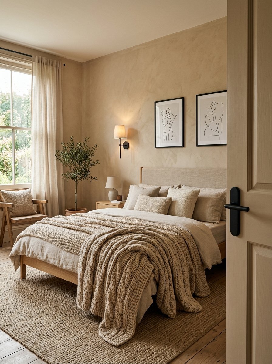
Beige got a bad reputation in the early two thousands. True warm beige remains a powerhouse color. It strips away all visual noise. I rely on this shade for clients with high stress jobs. They need zero visual stimulation when they get home. I picked up a roller and Dutch Boy paint for a stressed executive.
- Pair this with thick textured blankets
- Use matte black door handles
- Keep the ceiling a pure flat white
Finding the perfect bedroom color combination takes patience. Beige gives you a perfect blank canvas. It forgives decorating mistakes. You can swap your art out weekly. The walls will silently support whatever you hang up.
9. Soft Mint
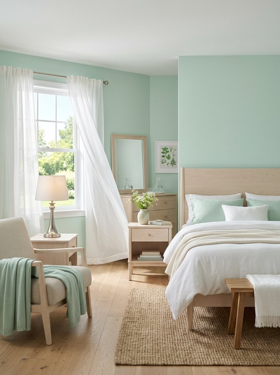
Mint green cools a room down instantly. You want the palest version you can find on the shelf. Too much mint looks like toothpaste. Just a whisper of mint looks like sea glass. I brushed on PPG paint in guest bedrooms to test this theory.
- Match this with pale birch wood furniture
- Hang sheer white curtains at the windows
- Use polished nickel lamps
This shade feels incredibly clean. You will feel fresh waking up surrounded by it. It works best with morning sunlight. The early rays make the walls glow softly. It sets a very calm tone for the day.
10. Blushing Pink
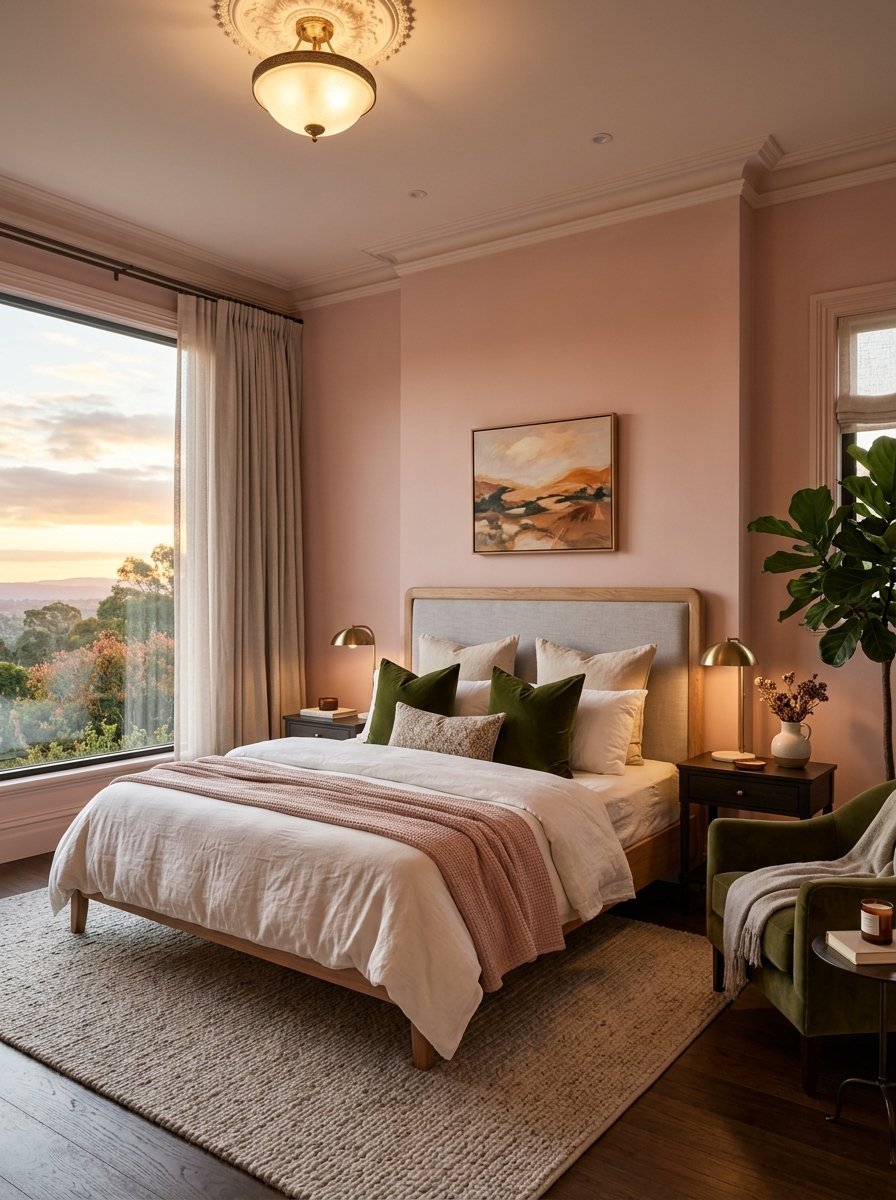
Pink is not just for nurseries anymore. A sophisticated blushing pink acts like a warm neutral. It flatters every skin tone perfectly. You actually look better looking in the mirror in this room. I tried Kelly Moore paint in high end master suites. The couples always end up loving the soft glow.
- Mix this with deep olive green accents
- Choose a velvety matte paint finish
- Keep the trim very crisp and white
This color softens harsh morning light. It makes waking up at dawn feel less painful. The room feels permanently stuck at sunset. It creates a very gentle environment.
11. Charcoal Gray
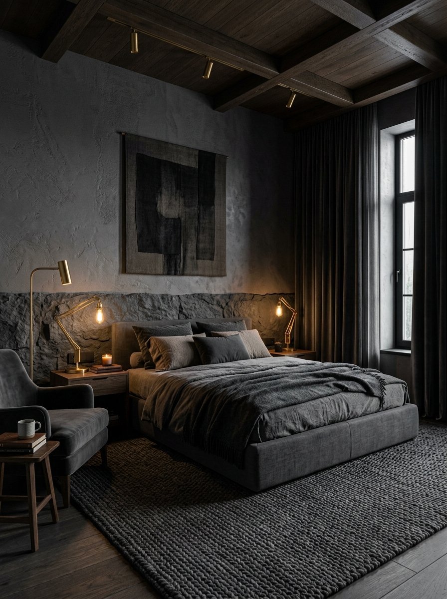
Charcoal gray provides maximum drama with zero anxiety. It creates a modern cave feeling. I have seen this color completely fix sleep issues. The dark walls tell your brain it is time to rest. I painted my own ceiling with Dunn Edwards paint once. It felt like sleeping under an endless sky.
- Paint the ceiling a soft white for balance
- Use large textured rugs on the floor
- Pick warm brass metals for your lamps
You must commit fully to this dark shade. It requires rich fabrics to balance the heavy walls. Use velvet curtains. Buy thick wool blankets. The contrast creates incredible comfort.
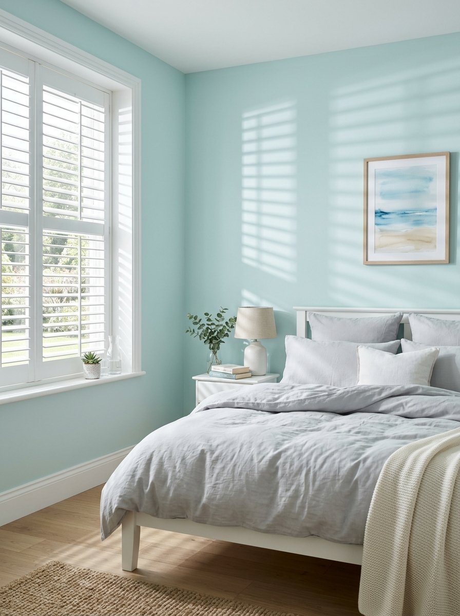
12. Icy Blue
Icy blue feels like a glass of cold water. It drops the visual temperature of the room immediately. I use this shade for clients living in very hot climates. The color tricks your brain into feeling cooler. I used Magnolia Home paint for a desert home last year.
- Mix this with pure stark white trim
- Keep window treatments very minimal
- Choose light gray wood flooring
This remains a classic among bedroom wall colors choices. It never looks dated. It always looks clean. You can pair it with silver mirrors perfectly. The reflections make the room feel twice as large.
13. Earthy Olive
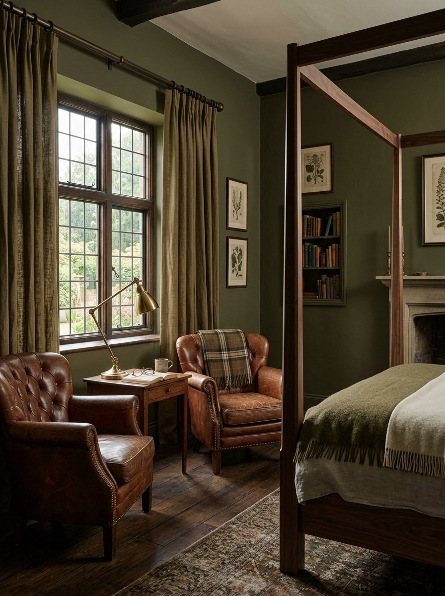
Olive green grounds a space instantly. It feels heavier and older than sage green. I have noticed this color makes cheap furniture look expensive. It creates a moody and historic atmosphere. I tried this in a modern builder grade home. It instantly gave the room soul.
- Match this with leather accent chairs
- Hang heavy canvas curtains
- Use dark bronze curtain rods
This shade wraps the room in a rich warmth. It forces you to slow down. The color absorbs the chaos of a long day. You will want to read books in this room. It practically begs you to rest.
14. Peachy Neutral
Peach holds incredible warmth without the aggression of orange. You want a peach that almost looks beige. I have seen this color totally change a dark northern facing room. It injects fake sunshine into gloomy spaces. I painted my own hallway this color to brighten it up.
- Pair this with creamy white bed linens
- Use rattan or wicker light fixtures
- Keep the baseboards a soft off white
This shade smiles at you. It makes waking up feel happy. It flatters the face just like soft pink does. Your mornings will feel lighter and easier inside this room.
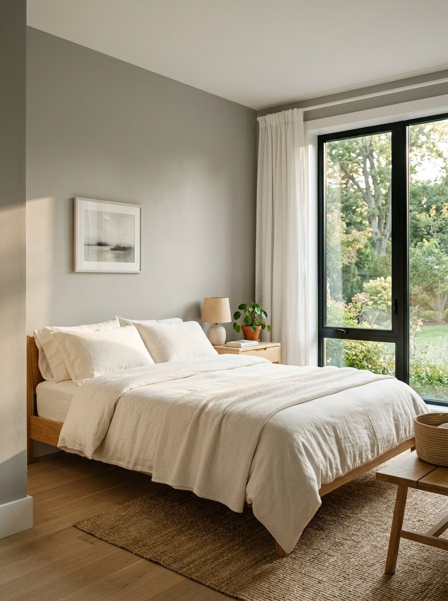
15. Light Greige
Greige marries the best parts of gray and beige. It gives you the cool tones of gray with the warmth of beige. This is my most requested color by far. I have painted entire houses in this single shade. It solves almost every design problem perfectly.
- Mix this with charcoal gray bed frames
- Use crisp white window shutters
- Paint the ceiling the exact same color
This falls under the best small room paint ideas available. It blurs the corners of a tiny space. The room feels expansive and quiet. It never competes with your art or rugs.
16. Slate Blue
Slate blue carries a heavy gray undertone. It looks like a storm cloud just before the rain starts. I have noticed this color works perfectly in rooms with high ceilings. It grounds the tall walls. I painted a massive vaulted ceiling room this shade. It made the massive space feel cozy.
- Match this with warm honey oak wood
- Hang natural linen roman shades
- Use soft white bedding with blue stripes
This acts as a phenomenal room wall colors choice. It feels extremely grown up and serious. It tells your brain to stop working. It demands quiet time.
17. Warm White
Warm white never fails. Pure white feels too stark for a bedroom. Warm white has a tiny drop of yellow or brown in the mix. I have seen this color make messy rooms look organized. It provides a clean slate every single morning.
- Pair this with lots of green houseplants
- Choose a flat finish to hide drywall flaws
- Use black metal frames for your art
This color bounces light deep into the room. It makes waking up much easier on dark winter mornings. You get a fresh start daily. It costs very little to maintain or touch up over time.
18. Soft Mustard
Mustard sounds terrifying for a bedroom. A very soft muted mustard actually feels like a warm hug. I tried this in a guest room facing away from the sun. The room instantly felt ten degrees warmer. Visitors absolutely love the cozy vintage feeling.
- Mix this with deep navy blue pillows
- Use dark mahogany wood dressers
- Keep the trim a very warm cream color
This shade requires confidence. You must embrace the warmth fully. It works best with thick textures. Buy a chunky knit blanket. Hang heavy velvet curtains. The room will feel incredibly secure and safe.
19. Deep Forest Green
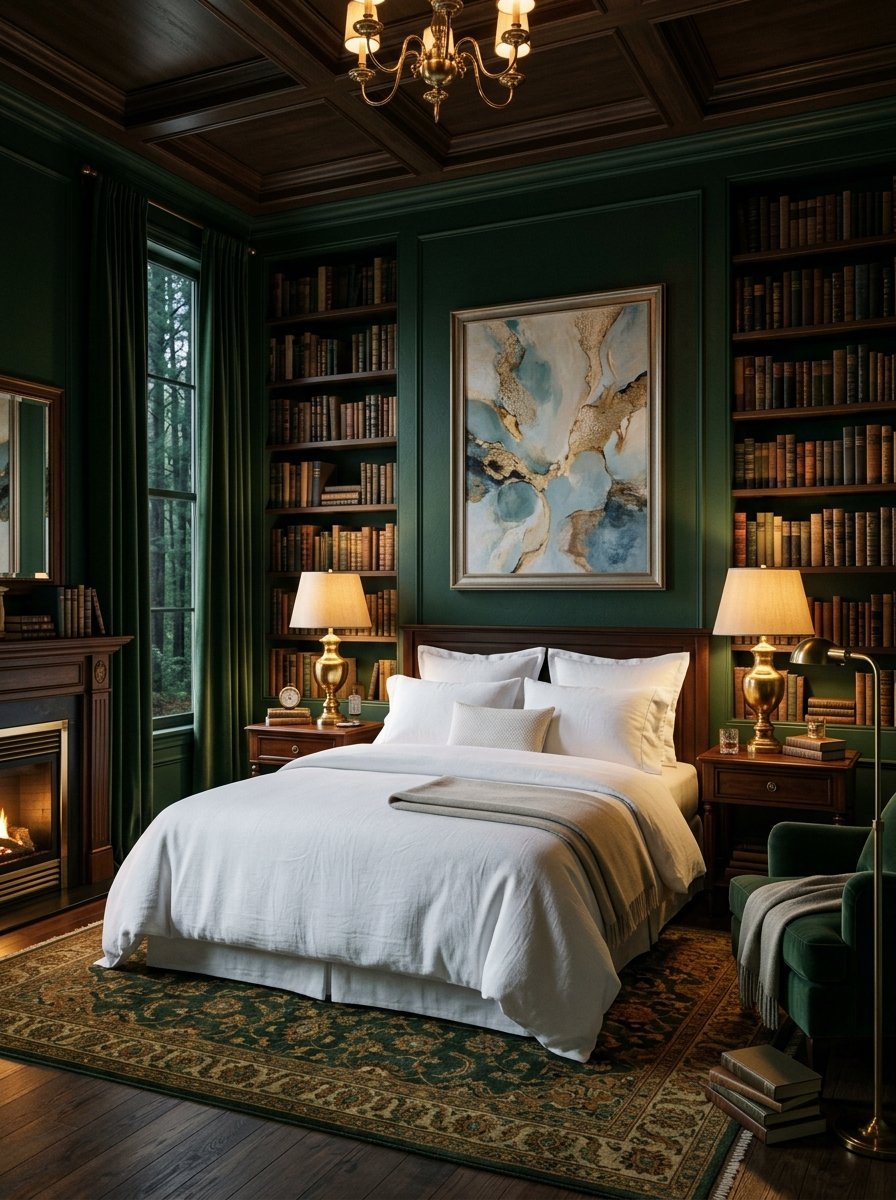
Forest green creates an instant library feeling. It feels incredibly wealthy and established. I have painted many accent walls this exact color. The rich green swallows the light beautifully. It feels like sleeping deep inside a quiet forest.
- Match this with shiny brass lamps
- Hang large pieces of abstract art
- Use crisp white bed sheets
This color puts your eyes to rest. You look at screens all day. Staring at this green wall relaxes your optic nerves. It creates a physical relaxation response in the body. You will fall asleep much faster here.
20. Pale Taupe
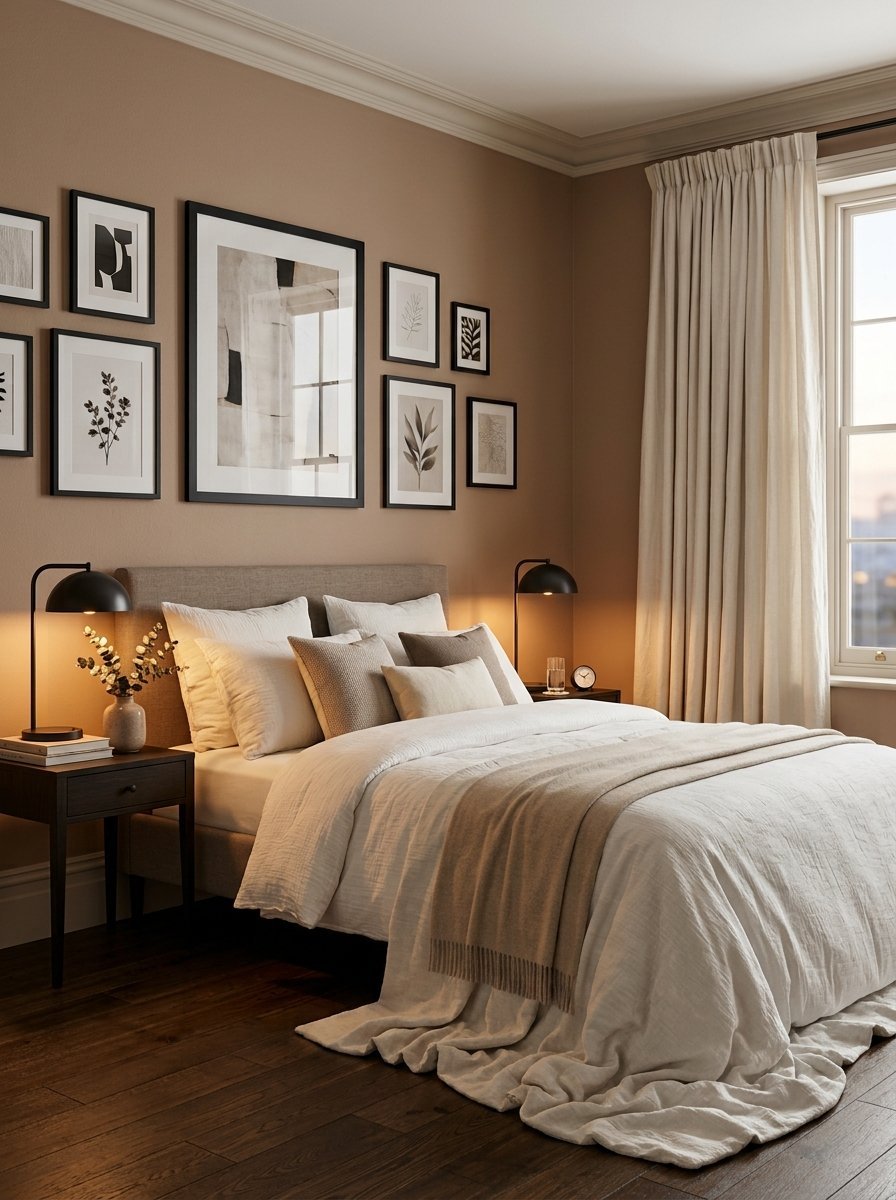
Taupe lives right between brown and gray. It feels very earthy and very grounding. I have noticed this color completely changes character throughout the day. It looks gray in the morning and brown at night. I painted my own dining room this shade.
- Pair this with soft ivory curtains
- Use matte black picture frames
- Paint the ceiling a flat pure white
This shade provides a very mature background. It feels expensive and very intentional. You can easily swap your accent colors with the seasons. Taupe perfectly supports red in winter and blue in summer.
21. Seafoam Green
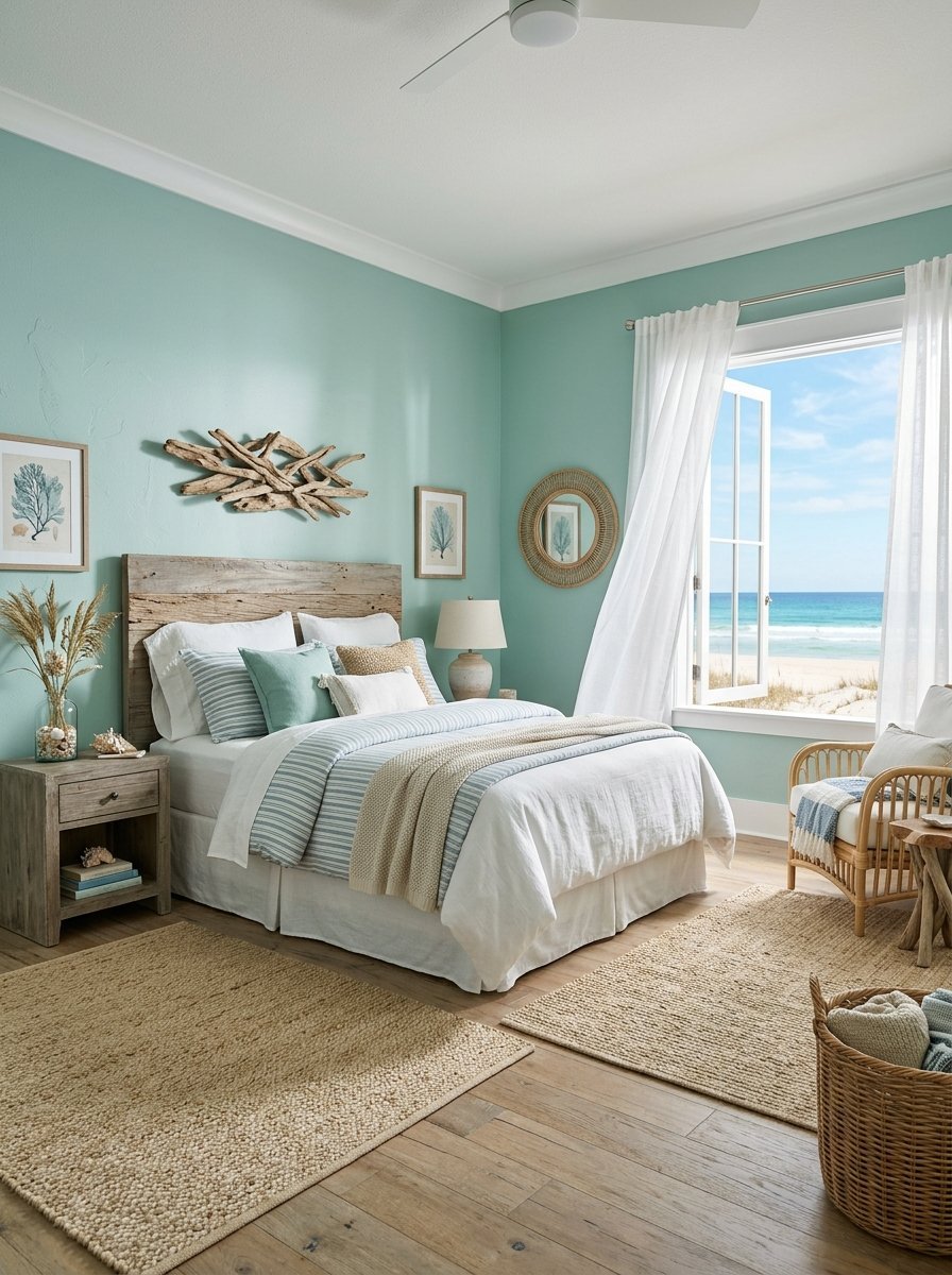
Seafoam green brings the ocean directly to your walls. It has a tiny drop of blue mixed into a pale green. I have seen this color completely refresh a tired old house. It makes the air inside the room feel cleaner. I painted a coastal rental property this exact shade.
- Mix this with light sandy beige rugs
- Hang sheer white linen at the windows
- Use natural driftwood accent pieces
This represents a perfect room color combination choice. It bridges the gap between warm and cool tones perfectly. You will literally breathe deeper when you walk through the bedroom door.
22. Muted Lilac
Lilac softens any harsh room immediately. You want a version that looks almost gray on the paint chip. True purple keeps the brain too active. Muted lilac whispers quietly in the background. I tried this in a small apartment bedroom recently. It made the space feel like a jewelry box.
- Match this with polished silver hardware
- Use deep charcoal gray blankets
- Keep all the baseboards bright white
This color feels very soft to the touch. It creates a velvety visual texture on the walls. The room feels padded and protected from the outside world. It guarantees a very peaceful night.
23. Clay Brown
Brown walls are making a massive comeback. A soft clay brown feels incredibly secure. I have noticed people sleep longer in brown rooms. It mimics the safety of a natural cave. I painted my own guest bathroom this color to test it out.
- Pair this with soft pink accent pillows
- Hang heavy cream colored curtains
- Use natural woven baskets for storage
This shade acts perfectly for room wall colors in large spaces. It pulls the walls slightly inward. It makes a massive cavernous master suite feel intimate. You will feel totally protected inside this space.
24. Soft Aqua
Aqua blends blue and green in perfect harmony. You want the lightest version available. Too bright aqua looks like a swimming pool. Pale aqua looks like sea glass found on the beach. I have seen this work wonders in southern facing rooms.
- Mix this with crisp white wooden blinds
- Use pale gray bedding
- Paint the ceiling a soft cool white
This is an ideal bedroom color combination base. It feels incredibly clean and very crisp. You will never wake up feeling groggy in this room. The walls gently wake you up with a cool visual breeze.
25. Pale Butter Yellow
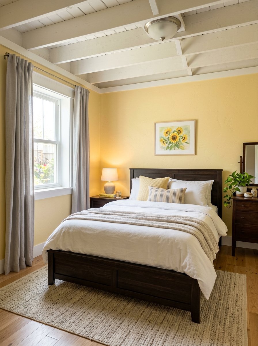
Yellow normally creates too much energy for a bedroom. A very pale butter yellow acts differently. It just glows softly like morning sunshine. I have noticed this color cures the winter blues entirely. I painted a basement bedroom this shade to fight the darkness.
- Match this with pure white trim
- Hang soft gray curtains
- Use dark wooden bed frames
This represents the best of room colour ideas bedroom options for dark spaces. It guarantees you will smile when you open your eyes. The room feels permanently happy and completely safe. It wraps up your day perfectly.
Frequently Asked Questions
Does a dark paint color make a small bedroom feel even smaller?
Dark colors do not always shrink a room. They actually make the walls recede into the shadows. The corners of the room visually disappear. This blurs the boundaries of the space. I have painted tiny rooms deep navy and they felt much bigger afterward. You just need proper lighting. Put lamps in at least three corners to balance the dark walls.
What is the best paint finish for bedroom walls?
You should always pick a matte or flat finish for sleeping spaces. Shiny paint reflects too much light. It shows every single flaw in your drywall. A matte finish absorbs the light beautifully. It creates a soft velvet look on your walls. I tried satin finish once in a bedroom and regretted it immediately. The glare from the lamps ruined the calm feeling entirely.
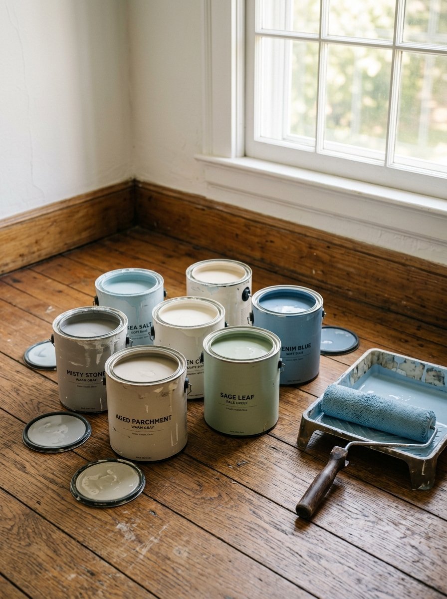
How do I test a color before painting the entire room?
Never pick a color from a tiny paper card. You must buy a physical sample can. Paint a large square on two different walls. Look at those squares in the morning light. Look at them again at night with your lamps turned on. Colors change dramatically throughout the day. I have seen perfect paper colors turn terrible on an actual wall.
Should I paint my ceiling the same color as the walls?
Painting the ceiling the same color creates a jewelry box feeling. It wraps the entire room in one solid mood. I do this often with medium and dark colors. It stops your eye from stopping at the top of the wall. If you paint the walls dark and leave the ceiling white, the room feels shorter. Wrap the color all the way over for maximum calm.
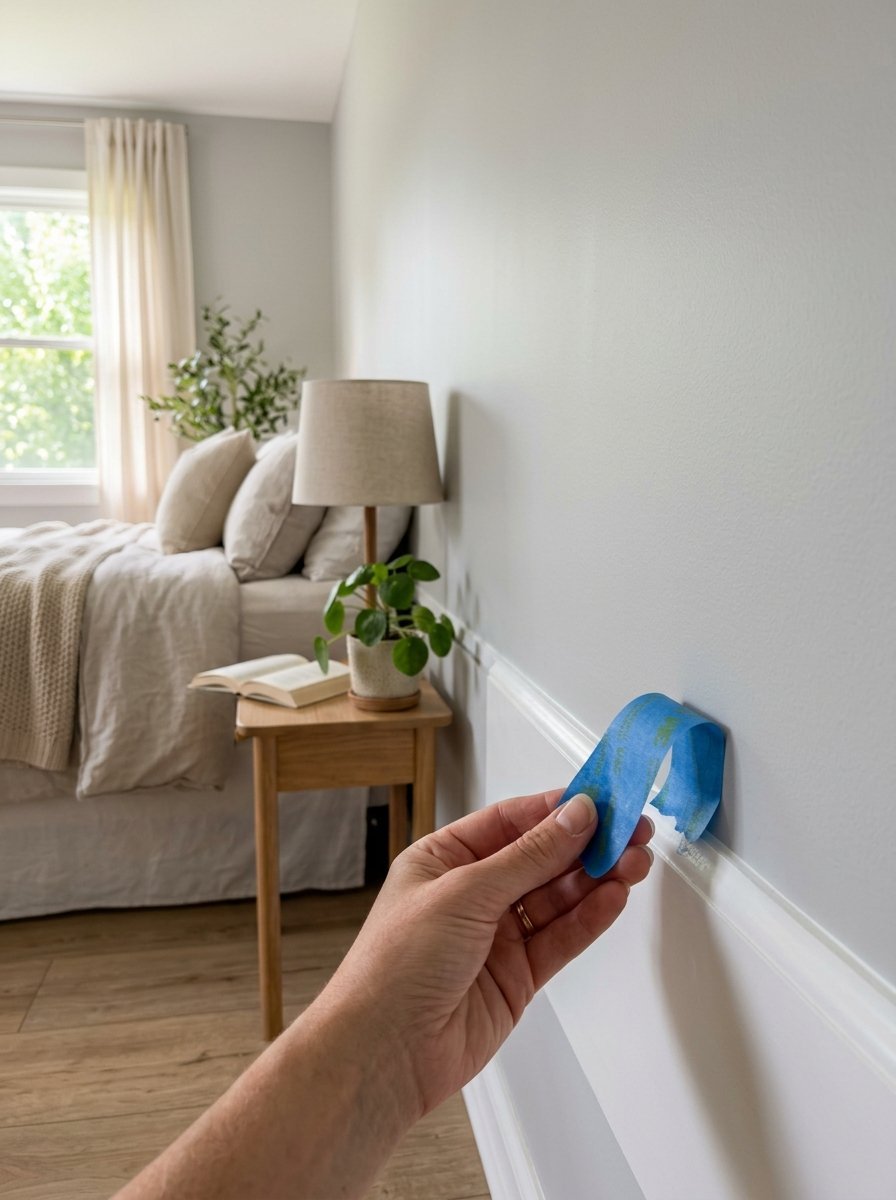
How long does it take to paint a standard bedroom?
You can easily finish a standard room in one weekend. Spend Friday night taping the edges and laying drop cloths. Paint your first coat on Saturday morning. Wait four hours. Paint your second coat on Saturday afternoon. I have followed this exact timeline for years. You will sleep in your newly painted calm room by Sunday night.
Final Thoughts
Your bedroom is the most personal room in your home. The paint you choose dictates how you start and end every single day. I have seen paint completely change how people feel in their homes. You have twenty five proven options above. Pick the one that makes your shoulders drop just reading about it. Go get a sample can today. Tape off your trim this weekend. Roll that first coat on the wall. You will feel the calmness wash over the room immediately. You deserve a space that feels like a true sanctuary.

Amelia Hart is the Senior Design Editor at Vellora Interiors, where she curates small-space and apartment content. With a background in color theory and years spent designing under-500-square-foot rentals, she’s the editor who’ll tell you exactly which paint sheen, curtain length, and lamp height to choose, no guessing. A former design lead at a boutique studio, her work has been featured in several home and lifestyle publications. Her guiding belief: “Good design isn’t about more, it’s about choosing better.”