Most people think a high end living room costs a fortune. They assume luxury lives in custom furniture or expensive art. I used to think the same. Then I spent a decade helping homeowners flip dated spaces into editorial retreats. I learned a secret. The right paint color does 90% of the heavy lifting. A cheap gallon of paint can make your walls look like they belong in a five star hotel. It is the fastest way to add value to your home. You do not need a designer. You just need the right shade. I have tested hundreds of swatches in different lighting. Some colors fall flat. Others create instant depth. Here are 25 living room colors that look expensive without the designer price tag.
Executive Summary
Luxury is a feeling of intentionality. It comes from colors with complex undertones. These shades react beautifully to light. In this guide you will find 25 proven colors. I have categorized them by mood and style. We will cover soft neutrals and bold moody tones. You will learn why certain grays look cheap and others look rich. I also include specific brand recommendations like Sherwin Williams and Benjamin Moore. We look at the best finishes for a high end glow. Most of these projects cost less than one hundred dollars. You can finish them in a single weekend. By the end you will know exactly which color fits your lighting and furniture.
1. Classic Greige
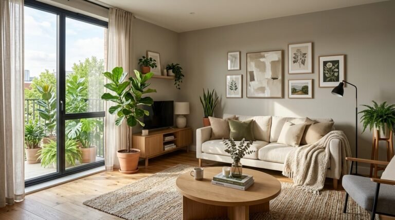
Greige is the gold standard for luxury. It sits between gray and beige. This mix keeps your room from feeling too cold or too yellow. In my experience it works best in rooms with plenty of natural light. I once used this in a small condo. The space felt twice as large instantly. It provides a clean backdrop for colorful art. It looks expensive because it feels effortless. Stick to a flat or matte finish for the best look.
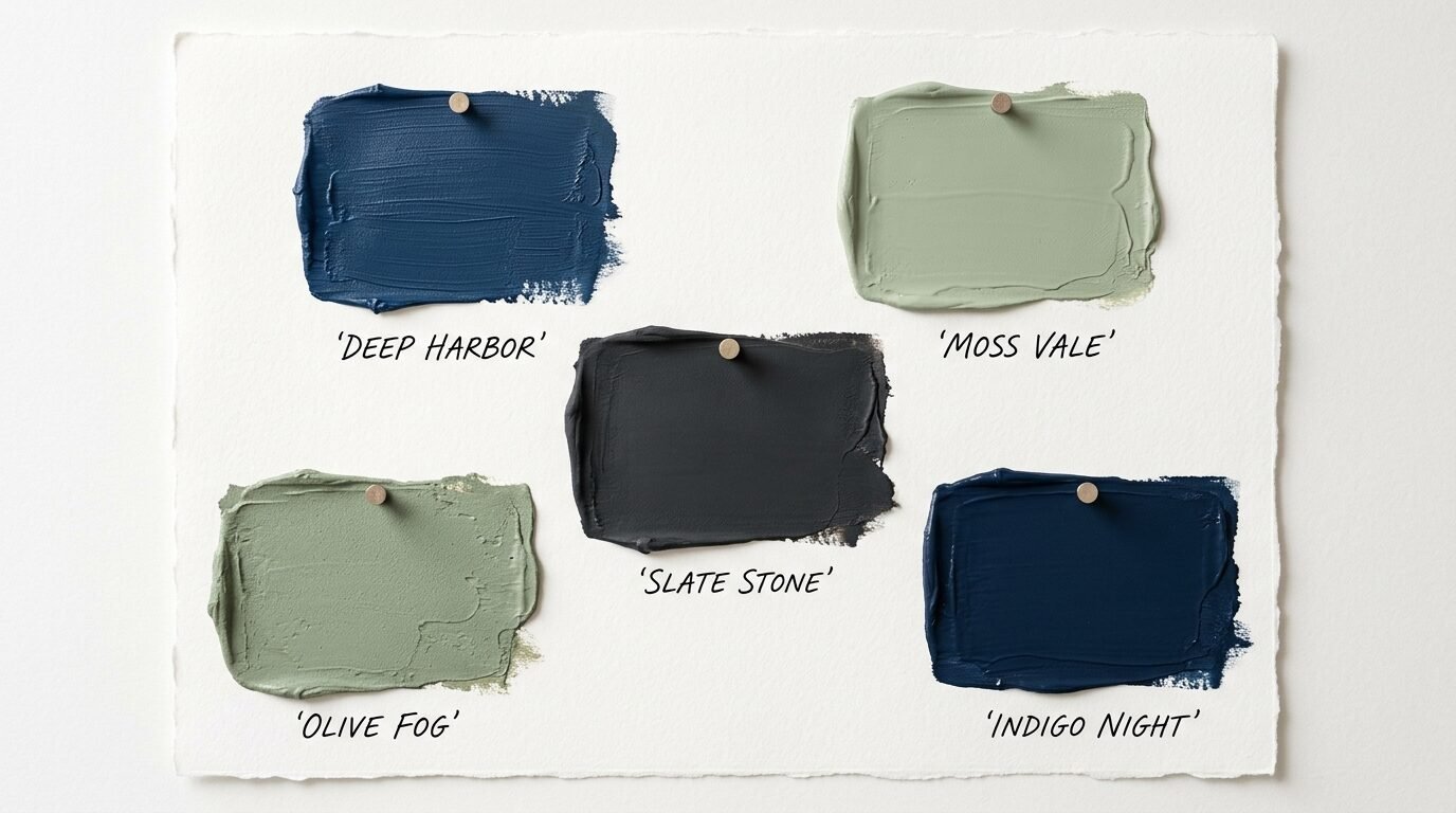
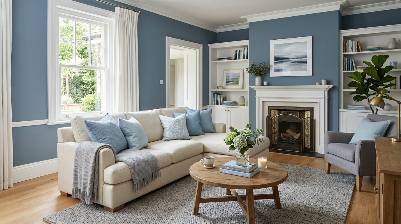
2. Deep Navy Blue
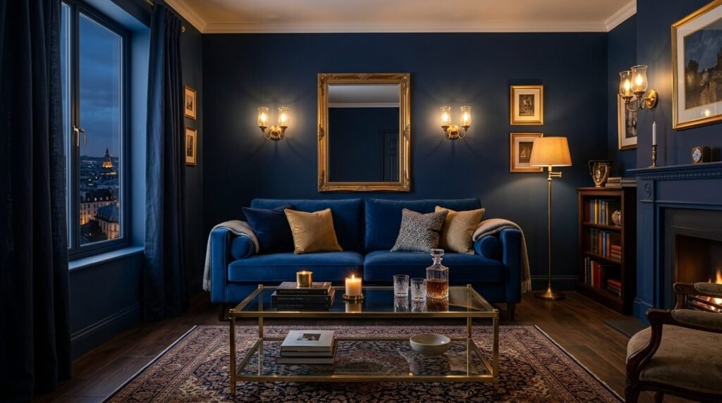
Navy blue feels like a velvet suit for your walls. It is a bold choice that pays off. Dark colors create a sense of mystery and depth. I often recommend navy for rooms used mostly in the evening. It creates a cozy and intimate vibe. Pair it with gold accents for a royal feel. I saw this work wonders in a library style living room. The dark walls made the white crown molding pop. It looks like a high end lounge.
3. Soft Sage Green
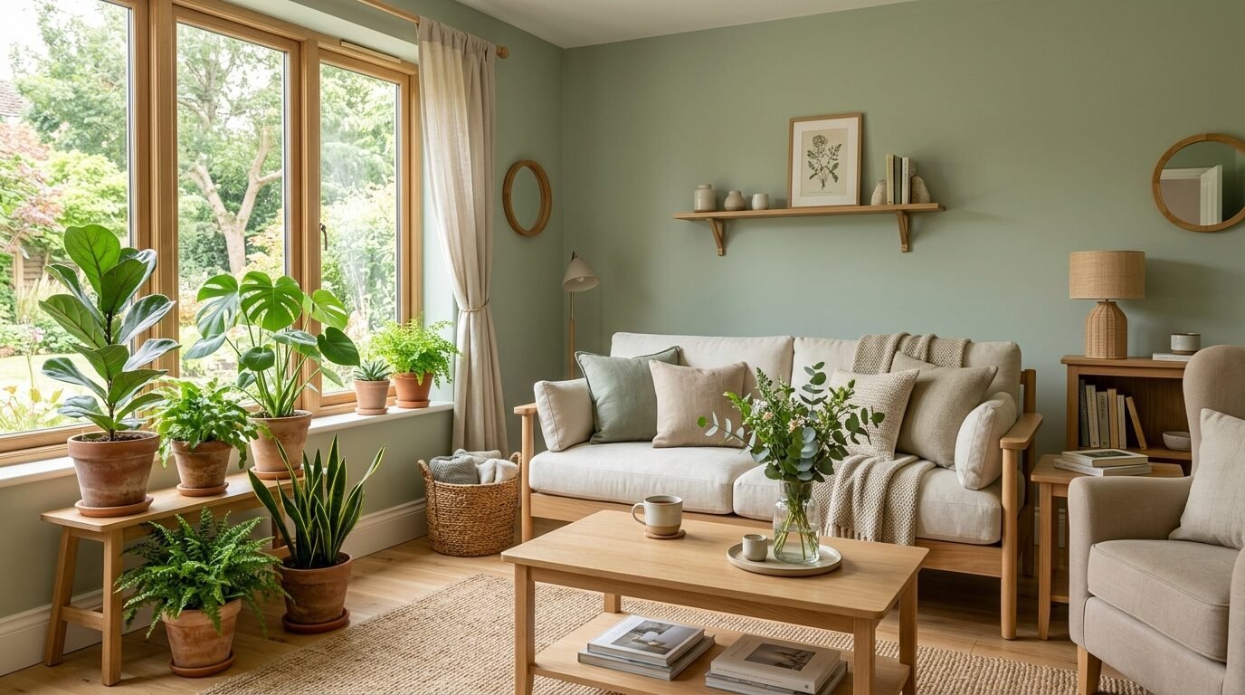
Sage green is the new neutral. It brings the outdoors inside. This color feels calm and sophisticated. It reminds people of high end spas. I have noticed that sage looks best with light wood furniture. It creates a natural and organic luxury. Avoid shades that are too bright or neon. You want a dusty or earthy version. This color hides wall imperfections well. It is a safe but stylish choice.
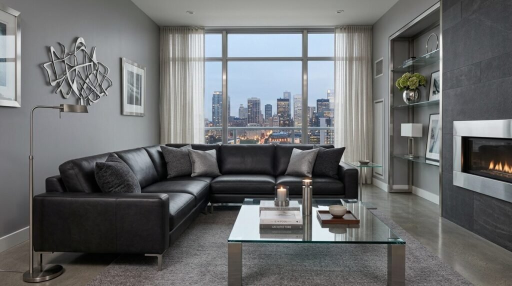
4. Charcoal Gray
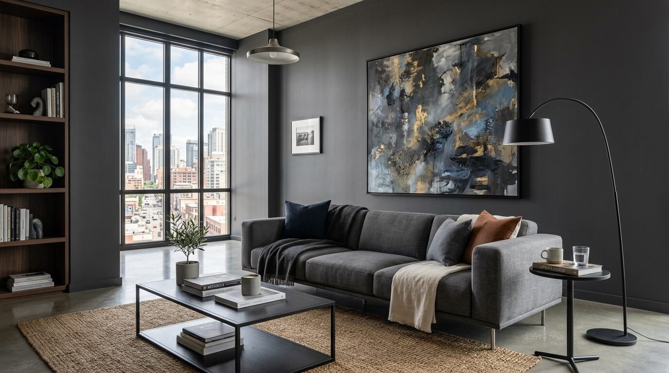
Charcoal is for the modern minimalist. It is darker than standard gray but softer than black. I love using charcoal on an accent wall. It adds immediate drama. In a project last year we painted a fireplace wall charcoal. The stone looked much more expensive against the dark paint. It creates a focal point that draws the eye. Use lamps with warm bulbs to keep the room feeling inviting. Dark gray feels very urban and chic.
5. Warm Terracotta
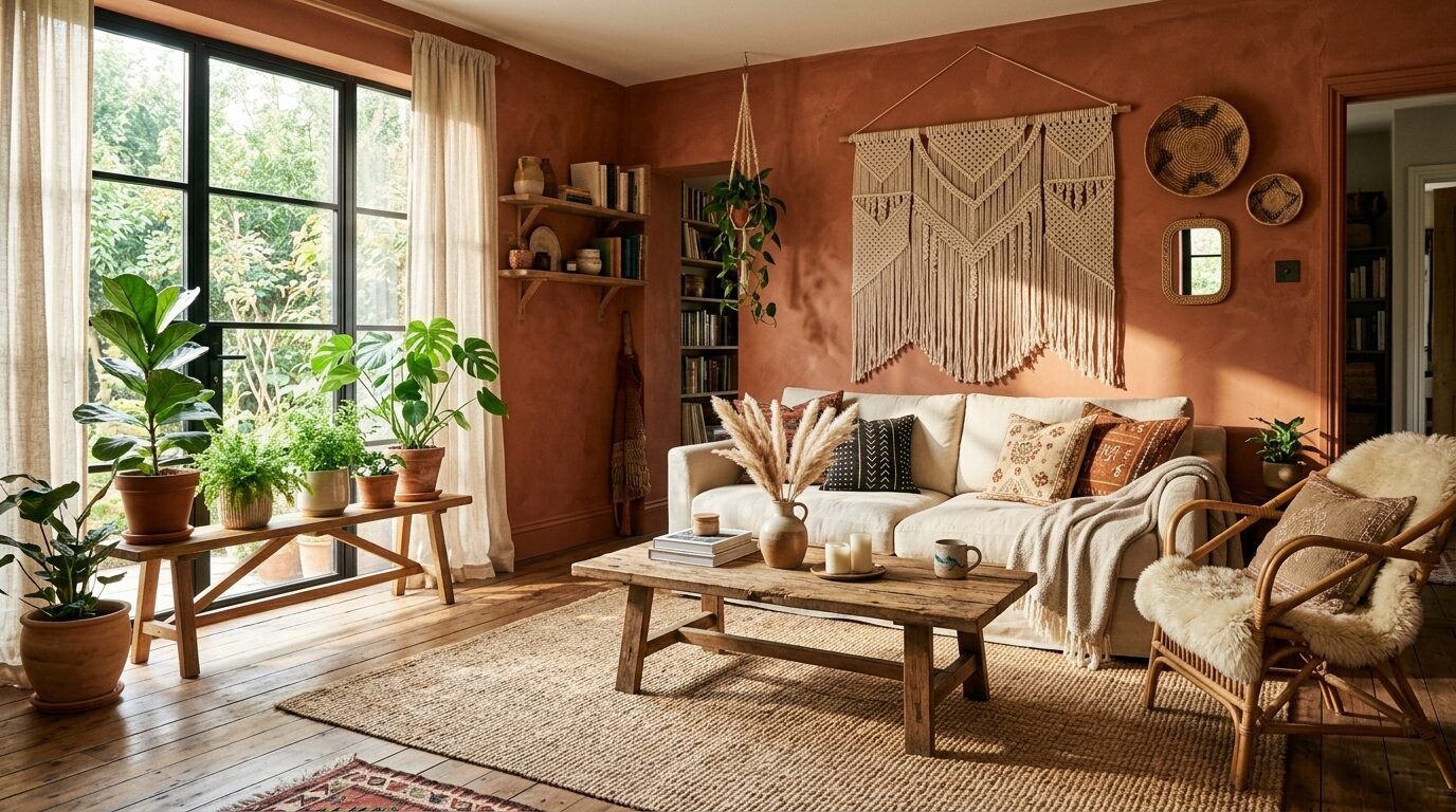
Terracotta is making a huge comeback. It feels earthy and grounded. This color works well in homes with a Mediterranean or boho vibe. It looks like sun drenched clay. I suggest using this in rooms that get western sun. The orange tones glow during the golden hour. It feels like a boutique hotel in the desert. Keep your furniture neutral to let the walls shine. This color adds warmth to a cold space.
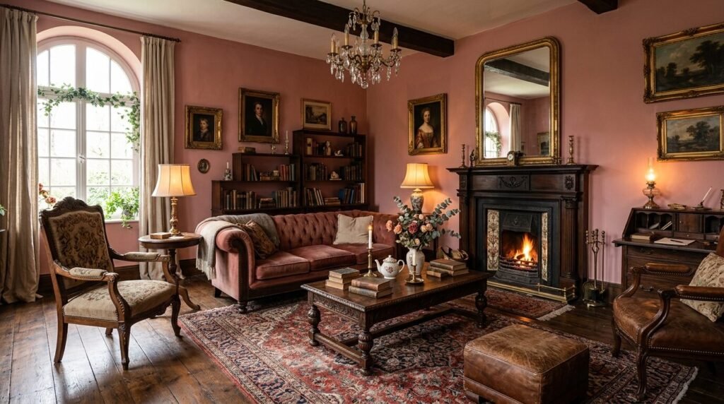
6. Pale Blush
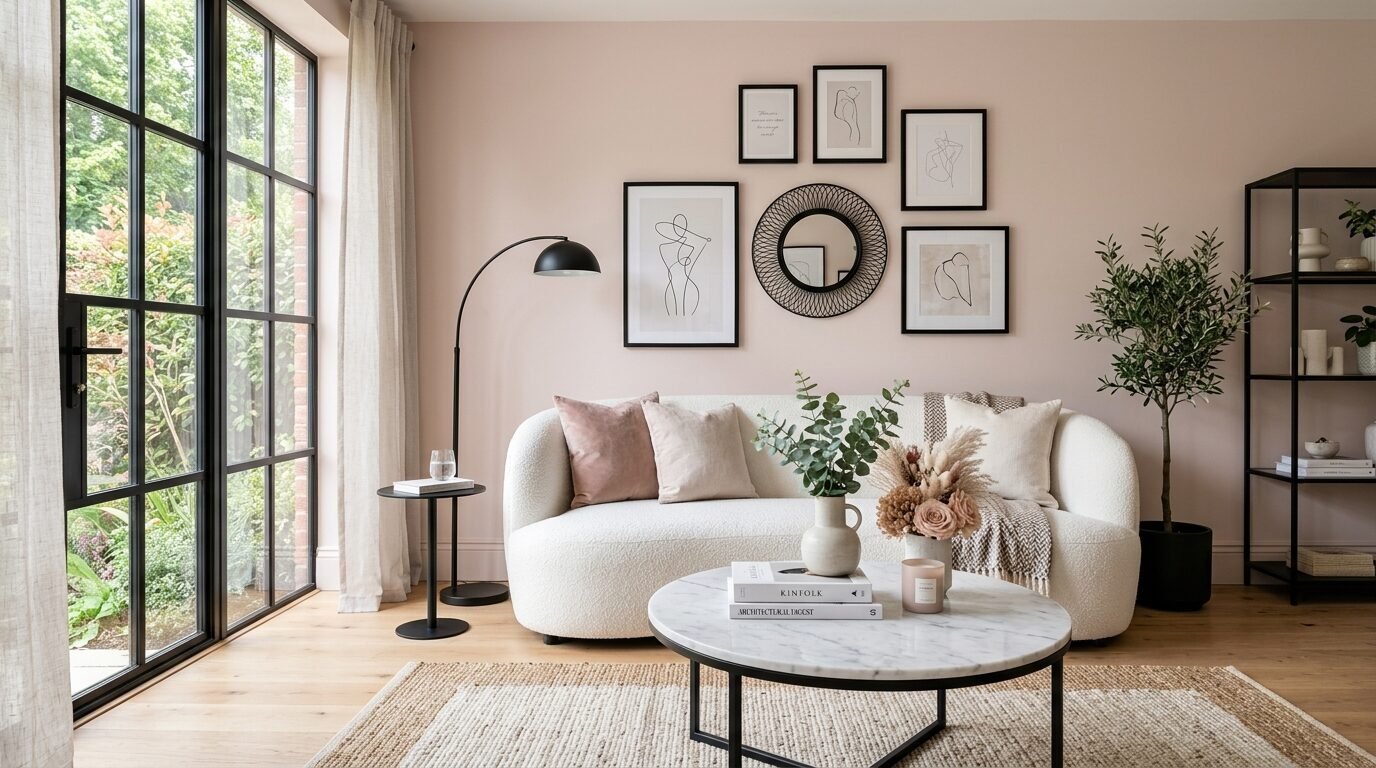
Blush is not just for nurseries. A sophisticated blush has gray undertones. It acts as a warm neutral. It makes everyone in the room look better under lamplight. I call it the filter color. It gives a soft and romantic glow. Pair it with black metal accents to keep it from feeling too sweet. I used this in a historic home renovation. The result was elegant and timeless. It feels high end because it is unexpected.
7. Hunter Green
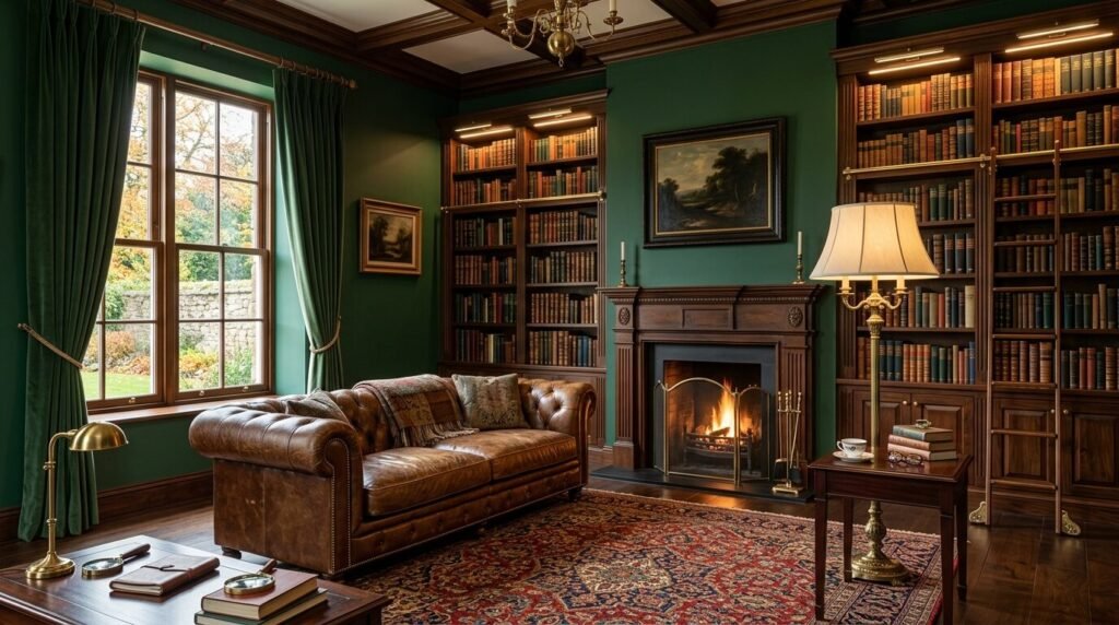
Hunter green is the color of old money. It feels established and grounded. It works perfectly in rooms with leather furniture. I love seeing this in a room with a fireplace. It creates a moody and masculine atmosphere. If you want a room to feel like a private club this is the color. Use a satin finish on the trim for a subtle contrast. It is a timeless shade that never goes out of style.
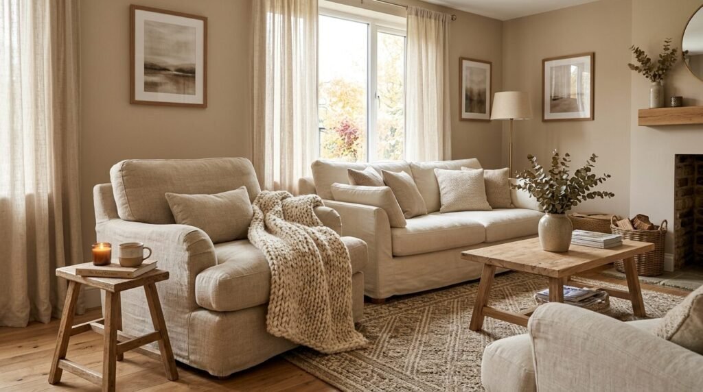
8. Creamy White
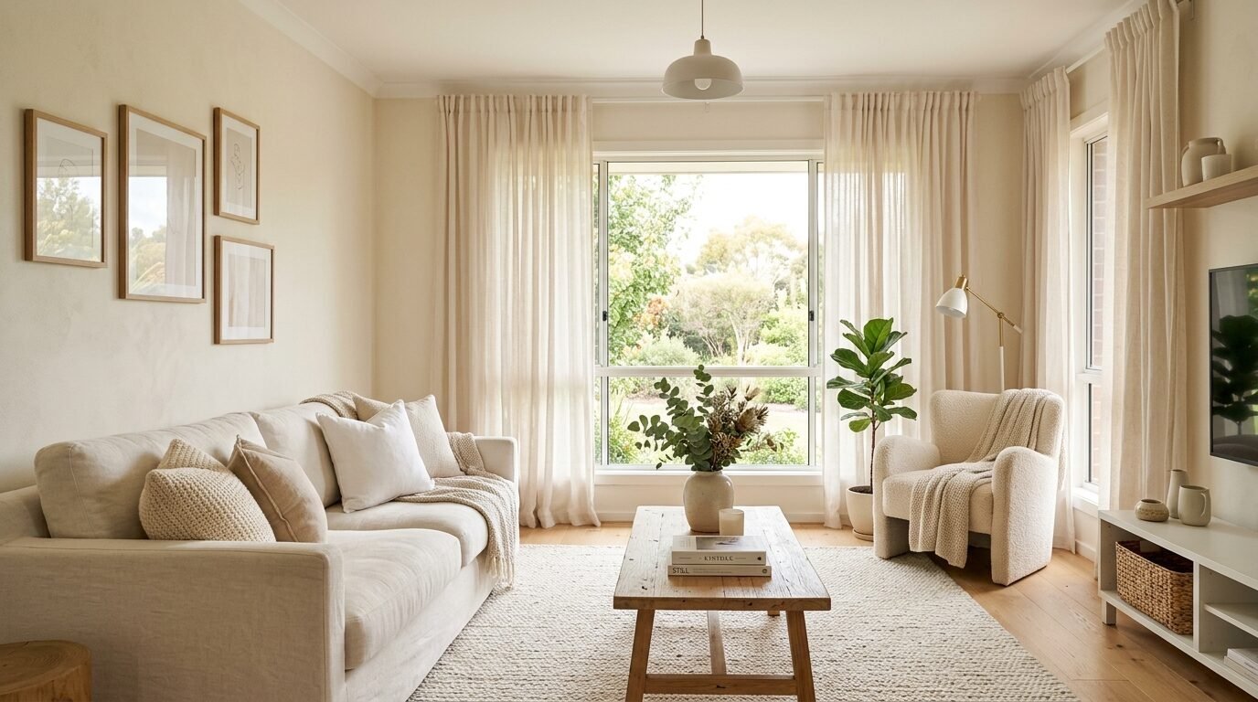
Pure white can feel clinical. A creamy white feels rich and soft. It has a tiny bit of yellow or brown to take the edge off. This is the secret to those airy California cool homes. It makes the room feel bright but lived in. I recommend this for dark rooms. It bounces light around without feeling harsh. I always use this on ceilings too. It creates a seamless and high end look.
9. Dusty Plum
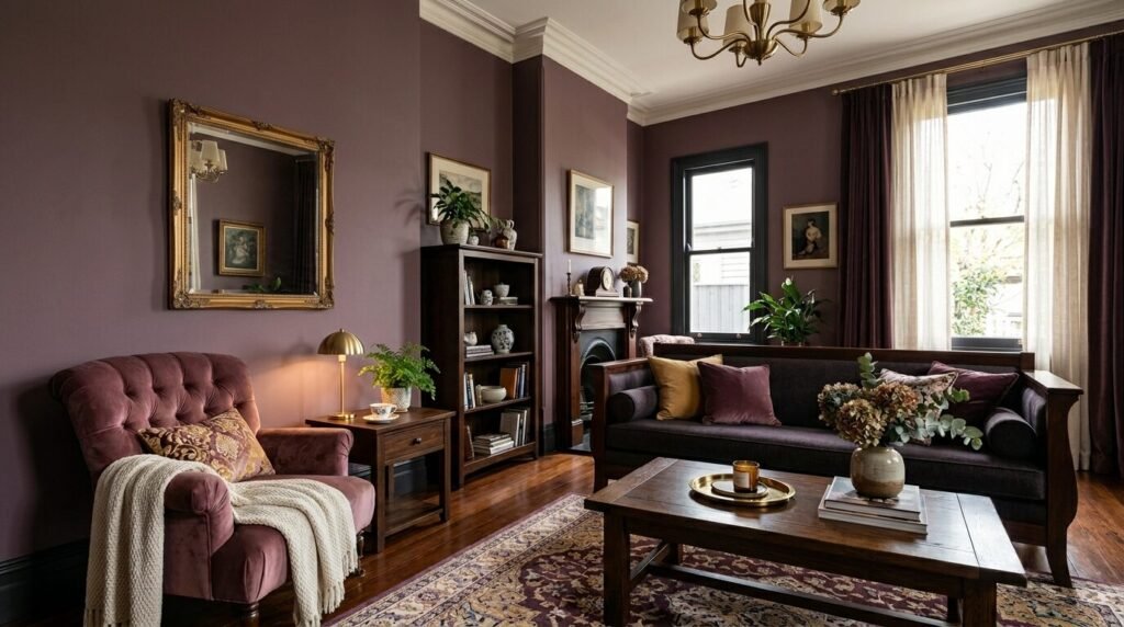
Plum is a risky choice that leads to big rewards. A dusty plum feels regal and sophisticated. It is a great alternative to navy. It feels warm and cocooning. I once saw a living room in London painted this shade. It looked incredibly expensive. It works best with velvet fabrics. Avoid bright purples at all costs. You want something that looks like it was mixed with a bit of gray.
10. Slate Blue
Slate blue is a mix of blue and gray. It is a very calming color. It feels like the ocean on a cloudy day. I find this color very versatile. It works with both traditional and modern decor. It is a great choice for a whole house color. It is interesting but not overwhelming. I often suggest this to clients who are afraid of dark colors. It is a perfect middle ground.
11. Mushroom Beige
Mushroom is a deep and earthy beige. It has a lot of soul. It feels more intentional than a standard tan. This color looks great with linen textures. I love it for a coastal or transitional style. It makes white trim look crisp and clean. It is a very forgiving color for DIY painters. It covers well and hides dust. It feels like a high end neutral.
12. Blackest Black
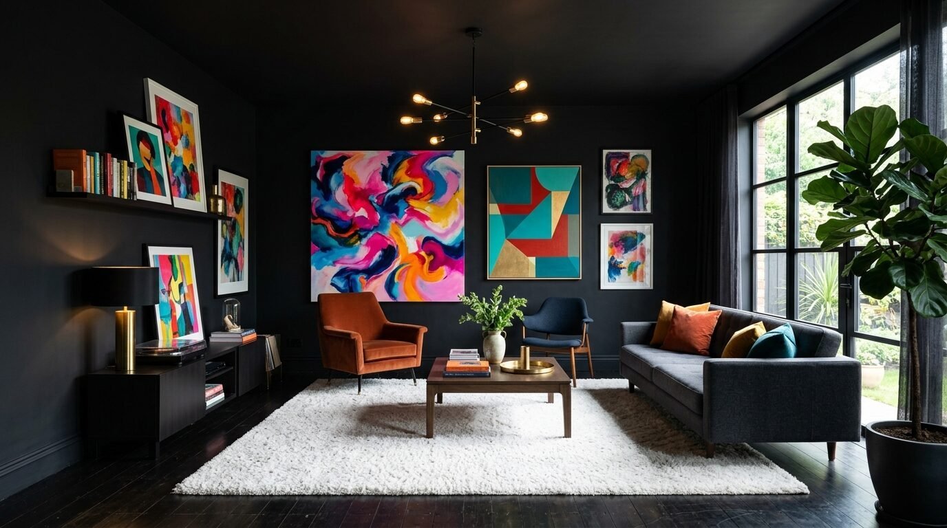
Painting a living room black takes courage. It also creates the ultimate luxury look. Black walls make everything else in the room stand out. Your art will look like it belongs in a gallery. I recommend this for rooms with large windows. The natural light prevents it from feeling like a cave. Use a matte finish to avoid reflections. It is the boldest way to upgrade your space.
13. Olive Green
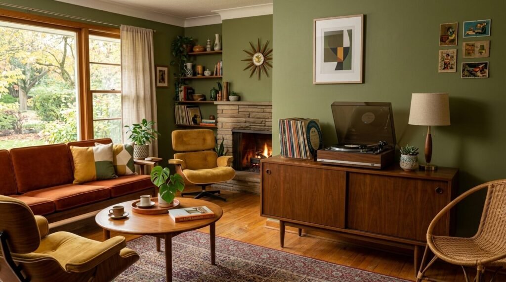
Olive green is sophisticated and moody. It has a vintage feel. It looks amazing with brass hardware. I have seen this work in mid century modern homes. It feels curated and thoughtful. Olive is a complex color that changes with the light. In the morning it looks fresh. At night it feels cozy. It is a great choice for adding character to a boring room.
14. Soft Sky Blue
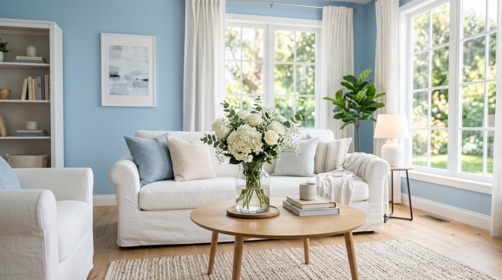
A very pale blue can look like a luxury hotel suite. The key is to pick a blue with gray or silver undertones. You do not want it to look like a baby boy room. It should feel like a clear morning sky. This color makes small rooms feel much taller. I love it on the ceiling of a white room. It adds a subtle layer of interest. It is a very fresh and clean look.
15. Warm Pewter
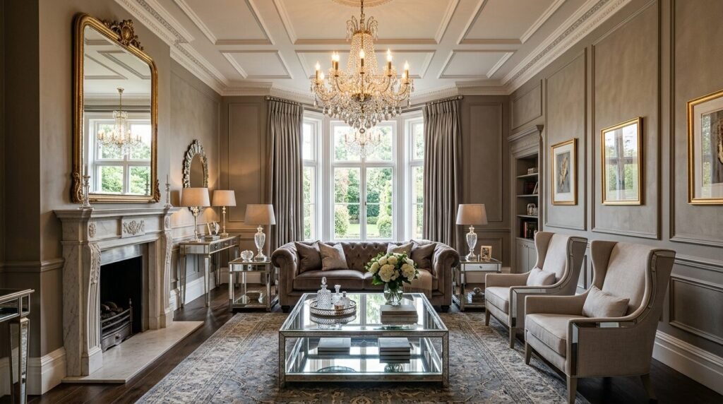
Pewter is a metallic gray that feels very high end. It has more depth than a standard silver. It works well with mirrored furniture. I like using this in formal living rooms. It feels polished and professional. It is a great backdrop for family photos in black frames. Pewter feels like a jewelry box for your home. It is a timeless and elegant choice.
16. Burnt Sienna
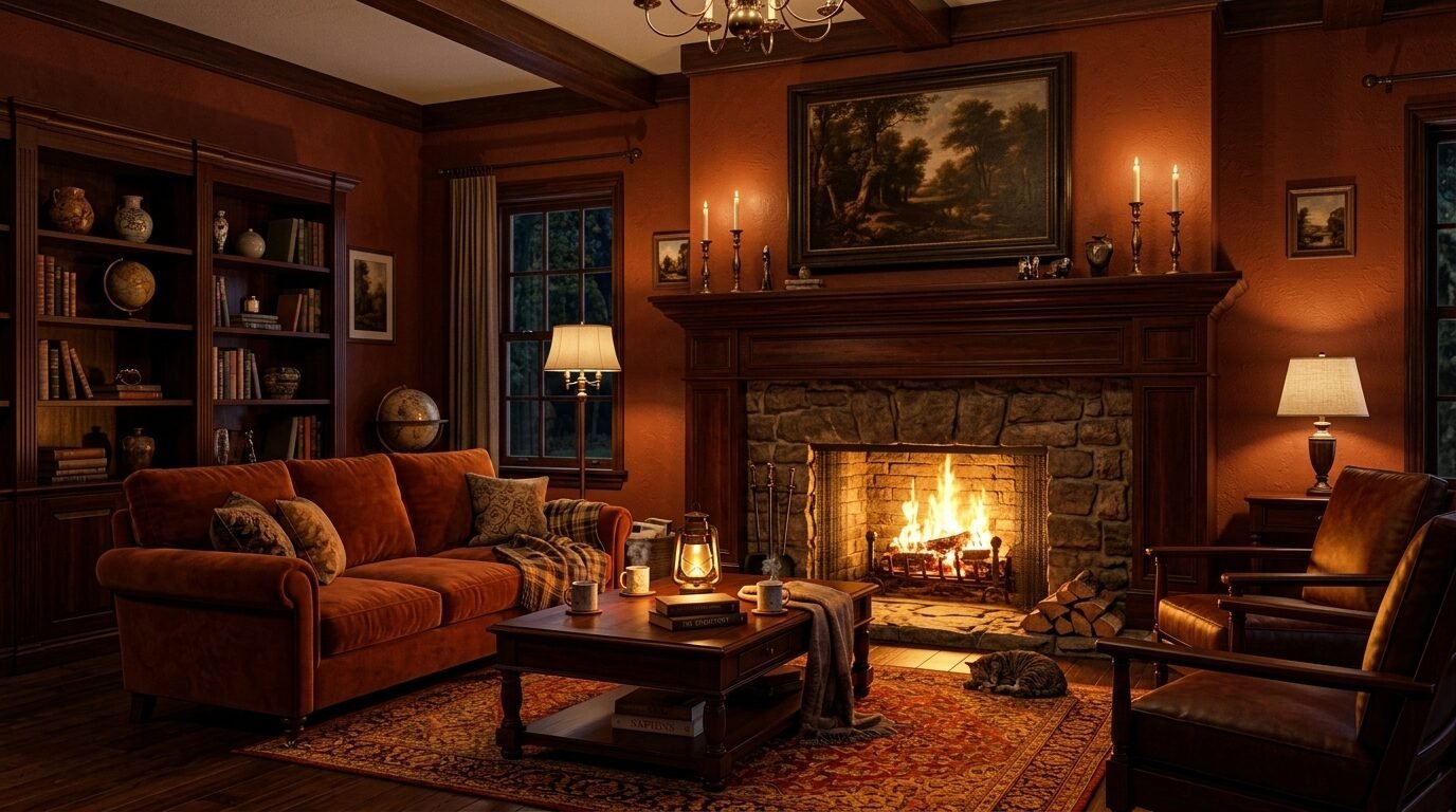
This is a deep reddish brown. It feels like aged leather or mahogany. It adds a lot of weight to a room. I suggest using this in a room with high ceilings. It helps bring the space down to a human scale. It feels very grounded and warm. Pair it with cream colored rugs for contrast. It is a very rich and soulful color.
17. Cool Mint
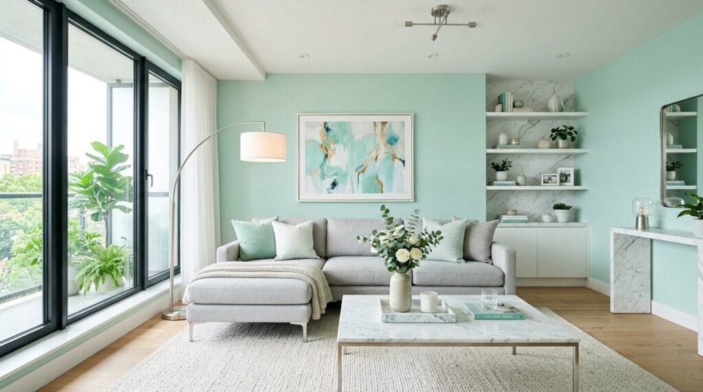
Mint can look cheap if it is too bright. A cool mint with gray undertones looks like expensive tile. It feels very refreshing and light. I like this for sunrooms or living areas near the kitchen. it creates a seamless flow. It looks great with white marble accents. It is a very chic and modern choice.
18. Champagne Gold
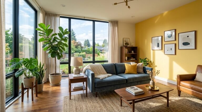
This is a very light yellow with a touch of tan. It looks like a glass of bubbly. It adds a subtle warmth to the walls. It is a great choice for rooms that lack natural light. It makes the walls glow from within. I often use this instead of beige. It feels more special and unique. It is a very soft and pretty color.
19. Stormy Teal
Teal is a high energy color. A stormy teal is more muted and mature. It feels like a deep sea adventure. I love this for a creative and vibrant living room. It works well with eclectic furniture. It makes a statement without being loud. I have used this on built in bookshelves with great success. It adds a custom look to standard shelving.
20. Oatmeal Neutral
Oatmeal has a lot of texture in its tone. It is a warm white with flecks of gray and brown. It feels very organic and raw. I love this for a rustic or farmhouse style. It looks like high end linen fabric. It is a very easy color to live with. It does not demand attention. It just makes everything else look better.
21. Dusty Rose
Rose is a soft and sophisticated pink. It feels vintage and collected. It looks amazing with dark wood floors. I suggest using this in a room with a lot of antique pieces. It bridges the gap between old and new. It is a very flattering color for skin tones. It makes the whole room feel warm and inviting.
22. Silver Fox
This is a cool gray that looks like polished stone. It is very sleek and modern. I love it in homes with open floor plans. It creates a consistent and high end look. It looks great with stainless steel accents. It is a very professional and clean color. It feels like a luxury high rise apartment.
23. Emerald Green
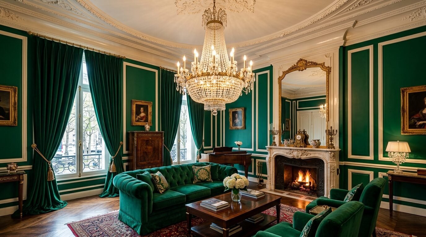
Emerald is the ultimate jewel tone. It feels very decadent. Use this in a room where you want to impress guests. It looks incredible under a chandelier. I suggest using a high gloss finish on the trim. This creates a very expensive and custom look. It is a bold color that feels very confident.
24. Taupe Brown
Taupe is a classic for a reason. It is a deep and rich neutral. It feels very solid and permanent. I like using this in rooms with large area rugs. It anchors the space beautifully. It is a very sophisticated alternative to gray. It feels like a warm hug. It is a very comforting and high end choice.
25. Soft Lavender
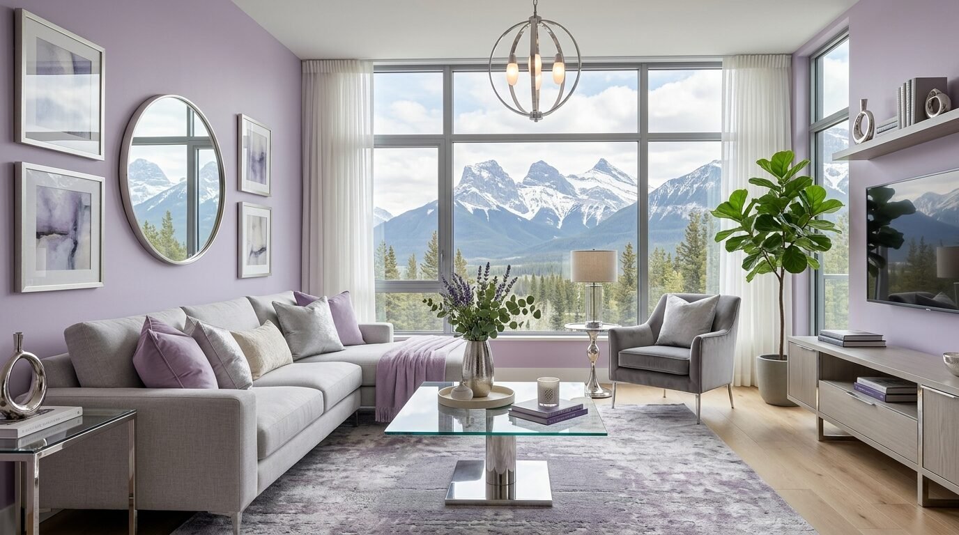
Lavender with a heavy gray base looks like a misty mountain. It is very ethereal and light. I like this for a calm and quiet living room. It feels very artistic and unique. Pair it with silver or chrome accents. It is a very fresh and modern take on a classic color. It looks like a high end art gallery.
Best Tools for a High End Finish
Picking the color is only half the battle. You need the right tools to make it look expensive. I have tried many brands over the years.
Essential Paint Supplies
- Purdy Brushes: These hold more paint and leave fewer streaks.
- Wooster Rollers: Use a 3/8 inch nap for a smooth finish on drywall.
- Handy Paint Pail: This makes cutting in much easier.
- FrogTape: This is the only tape that prevents bleed through.
- Sanding Sponge: Use this between coats for a professional feel.
Luxury Paint Brands
- Sherwin Williams Emerald: It has a beautiful flat finish that is still washable.
- Benjamin Moore Aura: The pigment is very rich and covers in fewer coats.
- Behr Dynasty: Great budget option that feels very thick and high quality.
Comparison Table: Light vs. Dark Hues
| Feature | Light Colors (Creams/Greiges) | Dark Colors (Navy/Charcoal) |
| Best For | Small rooms with low light | Large rooms with big windows |
| Mood | Airy and open | Moody and intimate |
| Maintenance | Shows scuffs easily | Shows dust and fingerprints |
| Furniture Pairing | Dark wood or colorful pieces | Light wood or metallic accents |
| Vibe | Relaxed luxury | Formal drama |
Frequently Asked Questions
Which finish looks the most expensive?
In my experience a matte or flat finish looks the most high end. It hides imperfections on the wall. It also absorbs light rather than reflecting it. This gives the color more depth. If you have kids or pets use a high quality washable flat paint.
Can I paint a small room a dark color?
Yes you can. Many people think it makes the room look smaller. I disagree. Dark colors blur the corners of the room. This can actually make the space feel infinite. Just make sure you have enough lamps.
How do I choose between cool and warm tones?
Look at your flooring. If your floors are warm like oak or cherry choose a warm paint. If you have cool gray floors or white tile choose a cool tone. Matching the undertones is the key to a professional look.
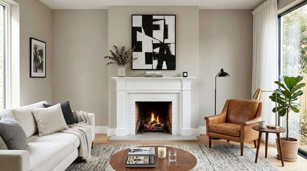
Is an accent wall still in style?
Accent walls are still great for a budget luxury look. They allow you to use a bold color without overwhelming the space. Pick the wall with the fireplace or the TV. It creates a natural focal point.
What is the best white for living rooms?
I always recommend Benjamin Moore Simply White. It is a very clean white but has a tiny bit of warmth. It does not look yellow or blue. It just looks like a fresh start.
How many coats of paint do I really need?
Always do two coats. Even if the paint says one coat. The second coat adds the richness and durability you see in magazines. It makes the color look solid and professional.
Should the trim match the walls?
Painting the trim the same color as the walls is a huge trend right now. It is called color drenching. It makes the room look much more expensive and custom. Use a different sheen like satin on the trim for a subtle contrast.
Conclusion
Creating a luxurious living room does not require a massive renovation. It starts with a single gallon of paint. The 25 colors I shared are proven to elevate a space instantly. Whether you want the airy feel of a coastal retreat or the moody drama of a city lounge there is a shade here for you. Remember to test your swatches in your own light. Paint a large square on the wall and watch it change throughout the day. Luxury is about the details and the effort you put into the finish. Start with one room this weekend. You will be surprised how much a simple color change can transform your home.

Sloane Whitaker is the Editor-in-Chief at Home Wall Trends, leading editorial direction with over a decade of experience in residential interior design and home styling. Her specialty is space planning and layout, the unglamorous fundamentals that make a beautiful room actually function. A graduate of the New York School of Interior Design, Sloane has styled over 200 client homes before turning her focus to digital publishing. Her editorial standard: “If a reader can’t picture themselves doing it on a Saturday afternoon, we haven’t explained it well enough.”