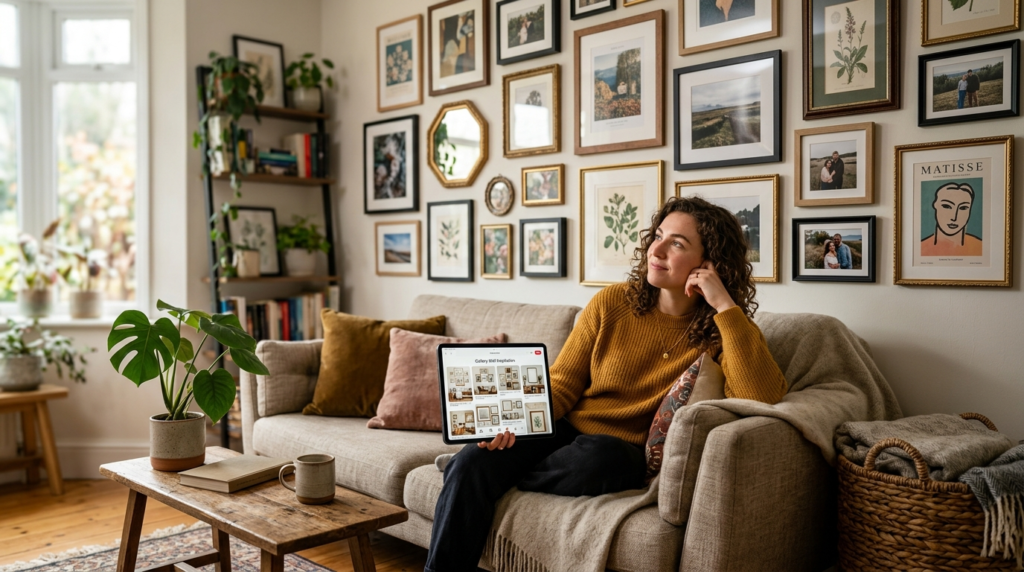
I remember my first attempt at a gallery wall in my cramped San Francisco apartment. I didn’t use a level. I used my eyes and a heavy dose of optimism. Three hours later, I had fourteen unnecessary holes in my drywall and a collection of frames that looked like they were sliding off the wall. My landlord was not happy. That failure taught me that a great art display requires more than just nails. It requires a system.
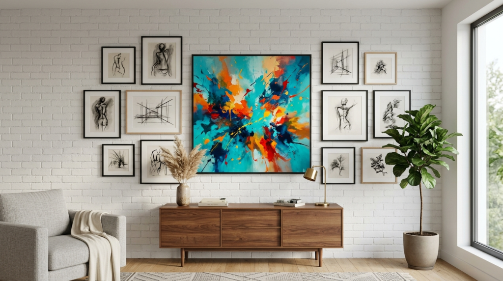
If you want a home that feels like a curated museum but functions like a cozy retreat, you are in the right place. These gallery wall living room hacks will save your sanity and your security deposit. We are moving past basic grids. I have tested these methods in client homes and my own living room over the last decade. Whether you live in a modern loft or a traditional suburban home, these tips will help you create a focal point that actually stays straight.
Summary
This guide provides 24 professional gallery wall living room hacks to help you design, hang, and maintain a stunning art collection. You will find practical advice on layout planning, hardware selection, and budget-friendly curation. We cover everything from the classic paper template method to advanced lighting setups. My goal is to give you the confidence to mix different frame styles and art mediums without making your room feel cluttered. By the end of this deep dive, you will know exactly how to space your frames, which tools actually work, and how to fix common mistakes before they happen. These insights come from years of trial and error in real American homes. We focus on results that look expensive but cost very little.
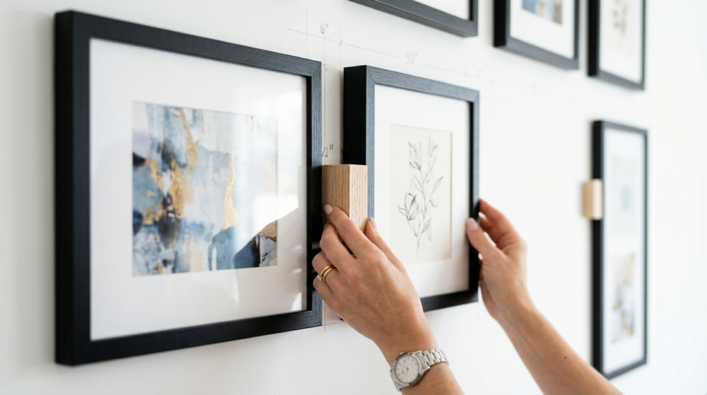
1. Trace Your Frames on Kraft Paper
This is the single most important rule for any art lover. I never hammer a nail without a paper template first. Buy a roll of brown kraft paper or use old grocery bags. Lay your frames down and trace the edges. Cut them out and label each one with the name of the art piece. Use painter tape to stick these templates to your wall.
In my experience, this saves you hours of measuring. You can move the paper around until the flow feels right. I once spent a whole Saturday moving paper shapes for a client in New York until we found the perfect balance. It prevented us from making twenty holes in her custom wallpaper. Use a pencil to mark where the hanging hardware is on the back of the frame directly onto the paper. Then you just nail through the paper and rip it away.
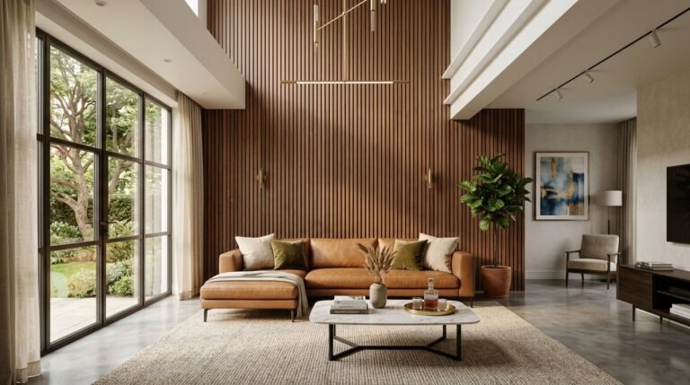
2. Start with a Focal Point Piece
Every gallery wall needs an anchor. This is usually the largest piece of art in your collection. Place this piece slightly off-center or at eye level first. Everything else will grow from this starting point. If you start with small pieces, the wall often feels disconnected or floating.
I saw a friend try to build a wall using only five by seven prints. It looked like a swarm of bees from across the room. We fixed it by adding one large sixteen by twenty landscape in the middle. Suddenly, the smaller prints had a purpose. Your anchor piece does not have to be expensive. It just needs to be big enough to command attention. This creates a visual weight that grounds the entire living room.
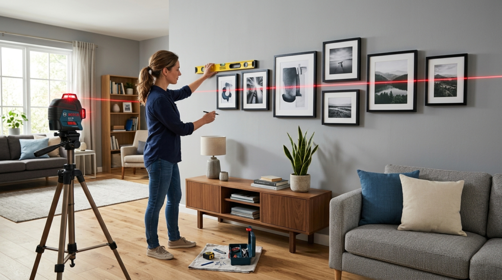
3. Use a Level and a Laser Level
Do not trust your eyes. Walls are often crooked and floors are rarely flat. A standard bubble level is good, but a laser level is a game changer for gallery wall living room hacks. You can project a straight line across the entire wall. This ensures your frames align perfectly along a horizontal or vertical axis.
I personally use a Bosch laser level I bought at a local hardware store years ago. It has saved me from dozens of lopsided displays. If you are on a budget, a simple torpedo level works fine too. Just make sure you check the level on the top of the frame and the side. Even a two millimeter tilt will become obvious once you step back five feet.
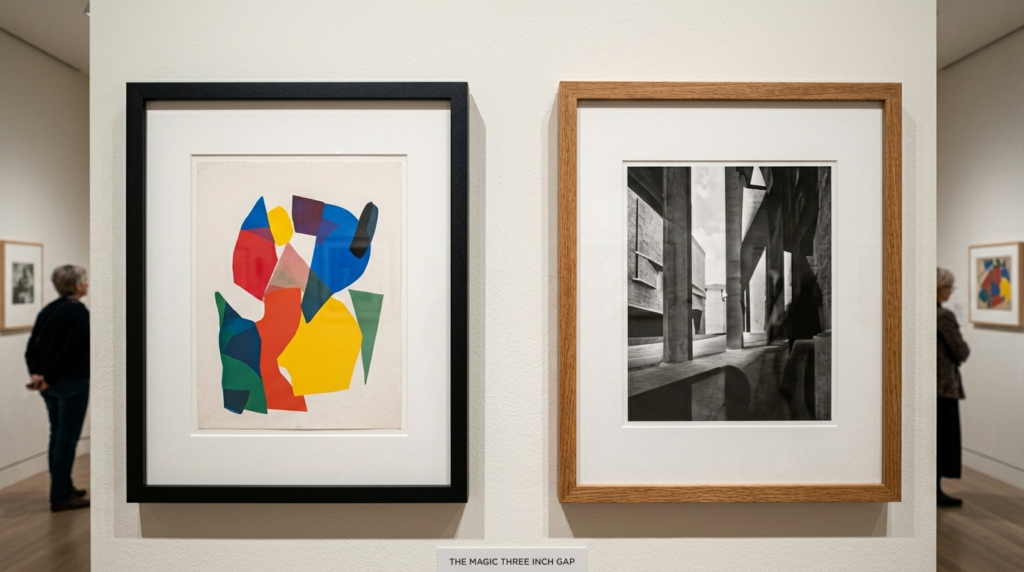
4. The Magic Three Inch Gap
Spacing is where most people fail. If your frames are too far apart, the wall looks sparse. If they are too close, it looks messy. Three inches is the industry standard for a reason. It provides enough breathing room for the art to shine while keeping the collection unified.
I have tried two inch gaps, but they often feel too tight in large living rooms. Four inches can work if the art is massive. For a standard eight foot ceiling, stay with three inches. I use a small block of wood cut to exactly three inches as a spacer. Hold the block between the frames as you hang them. This keeps the distance consistent without you having to pull out a measuring tape every thirty seconds.
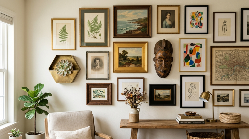
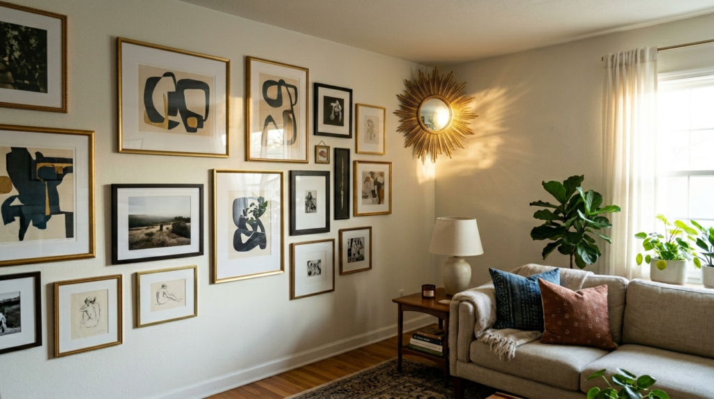
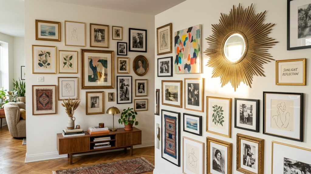
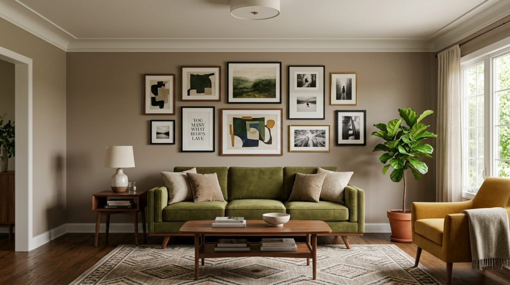
5. Mix Your Frame Textures
A wall of identical black frames can feel a bit like a corporate office. To get that Pinterest look, you need variety. I love mixing thin metal frames with chunky wooden ones. Throw in a vintage gilded frame from a thrift store to add some history.
I once worked on a project where we used nothing but white frames. It looked flat and boring. We swapped three of them for natural oak and one for a deep walnut. The wall immediately felt warmer and more personal. Texture adds depth. Think about the finish too. A mix of matte, glossy, and raw wood creates a visual story that feels like it grew over time rather than being bought in a single box.
6. Command Strips for Renters
If you cannot drill into your walls, Command strips are your best friend. They are the gold standard for gallery wall living room hacks in rental spaces. I have used them for years in my own homes. The key is to use the heavy duty versions and follow the instructions exactly.
Clean the wall with rubbing alcohol first. This is a step people always skip, and it is why frames fall at night. I once had a heavy mirror fall because I was lazy with the cleaning step. Now, I wait the full hour for the adhesive to set before I hang the art. These strips allow you to adjust the position of the frame slightly if you get the angle wrong. It is a forgiving way to build a large display.
7. Integrate Three Dimensional Objects
A gallery wall does not have to be flat. Some of the best displays I have seen include items like wooden bowls, brass keys, or small wall planters. These objects break the “sea of rectangles” and add a tactile element to your living room.
I have a set of vintage brass scissors hanging in my own gallery wall. It is a conversation starter every time someone visits. It also helps fill those weird, small gaps where a square frame just won’t fit. Look for items that have sentimental value. An old skeleton key from your first home or a dried flower press can make the art feel more like a personal story.
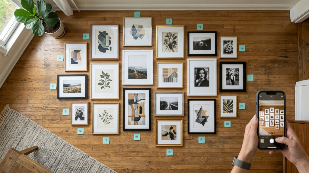
8. The Floor Mockup Method
Before you touch the wall, use your floor. Clear a space in your living room that is the same size as your wall area. Lay out your art and move the pieces around. This lets you see the colors and scales side by side.
I do this for every single gallery wall project. I often realize that two pieces of art have colors that clash when they are close together. It is much easier to swap a frame on the floor than it is to move a nail in the wall. Take a photo of the final floor layout on your phone. You can refer to this picture as you start hanging the templates. It keeps you on track and prevents “layout fatigue” halfway through the process.
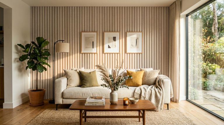
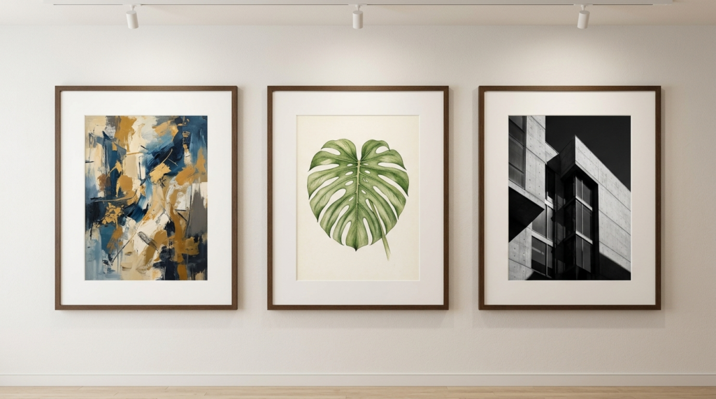
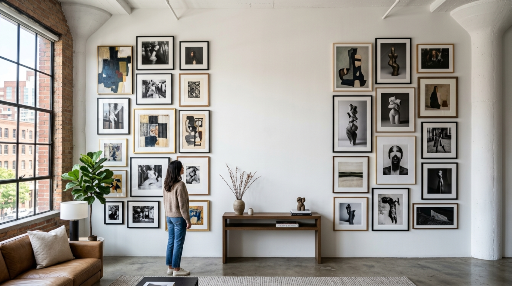
9. Use Consistent Matting
If your art is very different in style, use consistent matting to tie it all together. Using the same width and color of matting for every piece creates a professional, gallery-grade look. I usually go with a crisp white or a light cream.
In my experience, extra wide mats make even cheap prints look high end. I once took some basic postcards from a trip and put them in frames with five inch wide mats. They looked like expensive museum pieces. If you have a busy wall with lots of colors, the white space provided by a mat gives the eye a place to rest. It makes the whole living room feel more organized.
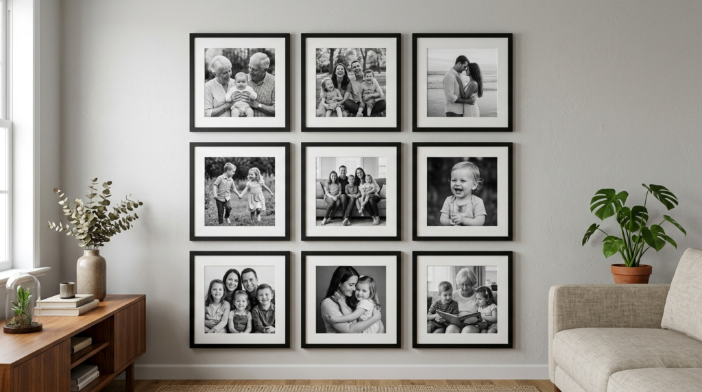
10. Frame Your Personal Photos in Black and White
Color photos can sometimes feel chaotic when grouped together. A great hack is to turn all your personal family photos into black and white prints. This creates a cohesive look regardless of when or where the photos were taken.
I did this for a hallway gallery wall last year. I had photos from the 1970s and photos from last week. In color, they looked messy. In black and white, they looked like a curated collection. It adds a timeless quality to your decor. You can use a simple phone app to desaturate your images before printing them. This is one of the easiest gallery wall living room hacks for a sophisticated home.
11. Incorporate Mirrors to Reflect Light
Mirrors are a secret weapon for art lovers. Adding one or two small mirrors into your gallery layout helps bounce light around the room. This is especially useful in dark living rooms or small apartments.
I like using round mirrors to break up all the straight lines of the frames. I once placed a small sunburst mirror in the corner of a gallery wall. It caught the afternoon sun and made the whole wall glow. It also creates the illusion of more space. If your living room feels cramped, a mirror in your art display can make it feel much more open and airy.
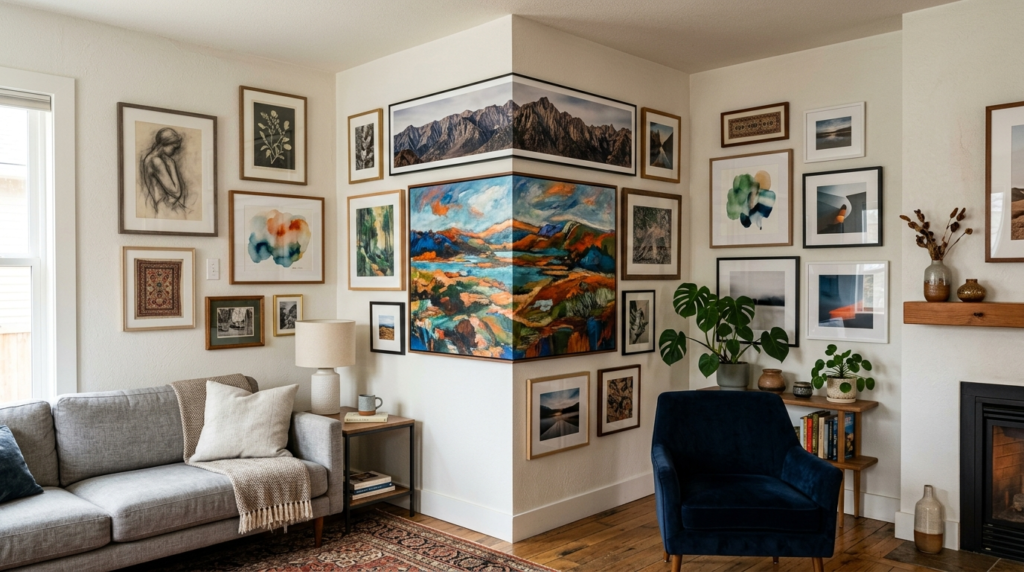
12. Create a “Corner Wrap” Gallery
Do not stop at the edge of the wall. Wrapping your gallery wall around a corner is a bold move that looks incredible. It connects two different areas of a room and makes the architecture feel more integrated.
I saw this in a cottage in Maine and it changed how I think about layout. They had art that flowed from the living room wall right onto the entry wall. It led the eye through the house. When doing this, make sure the spacing stays consistent as you turn the corner. Use your level to ensure the pieces on both walls align at the same height. It creates a cozy, “wrapped” feeling that is perfect for art lovers.
13. High Low Art Mixing
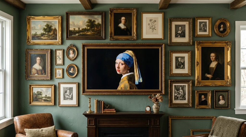
You do not need an expensive collection to have a great wall. The best gallery wall living room hacks involve mixing high-end pieces with affordable finds. Combine an original oil painting with a page from a vintage book or a piece of cool wrapping paper.
I have a framed Hermès scarf hanging next to a three dollar print I found at a garage sale. No one can tell the price difference because the frames are both high quality. This approach makes your home feel lived in and authentic. It shows that you have an eye for beauty, not just a big budget. Look for interesting typography in old magazines or even pieces of fabric with cool patterns.
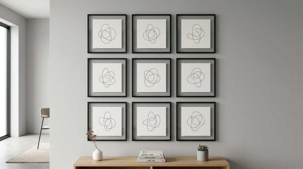
14. Use a Grid for Modern Minimalism
If you prefer a clean, organized look, go with a strict grid. This means using identical frames and spacing them perfectly. It is a very powerful look for a modern living room.
I recently helped a client hang a three by three grid of architectural sketches. We used a ruler to make sure every single gap was exactly two point five inches. It looked like a high-end art gallery. The key here is precision. If one frame is off by a hair, the whole thing looks wrong. Use your laser level and take your time. This style works best with art that has a similar color palette or theme.
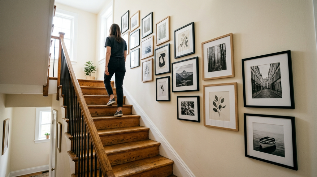
15. The Staircase Slope
Hanging art along a staircase is tricky but rewarding. The hack here is to follow the angle of the stairs. Measure a set distance from each step up the wall to create an imaginary “floor line” that angles upward.
I once spent four hours helping a neighbor with her staircase wall. We used the “center line” method. We drew a light pencil line that followed the slope of the stairs at eye level. Then we hung the art so the middle of every frame hit that line. It looked natural and balanced. Avoid hanging very heavy frames in high traffic areas like stairs where people might bump into them.
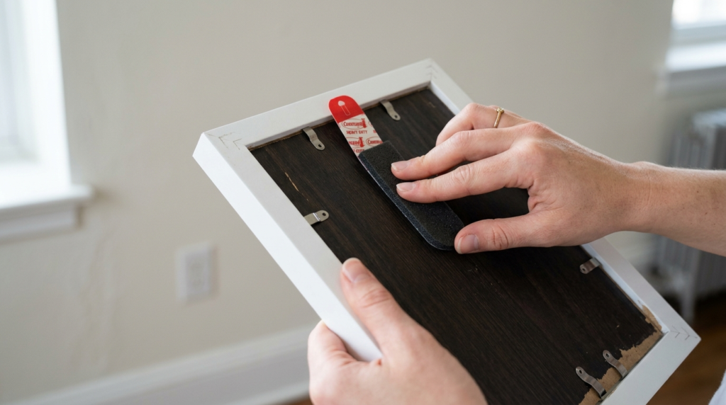
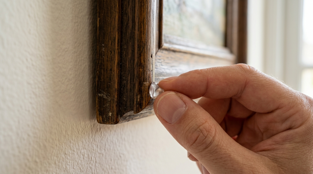
16. Use Museum Putty for Stability
Even if you hang your art perfectly, it will eventually shift. Doors slamming or people walking nearby can cause frames to tilt. Museum putty is a clear, removable wax that keeps frames in place.
I put a small pea sized dot of museum putty on the bottom corners of every frame I hang. I learned this after a small earthquake in California left my entire art wall crooked. The putty keeps everything perfectly level. It also prevents the frames from rattling against the wall. It is cheap, reusable, and safe for paint. This is one of those small gallery wall living room hacks that makes a huge difference in the long run.
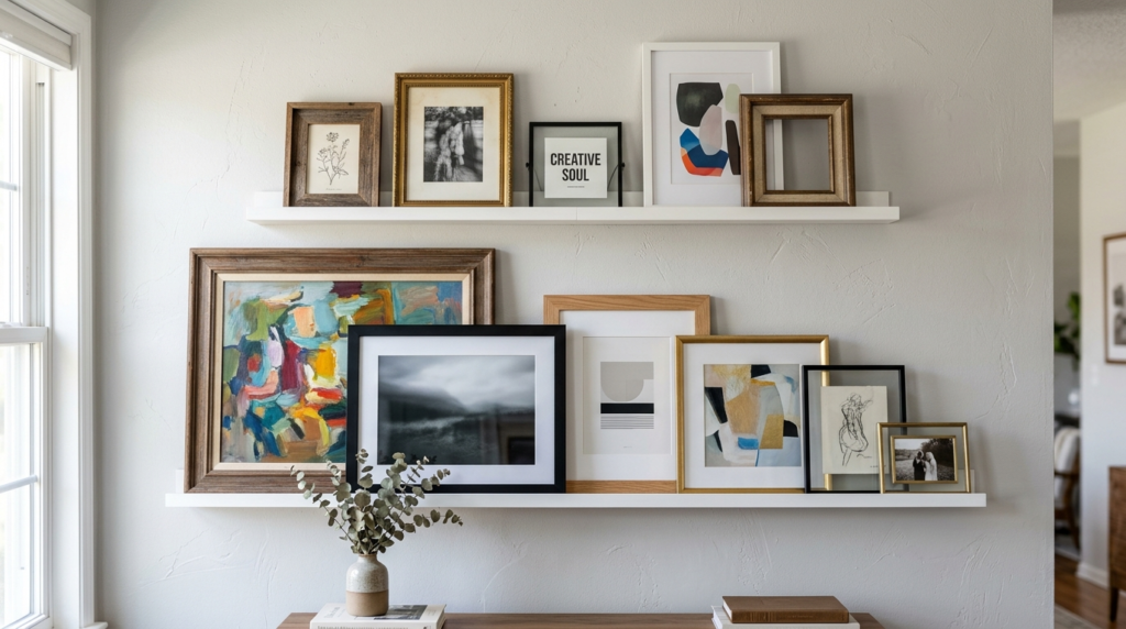
17. Layer Frames on a Picture Ledge
If you are indecisive, use picture ledges. These long shelves allow you to lean and layer your art without making holes for every piece. You can swap art in seconds as your mood changes.
In my experience, this is the best option for people who love to collect new prints. I have a ledge in my office where I rotate my favorite seasonal art. Layering a small frame in front of a larger one adds depth and a casual, effortless vibe. Just make sure the ledge has a small lip on the front so the frames do not slide off. IKEA makes great affordable versions of these ledges.
18. Match Your Art to Your Room Colors
Your gallery wall should feel like part of the room, not a separate entity. Pull colors from your rug, pillows, or curtains and find art that features those same tones. This creates a sense of harmony.
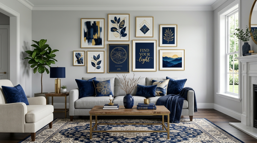
I once had a living room with a lot of navy blue and gold. I found three prints that featured small splashes of gold leaf. It tied the whole space together instantly. You do not need an exact match. Even a similar “vibe” or warmth level will work. If your room is full of cool tones like blues and greys, look for art with similar undertones. This makes the art feel like it was custom made for your home.
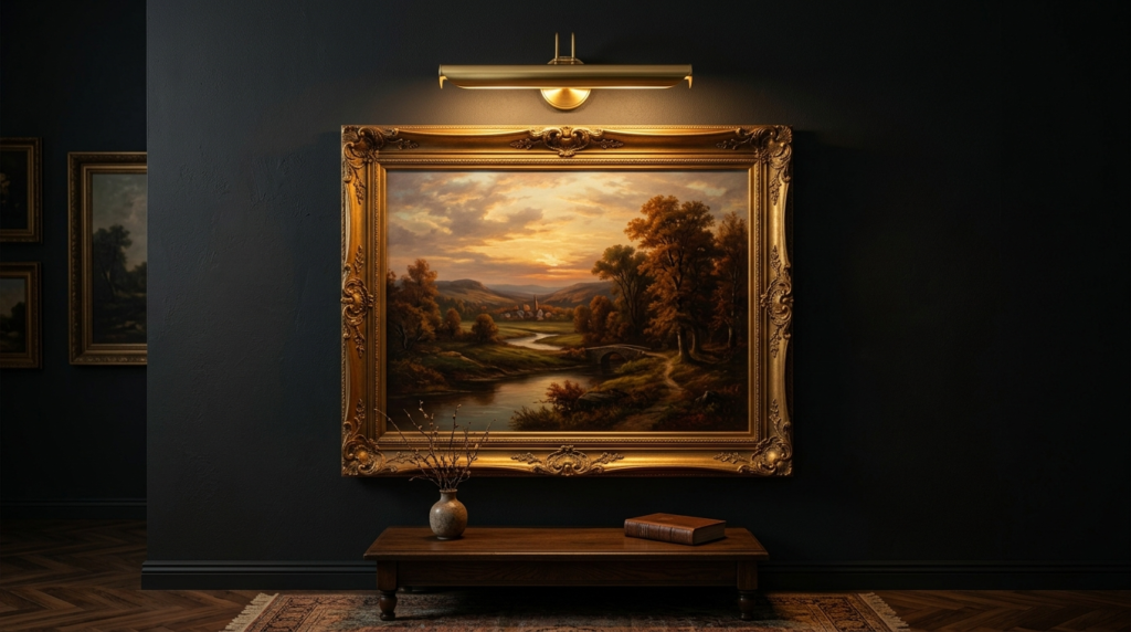
19. Don’t Forget the Lighting
Great art needs great light. If your living room is dim, your gallery wall will look flat. Consider adding a battery operated picture light above your main anchor piece.
I’ve noticed that most people overlook lighting until the end. I added two small spotlights to my gallery wall last year and it changed everything. The textures of the oil paintings finally became visible at night. You can now find wireless, remote controlled lights that stick to the wall. This means no messy cords and no need for an electrician. It makes your gallery wall look like a professional museum installation.
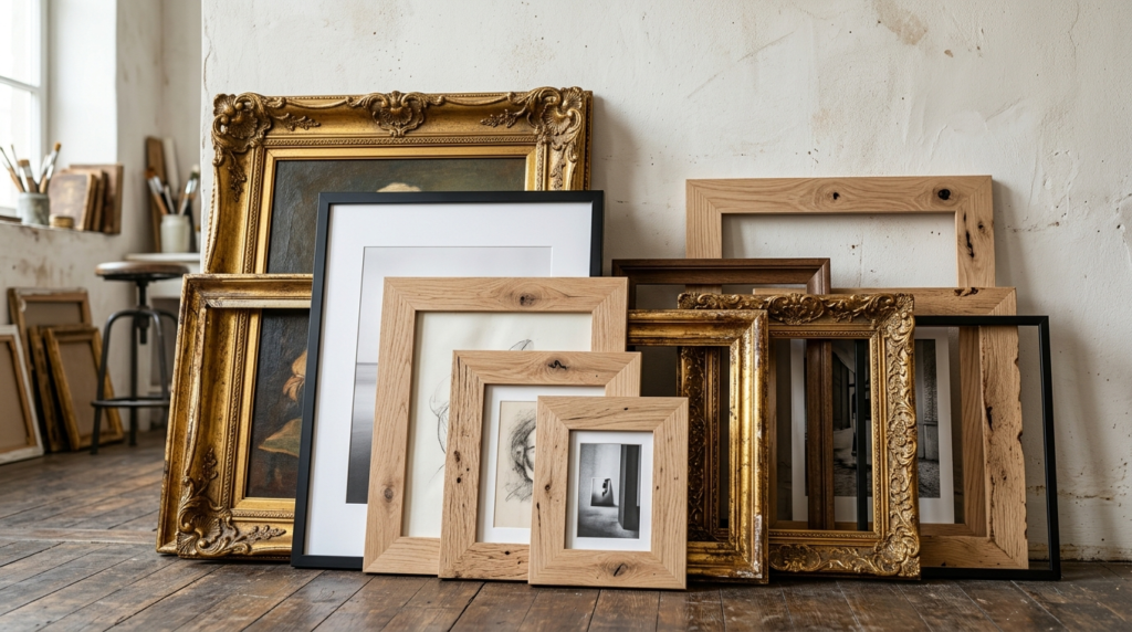
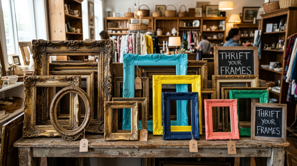
20. Thrift Your Frames
Buying new frames for twenty pieces of art can cost a fortune. I find most of my best frames at thrift stores and estate sales. Do not worry about the art inside the frame. Look at the quality and shape of the frame itself.
I once found a solid wood, hand carved frame for five dollars. It had an ugly painting of a duck inside. I threw the duck away, gave the frame a quick coat of black spray paint, and used it for a modern abstract print. It looks like it cost two hundred dollars. Mixing old and new frames gives your wall a “collected over time” feel that you simply cannot buy at a big box store.
21. Use Digital Art Screens
If you love art but have limited wall space, consider a digital frame like the Samsung Frame TV. You can display thousands of different artworks on one screen. When it is off, it looks exactly like a framed piece of art.
I’ve seen this work beautifully as the “anchor” for a gallery wall. You surround the TV with physical frames and prints. Most people do not even realize it is a television until it turns on. It is a great way to keep your living room feeling sophisticated while still having the tech you want. You can even upload your own photos or digital art purchases from sites like Etsy.
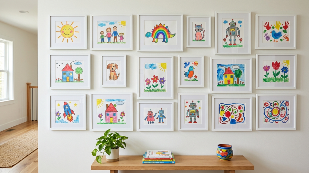
22. Hang Children’s Art with Pride
Your kids’ drawings can be high art if you frame them correctly. The secret is to use high quality frames and professional matting. This elevates a simple crayon drawing into a beautiful piece of decor.
I have a dedicated section of my living room for my daughter’s work. We use frames that open from the front so we can swap the art easily. It makes the kids feel like their creativity is valued. It also adds a pop of bright, uninhibited color that professional art often lacks. This is one of the most heartwarming gallery wall living room hacks you can use.
23. Pay Attention to the “Eye Level” Rule
A common mistake is hanging art too high. This is often called “gallery neck” because people have to look up to see the art. The center of your display should be roughly 57 to 60 inches from the floor.
I’ve seen many living rooms where the art is practically touching the ceiling. It makes the room feel unbalanced. If you are hanging art above a sofa, leave about six to eight inches of space between the top of the sofa and the bottom of the frames. This keeps the art connected to the furniture. You want the collection to feel like part of the seating area, not a separate floating island.
24. Be Brave with “Empty” Space
You do not have to fill every inch of the wall. Sometimes, leaving a gap can create a modern, edgy look. It allows the eye to breathe and focus on the pieces that are there.
I once worked with an artist who left a massive three foot gap in the middle of her gallery wall. It felt intentional and cool, like a pause in a conversation. Do not feel pressured to buy more art just to fill a hole. Wait until you find something you truly love. A gallery wall is a living thing. You can always add to it later. Patience is often the best hack of all.
Frequently Asked Questions
How do I choose a theme for my gallery wall?
You do not necessarily need a strict theme. However, having one common element helps. This could be a color, a frame style, or a subject matter like travel or nature. I usually tell clients to pick a “feeling” instead of a theme. If you want a moody room, look for darker prints and heavy frames. If you want a bright room, go with light wood and airy watercolors. In my experience, the most successful walls are those that reflect the personality of the people living there. Don’t worry too much about matching a specific style. If you love every piece individually, they will likely look good together.
What is the best way to hang heavy frames on drywall?
For heavy pieces, always use a wall anchor or find a stud. I never trust a simple nail for anything over five pounds. I prefer using “E-Z Ancor” twist-in toggles. They are easy to use and can hold a lot of weight without a lot of damage. If you are hanging a large mirror or a heavy framed canvas, use two hanging points instead of one. This distributes the weight and keeps the piece from tilting. I once saw a heavy frame rip right out of the wall because the owner used a tiny finishing nail. It ruined the art and the wall.
Can I mix black and white and color art?
Yes, you absolutely can. The key to making this work is balance. Do not put all the color pieces on one side and the black and white pieces on the other. Spread them out evenly. I like to use black frames for everything when mixing styles. This provides a consistent “border” that ties the different mediums together. I’ve noticed that adding a few black and white sketches helps tone down a wall that feels too bright. It adds a sophisticated layer to the collection.
How do I know if my gallery wall is too big for the room?
If the art is overwhelming the furniture, it might be too large. A good rule is that the art display should take up about two thirds to three quarters of the width of the furniture below it. If your wall is empty, you can go as big as you want. However, in a small living room, a floor to ceiling gallery can feel a bit claustrophobic. I suggest starting small and expanding over time. You will feel it when the balance is right. Trust your gut. If you walk into the room and immediately feel stressed, the wall might be too busy.
Is it okay to hang art over a fireplace?
Yes, but be careful with heat. If you use your fireplace often, the heat can damage oil paintings or cause paper art to warp. I suggest hanging less valuable pieces or using heat resistant glass. Also, make sure the art is high enough that it does not get soot on it. I’ve seen some beautiful fireplace displays, but they require a bit more maintenance. Check the back of your frames occasionally to make sure they aren’t getting too warm. If they are hot to the touch, you need to move them higher.
Conclusion
Creating a gallery wall is one of the most rewarding home projects you can take on. It is a chance to show off your history, your tastes, and your travels. By using these 24 gallery wall living room hacks, you can avoid the common pitfalls of crooked frames and damaged walls. Remember to plan your layout on the floor first and use paper templates to save your drywall. Don’t be afraid to mix vintage frames with modern prints or add 3D objects for more texture.
My biggest piece of advice is to have fun with it. Art is personal. There is no “perfect” way to do it as long as it makes you happy when you walk into your living room. I’ve changed my own art wall three times in the last two years, and each version felt right for that moment. Start with one piece you love and let the rest grow naturally. Your home is a work in progress, and your art should be too.

Amelia Hart is the Senior Design Editor at Vellora Interiors, where she curates small-space and apartment content. With a background in color theory and years spent designing under-500-square-foot rentals, she’s the editor who’ll tell you exactly which paint sheen, curtain length, and lamp height to choose, no guessing. A former design lead at a boutique studio, her work has been featured in several home and lifestyle publications. Her guiding belief: “Good design isn’t about more, it’s about choosing better.”