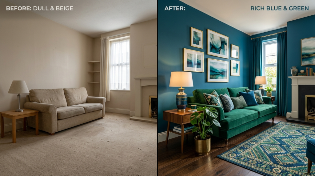
Staring at a beige living room feels like looking at a blank spreadsheet. It is safe. It is clean. It is also incredibly boring. My first apartment in Chicago was a sea of “rental tan.” I felt uninspired every time I walked through the door. I wanted a space that felt like a deep forest or a calm ocean. I wanted blue and green.
Most people fear these colors together. They worry the room will feel too dark or like a literal jungle. In my experience, mixing blue and green is the fastest way to make a home feel expensive without spending five figures. I have spent ten years testing these combinations. I have seen what makes a space sing and what makes it feel like a swamp.
This guide breaks down exactly how to use these shades. We will look at specific paint codes, furniture brands like West Elm and IKEA, and small shifts that change the entire mood. You do not need a degree in color theory. You just need a few brave choices and a weekend to move some furniture.
🔹 Executive Summary
This article provides a roadmap for using blue and green to create a high-end living room. You will see how to balance cool and warm tones using twenty specific strategies. We cover everything from $20 pillow swaps to $2,000 sofa investments.
Expect to see real-world examples using brands like Farrow & Ball and Benjamin Moore. I share my own failures, like the time I painted a wall “Submarine Blue” and it looked like a dark cave. You will learn how to avoid those mistakes. By the end, you will have a clear plan to refresh your space. We focus on ROI, emotional impact, and visual balance.
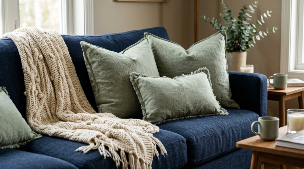
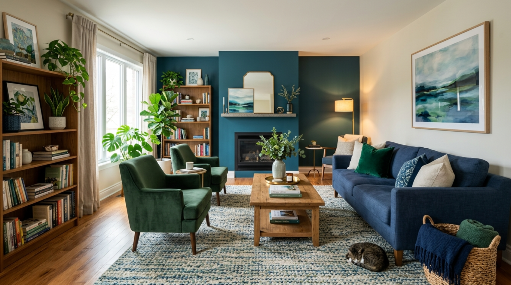
1. Layer Navy Blue and Sage Green for Instant Depth
Mixing a heavy dark color with a soft light color creates balance. Navy blue provides a grounded foundation. Sage green adds a breath of fresh air. I once helped a client who had a massive navy velvet sofa. The room felt heavy until we added sage green curtains.
In my experience, the trick is the ratio. Use 60% navy and 40% sage. This prevents the room from looking like a checkerboard. Try Farrow & Ball Hague Blue for the dark elements and Saybrook Sage for the accents. It feels sophisticated rather than childish.
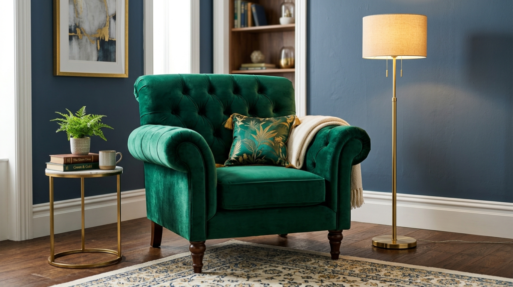
2. Use Emerald Green Velvet as a Focal Point
Emerald green is the “power suit” of interior design. It demands attention. A single velvet chair in this shade can carry an entire room. I bought an emerald chair from Article three years ago. It is still the first thing people mention when they visit.
Velvet catches light in a way that flat cotton cannot. This adds texture. If you have blue walls, an emerald chair creates a “jewel box” effect. It feels moody and cozy. Avoid cheap velvet that looks shiny. Look for matte finishes.
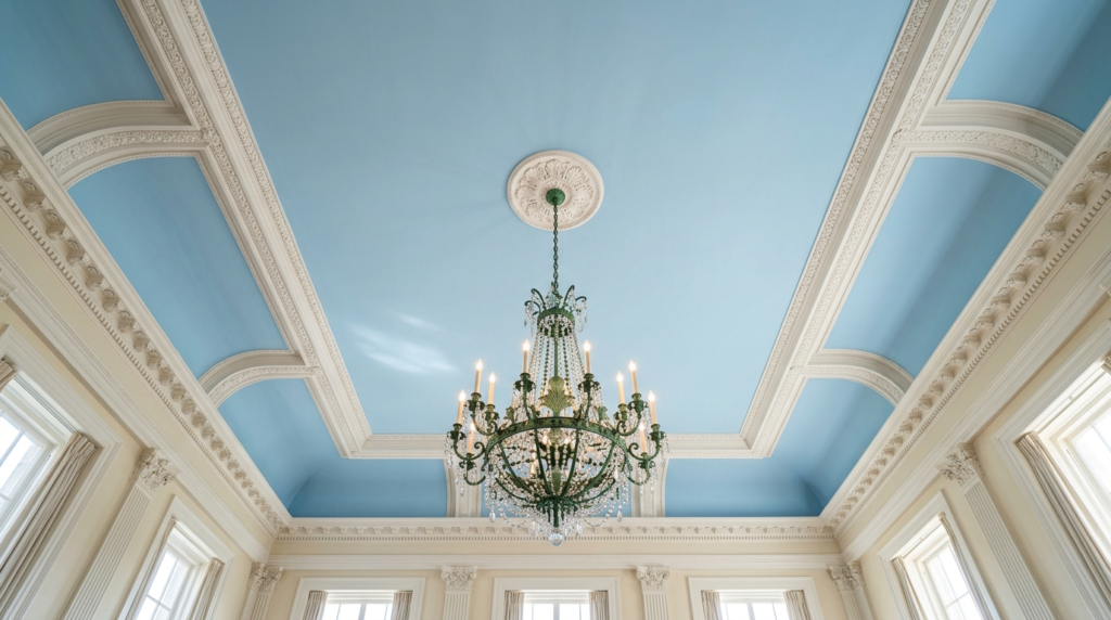
3. Paint the Ceiling a Soft Sky Blue
Designers call this “Haint Blue” in the South. It mimics the sky. Most people leave ceilings white. That is a missed opportunity. A soft blue ceiling makes the room feel taller. It draws the eye upward.
I tried this in a small sunroom last summer. The room felt twice as big instantly. Pair this with olive green plants on the floor. The blue ceiling acts as the sky and the plants act as the earth. It creates a natural, outdoor feeling inside your home.
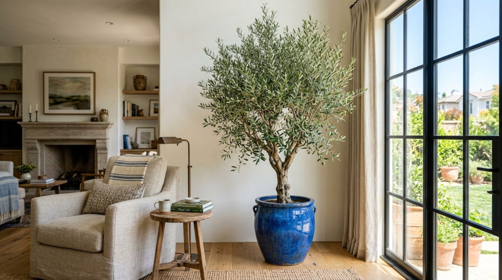
4. Introduce Large Olive Trees for Natural Greenery
Fake plants used to look terrible. Now, brands like Afloral or even IKEA have realistic options. A tall olive tree provides a dusty green that pairs perfectly with slate blue. The height of the tree breaks up the horizontal lines of your furniture.
I’ve noticed that people often buy plants that are too small. Go big. A six-foot tree in a corner changes the architecture of the room. Use a blue ceramic pot to tie the colors together. It creates a vertical bridge between your floor and your ceiling.
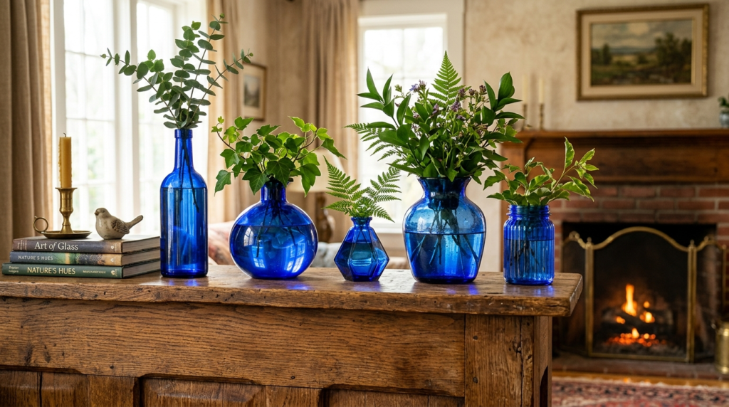
5. Style with Cobalt Blue Glass Accessories
Cobalt blue is intense. It can be overwhelming on a wall, but it is perfect for glass. Vases, bowls, or even a glass lamp base in cobalt add a “pop” that feels intentional. When light hits cobalt glass, it casts blue shadows across the room.
I love finding these at thrift stores. You don’t need to buy new. Look for vintage Empoli glass. Place these items near a window. The blue light will filter through and hit your green furniture, creating a beautiful layered effect.
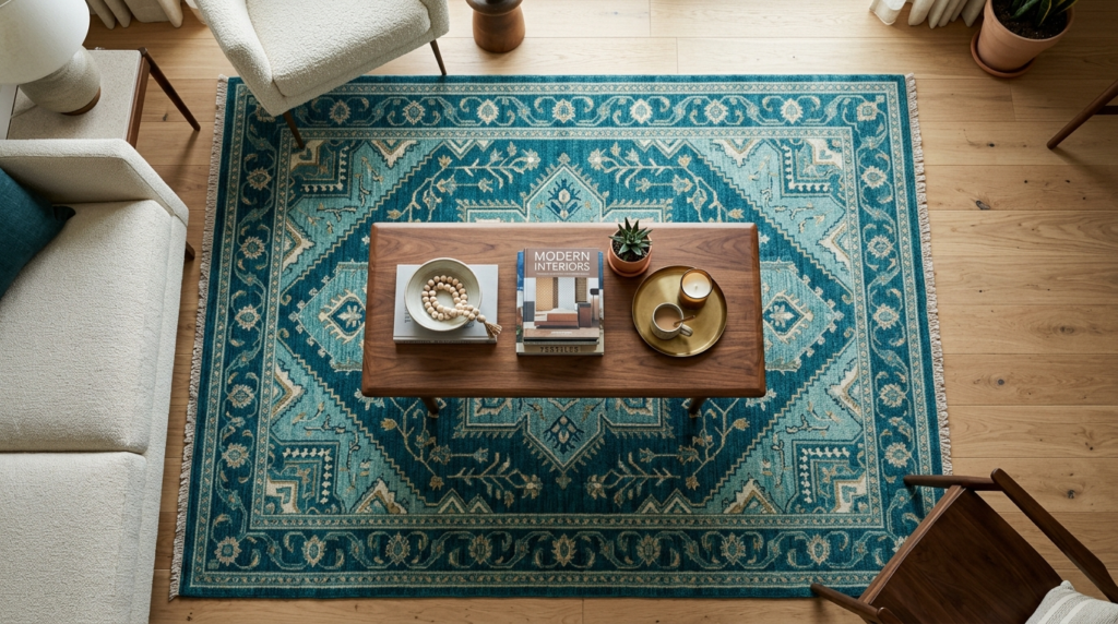
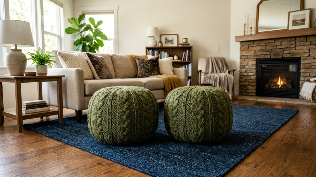
6. Ground the Space with a Teal Area Rug
A rug is the largest “block” of color in your room. A teal rug serves as a middle ground between blue and green. It contains elements of both. This makes it the perfect “bridge” color.
I recommend Ruggable for teal rugs if you have pets or kids. Their “Sotto Teal” rug is a great example. It stays flat and cleans easily. A teal base allows you to use darker navy furniture or lighter mint accents without anything clashing. It anchors the room.
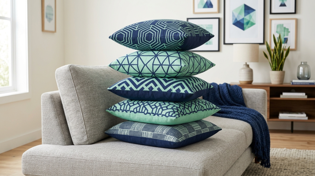
7. Mix Mint and Navy in Geometric Patterns
Mint green can look like a nursery color if you are not careful. To make it feel adult, pair it with navy blue. Use patterns. A navy blue pillow with a mint geometric print looks sharp and modern.
I saw this work perfectly in a West Elm catalog once. They used sharp lines to keep the colors from feeling too soft. It provides a crisp look. Use these patterns on smaller items like throws or ottoman covers. It keeps the energy high in the room.
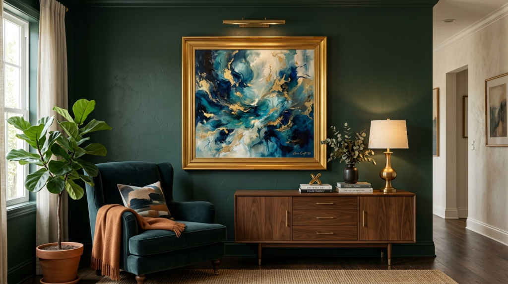
8. Create a Forest Green Accent Wall
If you want drama, forest green is the answer. It is a deep, moody shade that feels like a library. I painted my office forest green last year using Sherwin-Williams Cascades. It is my favorite room in the house.
A dark wall makes blue art stand out. If you have a light blue painting, put it on a dark green wall. The contrast is stunning. It makes the art look more expensive than it is. Just ensure you have enough lamps. Dark walls soak up light.
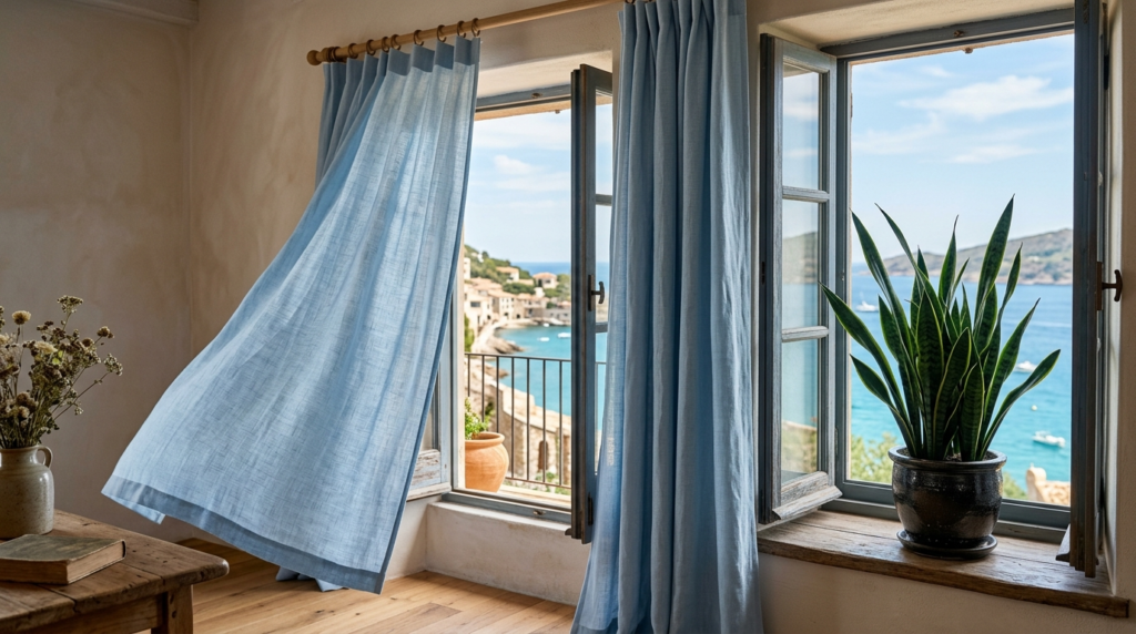
9. Hang Powder Blue Window Treatments
Heavy curtains can make a room feel closed off. Powder blue linen curtains feel light and airy. They frame the windows without blocking the view. When the sun shines through blue linen, the whole room gets a soft, cool glow.
I prefer linen over polyester. The texture looks more natural. Pair these with dark green velvet pillows on your sofa. The “heavy” green and “light” blue create a balanced sensory experience. It feels like a spring morning.
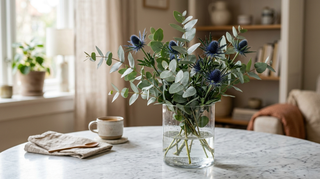
10. Use Eucalyptus and Blue Thistle for Floral Decor
You don’t always need paint or furniture to change a color scheme. Flowers are the easiest hack. Eucalyptus has a muted, silvery green leaf. Blue thistle has a sharp, structural blue head. Together, they are the perfect blue-green duo.
I keep a vase of these on my coffee table. They last for weeks even after they dry. It is a $15 investment that reinforces your color palette. It proves that you thought about every detail, down to the plants.
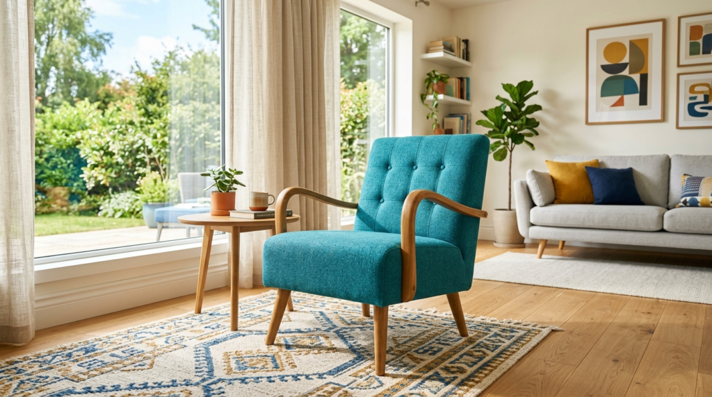
11. Add a Turquoise Mid-Century Modern Chair
Turquoise is a high-energy color. It leans toward the blue side but has enough green to feel tropical. A mid-century modern chair with wooden arms looks great in turquoise. The wood adds a warm brown that keeps the blue and green from feeling too “cold.”
I’ve seen people use two turquoise chairs facing a navy sofa. It creates a conversation area that feels separate from the rest of the room. It is a classic look that has worked since the 1950s. Brands like Joybird offer great custom options for this.
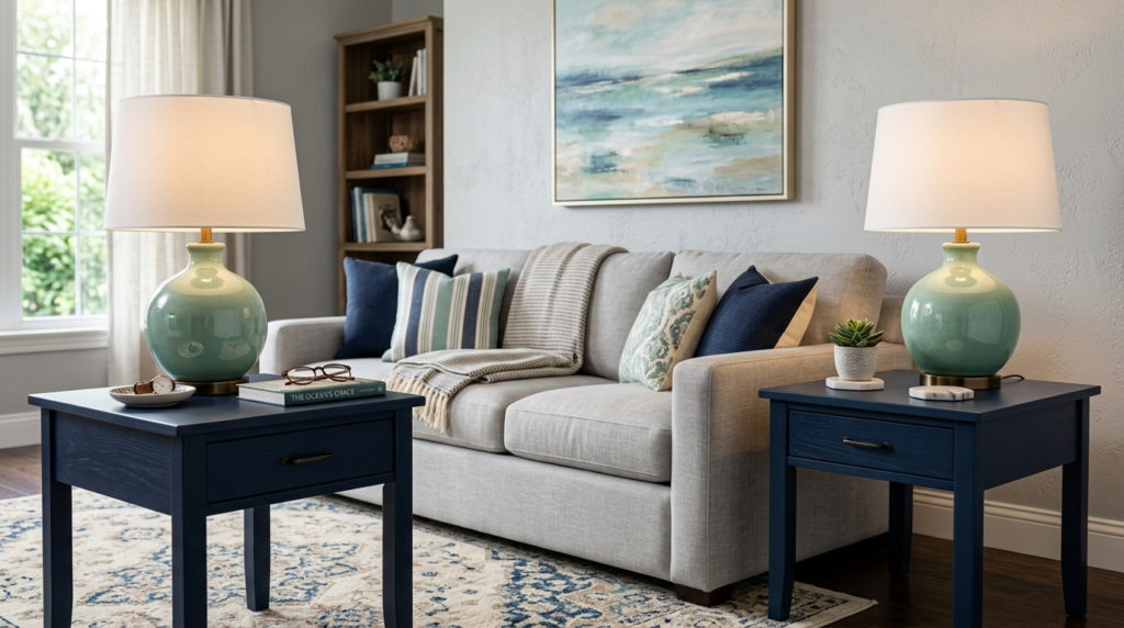
12. Choose Seafoam Green Ceramic Lamps
Lighting is often an afterthought. A seafoam green lamp is a subtle way to add color. Ceramic bases have a weight and a sheen that look high-end. Seafoam is a very “safe” green that works with almost any blue.
I found a pair of these at Target a few months ago. They sit on navy blue end tables. The light green against the dark blue is a classic coastal combination. It feels like a high-end beach house in the Hamptons.
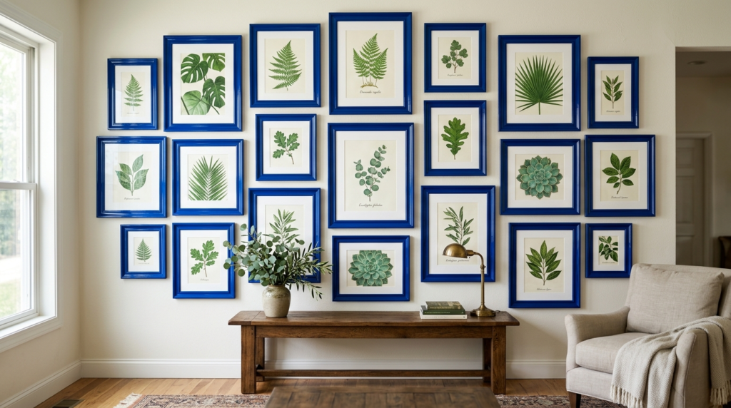
13. Frame Art in Royal Blue Frames
Most people use black, white, or wood frames. Royal blue frames are a bold choice. They turn the frame itself into a piece of art. If you have botanical prints (which are green), a blue frame makes the green leaves look more vivid.
I tried this with a set of three fern prints. I spray-painted cheap IKEA frames a glossy royal blue. The transformation was incredible. It looked like a custom job from a gallery. It is a cheap, fast hack for a Saturday afternoon.
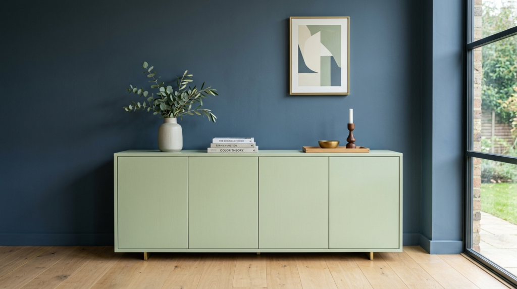
14. Try Pistachio and Slate Color Blocking
Color blocking is when you use large, solid chunks of color next to each other. Slate blue is a gray-blue that feels very industrial. Pistachio green is a creamy, warm green. These two “mismatched” colors actually look great together.
Think of a slate blue wall with a pistachio green sideboard. The contrast is unexpected. Most people wouldn’t think to pair them. In my experience, these “weird” combinations are the ones that make a home look professionally designed.
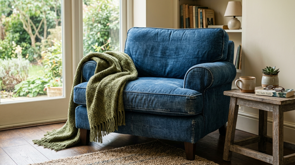
15. Incorporate Denim Upholstery for a Casual Vibe
Blue doesn’t have to be formal. Denim or chambray upholstery is durable and relaxed. It provides a blue base that isn’t as “preppy” as navy. A denim armchair is the perfect spot for a moss-green wool throw blanket.
I love denim for families. It hides stains and wears in like a favorite pair of jeans. It creates a lived-in feel. When you add green accents, the room feels like a cozy garden shed or a rustic cottage. It is very approachable.
16. Place Moss Green Textured Ottomans
Texture is just as important as color. A moss green ottoman in a chunky knit or boucle fabric adds a “fuzzy” element. Moss green is a very earthy, yellow-toned green. It pairs beautifully with denim or navy blues.
I use two small moss green ottomans as coffee table alternatives. They are easy to move. They add a soft edge to a room full of hard furniture. The green looks like actual moss growing in a blue-tinted forest. It is very grounding.
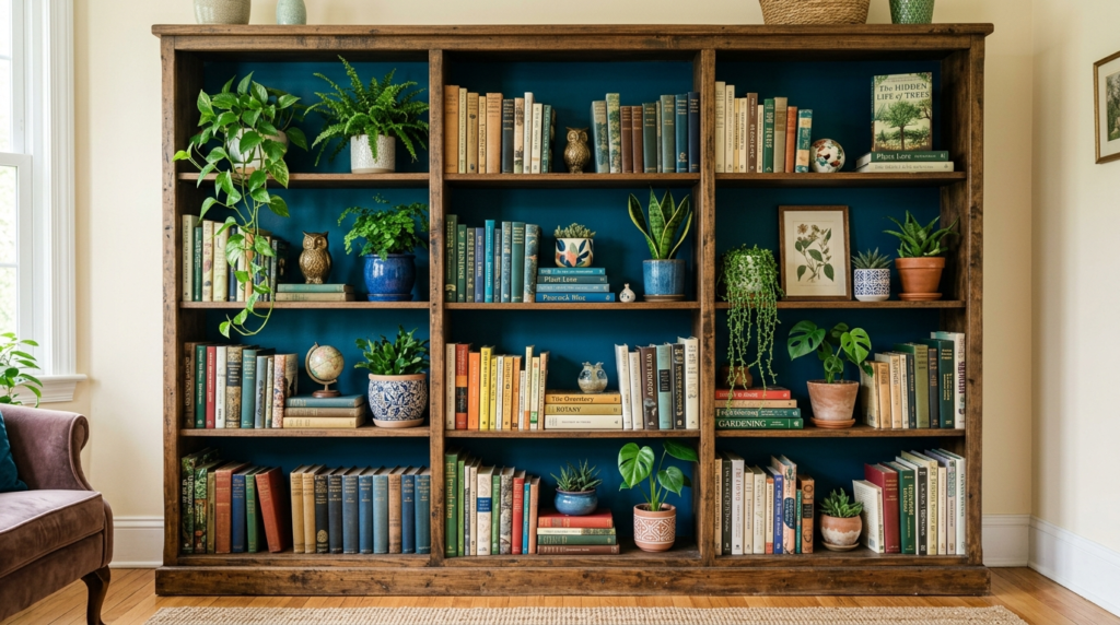
17. Paint Bookshelf Backing Peacock Blue
Peacock blue is a deep teal with a lot of soul. Painting just the back of your bookshelves this color creates depth. Your books and green plants will pop against the dark blue background.
This is a trick I used in my last rental. I didn’t want to paint the whole room, so I just did the shelves. It took two hours. It made the whole wall look like a custom built-in unit. Use a high-gloss finish for a glamorous look.
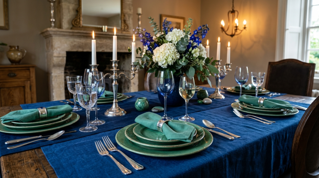
18. Set the Scene with Jade and Sapphire Tablescaping
If your living room has a dining nook, use your table to reinforce the colors. Jade green plates on a sapphire blue tablecloth look regal. It feels like a fancy dinner party every night.
I’ve noticed that people forget their table is part of the room’s decor. Even a sapphire blue runner with a jade green bowl of fruit makes a difference. It carries the color theme through the entire open-concept space.
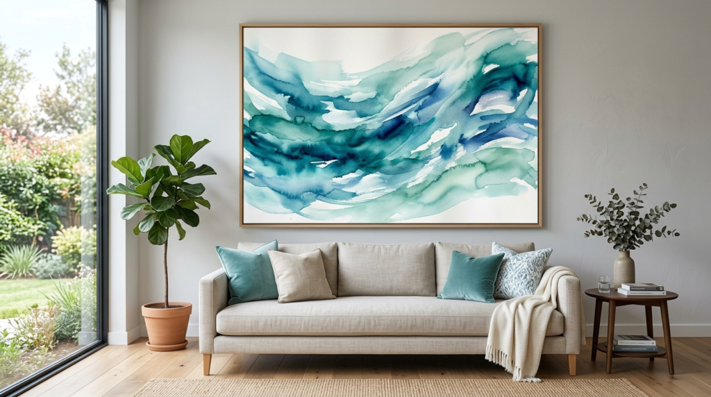
19. Hang Large Aquamarine Watercolor Art
Aquamarine is the color of clear Caribbean water. It is a perfect mix of blue and green. A large watercolor piece in these shades feels calming. Watercolors have a lot of white space, so the color doesn’t feel heavy.
I recommend looking on Etsy for digital prints. You can print them large and frame them yourself. One massive piece of art is better than ten small ones. It creates a clean, “Pinterest-worthy” focal point that ties your whole palette together.
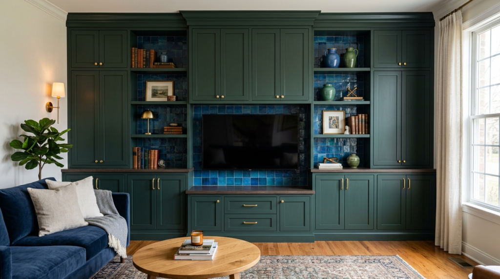
20. Install Hunter Green Cabinetry
If you have a wet bar or built-in cabinets in your living room, paint them hunter green. It is a classic, timeless color. Pair the green cabinets with blue backsplash tiles or blue bar stools.
I saw this in a renovated 1920s home. The hunter green looked original to the house. The blue accents made it feel modern. It is a bold move, but it has a huge payoff. It makes the room feel permanent and well-built.
🔹 Frequently Asked Questions
Can I mix dark blue and dark green in a small room?
Yes. Many people think dark colors make a room smaller. In reality, they make the corners disappear. This creates an illusion of infinite space. I’ve seen 10×10 rooms look like grand libraries when painted dark green with navy accents. Just make sure you have “layers” of light. Use floor lamps, table lamps, and overhead lights.
What is the best “neutral” to use with blue and green?
Tan or cognac leather is the best “third” color. The warmth of the brown balances the coolness of the blue and green. I always suggest a leather chair or a wooden coffee table. It keeps the room from feeling like a cold aquarium. White also works for a crisp, clean look, but wood adds more soul.
How do I know if my blues and greens clash?
Look at the undertones. Some greens are “yellow-greens” (warm) and some are “blue-greens” (cool). Some blues are “purple-blues” and some are “green-blues.” Generally, stay within the same “temperature.” If you use a warm olive green, pair it with a warm, slightly red-tinted blue. However, rules are meant to be broken. If it looks good to your eye, keep it.
What are three cheap ways to start this transition?
First, buy two green pillows for your blue sofa. Second, get a blue glass vase for your coffee table. Third, add a large green plant in a blue pot. These three items will cost less than $100 total. They will immediately signal a new color direction for your space.
Should I use matte or glossy paint for these colors?
For dark blue and green, matte or “eggshell” is usually better. Dark colors show every bump on a wall. Glossy paint reflects light and shows imperfections. I only use high-gloss for small areas like the inside of a bookshelf or a piece of furniture. Matte paint looks more modern and expensive on walls.
🔹 Conclusion
Changing your living room doesn’t require a total overhaul. It starts with a single choice. Maybe it is the sage green pillow or the cobalt blue vase. These colors are natural partners. They exist together in the forest and the sea. Bringing them into your home creates a sense of peace that white walls simply cannot offer.
In my experience, the best homes are the ones that reflect a clear point of view. Don’t be afraid to be “too much.” A bold room is always more memorable than a safe one. Start small, trust your gut, and watch your living room turn into your favorite place to be.
Sloane Whitaker is the Editor-in-Chief at Home Wall Trends, leading editorial direction with over a decade of experience in residential interior design and home styling. Her specialty is space planning and layout, the unglamorous fundamentals that make a beautiful room actually function. A graduate of the New York School of Interior Design, Sloane has styled over 200 client homes before turning her focus to digital publishing. Her editorial standard: “If a reader can’t picture themselves doing it on a Saturday afternoon, we haven’t explained it well enough.”