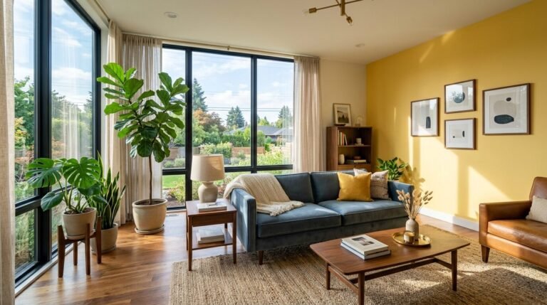
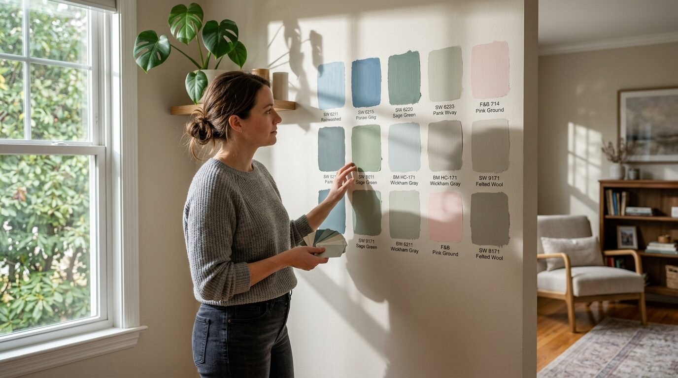
You walk into your living room and feel a heavy weight. The walls look flat. The color feels dated. You want a space that feels fresh yet wraps you in a warm hug. Choosing the right paint is the fastest way to change how your home feels. I have spent ten years helping homeowners pick colors that do not just look good on a swatch but feel right at 6:00 PM on a Tuesday. I have seen many people pick a gray that turns blue or a white that feels like a cold hospital. This guide helps you avoid those mistakes. We will look at colors that bring life to your space. These choices work for small apartments and large open houses. You will see how light affects these tones. We will talk about real costs and real brands.
Executive Summary
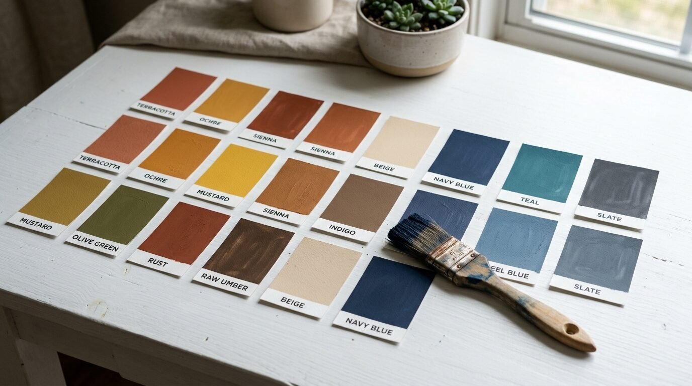
This guide gives you 25 specific paint choices to make your living room modern and cozy. You will see colors ranging from soft neutrals to deep moody tones. We look at brands like Benjamin Moore and Sherwin Williams. I include real prices for 2026 and how much time you need for these projects. You will find out why some colors fail in north facing rooms. We cover the shift from cool grays to warm greiges. You will see how to use matte and satin finishes to hide wall flaws. I share my own failures with dark greens and how I fixed them. By the end you will have a clear plan for your next DIY weekend.
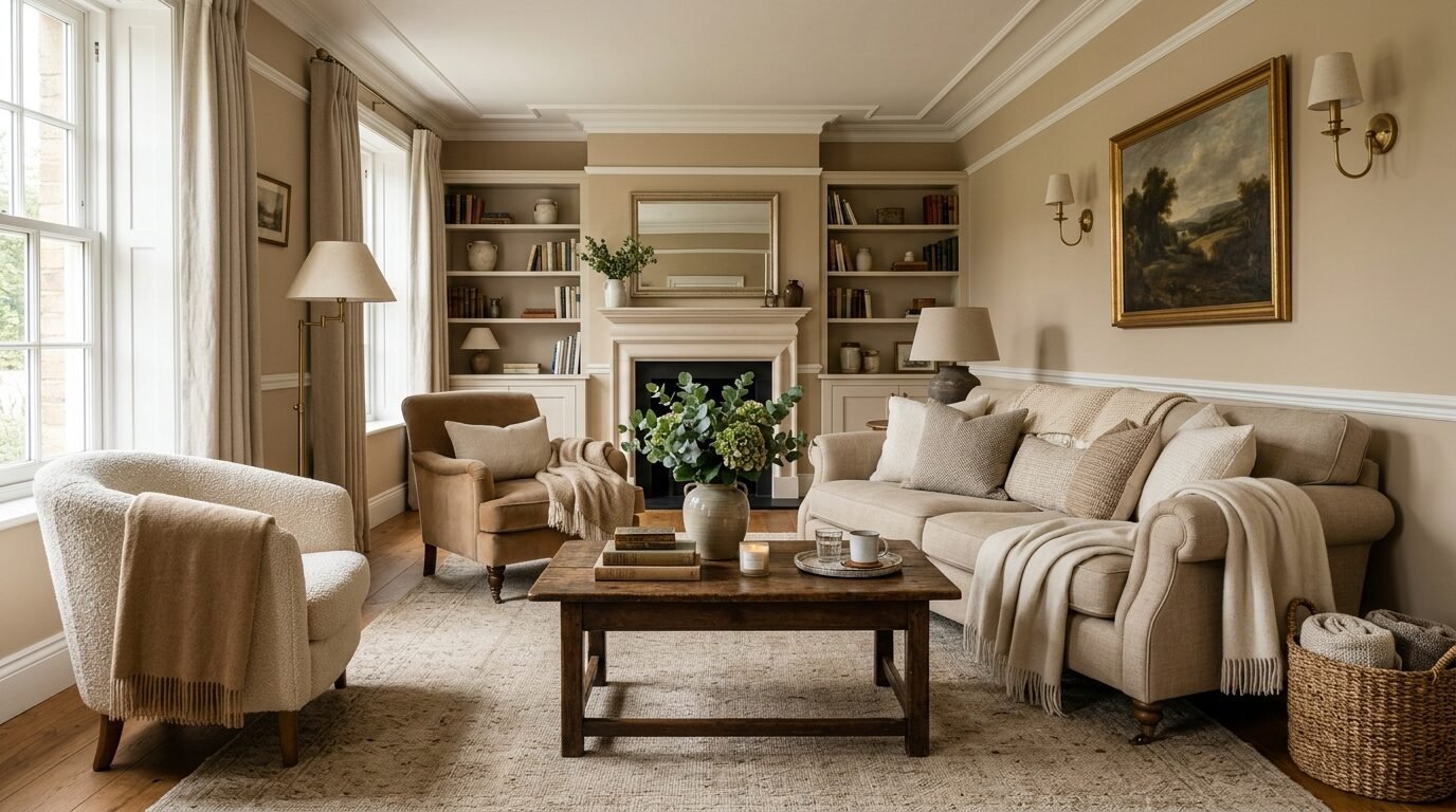
1. Soft Greige With Warm Undertones
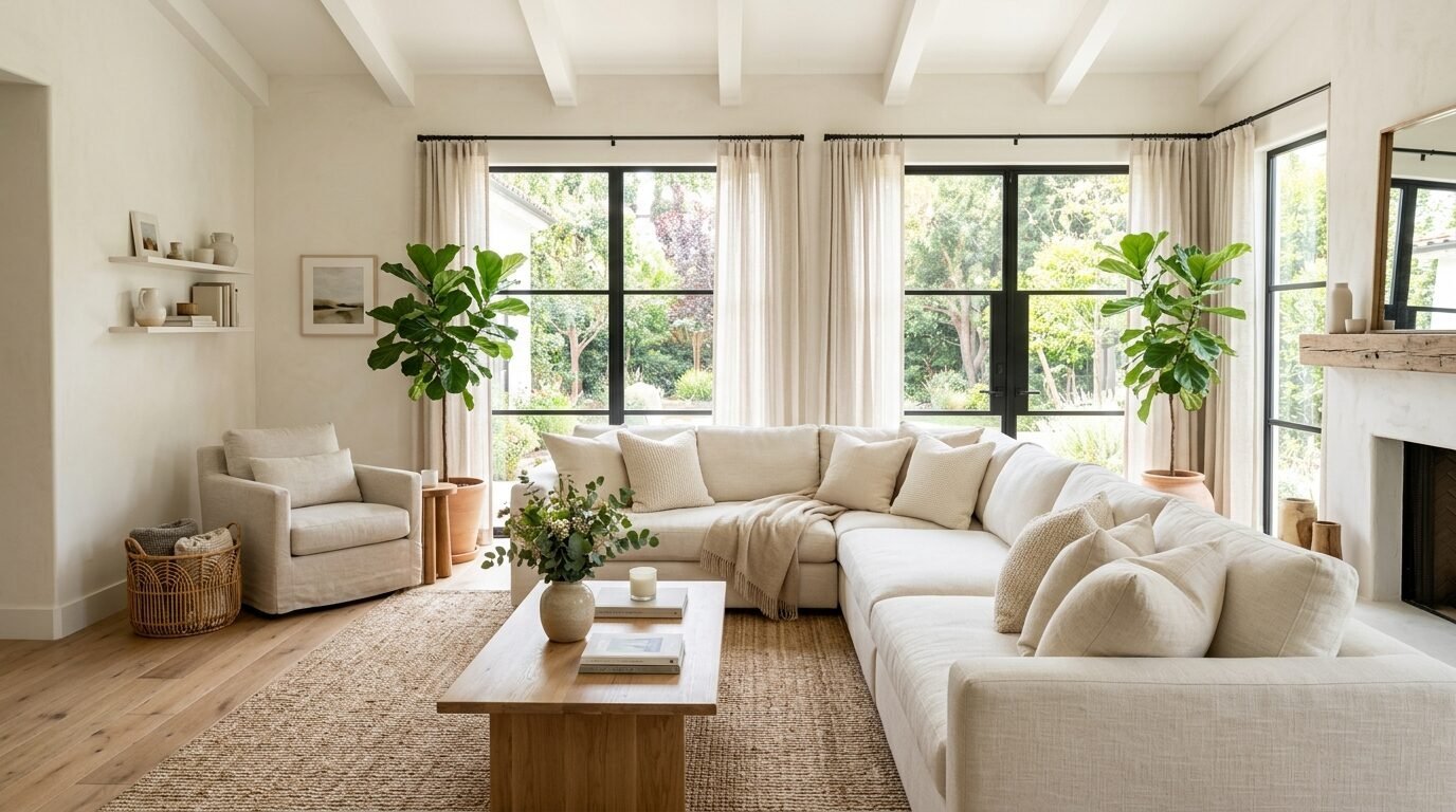
Greige is the mix of gray and beige. It is the most popular choice for a reason. It feels modern but avoids the cold feeling of pure gray. I used Revere Pewter by Benjamin Moore in a client’s dimly lit condo last year. It instantly made the room feel three feet wider. This color works because it adapts to your lighting. In the morning it looks crisp. At night it feels like a warm blanket. Use a flat finish on the walls to hide bumps. Use a silk finish on the trim for a subtle contrast.
2. Deep Forest Green For Moody Vibes
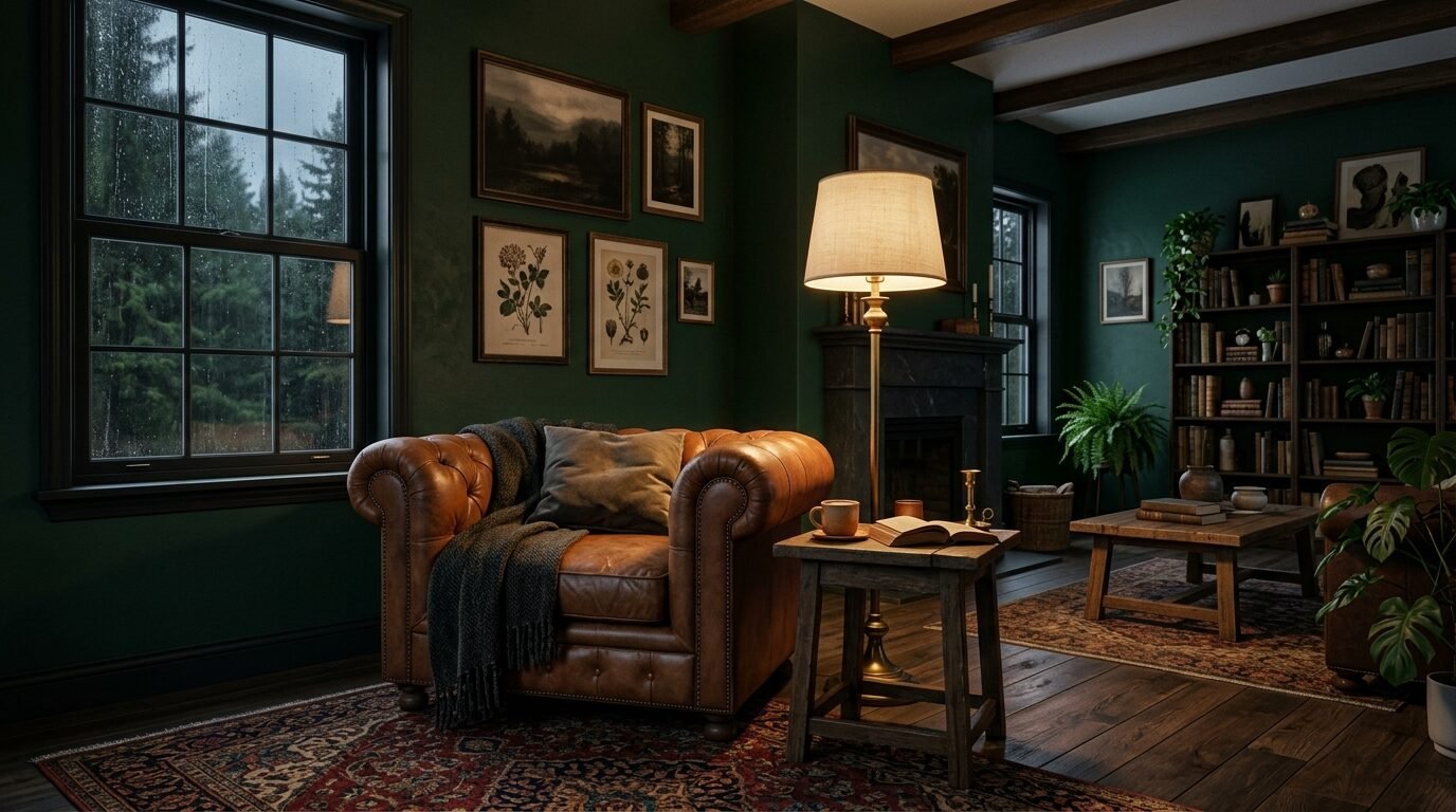
Dark green is the new navy. It brings the outdoors inside. I painted my own study in Salamander by Benjamin Moore. It felt risky at first. The room was small. Most people say dark colors make rooms look smaller. I found the opposite. The walls seemed to disappear. It created a deep sense of security. This color needs high quality paint to avoid streaks. Expect to pay 80 dollars per gallon for premium brands. You will need two coats and a dark primer.
3. Dusty Blush For A Sophisticated Glow
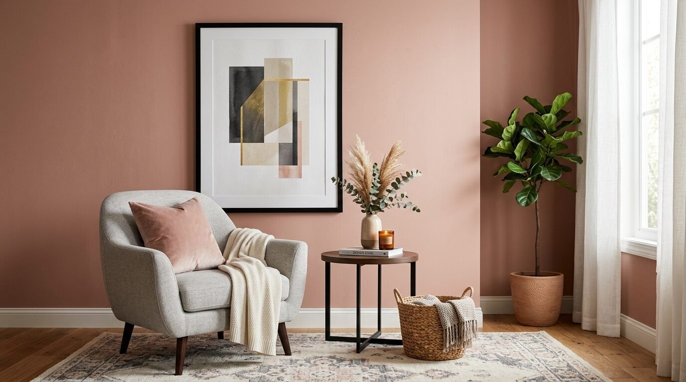
Forget bubblegum pink. Modern blush has gray and brown in it. It acts as a neutral. I saw this work perfectly in a West Coast bungalow. The light hit the walls and made everyone look healthy. It pairs well with light oak furniture and black accents. Setting Plaster by Farrow and Ball is a top choice here. It is expensive but the pigment depth is unmatched. If you are on a budget try Sherwin Williams Malted Milk. It gives a similar soft feel for less money.
4. Charcoal Slate For Sharp Contrast
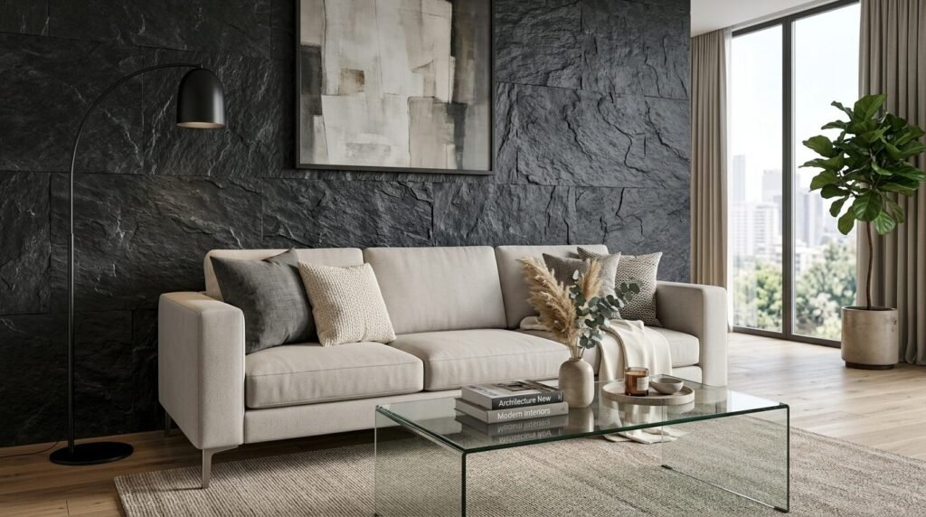
Charcoal is for people who want drama without the harshness of black. It looks great behind a light gray sofa. I once tried a cheap charcoal and it looked like a chalkboard. Do not skip the primer here. Iron Ore by Sherwin Williams is a classic. It has a soft velvet look when you use a matte finish. This color shows every fingerprint. If you have kids use a washable matte paint. This will cost about 10 dollars more per gallon but saves you hours of cleaning.
5. Pale Sage Green For Natural Calm
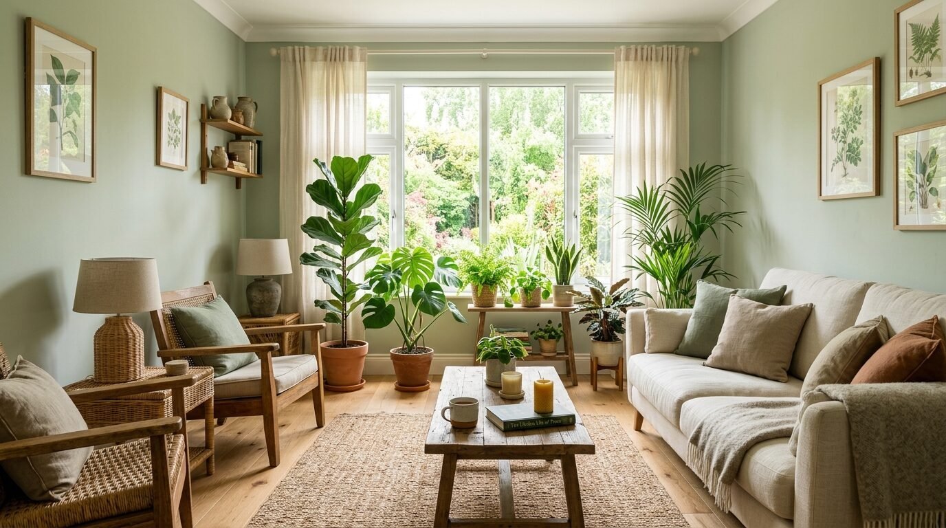
Sage green is a quiet color. It makes a living room feel like a spa. I recommend this for rooms with lots of plants. It makes the leaves pop. I used Saybrook Sage in a sunroom recently. The owner said her heart rate feels lower when she sits there. It is a very safe choice if you are scared of bold colors. It stays modern because it is not as yellow as the greens from twenty years ago. It feels fresh and light even on cloudy days.
6. Navy Blue For Timeless Elegance
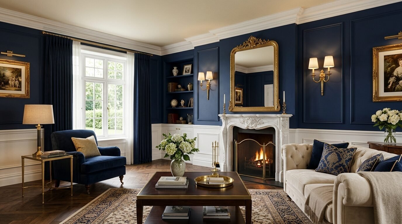
Navy is a safe way to go dark. It feels like a tailored suit. Hale Navy by Benjamin Moore is the gold standard. I have seen it in over fifty homes and it never looks bad. It works best with white trim and brass hardware. One mistake I see often is using navy in a room with no natural light. It can turn black quickly. Make sure you have good lamps. You will spend about 300 dollars on supplies for an average living room.
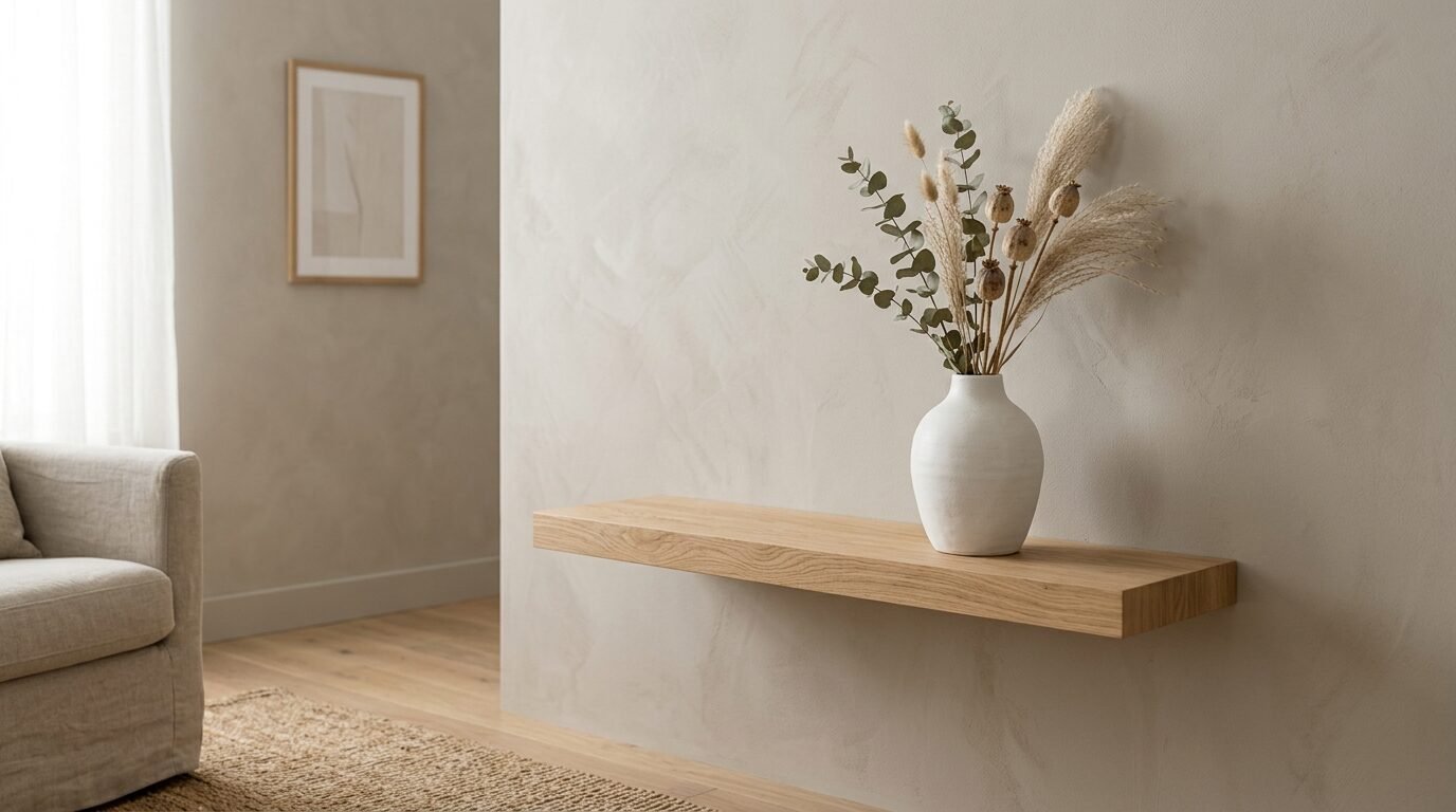
7. Creamy White For Airy Comfort
Pure white can feel sterile. Creamy white has a drop of yellow or gray. It feels like vanilla ice cream. Swiss Coffee is a favorite among designers. It creates a soft backdrop for colorful art. I noticed that high gloss white trim makes creamy walls look intentional rather than old. This is a great choice if you plan to sell your home soon. Buyers love it because it looks clean and bright.
8. Muted Mustard For Earthy Warmth
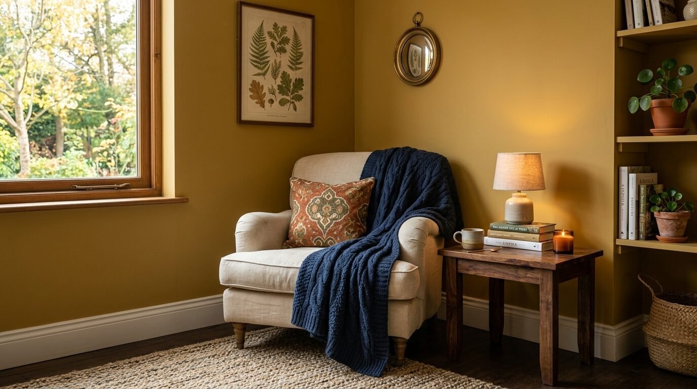
Mustard is bold but cozy. It reminds me of autumn leaves. You should use a muted version so it does not feel like a fast food joint. I saw a living room in Portland with mustard walls and dark wood floors. It felt incredibly inviting. Look at Ochre by Farrow and Ball. It is rich and deep. Pair it with navy pillows to balance the heat. This color looks best under warm LED bulbs.
9. Teal For A Rich Jewel Tone
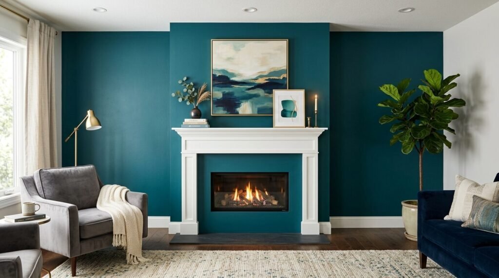
Teal sits between blue and green. It is a jewel tone that feels expensive. I used a deep teal for a feature wall behind a fireplace. The flickering orange flames against the teal looked stunning. It creates a focal point instantly. Be careful with your rug choice. A busy rug can make teal feel overwhelming. Stick to neutral floors.
10. Mushroom Brown For A Natural Hug
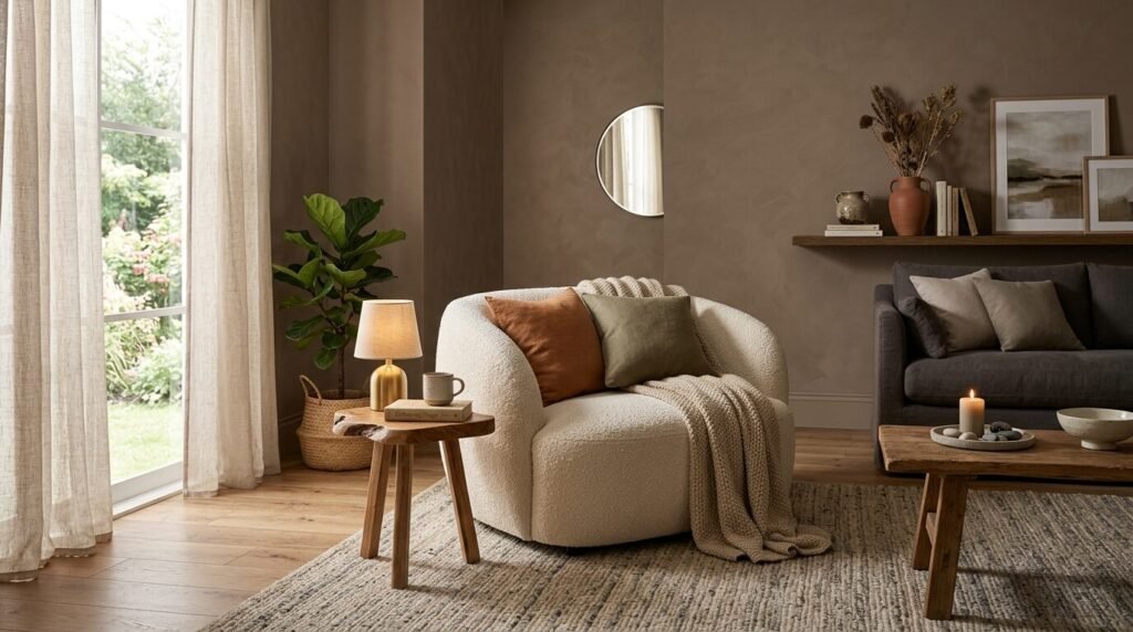
Mushroom is a mix of brown and gray. It is darker than greige but lighter than chocolate. It feels very grounded. I used this in a basement living room to hide the fact that the ceilings were low. It felt like a cozy cave in the best way. Jogging Path by Sherwin Williams is a great example. It works well with linen fabrics and textured rugs.
11. Greige With Pink Undertones
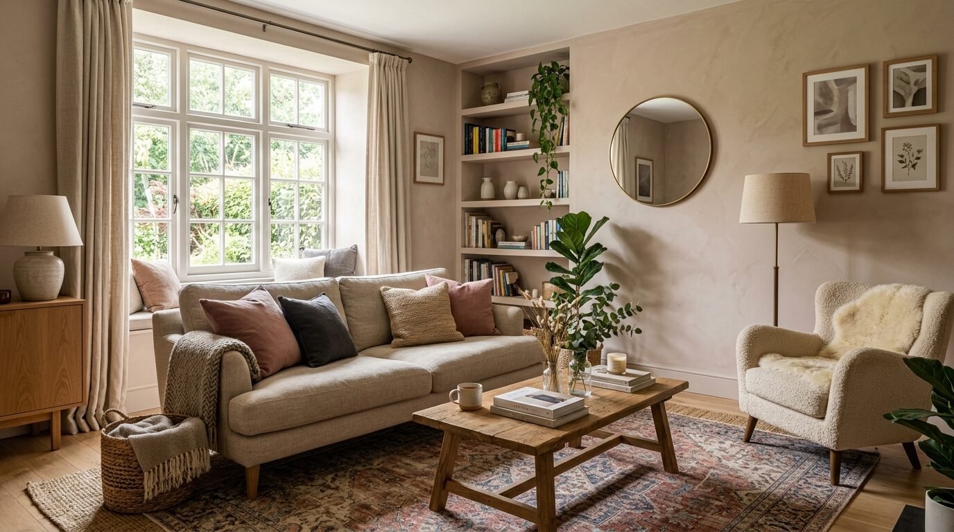
Some greiges feel too green or blue. A greige with a hint of red or pink feels much warmer. This is perfect for north facing rooms that get cold blue light. It balances the chill. I tried this in my first apartment. It made the space feel sunny even when it was raining. Look for colors that describe themselves as “warm” or “sandy.”
12. Terracotta For A Mediterranean Feel
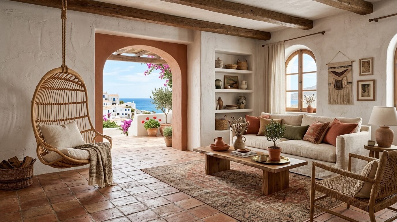
Terracotta brings a sun drenched feeling to your home. It is a mix of orange and brown. It feels very earthy and modern. I see this a lot in desert homes but it works anywhere. Use a clay based paint for a chalky texture. This adds to the organic look. It pairs beautifully with wicker furniture and cacti.
13. Olive Green For Organic Depth
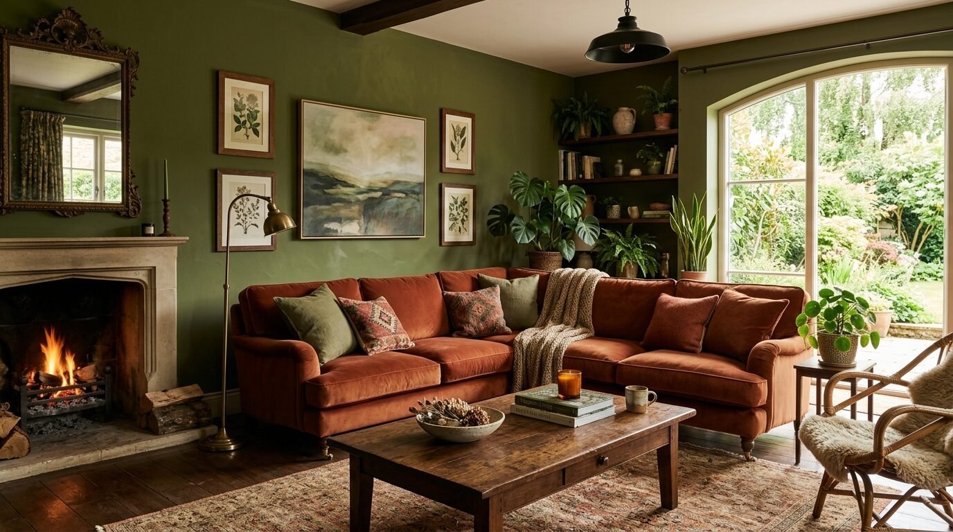
Olive is more sophisticated than sage. It has more yellow and brown. It feels historic but fits modern furniture. I saw an olive green room with a velvet rust sofa. It was the most stylish room I had ever entered. Olive Green by Benjamin Moore is a solid pick. It covers well and often only needs two coats.
14. Sky Blue For An Open Feeling
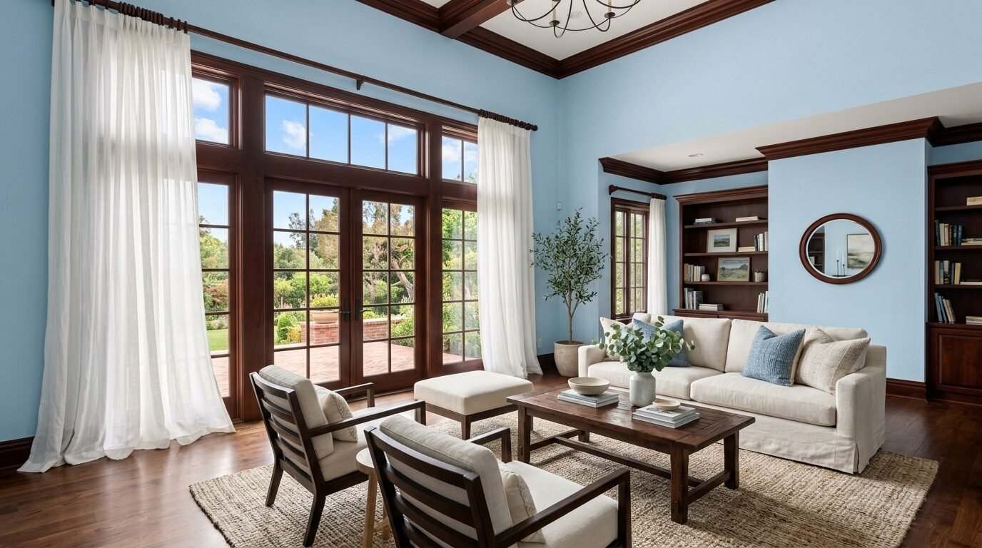
Light blue is not just for nurseries. A dusty sky blue feels very fresh in a living room. It makes the ceiling feel higher. I noticed it works best in rooms with dark wood trim. It provides a crisp contrast. Avoid anything too bright or it will look like a child’s room. Stick to blues with gray bases.
15. Burnt Orange For Retro Energy
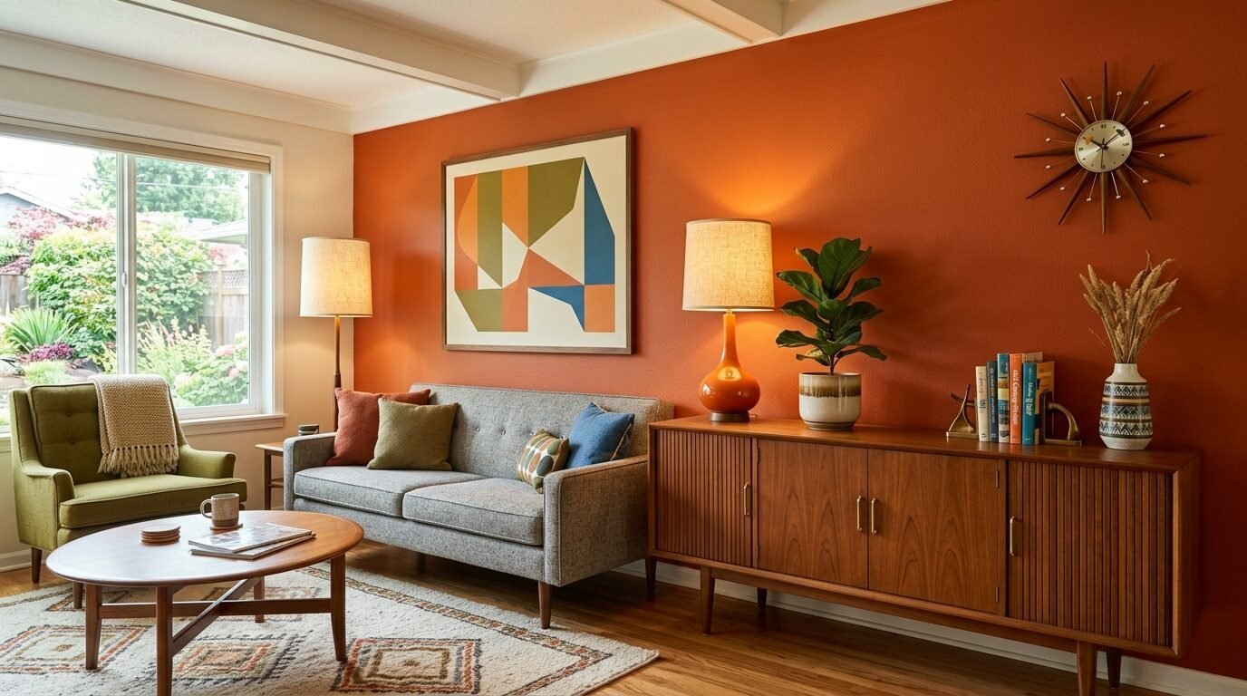
Burnt orange is for the brave. It has a 1970s feel that is very trendy right now. It feels like a sunset. I suggest using this on a single wall if you are unsure. I once painted a whole room this color and it was too much. We ended up doing three walls in cream and one in burnt orange. It was perfect.
16. Stone Gray For A Solid Foundation
Stone gray is a medium tone. It feels like a smooth rock. It is very stable and calming. It does not lean too warm or too cool. I use this when a client has a lot of colorful furniture. It acts as a quiet anchor. It hides scuff marks from pets and kids very well.
17. Lavender Mist For A Subtle Twist
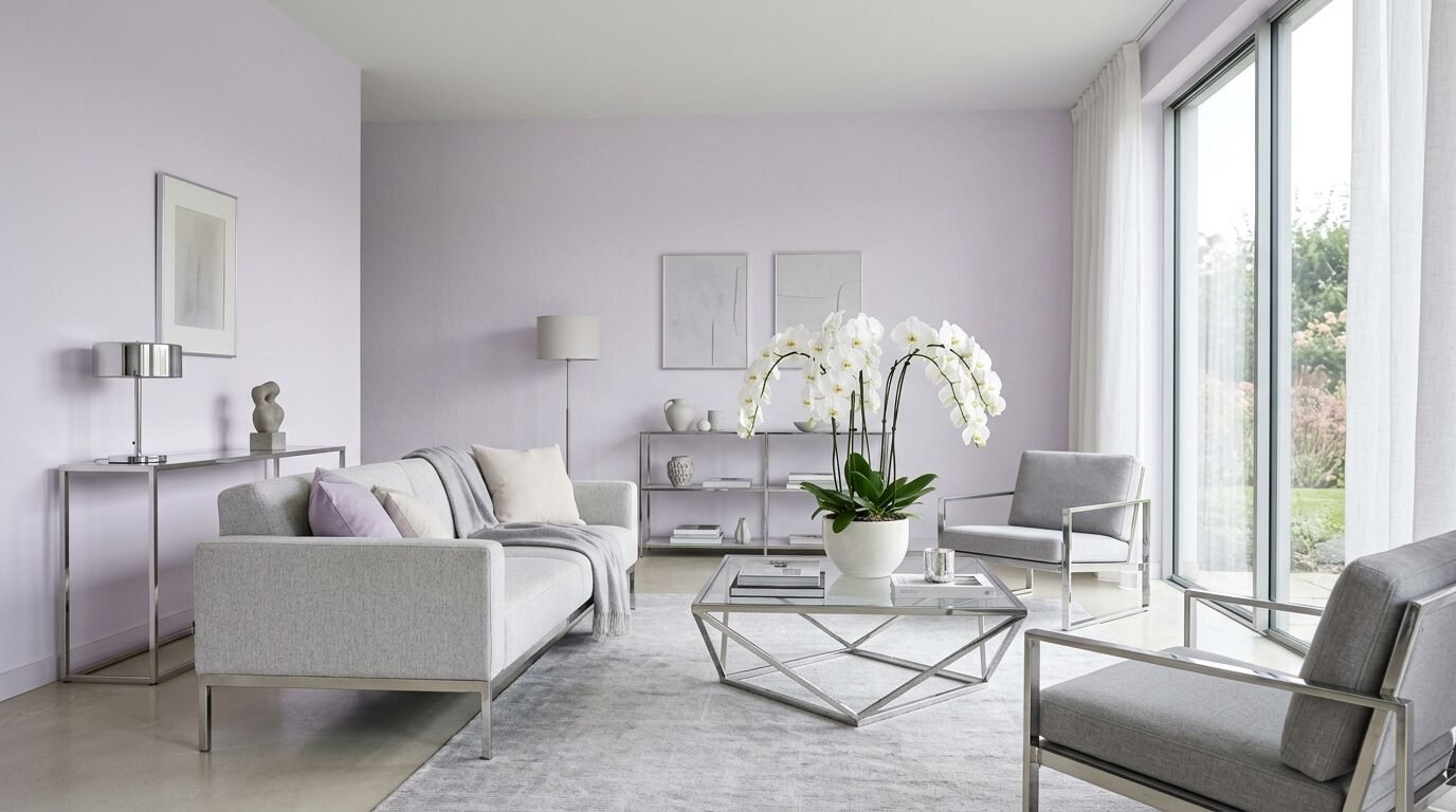
Lavender can be modern if it is very pale. It should almost look gray. It adds a touch of mystery. I saw this in a high rise apartment in New York. It felt very chic. It works best with silver or chrome accents. Keep the rest of the room minimal to let the color breathe.
18. Peachy Coral For A Cheerful Space
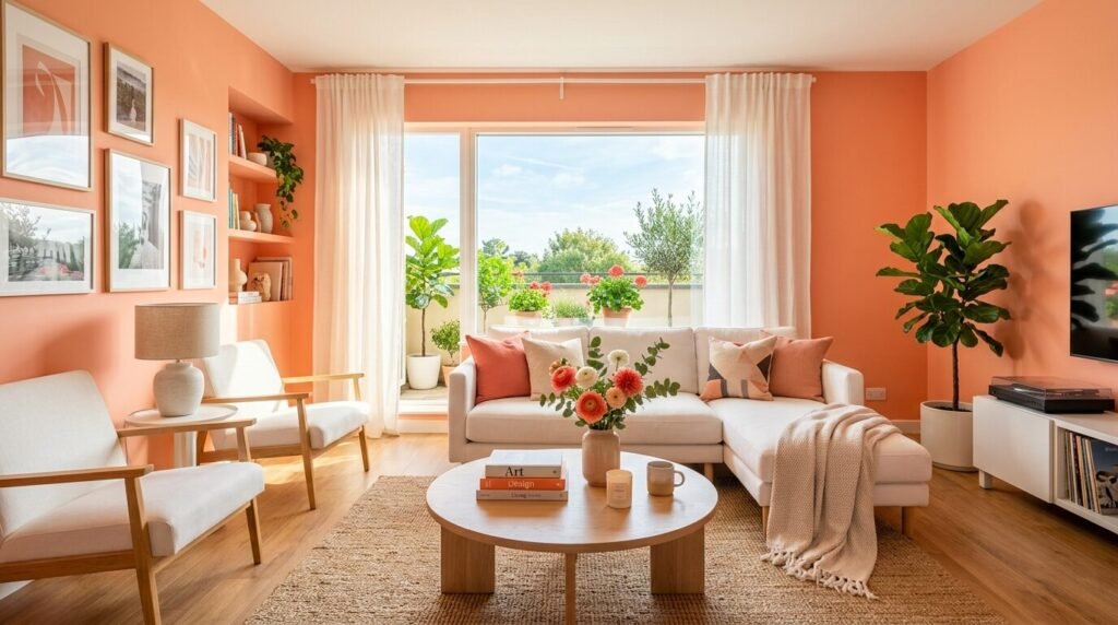
Peach is back. It is a happy color. It makes a room feel light and bouncy. I used this in a small cottage near the coast. The morning sun turned the whole room into a glow. Use white furniture to keep it looking modern. If you use dark furniture it can look dated.
19. Emerald Green For High Drama
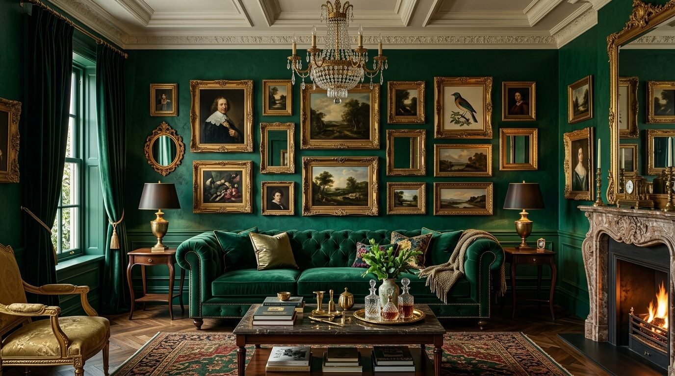
Emerald is the ultimate luxury color. It looks amazing with gold frames and velvet. I recommend a satin finish for emerald. The slight shine makes the color look deeper. It is hard to paint because it shows brush strokes. Hire a professional or use a high quality roller for this one.
20. Chocolate Brown For A Velvet Feel
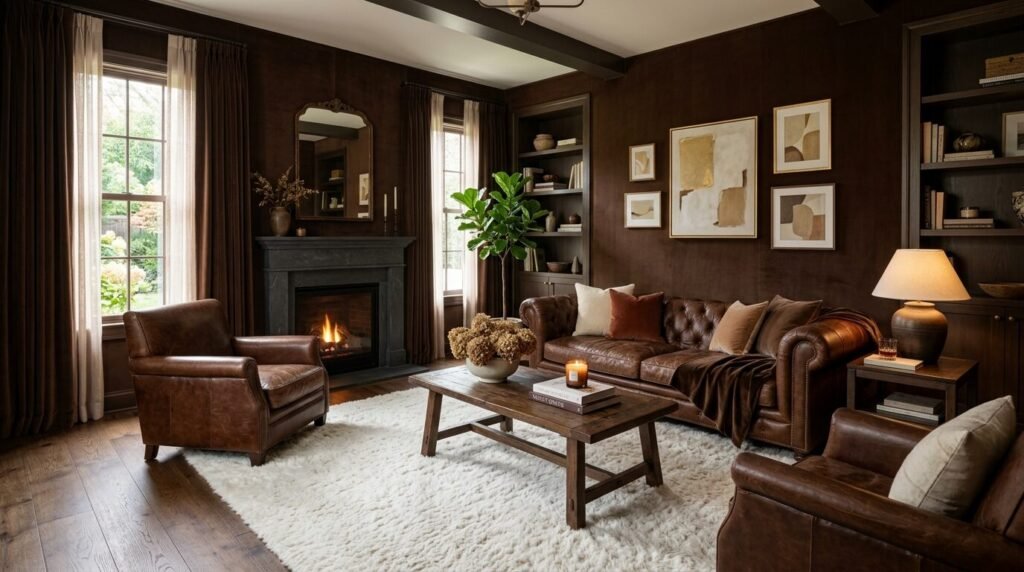
Deep brown is making a comeback. It feels like a high end hotel lounge. It is incredibly cozy. I saw a room with chocolate walls and a white rug. The contrast was beautiful. It feels very private and quiet. This is great for a media room where you watch movies.
21. Soft Yellow For A Sunny Day
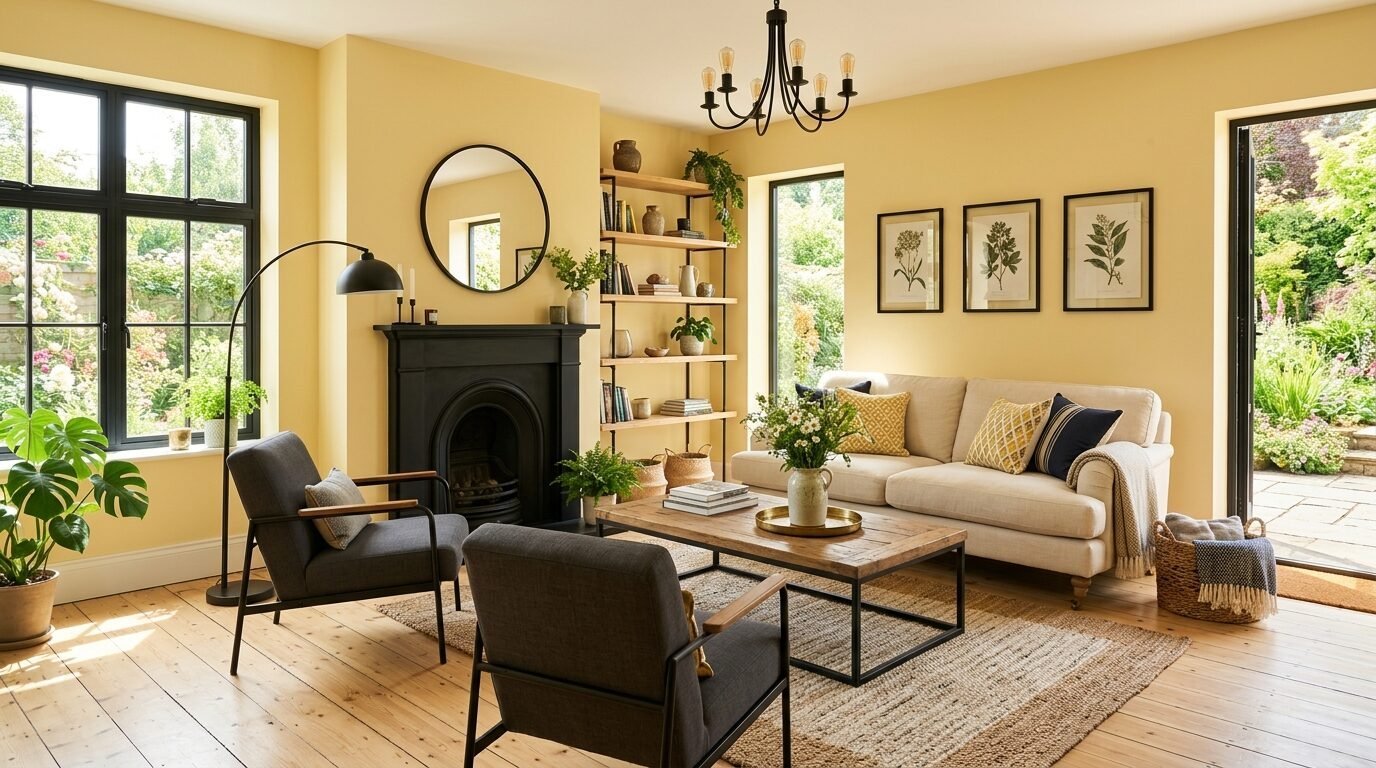
Yellow is tricky. You want the color of butter, not a lemon. A soft buttery yellow feels like a permanent hug. I used this in a kitchen that opened into a living room. It tied the spaces together with warmth. Use black accents to keep it from feeling too sweet.
22. Steel Blue For A Cool Modern Touch
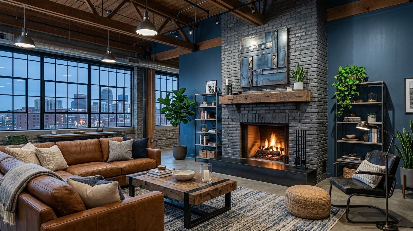
Steel blue has a lot of gray. It feels very industrial and clean. It is great for homes with a lot of metal or glass. I noticed it makes white marble fireplaces look stunning. It is a very professional and tidy color choice.
23. Beige For A Classic Return
Plain beige is no longer boring. The new beiges have more depth. They feel like oatmeal or sand. I recommend this for anyone who wants a “no-fail” option. It goes with everything. Shifting Sands by Sherwin Williams is a great choice. It feels expensive and clean.
24. Deep Plum For A Royal Touch
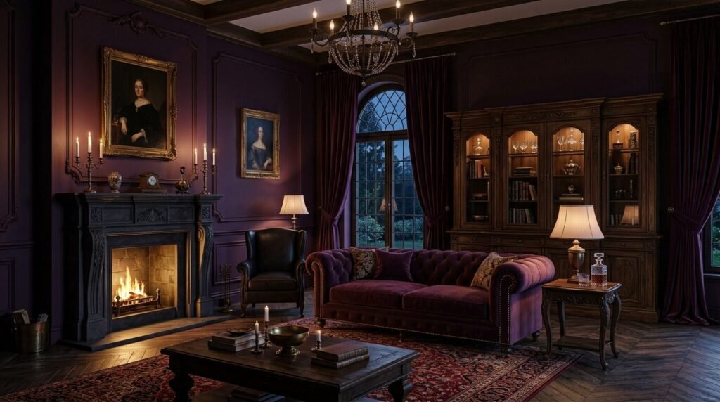
Plum is a mix of purple and brown. It is very dark and rich. It feels very mature. I used this for a client who wanted a “gentleman’s club” feel in his lounge. We added leather chairs and a dark rug. It felt very grounded. It is a great alternative to black or navy.
25. Mint Green For A Vintage Pop
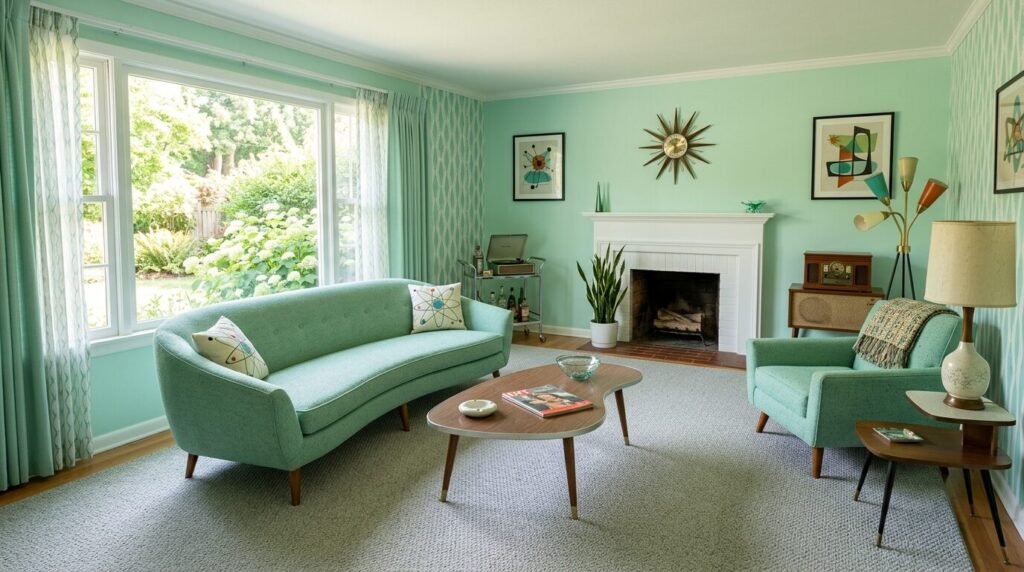
Mint can be very modern if paired with the right items. Think mid-century modern furniture. It feels very fresh and clean. I saw a mint living room with a gray sectional and it looked very current. It is a great way to add color without being too loud.
Comparison Of Popular Paint Brands
| Brand | Price Per Gallon | Best For | Durability |
| Benjamin Moore | $60 – $90 | Pigment Depth | High |
| Sherwin Williams | $55 – $85 | DIY Ease | High |
| Farrow & Ball | $110 – $130 | Historic Tones | Medium |
| Behr | $35 – $50 | Budget Projects | Medium |
| Valspar | $40 – $55 | Color Selection | Medium |
Real World Cost Analysis
Painting a standard living room usually costs between 400 and 900 dollars if you do it yourself. This includes two gallons of premium paint at 160 dollars. You need brushes, rollers, and tape for about 100 dollars. Drop cloths and a ladder might add another 150 dollars. If you hire a professional expect to pay 1200 to 2500 dollars. I have noticed that spending more on paint saves money in the long run. Cheap paint requires three or four coats. High quality paint often covers in two. This saves you hours of labor.
Frequently Asked Questions
Which paint finish is best for a living room?
Matte or flat finishes are best for walls. They hide imperfections and look modern. Eggshell is a good middle ground if you have kids because it is easier to wipe clean. Avoid high gloss on walls because it shows every bump and looks like a garage. Use semi gloss for trim and doors only.
How do I pick a color for a north facing room?
North facing rooms get cool blue light. Avoid cool grays or blues as they will feel like ice. Pick colors with warm bases like yellow, red, or orange. Warm greiges and soft whites with pink undertones work best here. They balance out the blue light and make the room feel lived in.
Do I really need a primer?
If you are changing from a dark color to a light color you must use a primer. It saves you from doing five coats of paint. If you are painting a dark color over a light one a tinted primer helps the color look rich and even. I always use a primer on new drywall or patched spots to prevent flashing.
How many gallons do I need for a 15 by 20 room?
A standard gallon covers about 350 to 400 square feet. For a room this size you will need two gallons for two coats. Always buy an extra gallon just in case. It is better to have a little left over for touch ups than to run out in the middle of a wall.
Is an accent wall still in style for 2026?
Accent walls are less popular now. People are moving toward “color drenching” where they paint the walls, trim, and even the ceiling the same color. This makes a room feel larger and more cohesive. If you do an accent wall make sure it has a purpose like highlighting a fireplace.
Conclusion
Choosing a paint color is a big decision but it should be fun. You have seen 25 ways to make your space feel modern and cozy. I have seen how a simple change in tone can change a person’s mood. Start with a small sample. Paint a large square on your wall and look at it at different times of the day. Do not rush the process. Whether you go with a safe greige or a bold emerald your home should reflect you. My personal favorite right now is the mushroom brown because it feels so stable in a busy world. What kind of feeling do you want when you sit on your sofa tonight?
Sloane Whitaker is the Editor-in-Chief at Home Wall Trends, leading editorial direction with over a decade of experience in residential interior design and home styling. Her specialty is space planning and layout, the unglamorous fundamentals that make a beautiful room actually function. A graduate of the New York School of Interior Design, Sloane has styled over 200 client homes before turning her focus to digital publishing. Her editorial standard: “If a reader can’t picture themselves doing it on a Saturday afternoon, we haven’t explained it well enough.”