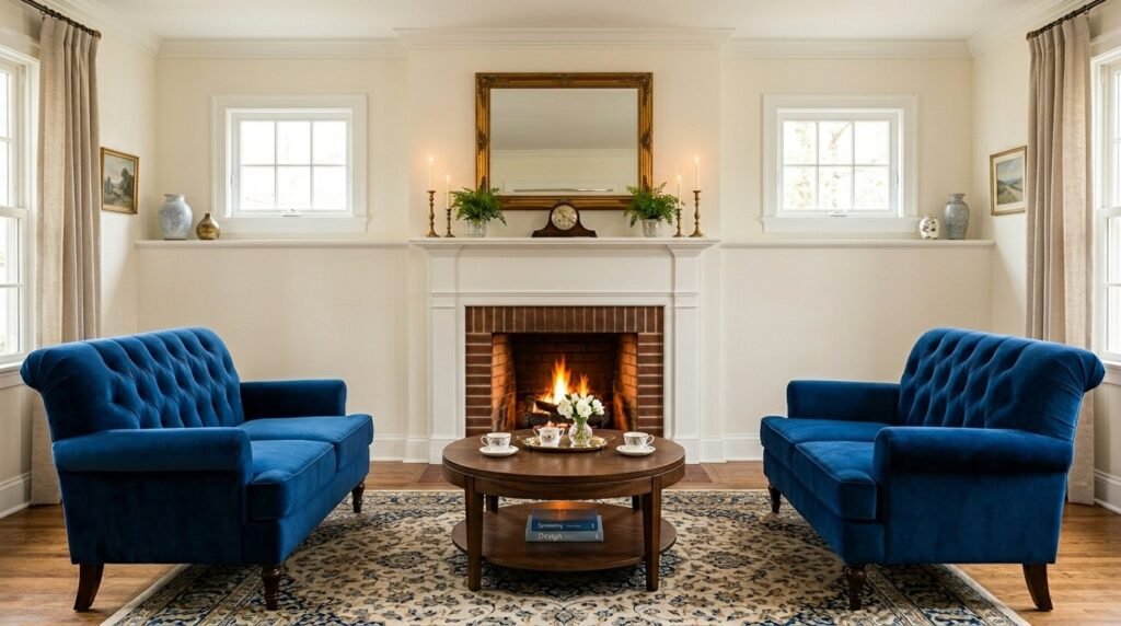
The living room felt cold despite the $4,000 Italian leather sofa sitting in the center of the room. I remember standing in a client’s home where the echo was so loud it felt like a cavern rather than a sanctuary. They had spent a fortune on high-end pieces, yet the space felt unfinished and uncomfortable. This is the reality many face: spending more money doesn’t guarantee a better result. In my experience, the difference between a catalog-worthy space and a cluttered mess isn’t the budget but the application of specific interior design living room secrets that prioritize flow over flash.
Most people approach a room transformation by buying furniture first and asking questions later. I’ve seen homeowners lose thousands on “Pure Products” that don’t fit their lifestyle or layout. You want a space that feels curated, not just decorated. In this guide, I will share the exact strategies I use to create high-end looks for less, focusing on how even the most lazy people can achieve a professional result. We will cover everything from the “The Originals” vintage sourcing to high-performance fabric selections that withstand real life.
Executive Summary
This article provides 22 actionable strategies to overhaul your living space while cutting unnecessary spending by up to 60%. You will discover how to manipulate visual weight to make small rooms feel double their size and why the “Layout First” rule is the most important step in any room transformation. We cover the shift from fast-furniture to durable, high-value items and how to mix textures to create a multi-sensory experience. While we won’t cover structural renovations or electrical overhauls, you will find specific brand recommendations like Article and West Elm, along with DIY alternatives that require zero power tools. By the end of this read, you will have a clear roadmap to a sophisticated, comfortable home that looks like a professional designer had a $50,000 budget.
1. Layered Lighting Plan
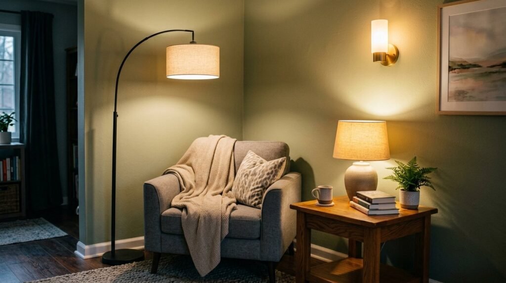
The biggest mistake I see is relying on a single overhead “boob light” to illuminate the entire space. A professional room transformation requires at least three levels of light: ambient, task, and accent. I recently helped a friend replace their harsh LED ceiling fixture with two warm-toned floor lamps from Target and a set of battery-operated sconces from Amazon. The total cost was under $150, but the atmosphere shifted from “doctor’s office” to “cozy lounge” instantly. You should aim to place light sources at different heights to eliminate shadows in the corners.
A practical step you can take today is to swap all your bulbs for “soft white” 2700K versions to create a cohesive glow. Many people believe they need expensive dimmers installed by an electrician, but smart bulbs like Philips Hue allow you to control intensity from your phone for a fraction of the cost. A common mistake is using cool-toned bulbs which make even the most expensive furniture look cheap and clinical.
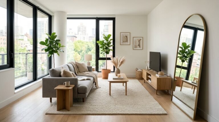
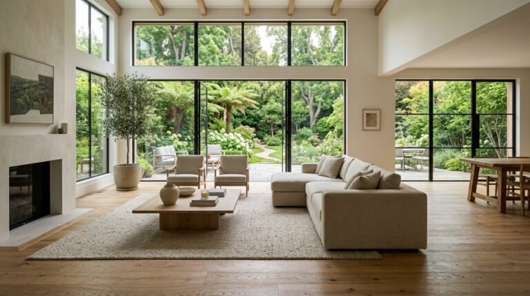
2. Statement Rug Anchors
A rug that is too small is the fastest way to make a large room look tiny and disjointed. I’ve noticed that most people buy a 5×7 rug because it’s cheaper, but it forces all the furniture to float awkwardly. For a successful design, at least the front two legs of every major seating piece must sit on the rug. I often recommend the “The Originals” jute rugs or large-scale wool blends from Ruggable for families. These provide a massive visual anchor that defines the seating area.
If you have a rug you love that is too small, try layering it over a larger, inexpensive sisal rug to get the scale you need without the high price tag. This trick adds texture and covers more floor for about $200. The contrarian view here is that you don’t always need a rug if you have beautiful herringbone wood floors, but for 90% of homes, the rug is the “glue” that holds the layout together.
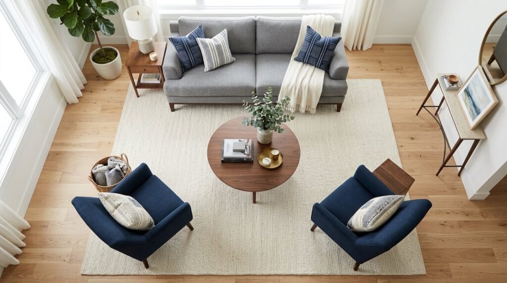
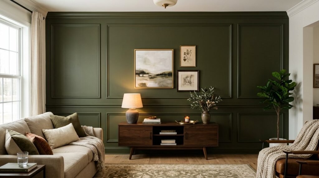
3. Visual Weight Balance
Balance isn’t about symmetry; it’s about how heavy an object feels to the eye. If you have a bulky, dark sofa on one side of the room, the other side needs something of equal visual weight, like a pair of armchairs or a large bookshelf. I once worked with a client who had a massive stone fireplace but nothing on the opposite wall, making the room feel like it was tipping over. We added a dark-painted “The Originals” vintage cabinet to the opposite corner, and the room instantly felt grounded.
You can test your room’s balance by taking a black-and-white photo of it on your phone. This strips away the distraction of color and lets you see where the “dark” or “heavy” spots are. A quick fix is moving a heavy plant or a floor lamp to a “light” corner. Many people think they need to buy more furniture to fix a room, but often, just redistributing the visual weight of what you already own is the real secret.
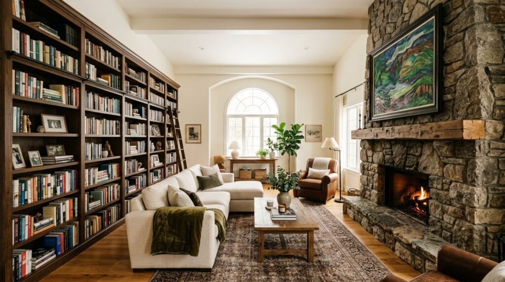
4. Vertical Space Utilization
Most homeowners stop decorating at eye level, leaving the top third of their walls completely bare. This makes ceilings feel lower and the room feel cramped. I’ve tried hanging curtain rods 4-6 inches above the window frame rather than right on it, and the room transformation is staggering. It draws the eye upward and makes the windows look massive. Using tall shelving like the IKEA Billy hack can also provide storage while drawing the gaze toward the ceiling.
A practical action is to hang your artwork so the center is about 57 to 60 inches from the floor, which is the standard gallery height. However, if you have a tall piece, don’t be afraid to let it take up vertical space. The cost of a longer curtain rod and extra-long drapes is usually under $100 but adds thousands in perceived value. Don’t fall for the mistake of thinking every wall needs to be filled; leaving some vertical “breathing room” is just as important.
5. Negative Space Intent
“Lazy people” often think that filling every corner makes a room feel finished, but the best design often involves what you leave out. Negative space, or the empty area around furniture, allows the eye to rest. In my experience, removing one small, cluttered side table can make a living room feel more expensive and intentional. I’ve seen rooms where every square inch was occupied, and it felt claustrophobic rather than curated.
Take thirty minutes to clear every surface in your room and only put back the items that are either beautiful or functional. This “reset” costs nothing and often reveals the true potential of your layout. A common mistake is pushing all furniture against the walls to “save space,” which actually creates an awkward, empty “dance floor” in the middle. Pulling furniture just 3 inches away from the wall creates a sense of airiness.
6. Mixed Texture Palette
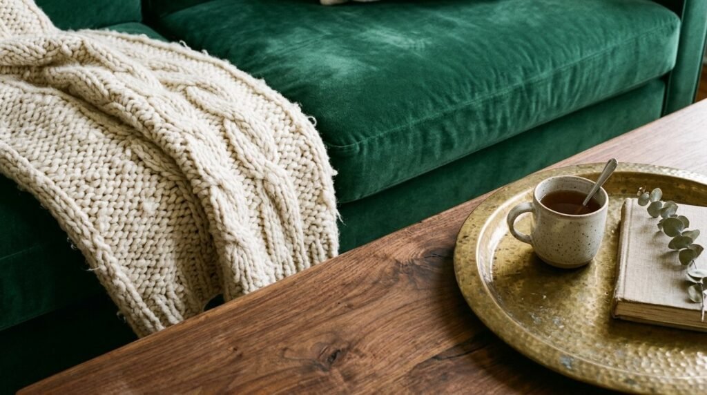
If everything in your room has the same finish—like all smooth leather or all flat cotton—the space will feel one-dimensional. I always suggest mixing at least four different textures: something soft (velvet), something hard (wood), something shiny (metal), and something rough (jute or linen). I’ve noticed that the most high-end “Pure Products” brands use texture rather than color to create interest. A leather sofa looks ten times better when paired with a chunky knit wool throw and a marble-topped coffee table.
Go to a local fabric store and grab a few remnants in different textures to see how they catch the light in your room before committing to new pillows. Adding a variety of textures can be done for under $50 with a few new cushion covers. Some designers argue that too much texture creates “visual noise,” but as long as you stay within a consistent color palette, the variety will feel sophisticated rather than messy.
7. Strategic Mirror Placement
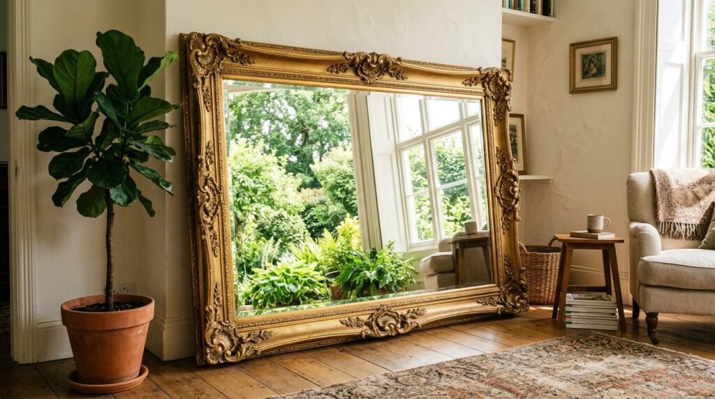
Mirrors are essentially “fake windows” that bounce light and double the visual depth of a space. I’ve seen a dark, windowless living room completely change after placing a large floor mirror opposite the main light source. I once found a massive ornate mirror at a thrift store for $40, spray-painted it matte black, and it became the focal point of the entire house. It’s one of those layout secrets that works every single time regardless of the room size.
A quick action is to lean a large mirror against a wall instead of mounting it for a more relaxed, modern feel. This takes five minutes and requires no drilling. Be careful not to place mirrors where they reflect something unattractive, like a cluttered entryway or a bathroom door. The goal is to reflect light or a beautiful view, not your laundry pile.
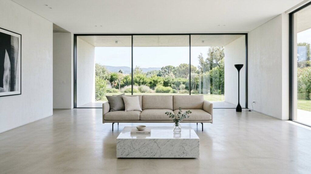
8. Scale and Proportion

Scale is the size of an object in relation to the room, while proportion is the size of an object in relation to other objects. A tiny coffee table next to a giant sectional looks like a mistake. I’ve noticed that people often buy furniture that is too small for their space because they are afraid of it feeling crowded. However, a few large-scale pieces actually make a room feel bigger than a dozen small, “leggy” pieces.
Measure your main seating area and ensure your coffee table is about two-thirds the length of your sofa. If your current table is too small, try grouping two matching smaller tables together to create the right scale. This “double-up” trick is a favorite of mine for awkward layouts. Avoid the “dollhouse” effect where everything is small and dainty; your room needs a “hero” piece that commands attention.
9. Focal Point Definition
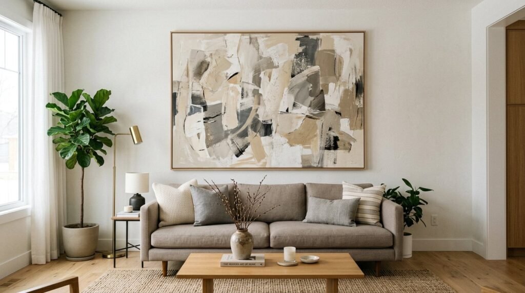
Every room needs a “North Star”—one place where the eye is supposed to land first. If you don’t have a fireplace, you can create a focal point with a large piece of art, a bold accent wall, or a statement bookshelf. In one project, the room felt aimless until we centered the sofa under a massive DIY canvas art piece. Suddenly, the furniture layout made sense.
Identify your focal point today. If you don’t have one, the easiest fix is to use a large-scale piece of art (at least 36×48 inches) on your largest wall. You can make your own art using a blank canvas and some joint compound for a textured, high-end look for under $60. Many people mistakenly think the TV should be the focal point, but I prefer to hide the TV or incorporate it into a gallery wall so the “Design” takes center stage.
10. Traffic Flow Layout
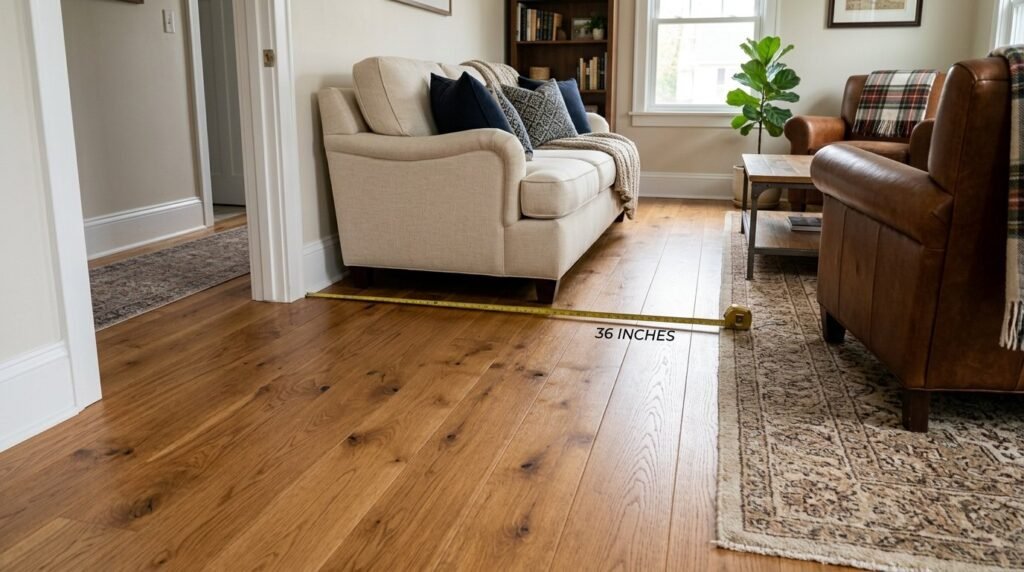
The most beautiful room is a failure if you can’t walk through it without bumping into a chair leg. A professional layout requires at least 30 to 36 inches of walking space for major pathways. I’ve seen “Pure Products” wasted because they were crammed into a space that blocked the natural flow from the kitchen to the seating area. I’ve tried “floating” the sofa in the middle of the room to create a walkway behind it, and it often improves the room transformation significantly.
Use blue painter’s tape on the floor to map out a new furniture arrangement before moving heavy pieces. This costs $5 and saves your back. A common mistake is placing furniture too close together; leave about 14 to 18 inches between your sofa and coffee table so people can reach their drinks but still have legroom.
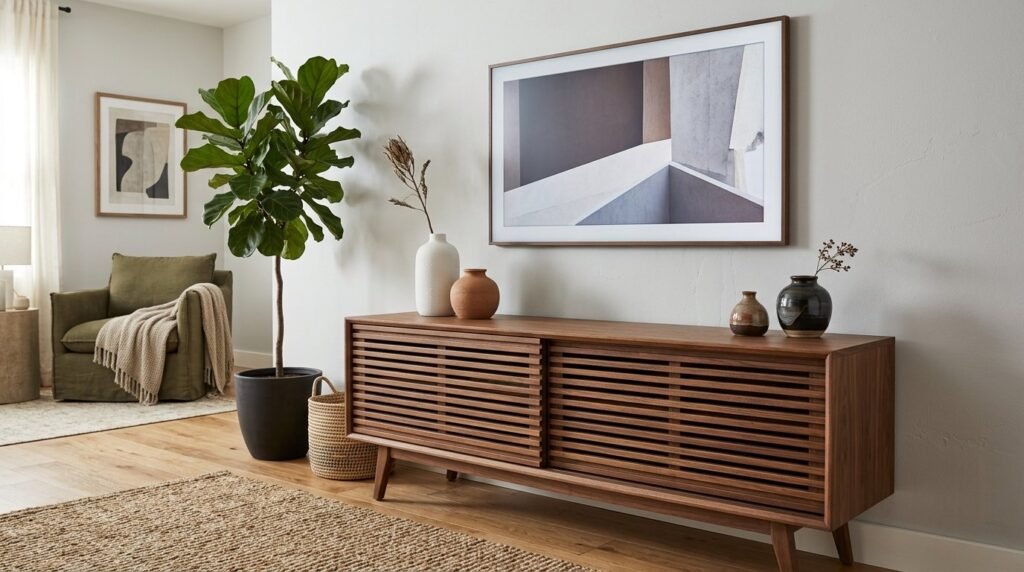
11. Nature Element Integration
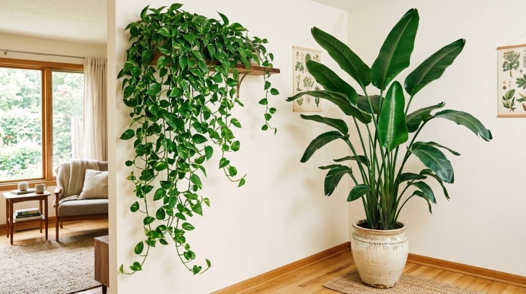
Biophilic design isn’t just a trend; it’s a necessity for a room to feel “alive.” I’ve noticed that rooms without plants often feel sterile and “plastic.” Adding a large Fiddle Leaf Fig or a simple Snake Plant adds a vibrant green that no paint color can replicate. I once used a large branch found in a backyard, dried it, and placed it in a tall floor vase—it cost $0 but looked like a $200 sculpture.
If you are one of those “lazy people” who kills every plant, try high-quality silk versions from brands like Afloral or Nearp0rt. They look incredibly real and require zero maintenance. The action step is to place at least one “tall” plant in a corner and one “trailing” plant (like a Pothos) on a shelf. Avoid small, scattered succulents; one large plant has more impact than five tiny ones.
12. Personal Artifact Display
Your living room shouldn’t look like a furniture showroom; it should look like your home. I love using “The Originals”—items with a story, like a bowl from a vacation or a vintage book collection. I’ve seen homes where everything was brand new from a big-box store, and it felt hollow. Adding a few meaningful objects gives the room “soul” and makes it feel more expensive because it’s unique.
The rule of three is your best friend here: group items in odd numbers of varying heights. For example, a tall vase, a medium-sized book, and a small candle. This creates a visual triangle that is naturally pleasing. A mistake people make is displaying every single trophy or souvenir they’ve ever owned; curation is the key to making personal items look like “Design” rather than clutter.
13. Performance Fabric Choice
Real life involves coffee spills and pets, and your “Design” should reflect that. I’ve seen many people regret buying a delicate linen sofa within the first month. In my experience, choosing performance fabrics like Crypton or high-quality polyester blends is the smartest investment you can make. Brands like Inside Weather offer beautiful options that are virtually indestructible.
If you already have a sofa you love but the fabric is failing, consider a high-end, tailored slipcover from a company like Bemz. It’s a $300 room transformation that saves you from buying a new $2,000 sofa. The contrarian take is that “distressed” leather actually looks better as it ages and gets scratched, making it a great “lazy” option for families who don’t want to worry about maintenance.
14. Ceiling Color Contrast
The “fifth wall” is often forgotten, but painting the ceiling a slightly different shade than the walls can change the entire feel of a room. I’ve tried painting a ceiling a soft, warm white (like Benjamin Moore Simply White) while the walls are a slightly darker cream. It creates a subtle depth that makes the room look professionally designed. Some bold designers even go for a dark “moody” ceiling to make a large room feel more intimate.
For a low-risk trial, use a removable “peel and stick” ceiling wallpaper in a subtle texture. This can be done in an afternoon for about $100. A common mistake is using high-gloss paint on the ceiling; it shows every bump and imperfection. Stick to flat or matte finishes to keep the look sophisticated and high-end.
15. Hidden Storage Solutions
Clutter is the enemy of expensive-looking design. I’ve noticed that “Pure Products” look best when they have room to breathe, which means hiding the remote controls, blankets, and toys. I love using ottomans with hidden storage or media consoles with closed doors rather than open shelving. One of my favorite interior design living room secrets is using a large vintage trunk as a coffee table—it provides massive storage and tons of character.
Spend $40 on a set of matching woven baskets to tuck under a console table or inside a bookshelf. This hides the “ugly” stuff while adding a layer of texture. Don’t fall for the trap of thinking you need more shelves; usually, you just need fewer things on display.
16. Symmetrical Arrangement Style
When in doubt, use symmetry to create an immediate sense of order and luxury. Placing two identical lamps on either side of a sofa or two matching chairs facing a fireplace creates a “formal” look that feels very high-end. I’ve seen rooms that felt chaotic suddenly feel “expensive” just by squaring up the furniture and matching the end tables.
If your room feels messy, try the “mirror image” trick. Arrange your main seating area so that if you cut it down the middle, both sides look mostly the same. This works best in traditional or transitional spaces. The trade-off is that too much symmetry can feel stiff, so break it up with one “off-center” element like a leaning piece of art or a unique floor lamp.
17. Hardware Material Contrast
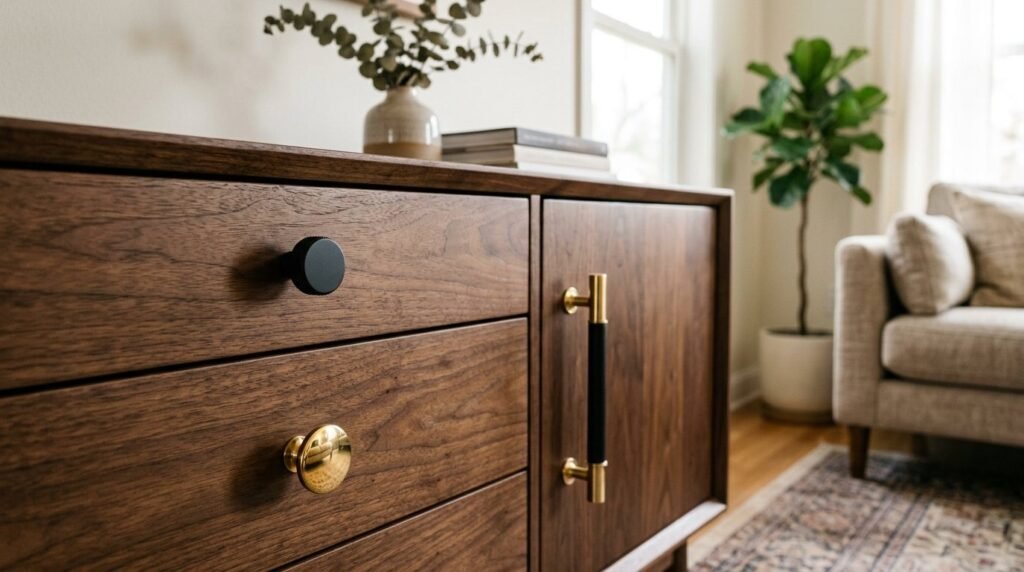
The “jewelry” of your room is the hardware—the knobs on your media console, the lamp switches, and even the picture frames. I’ve noticed that mixing metals (like brass and matte black) makes a room look like it evolved over time rather than being bought in a “room-in-a-box” set. I once took a standard IKEA dresser, swapped the plastic knobs for solid brass ones from Rejuvenation, and it looked like a $1,200 piece of furniture.
Change the hardware on one piece of furniture this weekend. It usually costs under $50 and takes twenty minutes. Avoid the mistake of matching every metal perfectly; a “The Originals” look comes from a thoughtful mix. A good rule of thumb is to have one “dominant” metal and one “accent” metal used in at least three places throughout the room.
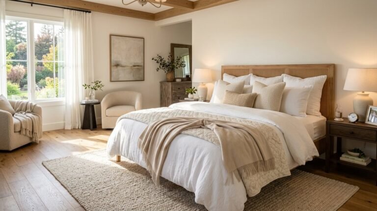
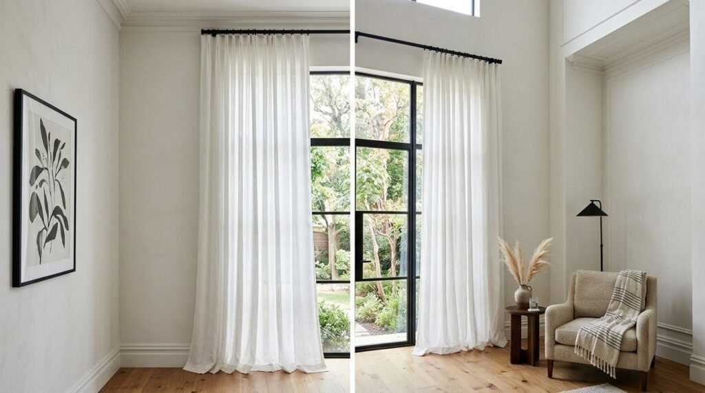
18. Window Treatment Height
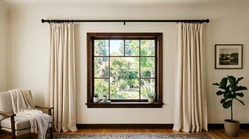
Short curtains that end at the windowsill are a design crime in most living rooms. Curtains should always hit the floor, or even “puddle” slightly for a romantic look. I’ve seen rooms transformed just by moving the curtain rod up and out. By extending the rod 6-10 inches beyond the window frame on each side, the window looks much wider and allows more natural light in when the curtains are open.
Buy 96-inch or 108-inch curtains instead of the standard 84-inch ones. If they are too long, you can use “hem tape” and an iron to shorten them without sewing. This costs nothing but an hour of your time. A common mistake is buying thin, “sheer” curtains that look like bedsheets; opt for lined curtains with some weight to them for a high-end, custom look.
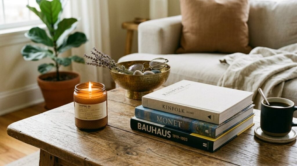
19. Layered Coffee Table
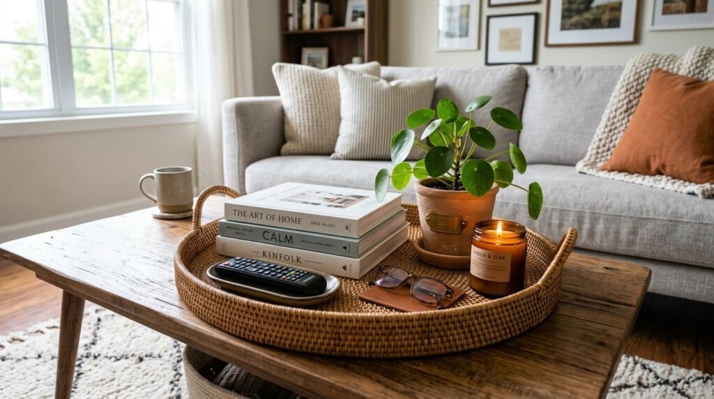
A bare coffee table looks like you just moved in; a cluttered one looks like you’ve given up. The secret is “layering.” I use a large tray to corral smaller items, a few oversized art books for height, and a natural element like a bowl of moss or a cluster of candles. I’ve noticed that this three-layer approach makes the room feel “finished” and intentional.
Go to your bookshelf and find your three prettiest books. Stack them on your coffee table and place a small decorative object on top. This creates an instant “vignette” for $0. Be careful not to make the display too high; you still want to be able to see the person sitting across from you.
20. Accent Wall Nuance
The days of the “bright red” accent wall are over. Modern accent walls are about texture and subtle shifts in tone. I’ve tried using “The Originals” wood molding to create a picture-frame effect on a single wall, then painting the whole thing one color. The shadows created by the molding add a level of sophistication that paint alone cannot achieve.
Use “Woven” or “Grasscloth” peel-and-stick wallpaper for a textured accent wall that looks incredibly expensive but can be removed by a renter. This costs about $150 for an average wall. A mistake many make is choosing a color that is too high-contrast; instead, pick a color that is just two shades darker than your main wall color for a “quiet luxury” feel.
21. Multipurpose Furniture Pick
In a modern living room, every piece should earn its keep. I’ve seen small spaces thrive by using “Pure Products” like nesting tables or a bench that doubles as extra seating and a coffee table. I once used a sturdy dining bench against a wall as a “plant stand” that could be pulled over when guests arrived. It’s a “lazy” way to be prepared for anything without adding clutter.
Look for a coffee table with a bottom shelf or a set of “C-tables” that can slide over the sofa arm. These additions provide functionality without taking up more floor space. Avoid furniture that only does one thing if you have a small room transformation in mind; flexibility is the ultimate luxury.
22. Seasonal Accessory Rotation
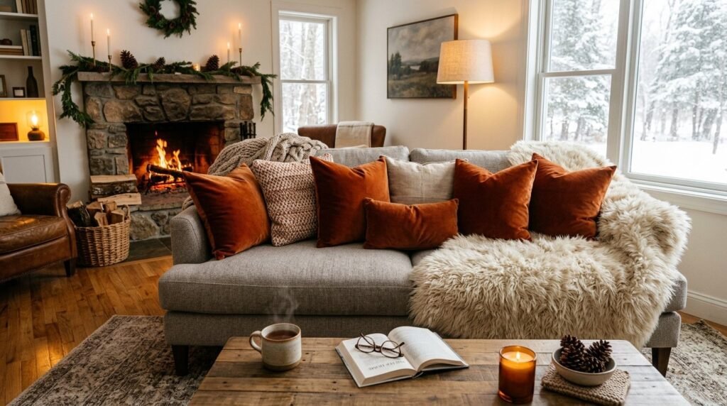
The most successful rooms change with the seasons. I’ve noticed that “The Originals” designers don’t keep the same pillows out all year. In the summer, I use light linens and clear glass vases; in the winter, I swap them for heavy velvets, faux fur throws, and dark wood accents. This keeps the space feeling fresh without a full renovation.
Store your “off-season” accessories in under-bed bins. Swapping your pillows and throws twice a year takes ten minutes and makes you fall in love with your room all over again. A common mistake is having too many “seasonal” items out at once, which makes the room feel like a holiday store. Stick to 3-5 key swaps to maintain a high-end “Design” year-round.
Frequently Asked Questions
What is the most common living room layout mistake?
In my experience, the most frequent error is “wall-hugging,” where every piece of furniture is pushed against the perimeter of the room. This creates a vast, unusable space in the center and makes conversation difficult. Instead, try “floating” your furniture by pulling it at least a few inches away from the walls. If the room is large enough, create a central seating group on a large rug. This makes the space feel more intimate and intentionally designed. Even in a small room, a small gap between the sofa and the wall can create a sense of airiness that makes the room feel larger.
How can I make my living room look expensive on a tiny budget?
The secret to a high-end look for less is focusing on “The Originals”—unique, vintage pieces mixed with clean, modern lines. Thrift stores and Facebook Marketplace are goldmines for solid wood furniture that can be sanded and refinished. Additionally, focus on scale. One large, dramatic piece of art or a massive floor lamp from a “Pure Products” outlet will look much more expensive than a dozen small, cheap accessories. Finally, never underestimate the power of paint. A fresh coat of “designer” white or a sophisticated moody hue can make even basic furniture look like it belongs in a gallery.
Which living room furniture should I invest the most money in?
Always invest in your “touch points”—the items you use every single day. This primarily means your sofa. A cheap sofa will lose its shape within a year, while a high-quality “Design” piece with a kiln-dried hardwood frame can last a decade. I’ve seen people spend too much on decorative side tables while sitting on a lumpy, uncomfortable couch. Spend your money on the sofa and the rug, as these are the anchors of the room. You can save money on coffee tables, lamps, and wall decor, which are easier to swap out as trends change.
How do I choose the right rug size for my living room?
The general rule is that your rug should be large enough for all the major furniture pieces to sit on it, or at the very least, the front legs of the sofa and chairs. For most standard living rooms, an 8×10 or 9×12 rug is the minimum size required. If you choose a rug that is too small, it creates a “floating island” effect that makes the room look disjointed and smaller than it actually is. If you’re on a budget, buy a large, inexpensive natural fiber rug like jute and layer a smaller, more expensive patterned rug on top of it.
How can I make a dark living room feel brighter?
Beyond the obvious choice of light paint, you should focus on reflective surfaces and “Layered Lighting.” Use mirrors strategically opposite windows to bounce natural light deep into the room. Swap heavy, dark curtains for light-filtering linens that offer privacy without blocking the sun. I’ve also noticed that adding a “Pure Products” high-gloss or metallic accent, like a brass tray or a glass coffee table, helps move light around the space. Finally, ensure your light bulbs are “warm white” (2700K-3000K) to mimic natural sunlight rather than the blue-ish light of standard LEDs.
Is an accent wall still in style for 2026?
Yes, but the approach has changed. The “Interior Design Living Room Secrets” of today focus on texture and architectural interest rather than just a bold paint color. Think about using wood slats, lime-wash paint, or a subtle mural wallpaper. The goal is to create depth and a focal point that feels integrated into the room’s overall “Design.” Avoid high-contrast colors that feel “stuck on” and instead choose a tone that relates to the other colors in your space. A textured accent wall in a neutral shade is a timeless way to add sophistication.
How do I mix different furniture styles without it looking messy?
The key to a successful “The Originals” mix is maintaining a consistent color palette or wood tone. If you have a mid-century modern sofa and a traditional vintage cabinet, try to ensure they both have similar “visual weight” and that the wood tones don’t clash too harshly. I’ve noticed that using a “bridge” element, like a modern rug that contains colors from your vintage pieces, helps pull everything together. Aim for an 80/20 split: 80% one dominant style and 20% “surprise” elements from another era to keep the room from looking like a set.
What are the best colors for a small living room?
While many people default to white to make a room feel bigger, don’t be afraid of “moody” colors. In a room with little natural light, a dark, rich color like charcoal or navy can actually make the walls “recede” and hide the corners, making the space feel infinite and cozy. If you prefer a light look, go for “greige” or a warm off-white rather than a stark, cold white. These colors provide a soft backdrop that makes your furniture pop. Always test your paint in large swatches on different walls, as the color will change drastically as the sun moves.
How can I hide my TV in the living room?
A large black rectangle can ruin a carefully curated room transformation. One of my favorite tricks is the “Samsung Frame” TV, which looks like art when not in use. If that’s not in the budget, try incorporating your TV into a gallery wall surrounded by framed art and photography of similar sizes. This “camouflages” the screen. Another option is a dark-painted “Design” accent wall behind the TV, which allows the screen to blend into the background. For “lazy people,” a simple stylish cabinet with doors is the easiest way to hide the tech when the movie is over.
What is the rule for hanging art in the living room?
Most people hang their art way too high. The center of the artwork should be at eye level, which is generally 57 to 60 inches from the floor. If you’re hanging art above a sofa, the bottom of the frame should be about 6 to 10 inches above the top of the sofa back. Also, ensure the art is in scale with the furniture; a tiny picture over a massive sectional will look lost. The art should take up about two-thirds to three-quarters of the width of the furniture it’s hanging over.
Can I mix different wood tones in one room?
Absolutely, and you should! A room where every piece of wood matches perfectly looks like a showroom rather than a home. The trick is to have a “dominant” wood tone and then mix in one or two “accent” wood tones. I’ve noticed that as long as the undertones are similar (all warm or all cool), the mix will look intentional. For example, pairing a light oak coffee table with a walnut media console works beautifully if you have other natural elements in the room to tie them together.
How do I make my living room child and pet-friendly?
Focus on “Performance Fabric” and rounded edges. Choose rugs with patterns or “heathered” textures that hide fur and crumbs. I always recommend avoiding sharp-edged glass coffee tables, which are both a safety hazard and a magnet for fingerprints. Use washable slipcovers and high-quality “Pure Products” storage bins to quickly clear away toys. A leather sofa is also a great choice for pets as it can be easily wiped down and doesn’t trap odors like fabric does.
The most important thing to remember is that your home is a reflection of your journey, not a museum. I’ve seen how small changes, like adjusting your curtain height or adding a “The Originals” vintage find, can completely transform a space from a room you sit in to a room you truly live in. By applying these interior design living room secrets, you aren’t just moving furniture; you’re creating an environment that supports your lifestyle. I encourage you to try just one of these ideas this weekend—perhaps the “reset” of your negative space or a new layered lighting plan. You’ll be surprised at how much a few intentional shifts can enhance your daily life. Save this guide on Pinterest, try one or two ideas in your own space, and share your transformation with others who are looking to elevate their home on a budget.

Meet Sloane Whitaker
Sloane Whitaker is the creative force and lead editor behind Vellora Interiors. With a background in architectural design and a passion for coastal-inspired living, Sloane specializes in bridging the gap between high-end luxury and everyday comfort.
After spending years curateing spaces in the Charleston market, she launched this platform to share her “elevated-yet-attainable” design philosophy. Whether she’s exploring the quiet simplicity of Japandi aesthetics or the storied charm of Craftsman architecture, Sloane’s goal is to help homeowners create spaces that feel both timeless and deeply personal.