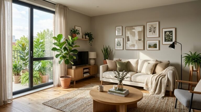
Last March, I walked into a client’s house in Austin. The walls were “millennial grey” from floor to ceiling. It felt like living inside a rainy cloud. My client, Sarah, felt stuck and tired in her own home. We decided to take a huge risk. We painted her main wall a deep, sun-baked terracotta. The change was instant. She started spending more time there. She even hosted her first dinner party in three years. That moment reminded me how much color dictates our mood. In 2026, we are moving away from boring neutrals. People want homes that feel alive and personal.
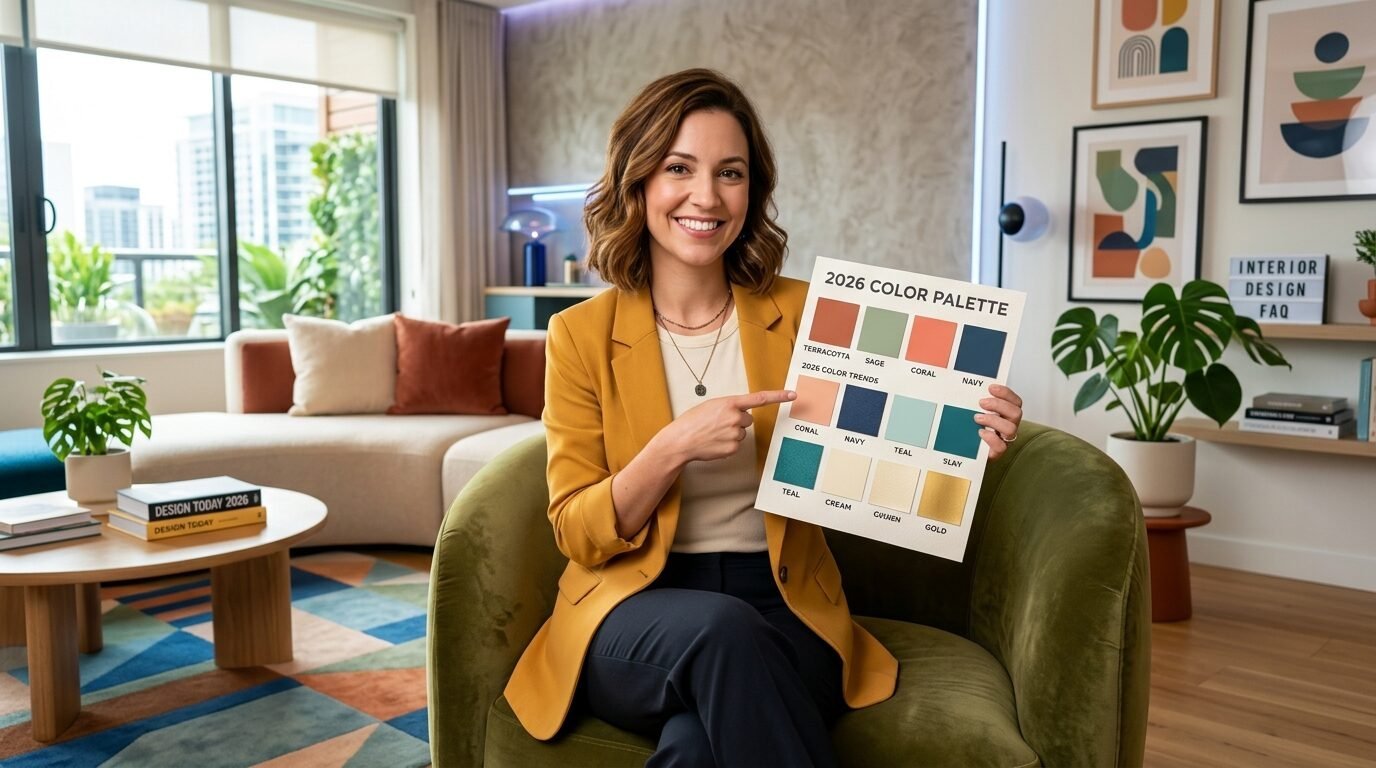
This guide gives you the exact palettes to make your space feel fresh. You will see how to mix bold tones with soft anchors. I will show you how to use 2026 trends without making your home look like a showroom. We cover everything from “Digital Lavender” to “Raw Clay.” You will find specific paint names and textile ideas. I have spent ten years designing interiors. These are the shifts I see happening right now. Most people fear color. You don’t have to. These 24 ideas are safe, stylish, and ready for your next project.
1. Butter Yellow and Slate Blue
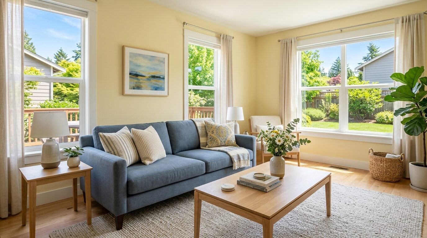
I call this the “Morning Cafe” look. It is the top trend for early 2026. Butter yellow is soft and cheerful. It does not overwhelm like neon yellow. Slate blue acts as a cooling anchor. I saw this work perfectly in a small Seattle apartment last month. The blue prevents the yellow from looking too childish. Use butter yellow on your walls. Add slate blue through velvet pillows or a large area rug. It feels like a sunny day at the beach.
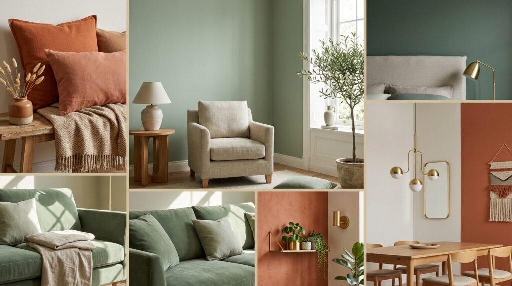
2. Raw Terracotta and Sage Green
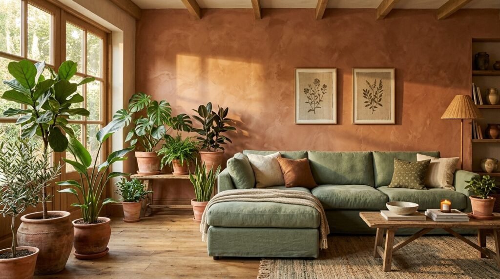
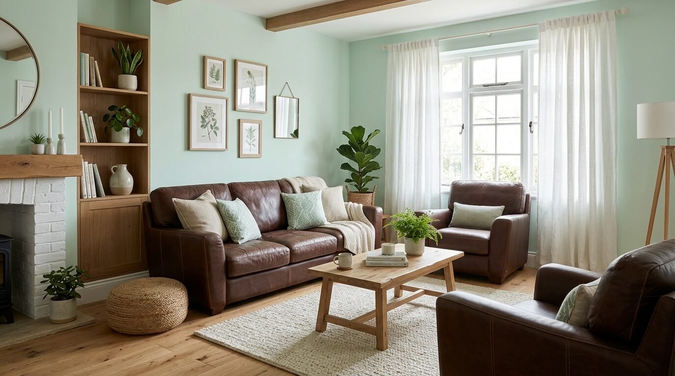
Nature 2.0 is huge this year. Raw terracotta has a dusty, earthy quality. It feels grounded. Sage green brings a leaf-like freshness. I tried this combo in a rental home recently. We used terracotta pots and a sage green linen sofa. It felt like an indoor garden. This pair works because the colors sit opposite each other on the color wheel. They balance the heat and the cool. It makes a room feel very stable.
3. Digital Lavender and Gunmetal Grey
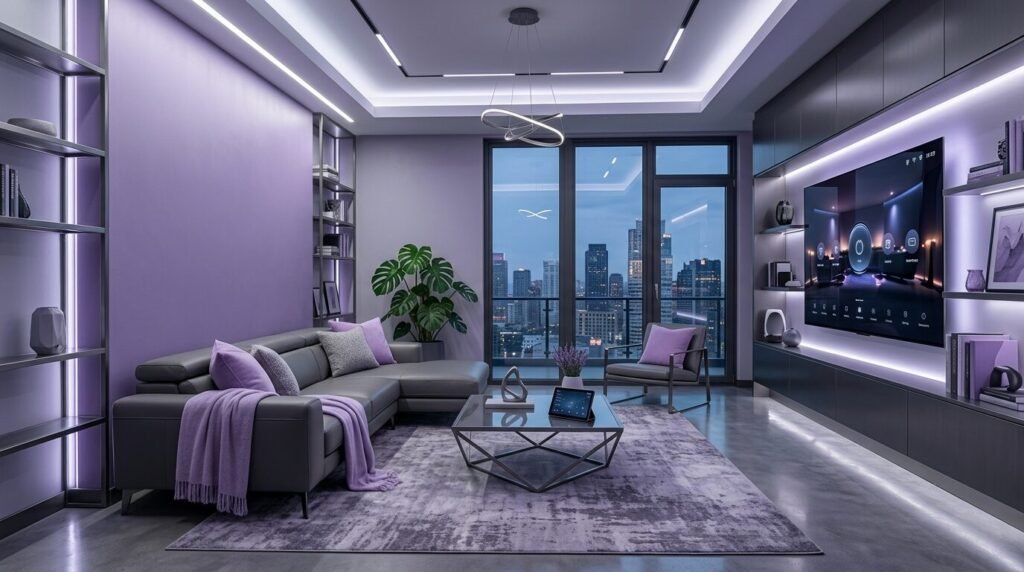
This is for the tech-savvy home. Digital Lavender was a hit in fashion, and now it hit our walls. It is a purple with a lot of grey in it. Gunmetal grey adds a masculine edge. In my experience, lavender can look “old lady” if you are not careful. The dark grey prevents that. Use gunmetal for your coffee table or light fixtures. Use lavender for a single accent wall or your curtains. It creates a calm, futuristic vibe.
4. Apricot Crush and Walnut Wood
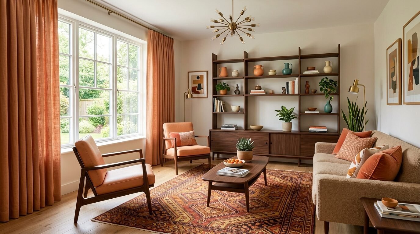
Warmth is the goal for 2026. Apricot is a juicy, energetic orange. Walnut wood is dark and expensive-looking. I once worked with a family who hated orange. I showed them apricot crushed velvet. They fell in love. The dark wood tones of walnut keep the apricot from looking too bright. It feels like a high-end mid-century modern lounge. Look for West Elm or Article furniture in walnut to pair with this paint.
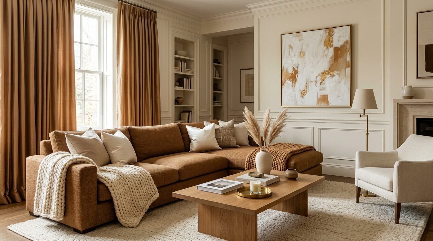
5. Deep Sea Teal and Caramel Leather
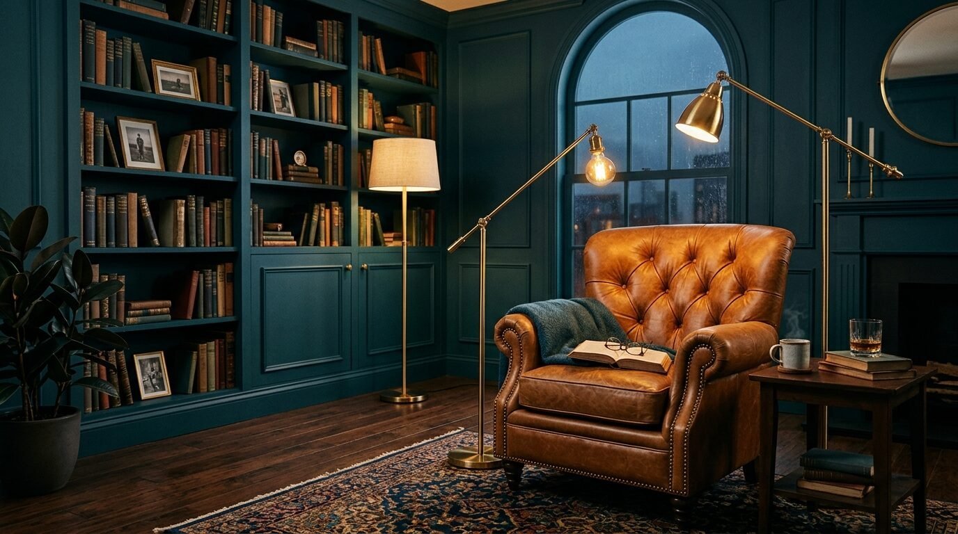
This is a classic that got a 2026 update. Deep sea teal is moody and sophisticated. Caramel leather brings a natural, worn-in feel. I suggest using teal on all four walls if you have a lot of natural light. If the room is dark, keep teal to the furniture. A caramel leather chair from Restoration Hardware looks amazing against a dark teal backdrop. It feels like a private library.
6. Tomato Red and Warm Sand
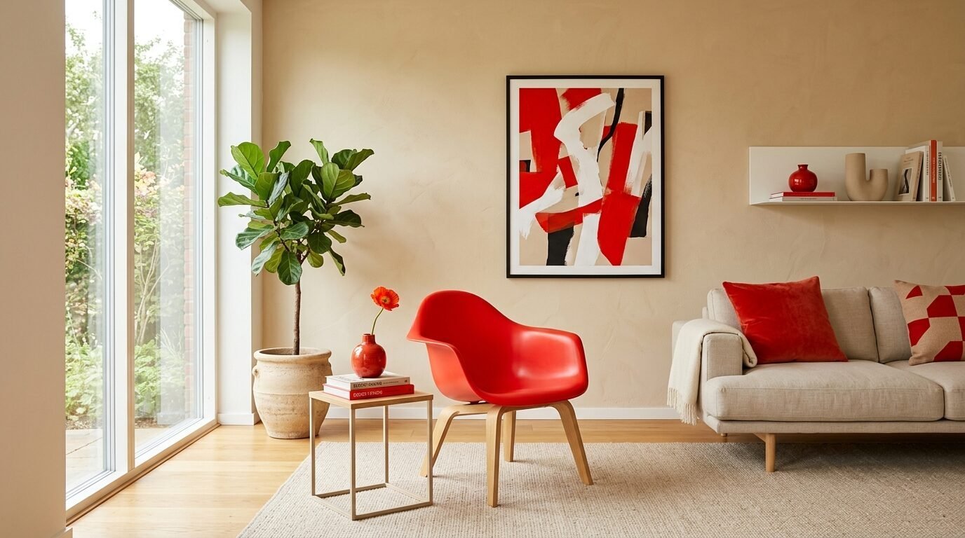
Red is back, but not the primary red of the 90s. This is a warm, orange-toned red. Sand is a soft, warm beige. This combo is high energy. I see this working in “dopamine decor” styles. Use red sparingly. A red lamp or a red side table is enough. Keep the walls and the sofa in the sand tone. It adds a pop of life without giving you a headache. It feels bold and confident.
7. Midnight Navy and Ochre Yellow
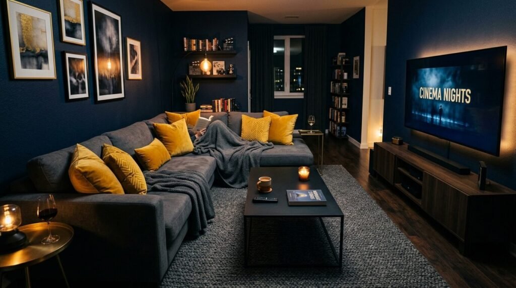
Navy is the new black for 2026. It is softer and more forgiving. Ochre yellow adds a spicy, vintage feel. I used this in a basement remodel last year. The navy hid the weird wall textures. The ochre pillows made the space feel bright. This is a great choice for media rooms. It is cozy but still has a strong personality.
8. Pale Mint and Chocolate Brown
Think of this as an “After Eight” mint palette. Pale mint is very cooling. Chocolate brown is rich and heavy. I noticed that brown furniture is selling out in 2026. People are tired of light oak. Chocolate brown feels more permanent. Mint walls make the brown furniture look modern. It is a very refreshing mix for a living room that gets a lot of afternoon sun.
9. Electric Blue and Concrete Grey
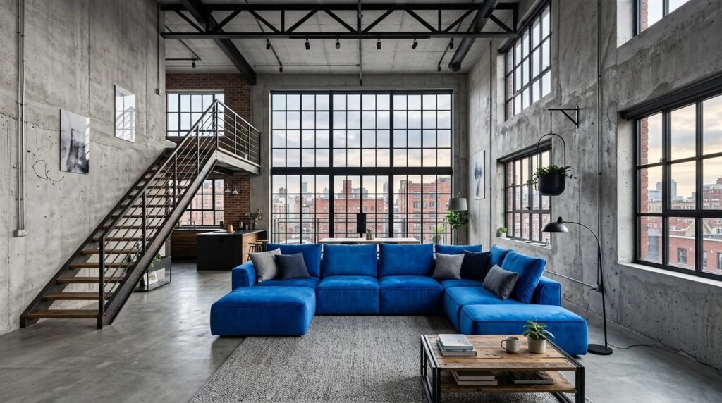
Industrial chic is evolving. Electric blue is a sharp, bright pigment. Concrete grey is flat and matte. This is a high-contrast look. I saw a loft in Chicago use this recently. They had a concrete floor and a giant electric blue sofa. It looked like a piece of art. Use this if you like a clean, minimal, and sharp aesthetic.
10. Sage Green and Deep Rosewood
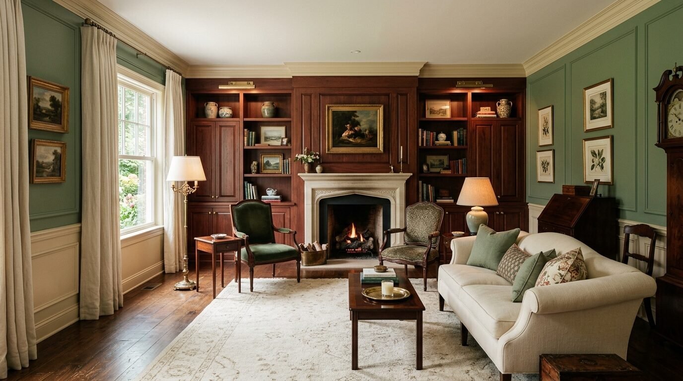
This is a romantic, botanical look. Sage is neutral and soft. Rosewood is a dark, reddish-brown wood or paint color. It feels like an old English manor. I love using rosewood for built-in bookshelves. Sage green walls make the books pop. It is a very literate and cozy atmosphere.
11. Warm White and Toasted Caramel
Monochrome does not have to be boring. Warm white has a drop of yellow in it. Toasted caramel is a mid-tone brown. This is the “quiet luxury” look of 2026. I recommend this for people who want a peaceful home. Layer different textures like wool, linen, and silk. Use the same two colors but in different fabrics. It looks very expensive and well-planned.
12. Teal and Mustard Yellow
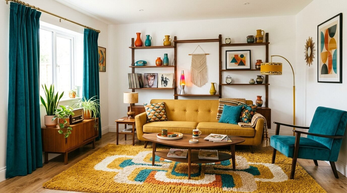
This is a retro revival favorite. Teal is deep and mustard is earthy. It reminds me of the 1970s but cleaner. I once had a client who wanted a “funky” living room. We used a mustard rug and teal curtains. They loved the energy it gave their mornings. It is a great way to show off your personality.
13. Dusty Rose and Olive Green
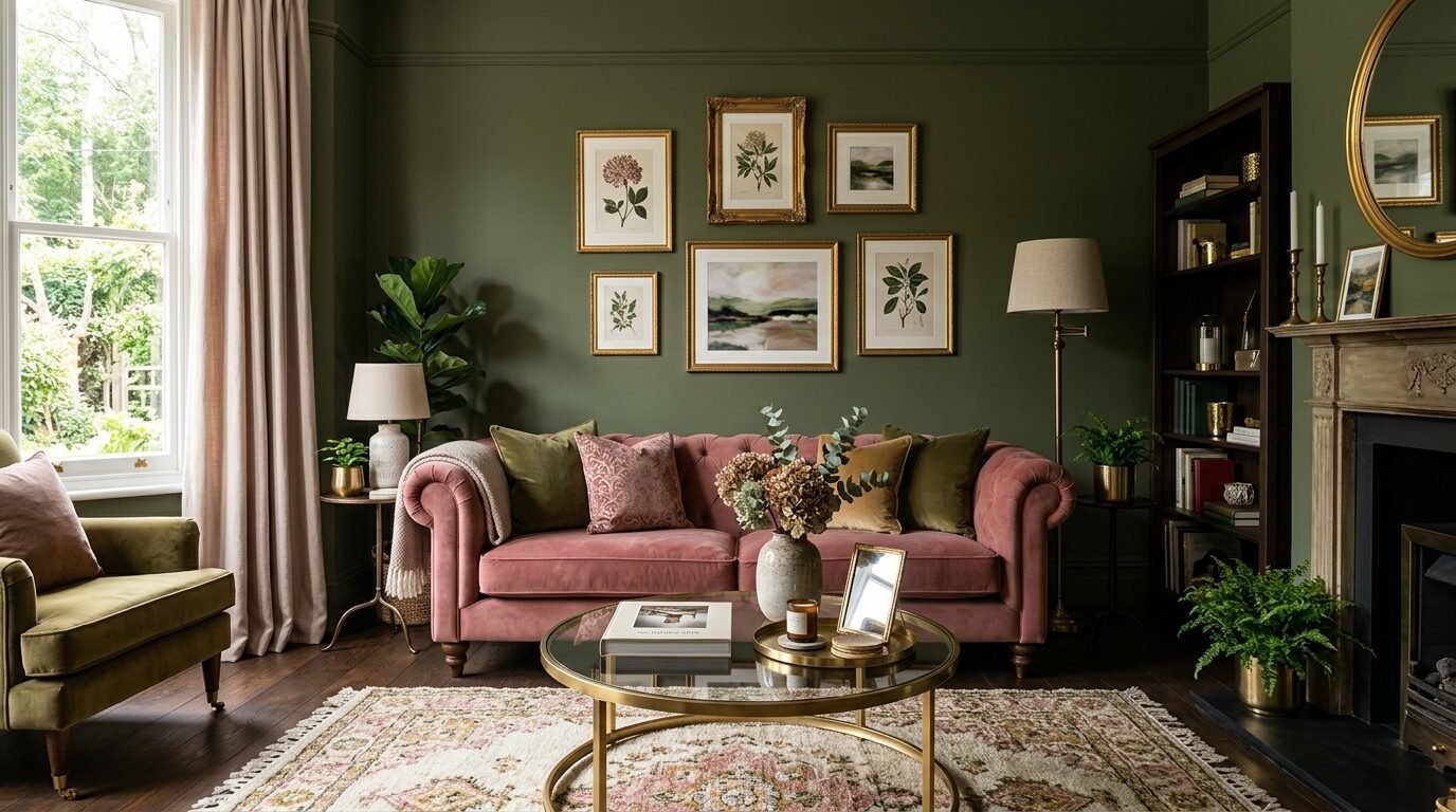
Olive green is a powerhouse neutral in 2026. Dusty rose is a pink that has grown up. It is not “Barbie pink.” It is muted and soft. Together, they feel very sophisticated. I suggest an olive green sofa with dusty rose throw blankets. It is a color scheme that looks great in candlelight.
14. Lilac and Forest Green
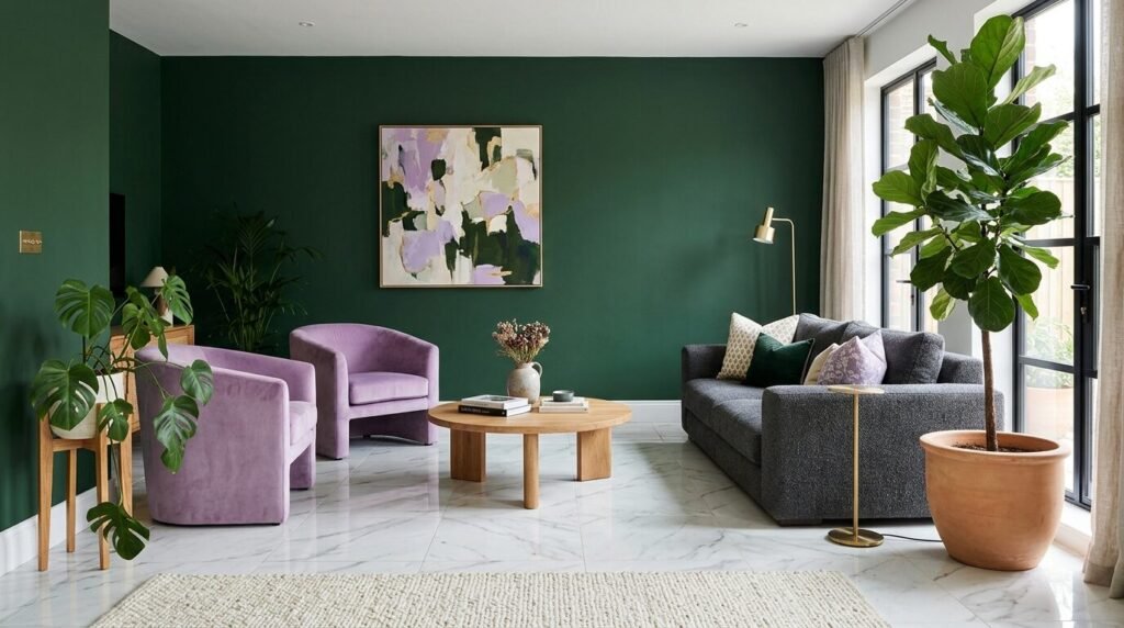
This is a bold, high-fashion choice. Lilac is whimsical. Forest green is serious. The contrast is what makes it work. In my practice, I find that people are afraid of purple. But when you pair it with a dark green, it feels grounded. It looks like a forest floor in the spring.
15. Greige and Soft Gold
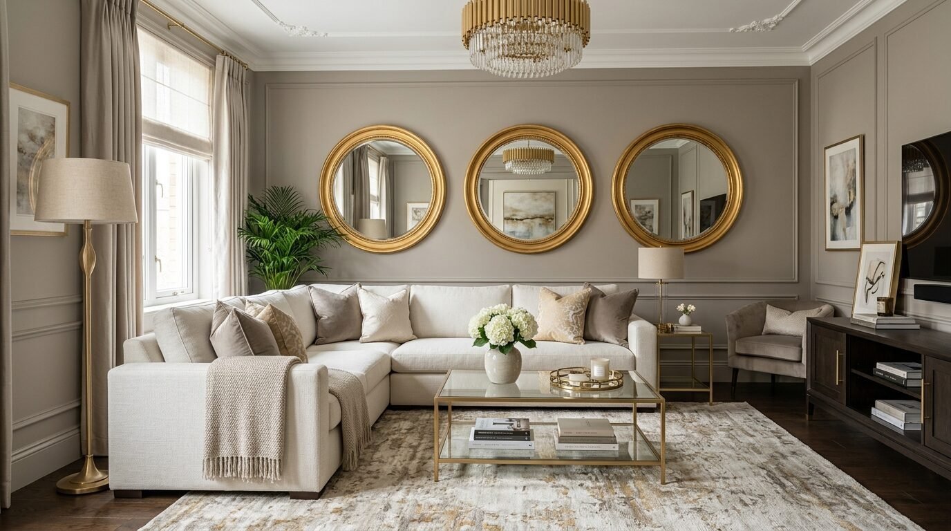
Greige is still around, but it needs gold to survive in 2026. Soft gold can be paint or metal. Use gold picture frames and gold-toned light fixtures. The greige walls provide a calm backdrop. This is a very safe choice if you are planning to sell your home soon. It appeals to everyone.
16. Burnt Orange and Indigo Blue
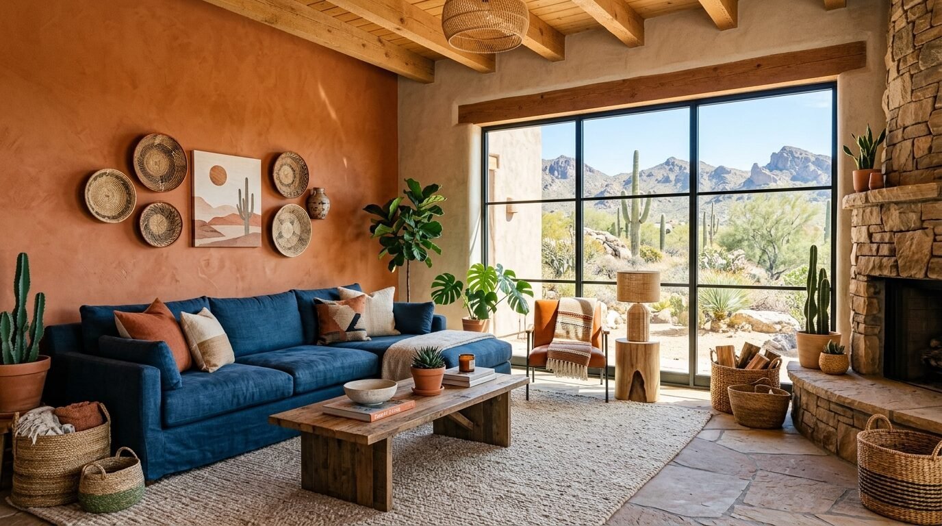
This is a sunset-inspired palette. Burnt orange is cozy. Indigo blue is deep like the night sky. I saw this work in a desert home in Arizona. The orange mimicked the rocks outside. The blue brought in the sky. Use indigo for your main seating and orange for your accents.
17. Sky Blue and Warm Sand
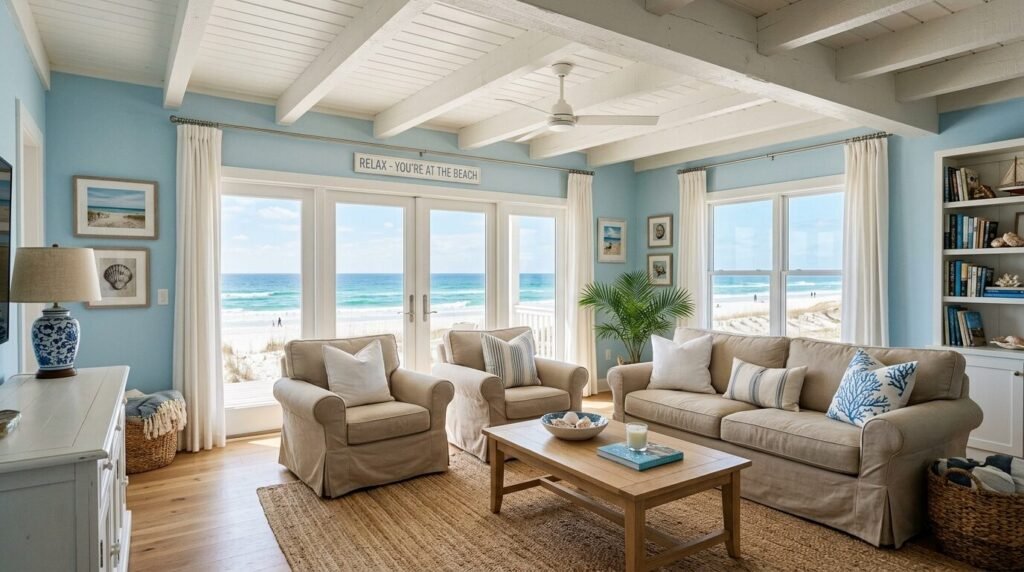
This is the ultimate coastal look. It is not the “nautical” look with anchors and ropes. It is just the colors of the beach. Sky blue walls and sand-colored furniture. I tried this in a Florida condo. It made the room feel five degrees cooler. It is very airy and light.
18. Emerald Green and Blush Pink
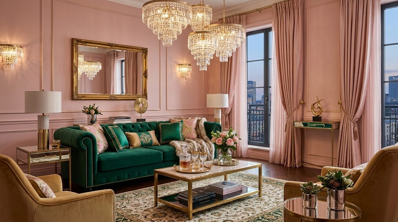
Emerald is a jewel tone that never goes out of style. Blush pink is its perfect partner. I noticed this combo in many high-end hotels recently. It feels very glamorous. Use emerald for a velvet accent chair. Use blush pink for the walls. It is a very “Instagrammable” look.
19. Charcoal Grey and Lemon Yellow
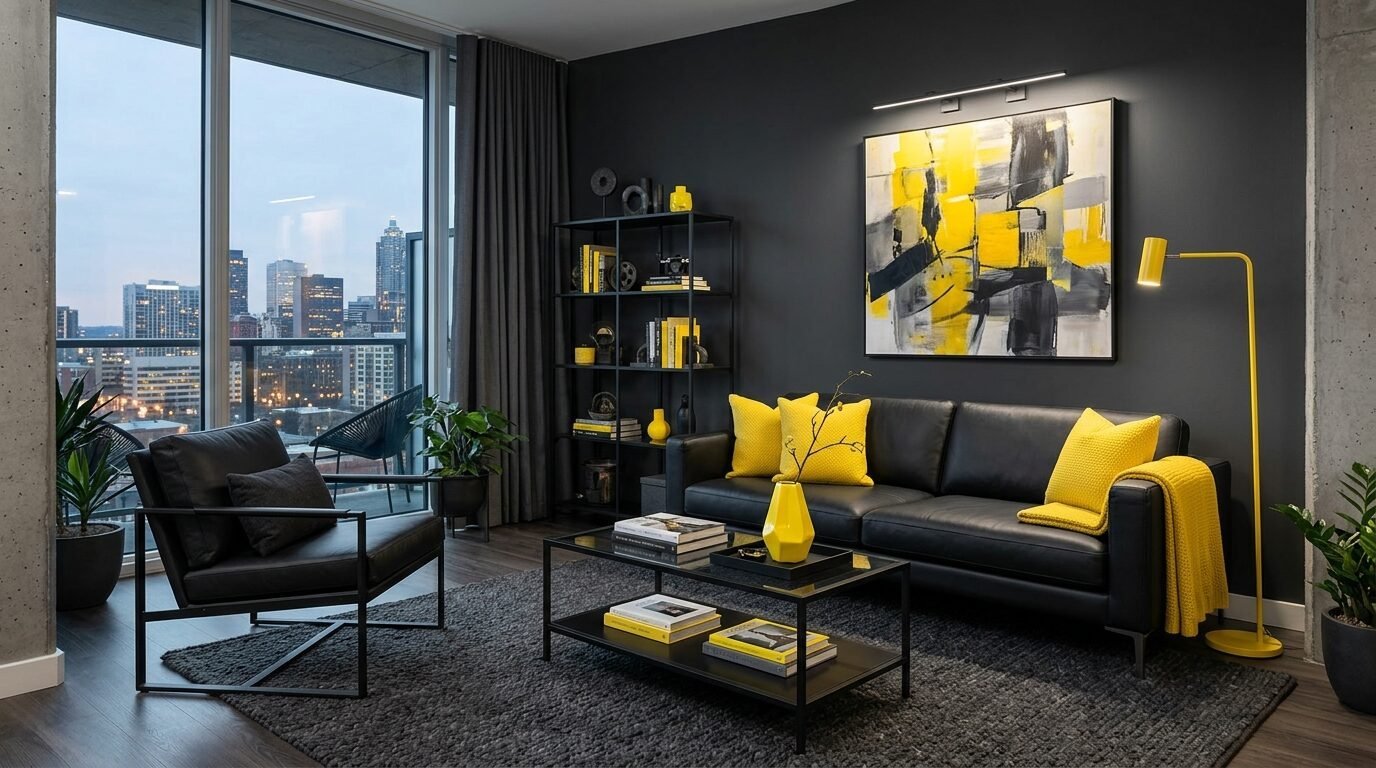
Charcoal is a very dark, moody grey. Lemon yellow is a sharp, bright pop. This is a modern classic. I like to use charcoal for the rug and lemon for small items like vases or books. It feels very urban and “big city.”
20. Terracotta and Cream
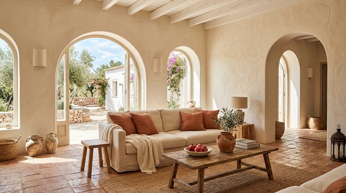
This is a Mediterranean dream. Terracotta is the earth. Cream is the clouds. I suggest using a textured plaster finish for the cream walls. Add terracotta tiles or a terracotta-colored sofa. It feels like a vacation home in Italy.
21. Mauve and Slate Grey
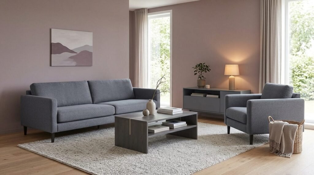
Mauve is a purple-grey that is very trendy right now. Slate grey is a cool neutral. This is a very calming palette. I used this in a home office that doubled as a living room. It helped my client stay focused but relaxed. It is a very adult and polished look.
22. Sage Green and Pewter
Pewter is a metallic grey with a bit of warmth. Sage is soft. This is a very organic and metallic mix. I love using pewter hardware on sage green cabinets. In a living room, use a pewter coffee table. It feels very hand-crafted and unique.
23. Plum and Dove Grey
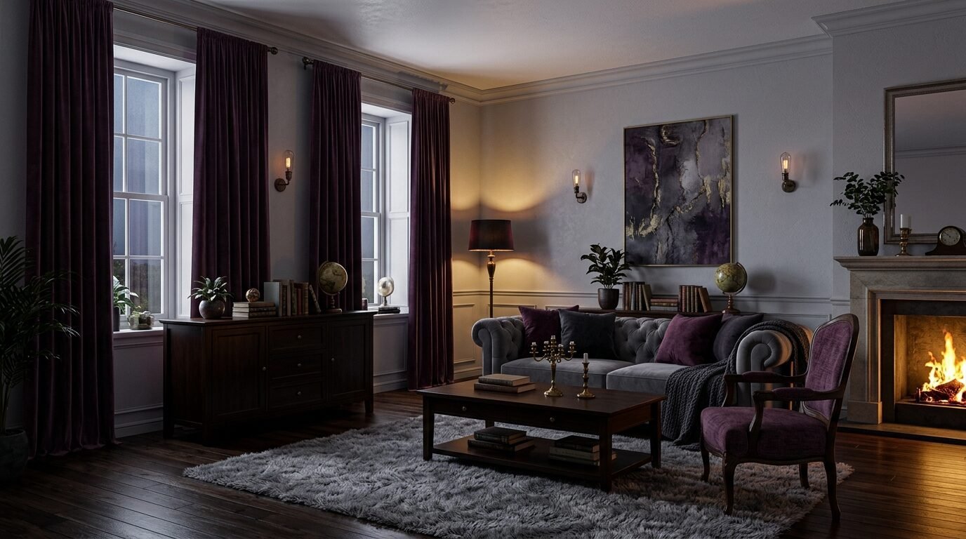
Plum is a very rich, dark purple. Dove grey is a light, airy grey. This is a very “royal” feeling combo. I recommend using plum for your curtains. When the sun hits them, the whole room turns a beautiful shade of violet. The grey walls keep it from feeling too dark.
24. Ivory and Onyx
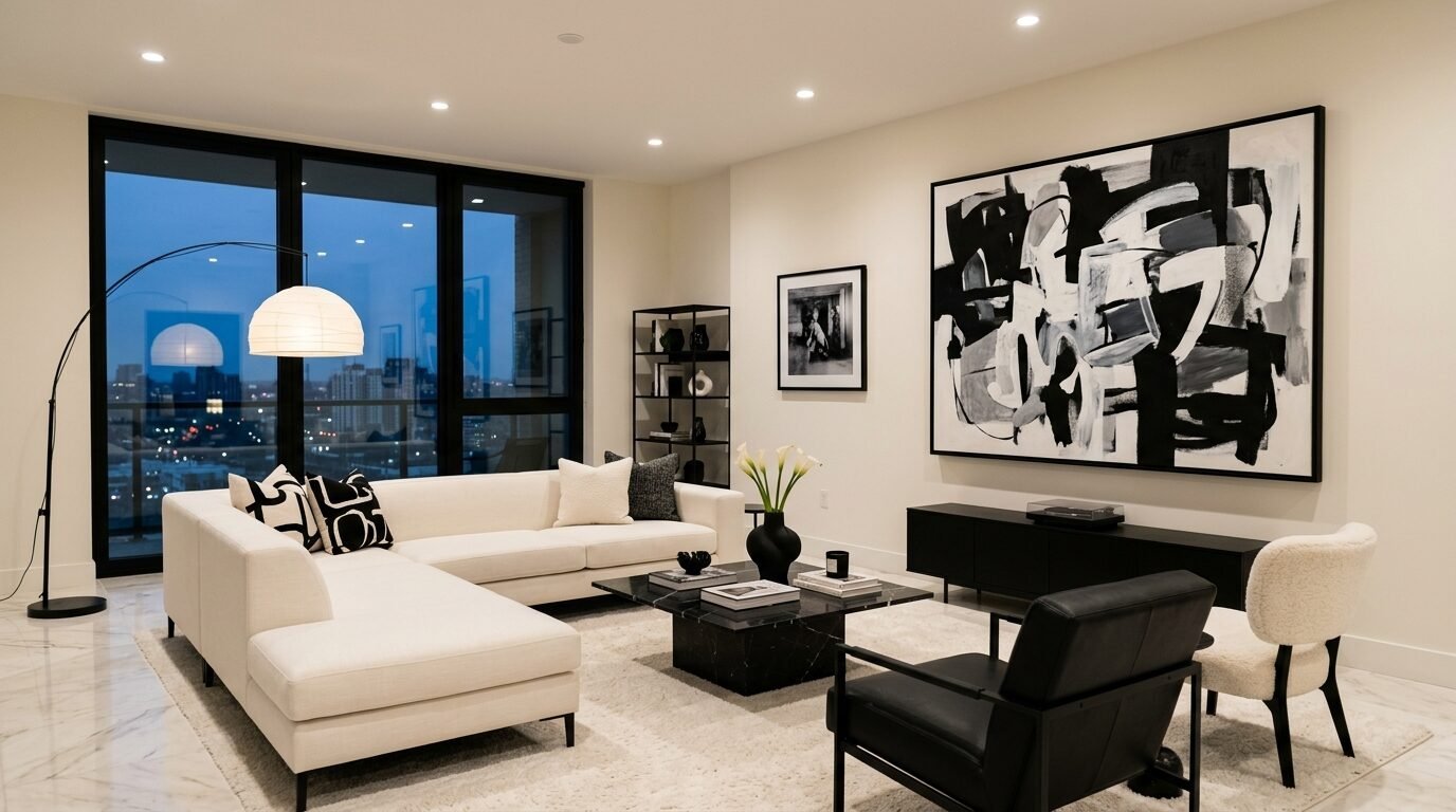
Black and white is the timeless choice. In 2026, we use ivory instead of pure white. Ivory is softer. Onyx is a deep, matte black. This is very high-contrast and sharp. I saw a house in Los Angeles that used ivory walls with black window frames. It looked incredible. It is simple, clean, and never goes out of style.
Common Mistakes to Avoid in 2026
I have seen many color projects fail. The biggest mistake is the “Accent Wall Trap.” People paint one wall bright red and leave the rest white. It looks unfinished. Instead, try painting the whole room a lighter version of that color.
Another failure I saw involved “Digital Lavender.” A client painted her whole ceiling and walls this color. It felt like being inside a grape. We fixed it by adding dark wood furniture and black metal lamps. You need a “weight” to pull bright colors down to earth.
Always check your paint samples at night. LED lights in 2026 have different “color temperatures.” A blue that looks great at noon might look like a hospital room at 8 PM. Buy a small pot. Paint a large piece of cardboard. Move it around the room for two days. This saves you hundreds of dollars in mistakes.
Frequently Asked Questions
What is the main color for 2026?
The industry is pointing toward “Butter Yellow.” It represents a move toward optimism and warmth. We are seeing it in textiles, kitchen appliances, and wall paints. It is a very easy color to live with compared to the greys of the past decade.
How do I pick a color for a small living room?
Do not feel like you must use white. Dark colors like “Midnight Navy” can actually make a room feel bigger. They blur the corners of the room. This creates an illusion of infinite space. If you want light, go for “Pale Mint” or “Sky Blue.”
Are grey living rooms out of style?
Plain “Cool Grey” is moving out. “Warm Grey” or “Greige” is still okay. People want more “pigment” now. If you have a grey room, add a warm wood coffee table or some “Apricot” pillows to bring it into 2026.
How many colors should be in a living room?
Follow the 60-30-10 rule. 60% is your main color (usually walls). 30% is your secondary color (upholstery). 10% is your accent color (decor). This creates a balanced look that is easy on the eyes.
Can I mix warm and cool colors?
Yes. In fact, you should. “Terracotta” (warm) and “Sage” (cool) is a perfect example. This balance keeps a room from feeling too “hot” or too “cold.” It creates a natural harmony that feels like the outdoors.
Is wallpaper coming back in 2026?
Yes, but in solid textures. People are using grasscloth wallpaper in colors like “Forest Green” or “Ochre.” It adds color and touchable texture at the same time. It is a great way to hide bad walls.
Your Next Steps for a Color Refresh
Color is the fastest way to change your life at home. You don’t need a full remodel. Start with one of these 24 ideas. Buy three paint samples today. Paint them on your wall. Watch how the light hits them. Pick the one that makes you feel the most at peace. Your home is your sanctuary. It should look like it. I predict that by the end of 2026, we will see even more “Dopamine Decor” where every room has a distinct, happy color. Don’t be afraid to be the first in your friend group to try it.
Sloane Whitaker is the Editor-in-Chief at Home Wall Trends, leading editorial direction with over a decade of experience in residential interior design and home styling. Her specialty is space planning and layout, the unglamorous fundamentals that make a beautiful room actually function. A graduate of the New York School of Interior Design, Sloane has styled over 200 client homes before turning her focus to digital publishing. Her editorial standard: “If a reader can’t picture themselves doing it on a Saturday afternoon, we haven’t explained it well enough.”