Staring at a wall of tiny paint swatches is enough to make anyone feel dizzy. I remember spending four hours at a local Sherwin-Williams last April. I left with twenty strips of “off-white” that all looked identical under store lights. Once I got home and slapped them on my north-facing wall, half turned a sickly shade of green. It was a mess.
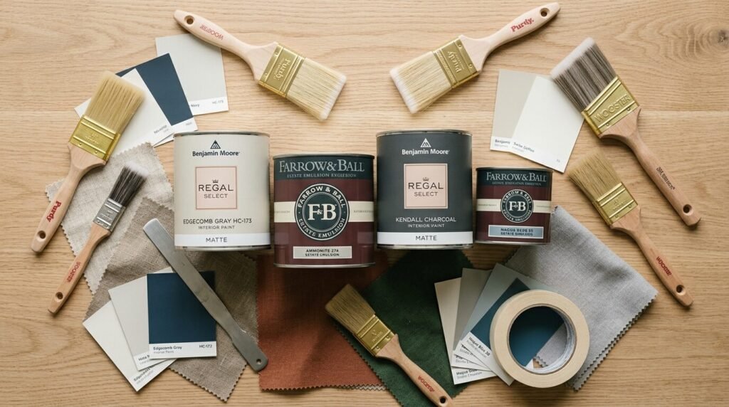
Choosing the right color is a high-stakes game. You are spending $75 a gallon for premium Farrow & Ball or $45 for Behr Marquee. Add the cost of brushes and your own weekend time. The pressure to get it right is heavy.
This guide cuts through the noise. I have tested these shades in real homes over the last year. These are the 22 living room paint color ideas trending this year that actually work in real life. We will look at light reflectance, undertones, and how they feel at sunset.
Executive Summary
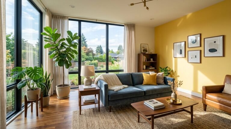
The trend this year moves away from cold, sterile grays. We are seeing a massive shift toward “earthy warmth” and “quiet luxury.” People want their living rooms to feel like a hug.
Expect to see deep, mossy greens and buttery creams dominating the scene. I have noticed that homeowners are finally brave enough to try “color drenching.” This means painting the walls, trim, and ceiling the same color.
We will cover 22 specific shades from brands like Benjamin Moore and Sherwin-Williams. You will see cost breakdowns and tips for different lighting. My goal is to help you avoid the “prison cell gray” mistake I made three years ago.
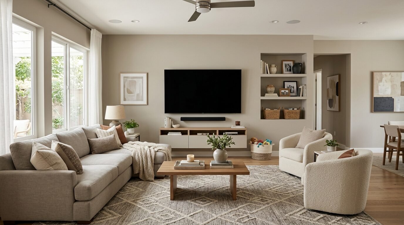
1. Mushroom Beige
Mushroom beige is the king of the “new neutrals.” It is warmer than gray but cooler than traditional tan. I used Sherwin-Williams Accessible Beige in a client’s sunny loft last July. The color felt sophisticated without being boring.
It works because it has a slight green undertone. This prevents it from looking like a 1990s rental office. In my experience, this shade pairs perfectly with black metal accents and oak furniture.
Expect to pay around $50 to $65 per gallon for a high-quality satin finish. It hides scuffs well, which is great if you have dogs or kids.
2. Moody Navy
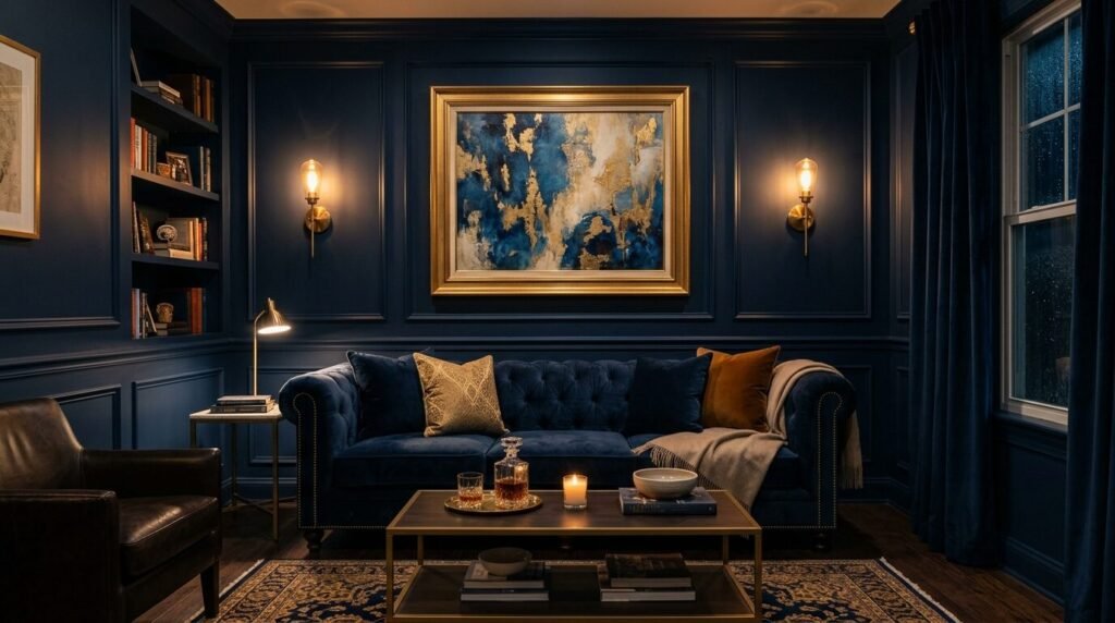
Navy is no longer just for nautical themes. A deep navy like Benjamin Moore Hale Navy creates instant drama. I saw this work wonders in a small den recently.
People think dark colors make rooms feel smaller. That is a myth. Dark colors make the walls recede. This creates a sense of infinite depth.
You need plenty of lamps for this one. At night, a navy room feels incredibly cozy and private. It is a bold choice that pays off in high-end vibes.
3. Soft Sage Green
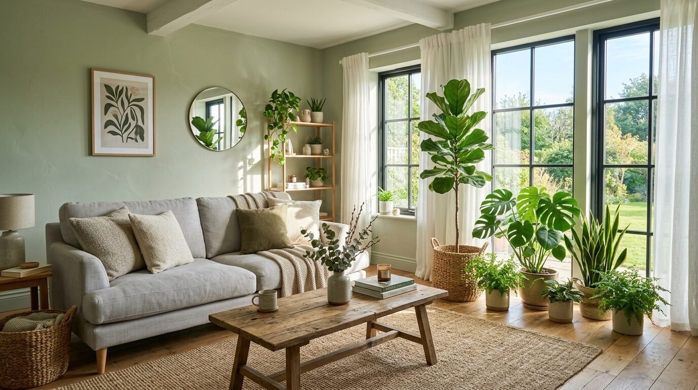
Sage green is the ultimate “stress-relief” color. Farrow & Ball French Gray is a top pick here. Despite the name, it reads as a soft, earthy green.
I’ve noticed this color works best in rooms with lots of plants. It blurs the line between your living room and the garden outside.
It feels fresh in the morning and cozy under warm light bulbs. Sage is a safe bet if you want color but fear anything too bright.
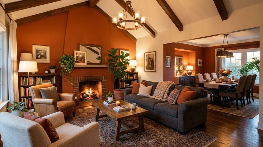
4. Warm Terracotta
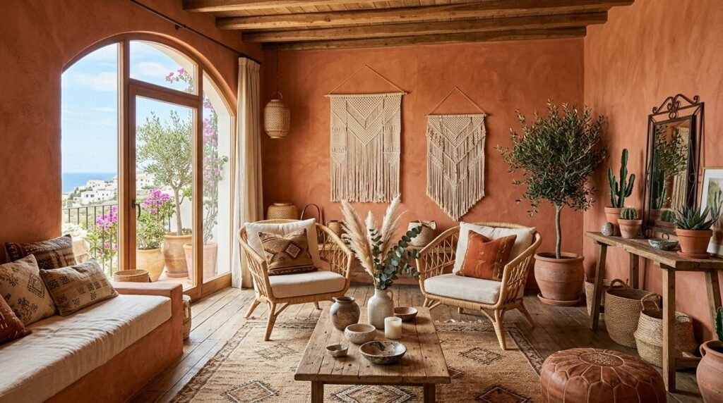
Terracotta is making a huge comeback. It brings a Mediterranean heat to even the coldest climates. I tried a shade called “Canyon Ridge” by Behr in a basement remodel.
The room went from “scary cave” to “boutique hotel” in two coats. It has an orange base but stays grounded with brown pigments.
Pair this with cream linens and woven rugs. It is a vibrant choice that feels grounded in nature.
5. Butter Cream
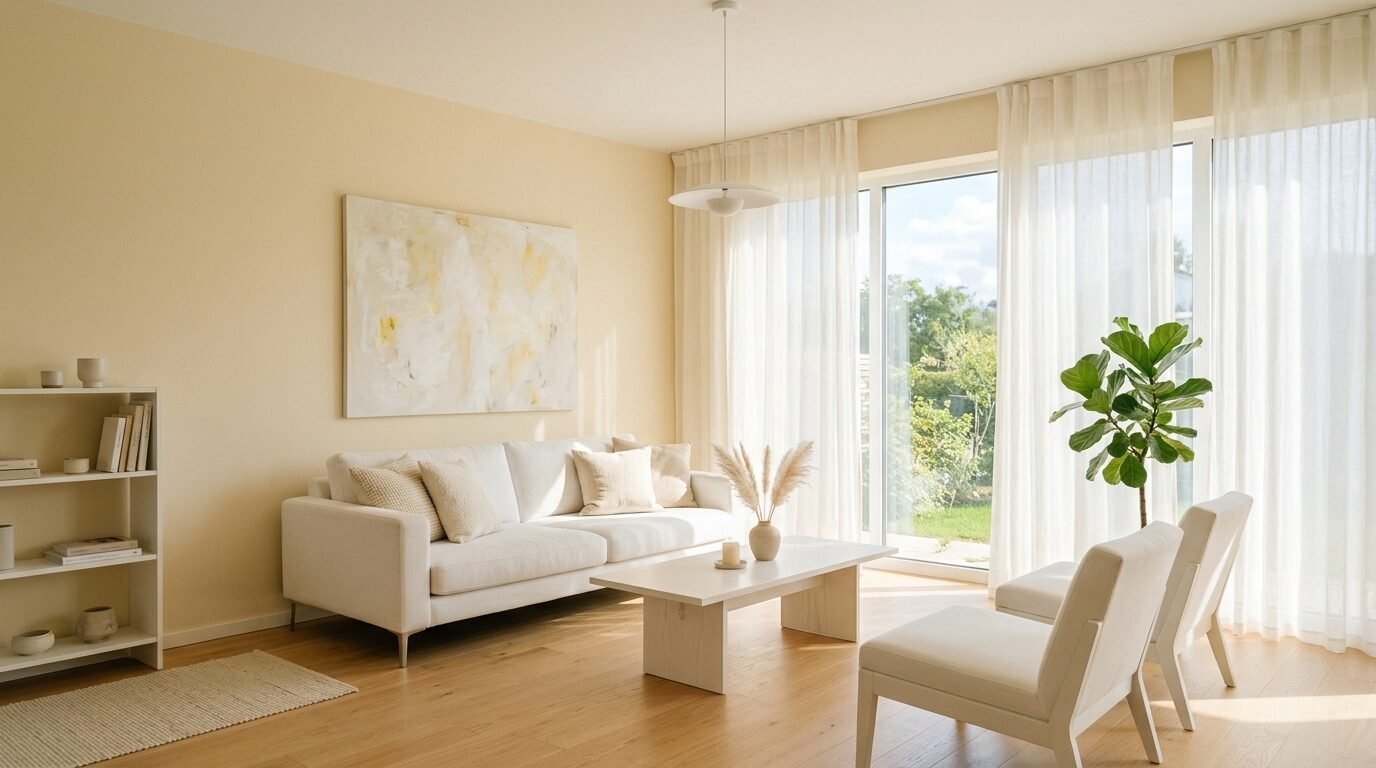
Pure white can feel like a hospital. Butter cream offers that same brightness with a spoonful of sugar. Benjamin Moore Simply White is my favorite for this.
It has just enough yellow to feel sunny even on a cloudy day. I have seen this work in dark apartments that get zero direct sunlight.
It makes the room feel airy and clean. Just be careful with your light bulbs. Use 3000K bulbs to keep it from looking too yellow.
6. Charcoal Slate
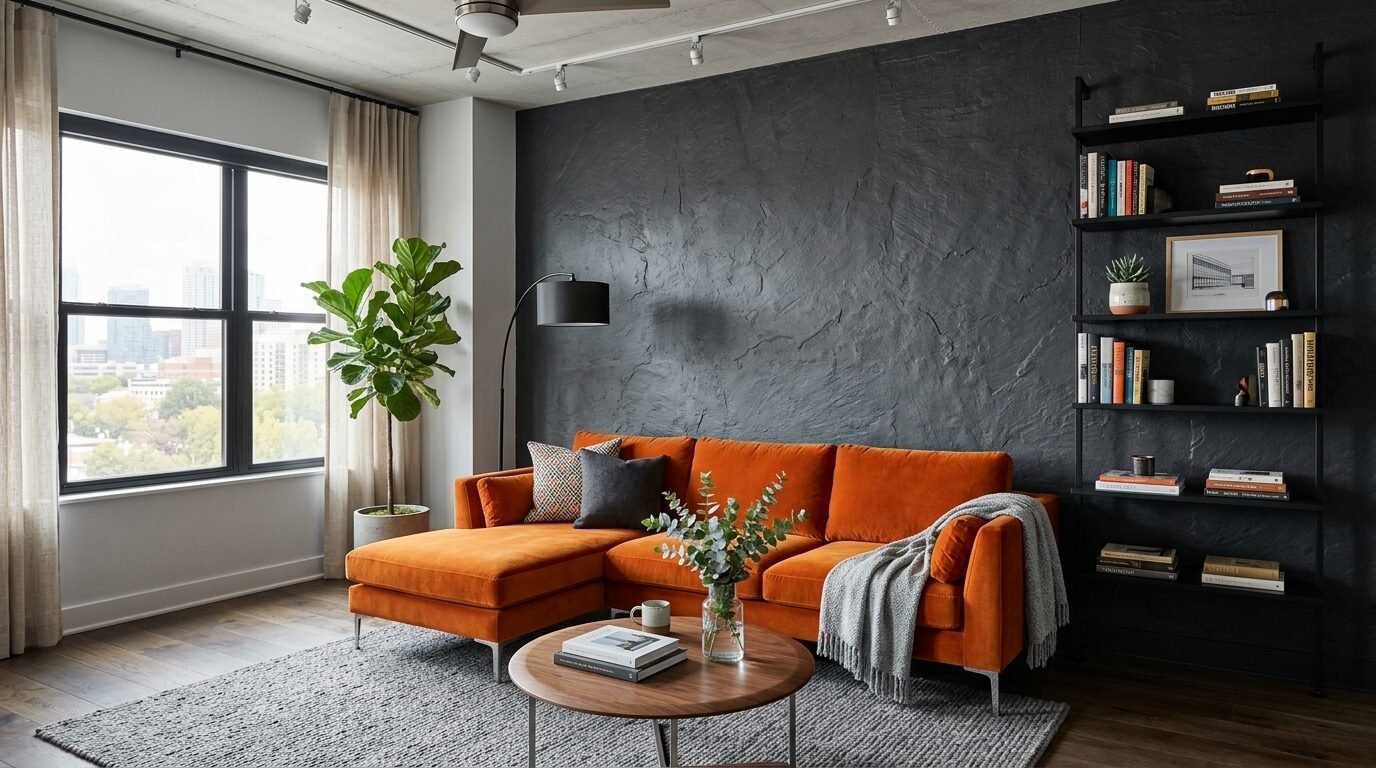
Charcoal is for the person who wants a black room but is not quite ready to commit. It is a smoky, deep gray with blue or purple undertones.
I used this on an accent wall behind a velvet sofa. The result was stunning. It makes colorful art pop like nothing else.
Be sure to buy a flat or matte finish for this. Shiny dark walls show every single bump in your drywall.
7. Dusty Rose
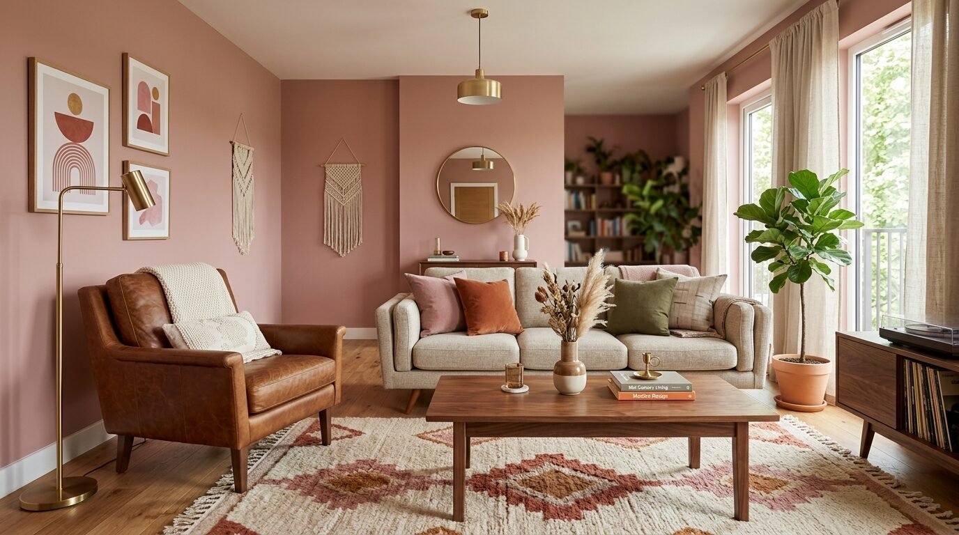
Forget the “nursery” vibes. Modern dusty rose is grown-up and chic. Think of a dried flower or a sunset in the desert.
I saw a living room painted in Backdrop’s “36 Hours in Marrakesh” recently. It felt warm and surprisingly masculine when paired with leather chairs.
It is a great alternative to beige. It adds a layer of personality without screaming for attention.
8. Forest Green
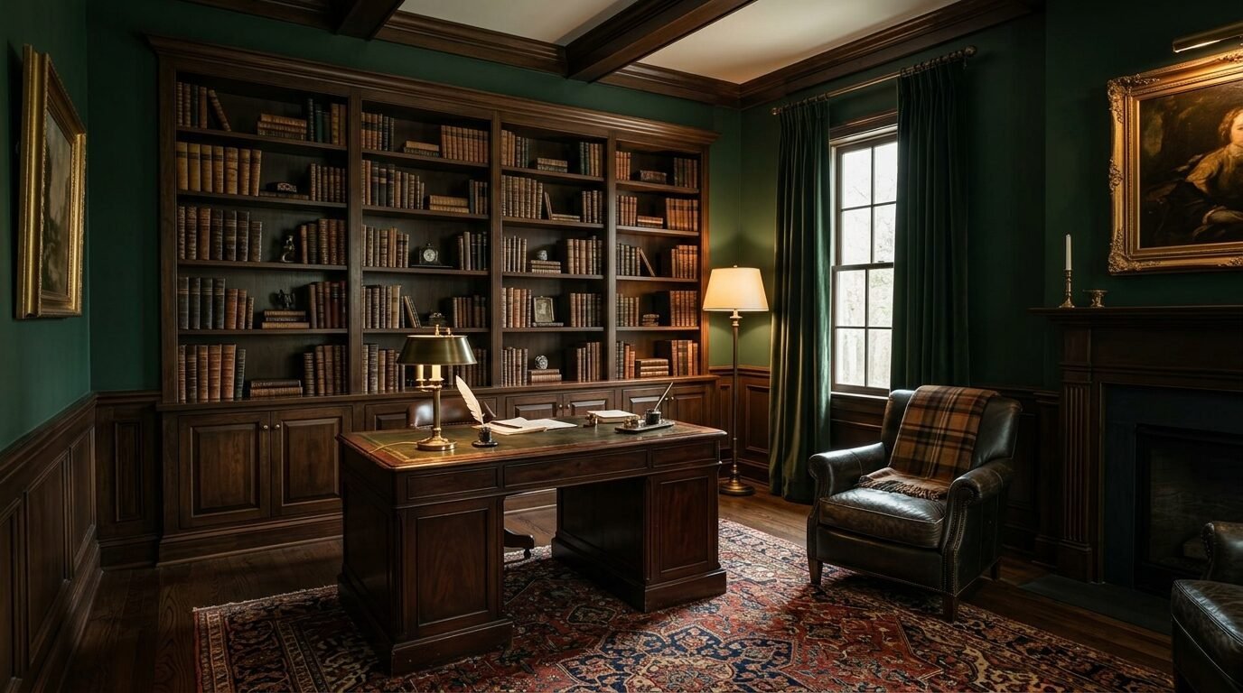
Dark green is the “new black” for 2026. A shade like Sherwin-Williams Dark Night is incredibly rich.
I’ve seen this used in library-style living rooms with floor-to-ceiling bookshelves. It feels expensive.
This color requires at least three coats for a smooth finish. Dark pigments are notoriously hard to apply evenly. Budget for extra paint and a high-quality roller.
9. Pale Lavender
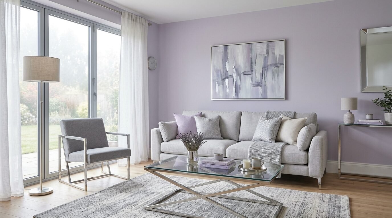
Lavender is the “wild card” entry for this year. It sounds scary but looks like a soft misty morning when done right.
Look for shades with heavy gray undertones. It should look like a “gray that forgot it was purple.”
It works beautifully in rooms with silver or chrome finishes. It is a cooling color that feels very modern.
10. Warm Pewter
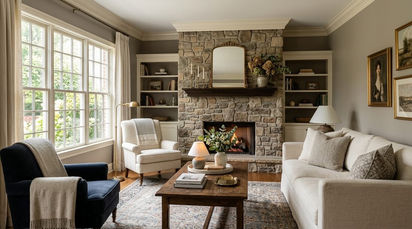
Pewter is the solution for people who miss the gray trend but want to update it. It is a “warm” gray that sits close to taupe.
I recommend Revere Pewter by Benjamin Moore. It is arguably the most famous paint color in the world for a reason.
It looks different in every house. In some, it looks like a warm stone. In others, it looks like a soft beige. Always test a sample first.
11. Chocolate Brown
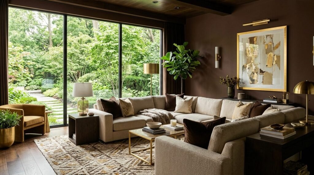
Brown is the biggest surprise of the season. We are seeing a shift toward “70s lounge” aesthetics.
A deep chocolate brown on the walls feels like a luxury wrapping paper. It is sophisticated and unexpected.
I suggest using this in a room with large windows. The natural light prevents the brown from feeling muddy or “dirty.”
12. Sky Blue
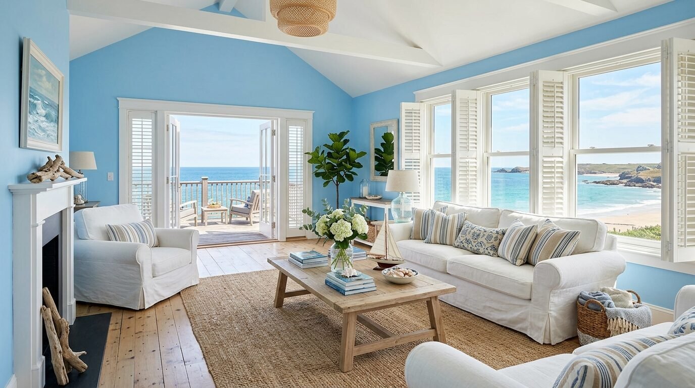
Sky blue provides a permanent “clear day” feeling. This isn’t a “baby blue.” It is a crisp, clean blue with a hint of white.
I’ve noticed this works best in coastal-style homes. It pairs naturally with white trim and light wood floors.
It makes small ceilings feel much higher than they actually are. It is a breath of fresh air for a cramped space.
13. Deep Teal
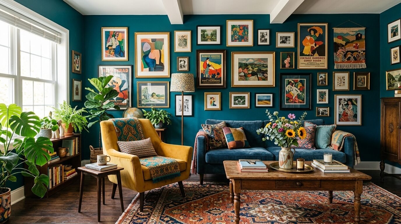
Teal is for the adventurous soul. It is a mix of blue and green that feels exotic and bold.
I saw a stunning living room using “Vardo” by Farrow & Ball. The color shifted from green to blue as the day went on.
This is a great choice for an “eclectic” home. It holds up well against colorful rugs and gold picture frames.
14. Greige
Greige is still a powerhouse. It is the perfect blend of gray and beige. It is the “safe” choice that still looks designer.
I often suggest Behr Perfect Taupe for this look. It is affordable and covers well.
It is the best color if you plan on selling your home soon. It appeals to almost everyone and makes the space look “finished.”
15. Soft Black
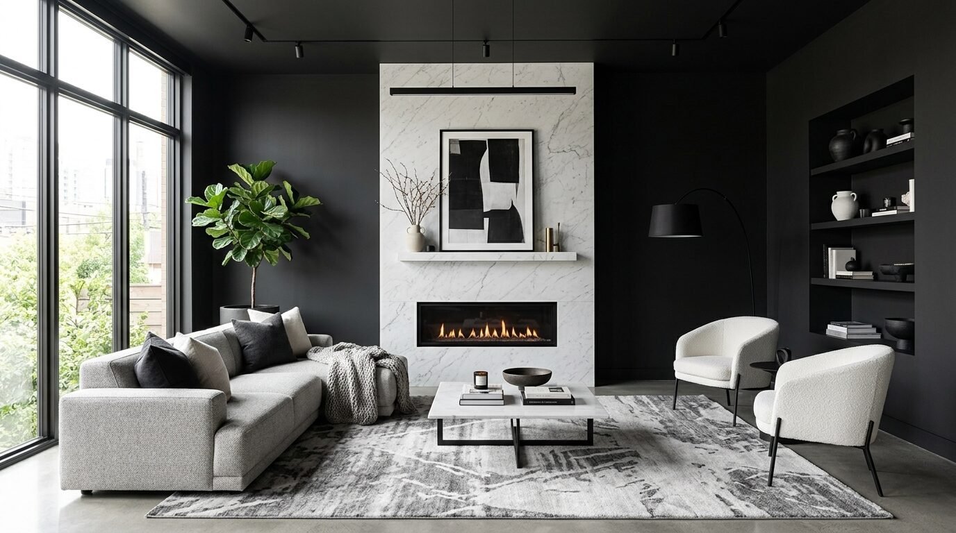
A room painted “soft black” is a statement of confidence. It is not a true “jet black.” It is more like a very dark ink.
I used “Tricorn Black” on a fireplace wall last winter. It made the flames look twice as bright.
The key is to use a “matte” finish. This absorbs light and makes the wall look like velvet.
16. Mustard Yellow
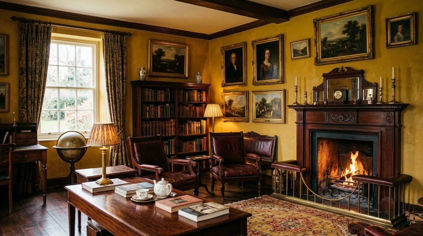
Yellow is difficult. But a muted, mustard yellow is pure gold. It feels historic and cozy.
I saw this in a Victorian-style living room recently. It looked like an old library in London.
Avoid “lemon” yellows. Look for shades that have a bit of brown or “dirty” pigment in them to keep it sophisticated.
17. Minty Aqua
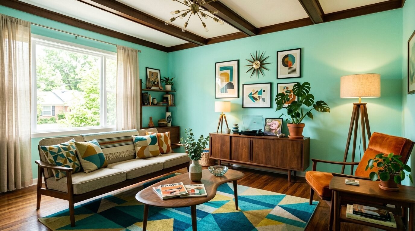
This is a refreshing, pale green-blue. It is very popular in “mid-century modern” designs right now.
It feels energetic. I recommend this for a living room that also serves as a workspace.
It keeps your brain awake. Pair it with walnut furniture for a classic 1950s look that feels updated for today.
18. Burnt Orange
Burnt orange is the color of autumn. It is cozy, social, and warm.
I’ve seen this work in rooms with high ceilings. It “lowers” the ceiling visually to make the room feel more intimate.
It is a loud color. You might want to use it on just one wall if you are nervous about committing.
19. Pale Peach
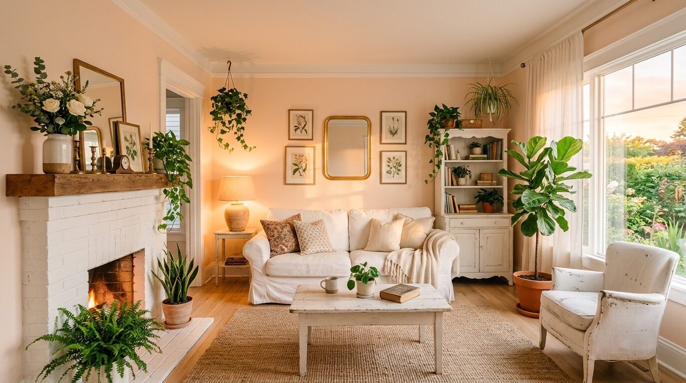
Peach is the softer cousin of terracotta. It gives everyone in the room a “healthy glow.”
I noticed that skin tones look amazing in peach-colored rooms. It is a very flattering backdrop for parties.
It feels vintage but in a “cool” way. It looks great with green houseplants and rattan furniture.
20. Olive Green
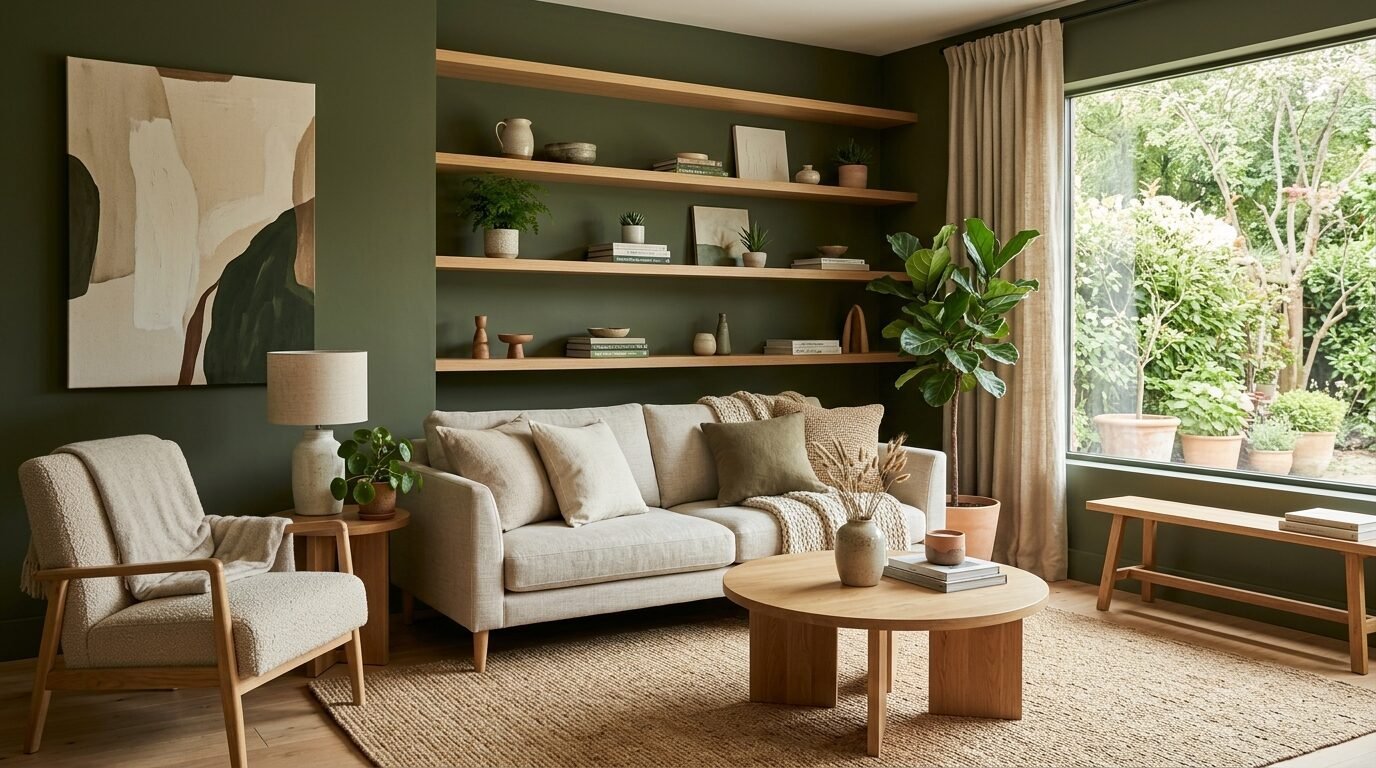
Olive green is a neutral in disguise. It is sophisticated, grounded, and very trendy.
I love “Olive Sprig” by PPG. It is a soft, organic green that works with almost any wood tone.
It brings a sense of history to a room. Even a brand-new house feels “lived-in” with olive walls.
21. Deep Plum
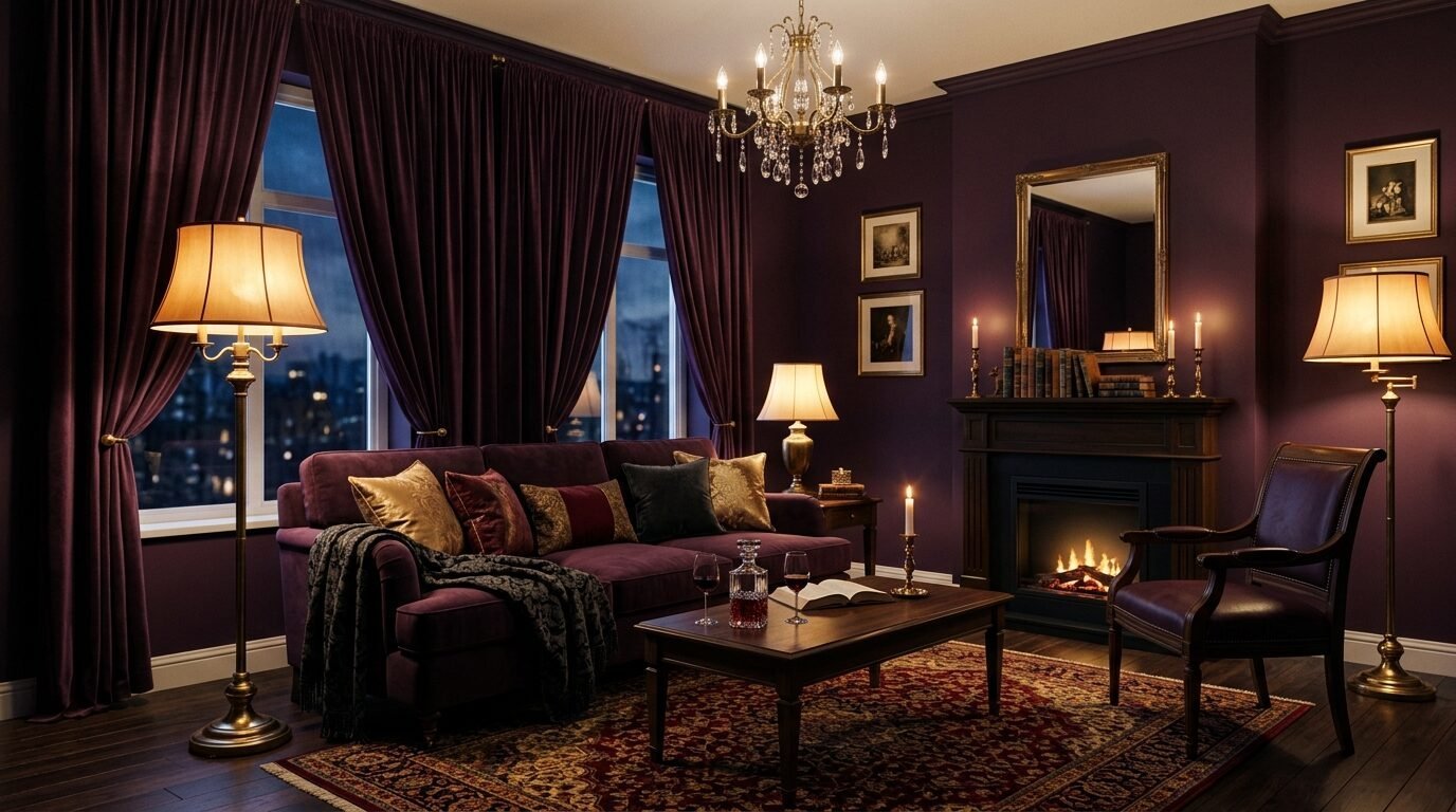
Plum is the ultimate luxury choice. It is a dark, regal purple that looks nearly black in low light.
I saw this in a room with brass lamps and it was breathtaking. It is a very romantic color.
It is perfect for a “media room” or a place where you watch movies. It makes the screen pop and the room disappear.
22. Steel Blue
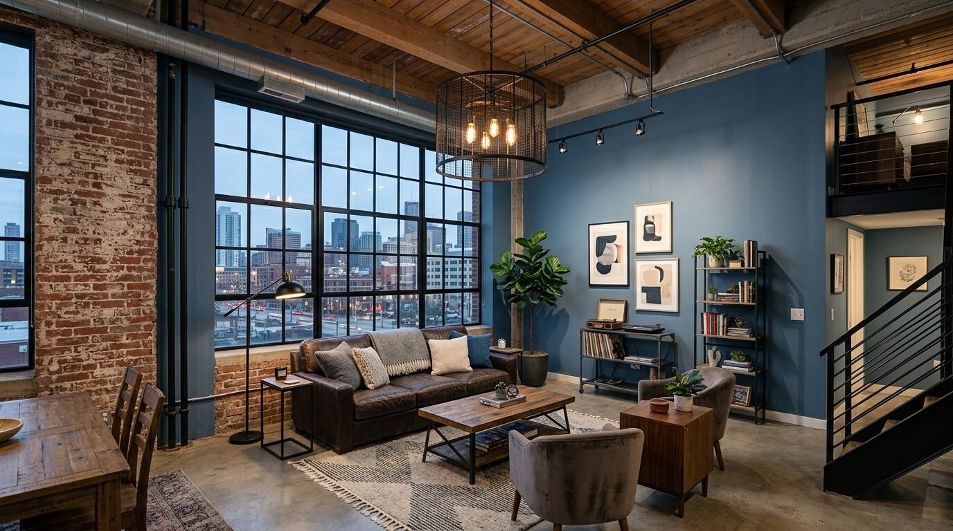
Steel blue is a cool, industrial color. It is blue with a heavy dose of gray and a tiny bit of green.
It feels very “New York City loft.” It is professional and calm.
I recommend this for south-facing rooms that get too much hot sun. The blue “cools” the room down visually.
Frequently Asked Questions
What is the most popular living room color for 2026?
The trend is leaning heavily toward “Mushroom” and “Sage Green.” People are moving away from the “all-white” look. They want colors that feel organic and connected to the earth. Warm neutrals are the safest and most popular choices for general homeowners.
Should I paint my ceiling the same color as the walls?
This is called color drenching. It is very popular right now. It creates a seamless, “wrapped” look. I have tried this in small rooms and it actually makes them feel larger. It removes the “visual break” at the top of the wall. However, only do this with lighter colors or mid-tones. A black ceiling can feel very heavy.
How much does it cost to paint a living room?
If you do it yourself, expect to spend $150 to $300 on paint and supplies. Professional painters usually charge between $800 and $2,000 for a standard living room. This depends on your location and the amount of trim work. Premium paints like Farrow & Ball will double your material costs but offer much better depth of color.
Does the “Light Reflectance Value” (LRV) matter?
Yes, it is the most important number on the back of the paint chip. It tells you how much light the color reflects. A score of 100 is pure white. A score of 0 is pure black. If you have a dark room, look for an LRV above 60. If you have a bright room, you can handle an LRV of 20 or lower.
What finish should I use for living room walls?
Eggshell or Satin is the standard for living rooms. They have a tiny bit of shine which makes them easier to clean. Flat or Matte finishes look beautiful and “high-end,” but they show fingerprints and are hard to wipe down. I always use Satin on the walls and Semi-Gloss on the baseboards and doors.
Conclusion
Choosing a paint color is a journey. It is okay to be nervous. I have seen hundreds of living rooms, and the most successful ones are the ones where the owner took a small risk.
Start by buying three sample pots. Paint large squares on different walls. Watch how the color changes at 10 AM and 8 PM. In my experience, the color you like at sunset is usually the winner.
Whether you go for a “Mushroom Beige” or a “Deep Plum,” remember that paint is not permanent. It is the cheapest way to completely change your life at home. Pick a shade that makes you feel good when you walk through the door.
Sloane Whitaker is the Editor-in-Chief at Home Wall Trends, leading editorial direction with over a decade of experience in residential interior design and home styling. Her specialty is space planning and layout, the unglamorous fundamentals that make a beautiful room actually function. A graduate of the New York School of Interior Design, Sloane has styled over 200 client homes before turning her focus to digital publishing. Her editorial standard: “If a reader can’t picture themselves doing it on a Saturday afternoon, we haven’t explained it well enough.”