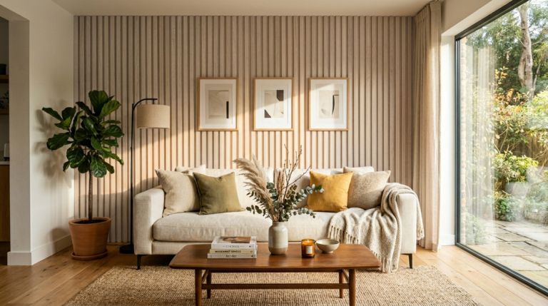
Blank walls feel cold. I remember staring at my own white living room wall for months. It felt like a hospital room. I wanted character. I wanted a story. A gallery wall changed everything. It made the room feel finished. It made the space feel like home. You do not need a huge budget. You just need a plan.
This guide gives you 25 specific ways to fill that space. We will look at layouts. We will look at frames. I will share what I saw work in real homes. These ideas are for beginners. They are for experts. They are for anyone who wants a beautiful home.
The Executive Summary of Your Wall Project
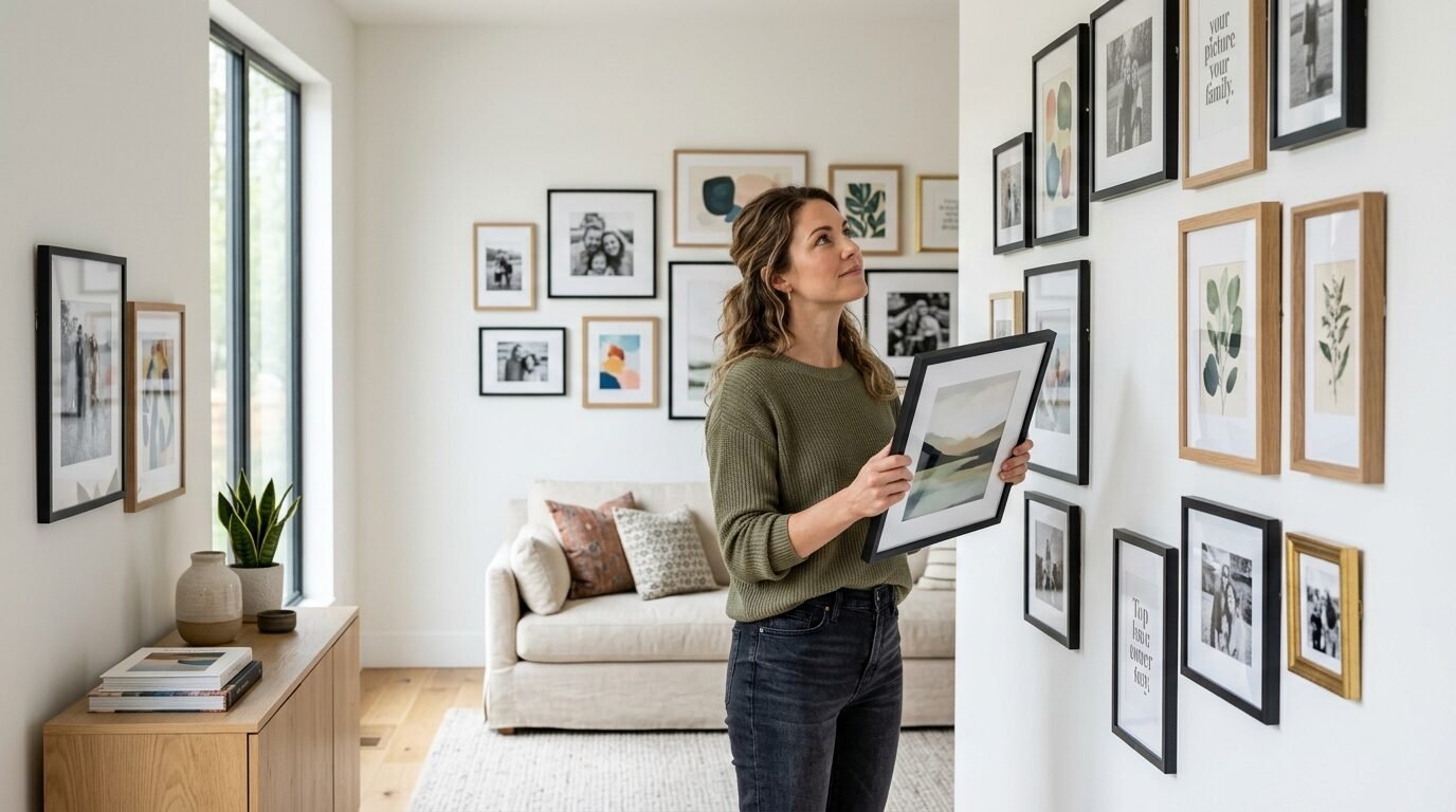
A gallery wall is a collection of items hung together. It works as one big piece of art. Most people fail because they stop too soon. They hang two frames and quit. I found that density is the secret. You want the wall to feel full.
You can use photos. You can use mirrors. You can even use baskets. In this article, I cover 25 distinct styles. I include exact tool lists. I give you pricing ranges. I share why some layouts fail. You will see how to measure correctly. You will know how to mix colors. By the end, you will have a clear vision for your room.
1. The Symmetrical Grid Layout
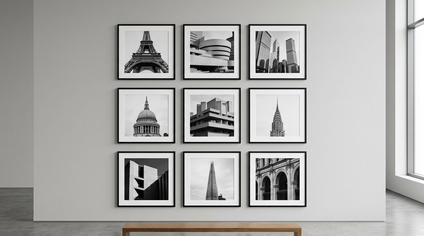
The grid is the most formal option. It uses the same frame size for every piece. I used this in my first apartment. I bought nine black Ikea Ribba frames. I put them in three rows of three. It looked expensive. It felt organized.
This style works best with a theme. Use all black and white photos. Use botanical prints. The secret is the spacing. Use a ruler. Keep exactly two inches between every frame. Use a level. If one frame is tilted, the whole wall looks bad. It is a classic look. It never goes out of style.
2. The Eclectic Floor to Ceiling Wall
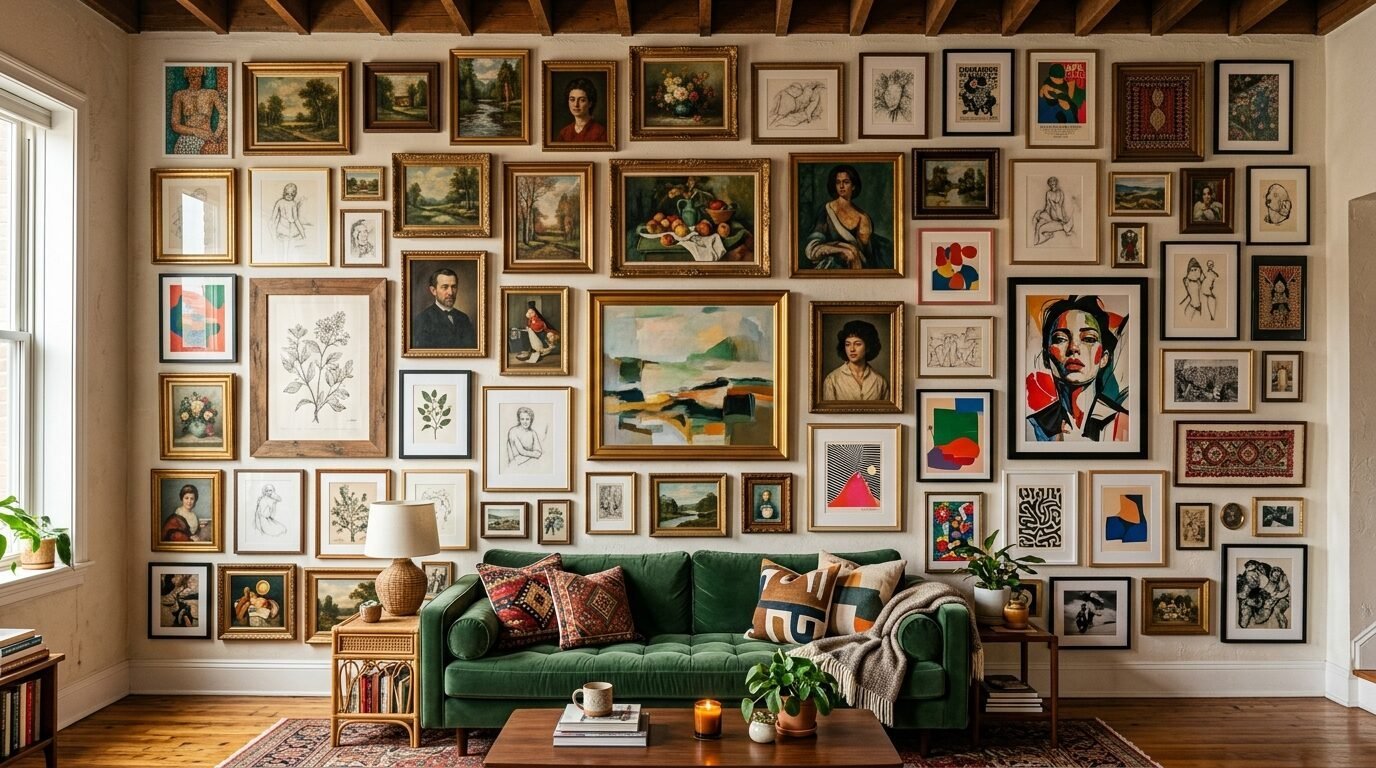
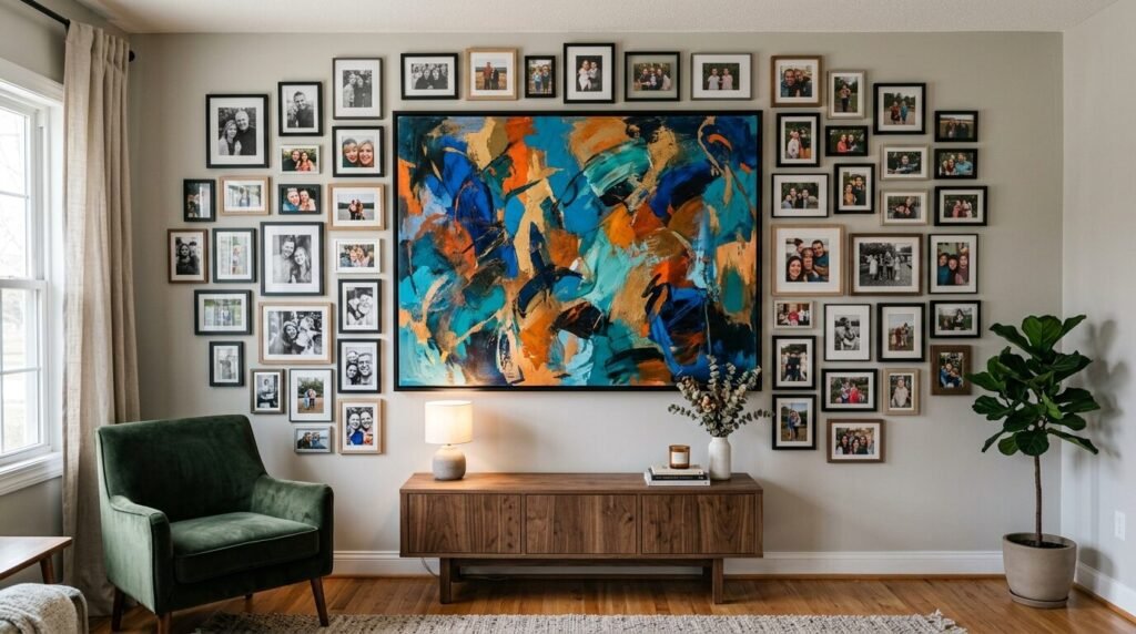
This is a bold choice. It covers the entire wall from the baseboard to the crown molding. I saw this in a small New York City flat. It made the low ceilings feel much higher. You start in the middle. You work your way out.
Do not worry about matching frames. Mix wood with metal. Mix gold with black. Use different sizes. It feels like a museum. It tells a long story. Use Command Strips for this. They let you move things as you grow the collection. It takes time to finish. The result is worth the wait.
3. The Minimalist Linear Row
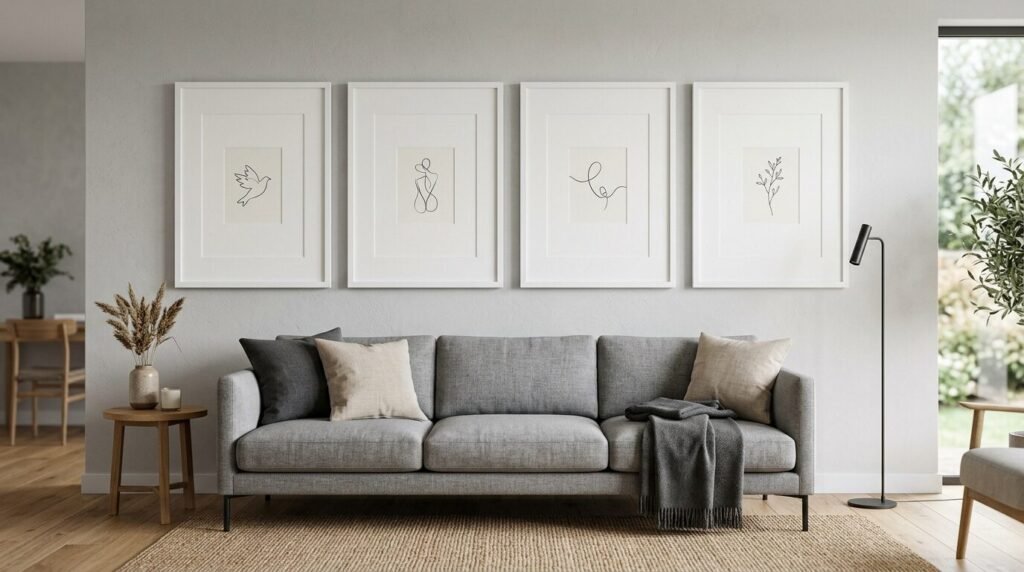
Sometimes less is more. A single long row of frames looks very modern. Hang them behind your sofa. Align the bottom edges perfectly. I tried this with five large frames. I used white mats with small 5×7 prints inside.
The extra white space in the matting looks high end. It feels calm. It does not clutter the room. This works well in small living rooms. It provides a focal point without being loud. Use thin metal frames for a sleek look. Target has great options for this.
4. The Vintage Gold Mirror Gallery
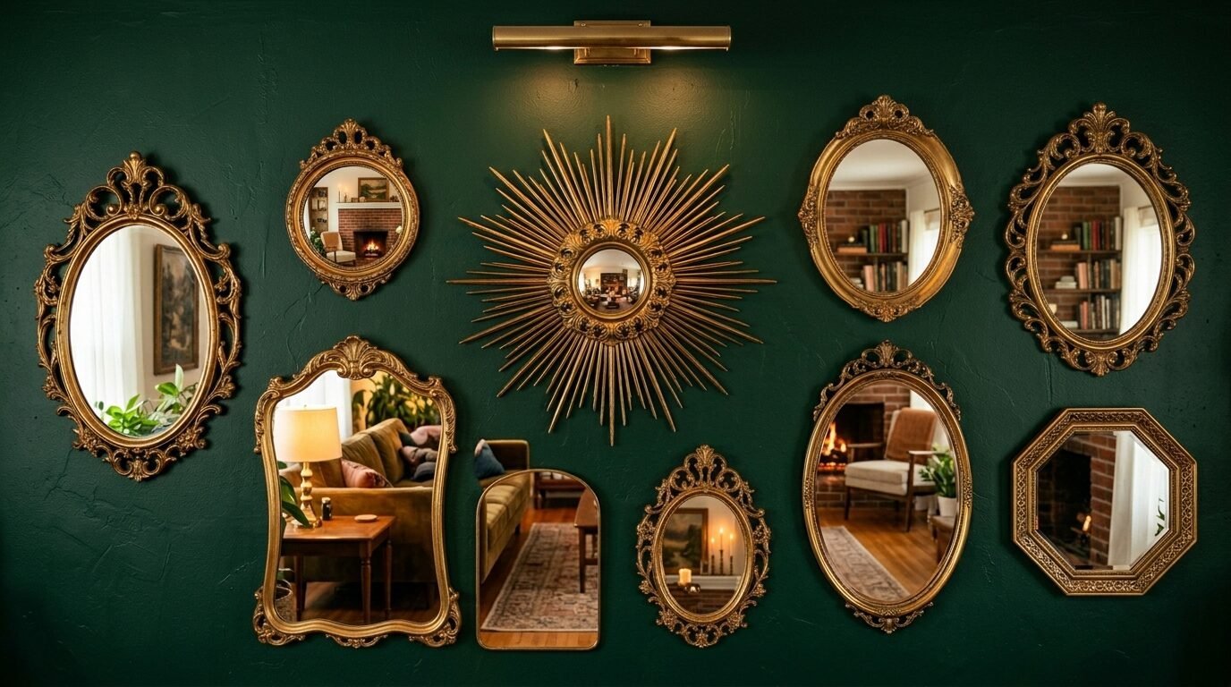
Art does not have to be paper. I love using old mirrors. Look for them at thrift stores. Look on Facebook Marketplace. Find different shapes. Find circles. Find rectangles. Find ornate frames.
Spray paint them all the same shade of gold. This ties them together. Mirrors bounce light around the room. They make dark corners feel bright. I noticed this works best on a dark painted wall. A navy or forest green wall makes the gold pop. It feels regal. It feels historic.
5. The Mixed Media Shadow Box Collection
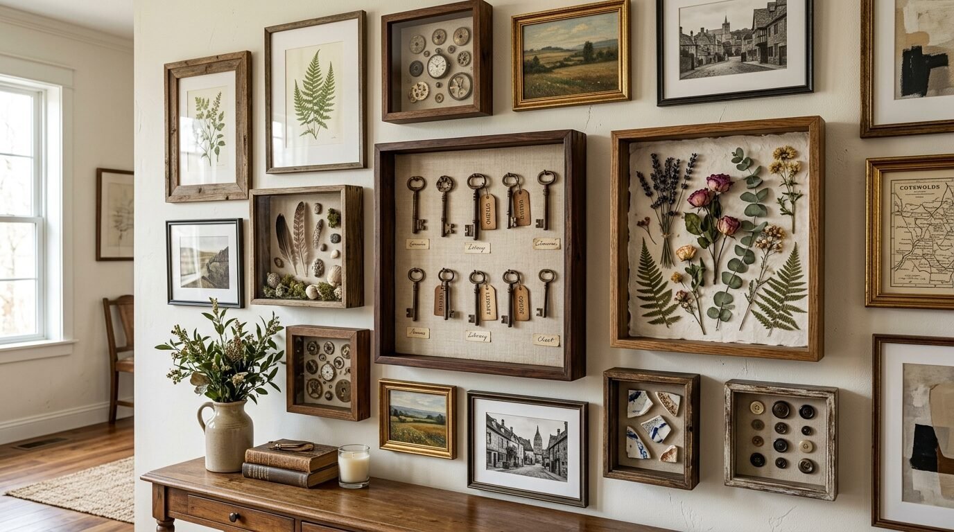
Shadow boxes allow you to hang 3D objects. I put my old travel keys in one. I put a dried wedding flower in another. Mix these with flat art. It adds depth. The wall looks textured.
People love to walk up and look closely. It starts conversations. I suggest using wood shadow boxes from Michaels. They are sturdy. They protect your items from dust. Place them near the center of your layout. They act as anchors for the smaller flat frames.
6. The Corner Wrap Around
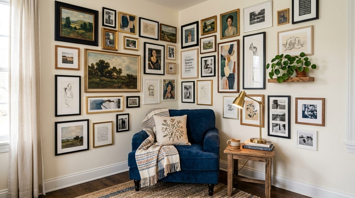
Do not stop at the corner. Continue your gallery onto the next wall. This creates a cozy nook. I did this in my reading corner. It hugs the chair. It makes the space feel private.
Use smaller pieces near the corner joint. It keeps the flow smooth. This layout breaks the rules of standard decorating. It feels fresh. It feels creative. Use a mix of vertical and horizontal pieces. This keeps the eye moving. It turns a boring corner into a feature.
7. The Monochrome Black and White Gallery
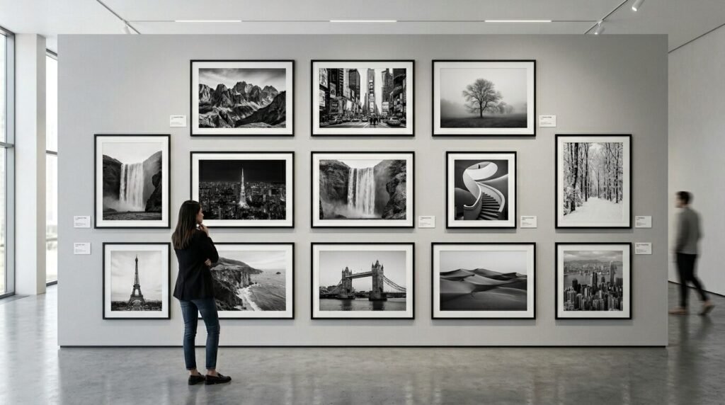
Color can be stressful. If you are worried about clashing, go monochrome. Use black frames. Use white mats. Use black and white photos. This is the safest way to get a professional look.
I see this often in high end design magazines. It looks sophisticated. It works with any furniture color. You can mix old family photos with modern art. The lack of color ties them together. It feels timeless. It looks intentional.
8. The Floating Shelf Gallery
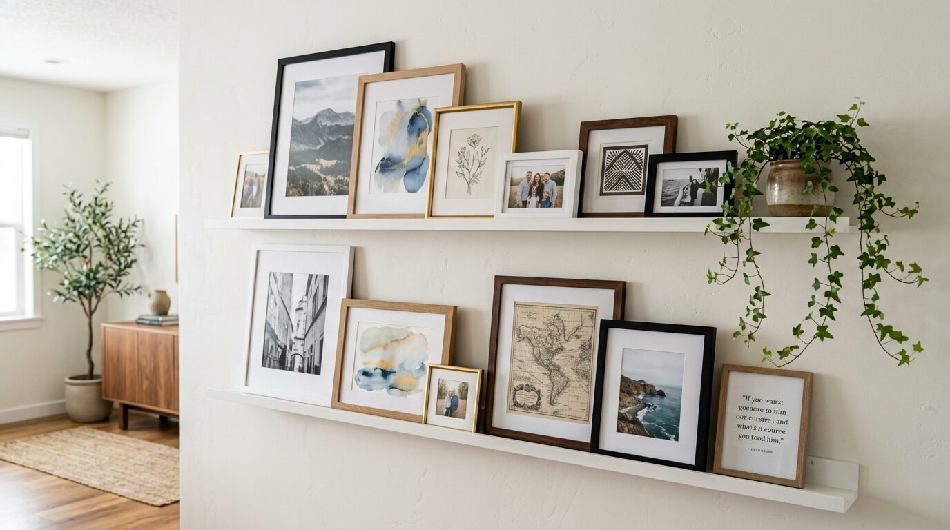
If you hate making holes in the wall, use ledges. Buy long picture ledges from West Elm or Ikea. Mount two or three of them. Lean your art on the shelves.
This is my favorite way to display art. I change my photos every month. You can overlap frames. You can add a small plant. You can add a candle. It is flexible. It is easy. You only have to level the shelf once. After that, you just play with the arrangement.
9. The Oversized Statement Piece Center
Start with one very large frame. Place it slightly off center. Then surround it with tiny frames. This creates a hierarchy. The big piece grabs the attention first. The small pieces keep people looking.
In my experience, the big piece should be a landscape or an abstract. The small pieces should be personal photos. Use a frame at least 24×36 inches for the center. It gives the wall a sense of scale. It feels balanced.
10. The Organic Basket Wall
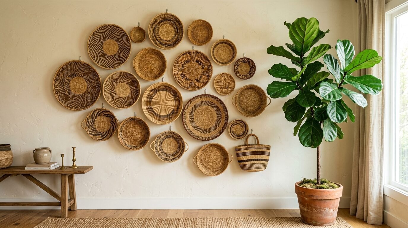
Woven baskets are popular for a reason. They add warmth. They add a natural feel. I find my baskets at local craft fairs. I look for different patterns.
Baskets are light. You only need a small nail to hang them. They add a circular shape to a room full of square furniture. This softens the space. It feels earthy. It feels relaxed. Mix in a few small framed botanical sketches. The green and tan colors look great together.
11. The Colorful Pop Art Grid
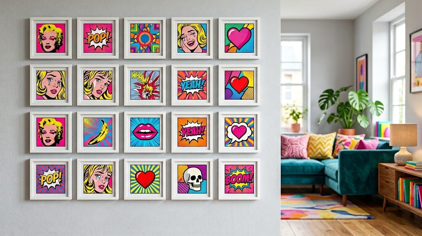
If you love color, use it. Pick four bright colors. Buy art that uses those colors. Use simple white frames. This keeps the focus on the art.
I saw a wall like this in a modern loft. It was full of energy. It made the room feel happy. Use a grid layout for this. The structure of the grid balances the wild colors. It keeps the wall from looking messy. It is a great way to show your personality.
12. The Architectural Blueprint Wall
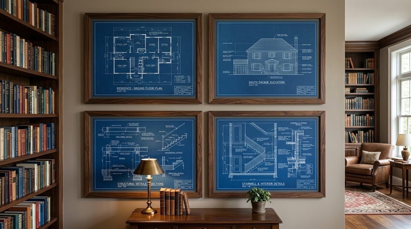
This is a great idea for history lovers. Find blueprints of your house. Find maps of your city. Find old patents. Frame them in dark wood.
These items usually have a blueprint blue or a sepia tone. They look cohesive. I used old maps of my hometown. It makes the living room feel personal. It tells a story of where you came from. These pieces are often large. You only need a few to fill a wall.
13. The Kids Art Professional Gallery
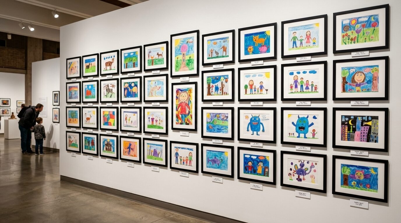
Do not hide your kids art on the fridge. Give it a real frame. Use high quality frames with glass. I saw a parent do this in a formal living room.
The kids art looked like abstract masterpieces. It builds their confidence. It adds a playful touch to the room. Use the same frame style for all of them. This makes the collection look curated. It turns scribbles into decor.
14. The Natural Wood and Botanical Theme
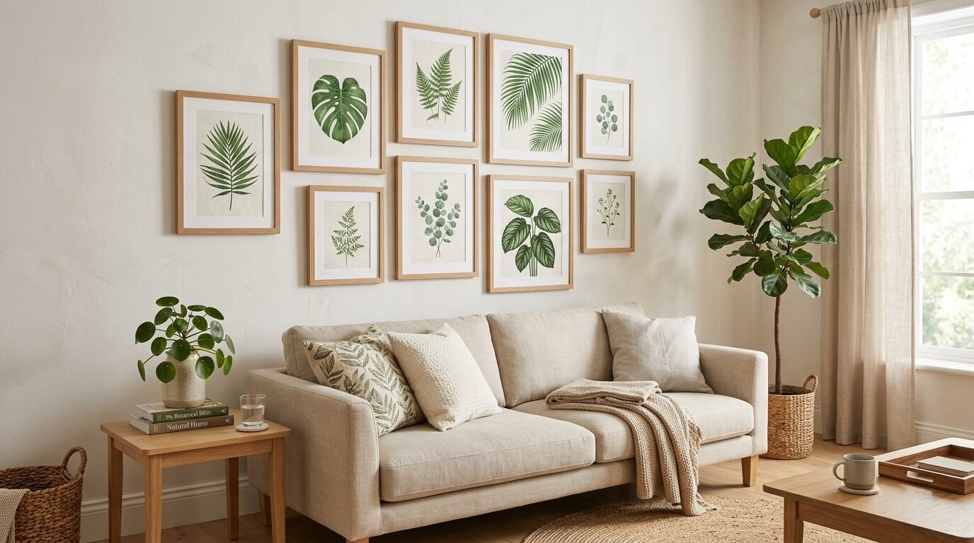
Botanical prints are easy to find. You can even print them at home. Use light oak or pine frames. This creates a Scandinavian feel.
I noticed this style works best with a lot of indoor plants. The frames match the plant stands. The art matches the leaves. It feels like an indoor garden. It is very calming. Use white backgrounds for the prints. This keeps the look clean and airy.
15. The Horizontal Staircase Layout
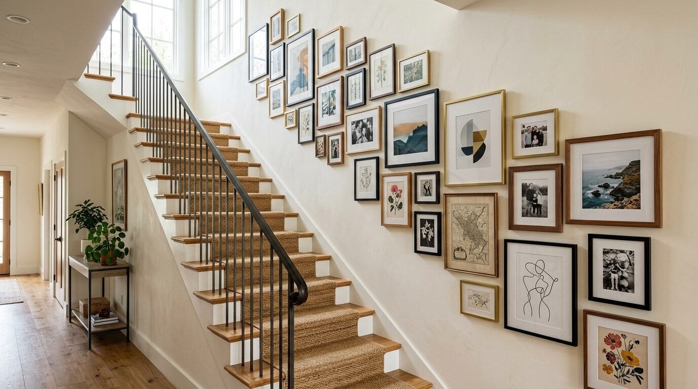
If your living room has a staircase, use that wall. Follow the angle of the stairs. The bottom of the frames should step up with the steps.
I tried this and found that spacing is hard. Start from the middle of the staircase. Work your way up. Work your way down. Use a mix of sizes. It makes the climb upstairs more interesting. It uses a space that most people ignore.
16. The Empty Frame Aesthetic
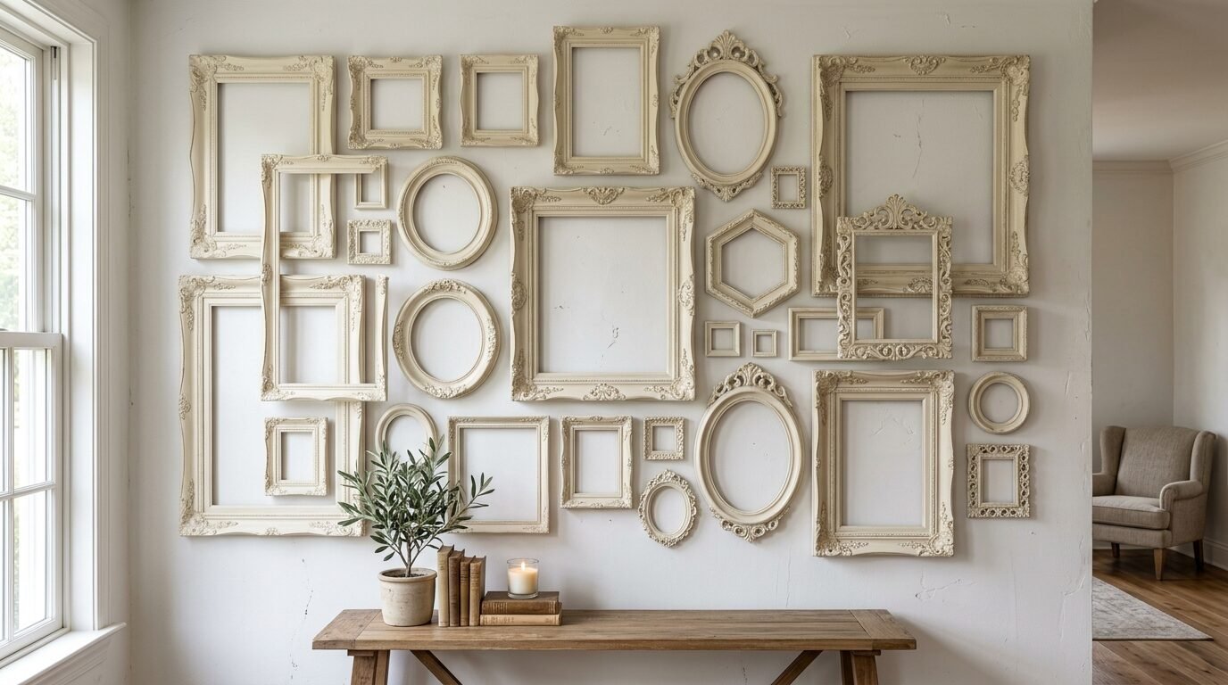
This is a unique look. You hang just the frames. No art inside. It sounds strange but it works. It focuses on the texture and shape of the frames.
I saw this in a farmhouse style home. The frames were painted white. They were hung on a white wall. It created a subtle, layered look. It is very budget friendly. You can find broken frames for almost nothing. Paint them and hang them up.
17. The Travel Photo Map
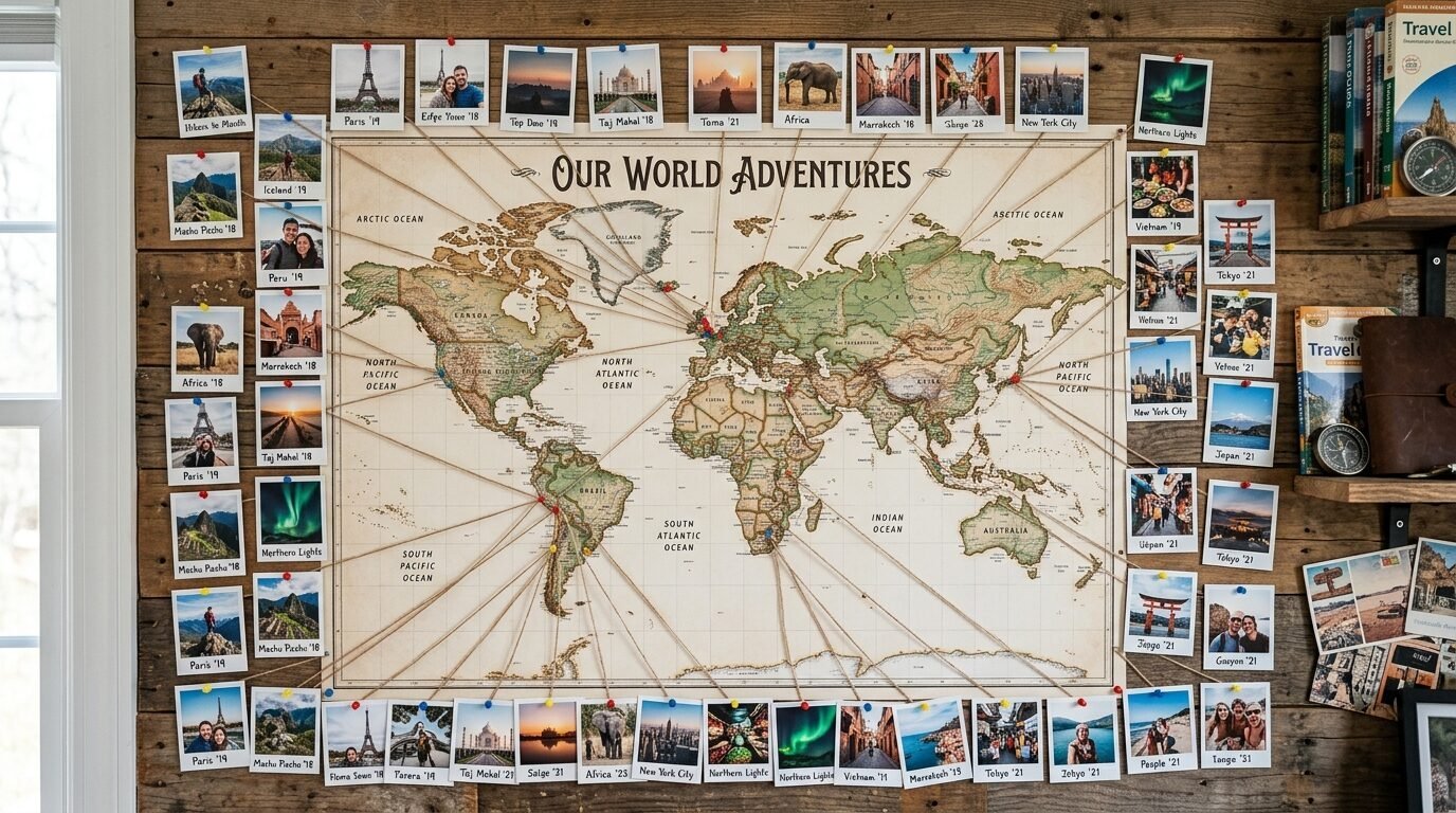
Print your favorite travel photos in a small square format. Arrange them in the shape of a world map. Or hang them around a large central map.
I use 4×4 inch prints for this. It looks like a giant puzzle. Use string to connect photos to their locations on the map. It is very interactive. Guests will spend a long time looking at it. It reminds you of your best memories every day.
18. The Mixed Metal Frame Wall
You do not have to choose one metal. Mix silver, gold, and copper. This feels modern. It feels expensive.
The key is to keep the frame styles similar. Use thin, simple profiles. I found that mixing metals works best when you have metal accents in your furniture. If you have a gold lamp and a silver coffee table, this wall ties them together. It looks intentional.
19. The Textile and Fabric Art Gallery
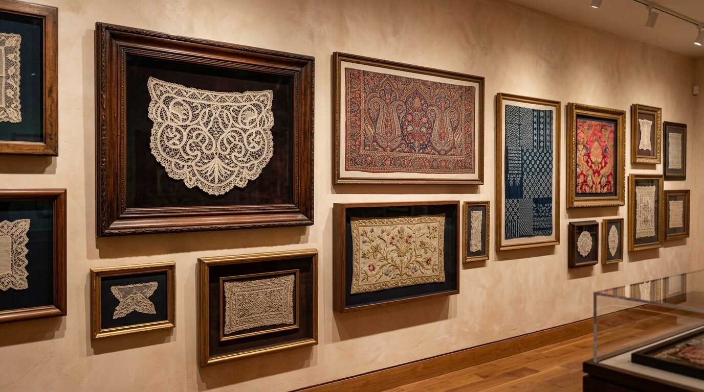
Art is not just for paper. Frame pieces of fabric. Use scraps of vintage rugs. Use pieces of lace. I framed a section of an old quilt from my grandmother.
It adds a soft texture to the wall. It breaks up the hard lines of the glass frames. Use deep frames or shadow boxes for thicker fabrics. This protects the material. It makes the fabric feel like a valuable artifact.
20. The Clock Gallery Wall
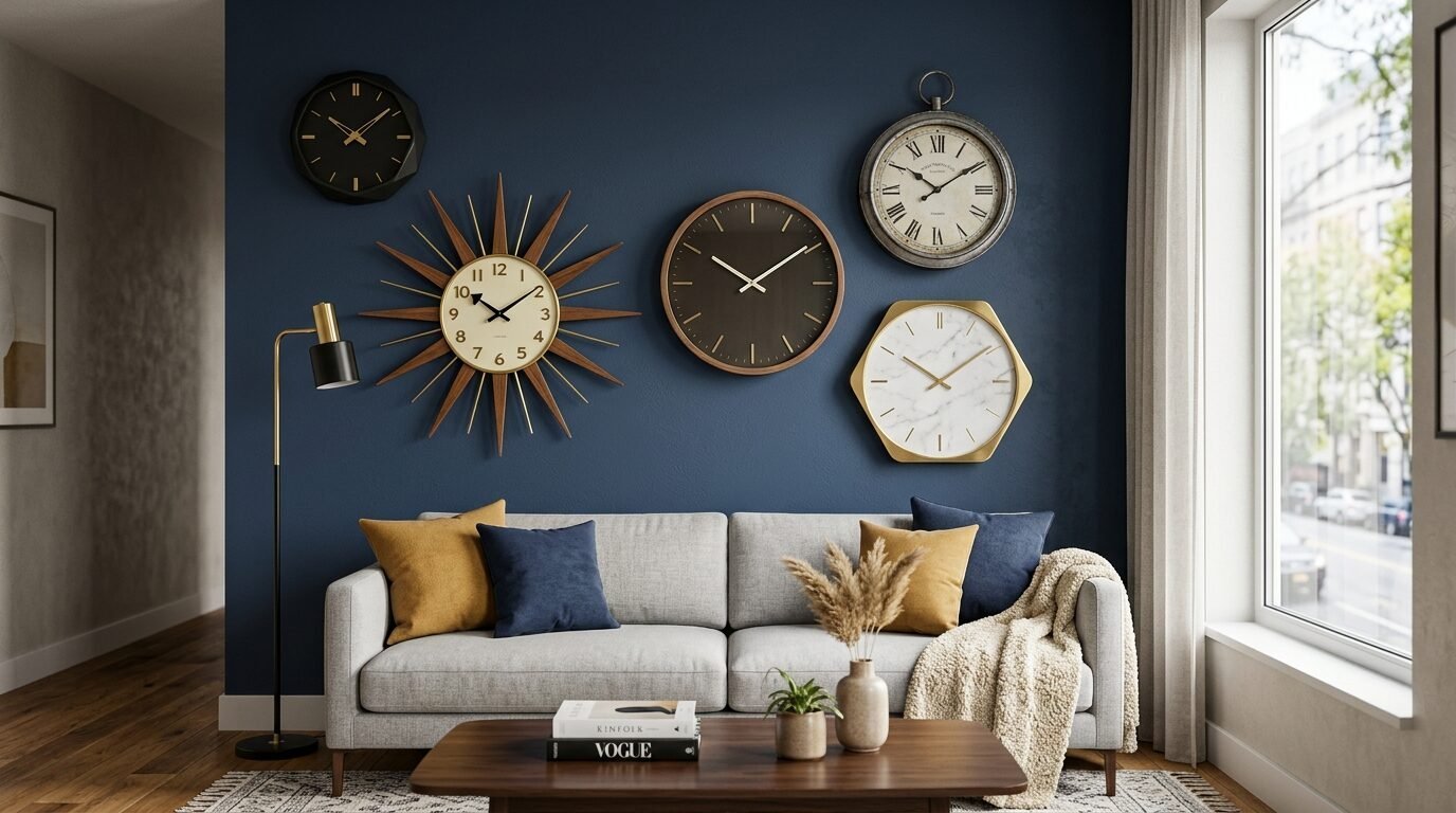
Time is art. Find five or six clocks of different sizes. Set them to different time zones of places you love.
I saw this in a home office that doubled as a living room. It was very chic. Use clocks with different faces. Use some with Roman numerals. Use some with modern dots. It adds a sense of movement to the wall. The ticking sound can be very peaceful.
21. The Sketchbook Page Layout
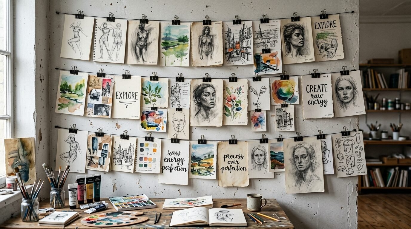
If you like to draw, use your pages. Tear them out. Do not worry about the rough edges. Use clips instead of frames.
I used black bulldog clips to hang my sketches. It feels like an artist studio. It is very easy to swap art out. You can change the whole wall in five minutes. This works well for people who get bored easily. It is casual. It is cool.
22. The Dark Wall Moody Gallery
Paint your wall a dark color first. Try charcoal or deep plum. Then hang art with bright colors. The contrast is amazing.
I noticed that gold frames look best on dark walls. They glow. The dark background makes the art look more professional. It feels like a high end gallery. Use museum lights above the frames for extra drama.
23. The Geometric Tape Layout
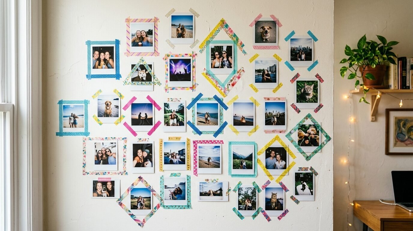
Use washi tape instead of frames. You can create geometric borders around your photos.
This is perfect for renters. It leaves no holes. I used gold washi tape for a temporary gallery. It looked surprisingly good. You can make the “frames” any size you want. It is a very cheap way to get a custom look.
24. The Portrait Gallery
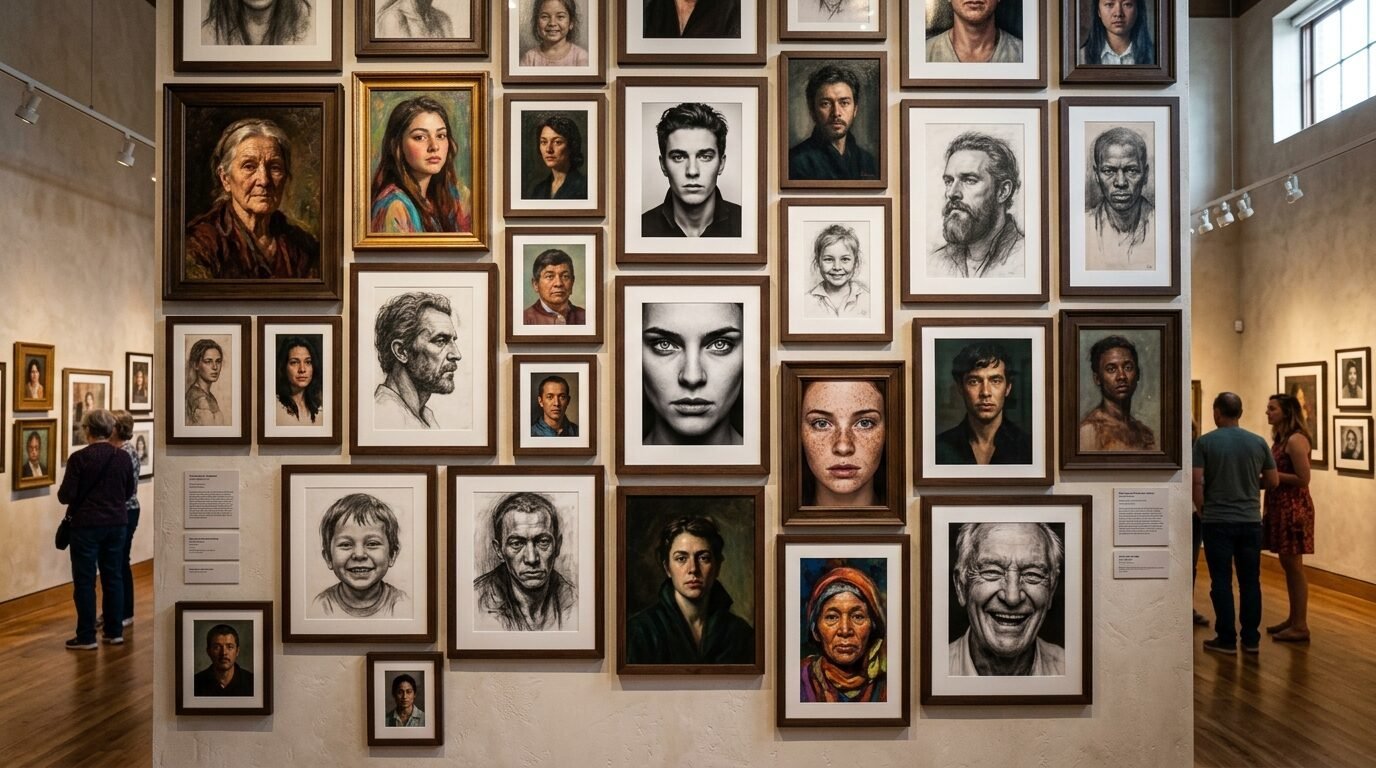
Focus only on faces. Mix family photos with sketches of people. Use different styles of portraits.
This creates a very human feel in the room. It feels like the room is full of friends. I saw this in a library. It felt very cozy and smart. Keep the frames simple so the faces are the focus.
25. The 3D Letter Gallery
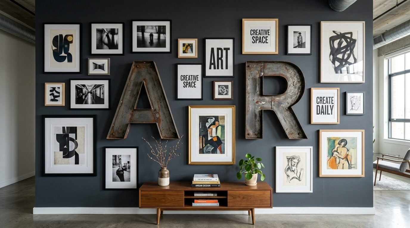
Mix in large wooden or metal letters. Use the first letter of your last name. Use words like “home” or “stay”.
I found that one or two letters are enough. Do not overdo the words. The letters act as a break from the rectangular frames. They add a graphic element. It makes the wall feel modern and fun.
Necessary Tools for Your Project
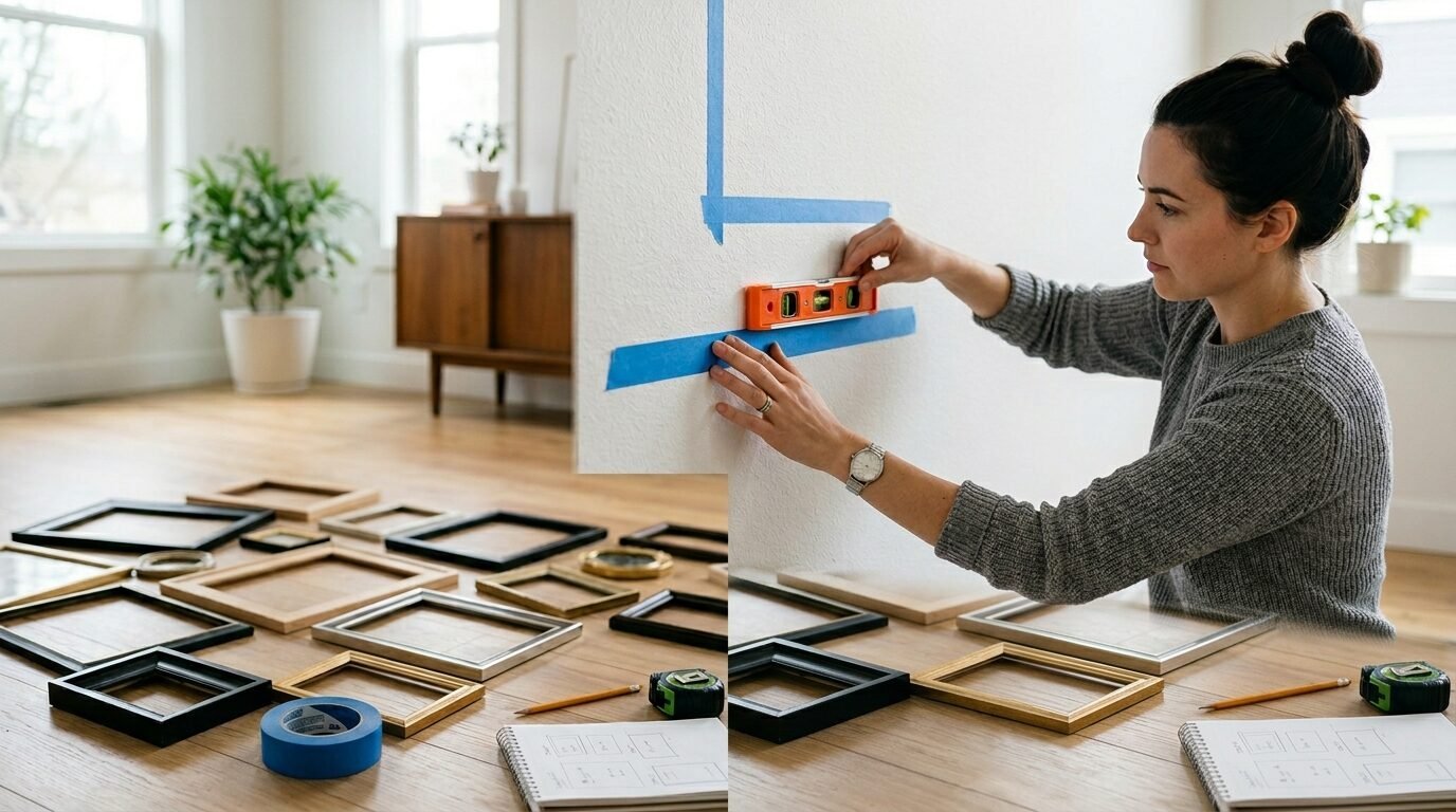
You need the right tools. I failed my first wall because I guessed the measurements. Do not guess.
- Blue Painter’s Tape: Use this to mark frame corners on the wall.
- A Level: This is the most important tool. No one likes a crooked frame.
- Command Strips: Use these if you are a renter or move art often.
- Kraft Paper: Trace your frames on paper. Tape the paper to the wall first.
- A Hammer and Small Nails: For heavier items.
- A Measuring Tape: Measure twice. Nail once.
Comparing Gallery Wall Styles
| Style | Best For | Cost | Effort |
| Grid | Formal Rooms | Medium | High |
| Ledge | Renters | Low | Low |
| Eclectic | Storytellers | Variable | Medium |
| Botanical | Nature Lovers | Low | Low |
| Mirror | Dark Rooms | High | Medium |
Frequently Asked Questions about Gallery Walls
How high should I hang my gallery wall?
The center of the gallery should be at eye level. This is usually 57 to 60 inches from the floor. If it is above a sofa, leave 6 to 8 inches of space between the top of the sofa and the bottom of the frames. I often see people hang art too high. It makes the room feel disconnected.
Should all my frames match?
No. You do not need matching frames. If you want a clean look, match them. If you want a collected look, mix them. I find that staying within a color palette helps. Use all woods or all metals if you mix shapes.
How do I plan the layout without making holes?
Trace your frames onto brown paper. Cut out the shapes. Tape the paper shapes to the wall using painter’s tape. Move them around until you like the look. This saves your walls. It also saves your time.
What spacing is best between frames?
Aim for two to three inches between pieces. Larger walls can handle more space. Smaller walls need tighter spacing. Consistency is key. If you pick two inches, stay with two inches everywhere.
Can I mix color and black and white photos?
Yes. I like to use a 70/30 rule. Make 70 percent one style and 30 percent the other. This looks intentional rather than random. It adds a nice layer of visual interest.
Final Thoughts on Your Living Room Wall
Creating a gallery wall is a journey. It does not have to be perfect on day one. I started mine with three photos. Now it has fifteen. It grows as my life grows.
Pick one idea from this list. Buy a few frames. Start in the center. You will see the room change instantly. It adds soul to your home. It tells your guests who you are. Start today. Your wall is waiting.
Sloane Whitaker is the Editor-in-Chief at Home Wall Trends, leading editorial direction with over a decade of experience in residential interior design and home styling. Her specialty is space planning and layout, the unglamorous fundamentals that make a beautiful room actually function. A graduate of the New York School of Interior Design, Sloane has styled over 200 client homes before turning her focus to digital publishing. Her editorial standard: “If a reader can’t picture themselves doing it on a Saturday afternoon, we haven’t explained it well enough.”